I’ve been trying to limit the amount of Covid-19 visualisations I’ve been covering. But on Sunday this image landed at my front door, above the fold on page 1 of the New York Times. And it dovetails nicely with our story about the pandemic’s impact on Pennsylvania, New Jersey, Delaware, Virginia, and Illinois.
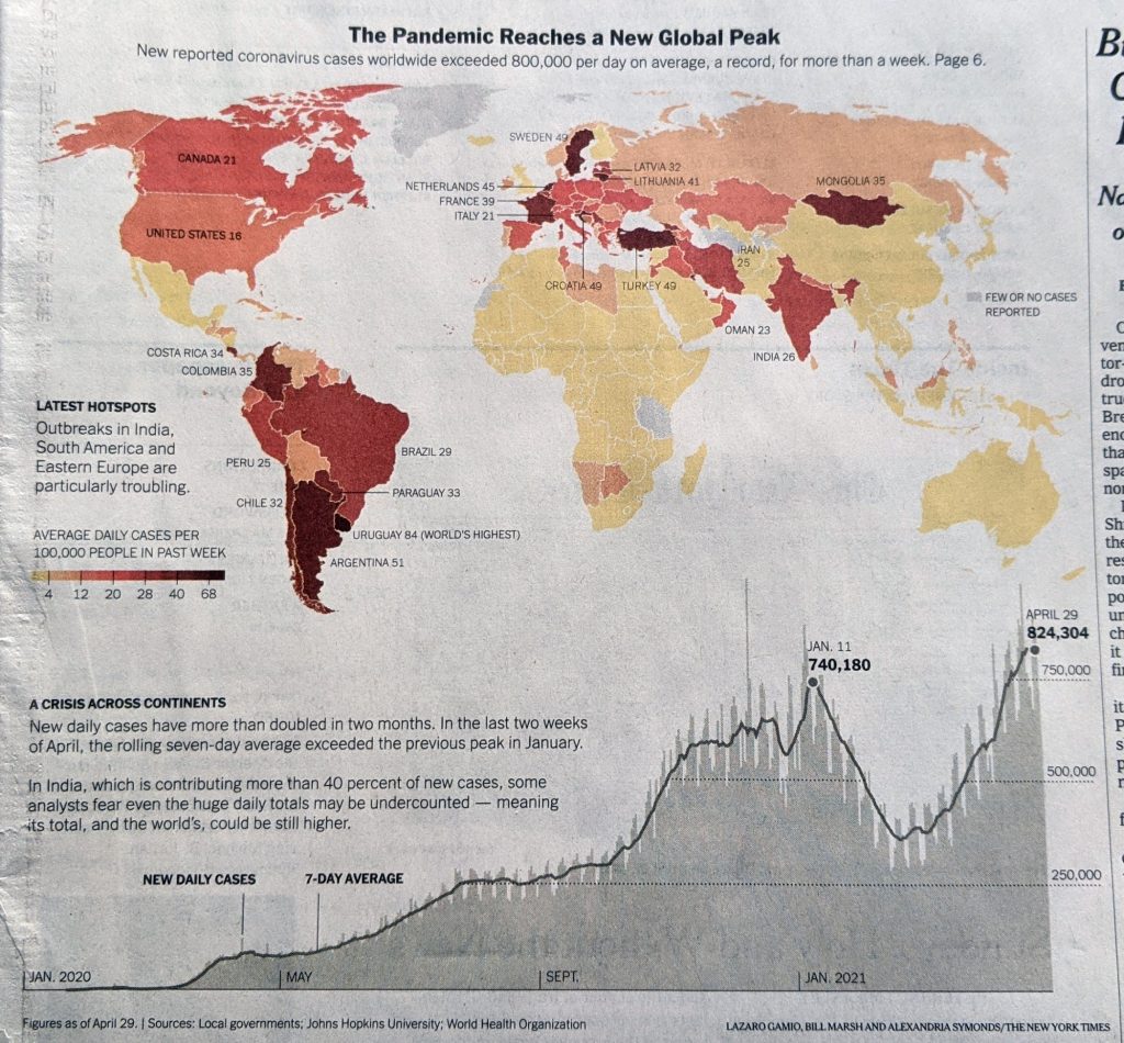
For most of 2020, the United States was one of the worst hit countries as the pandemic raged out of control. Since January 2021, however, the United States has slowly been coming to grips with the virus and the pandemic. Its rate is now solidly middle of the pack—no longer is America first.
And if you compare the chart at the bottom to those that I’ve been producing, you can clearly see how our five states have really gotten this most recent wave under control to the point of declining rates of new cases.
However, you’ve probably heard the horror stories from India and Brazil where things are not so great. It’s countries like those that account for the continual increase in new cases at a global level.
Credit for the piece goes to Lazaro Gamio, Bill Marsh, and Alexandria Symonds.
Leave a Reply
You must be logged in to post a comment.