Not All Charts Are Necessary Part 2

The table option
The table option

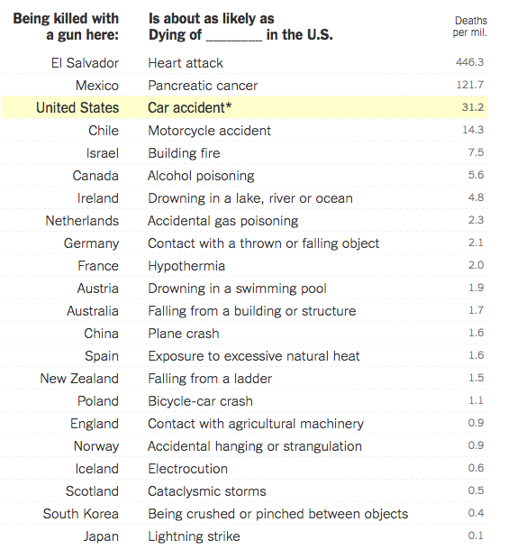
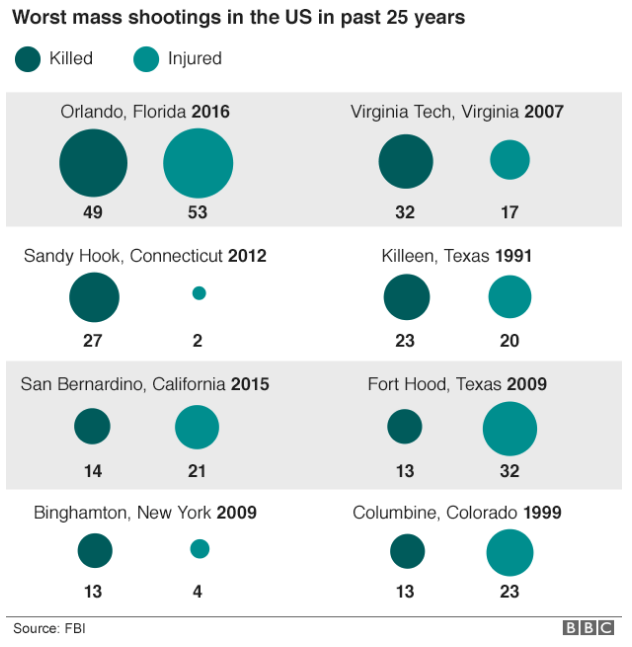
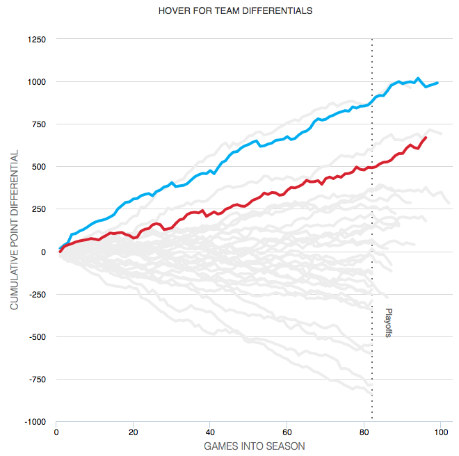
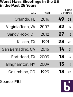
Monday I examined a chart from the BBC that in my mind needlessly added confusing visual components to what could have been a straight table. So here we take a look at some other options that could have been used to tell the same story. The first is the straight forward table approach. Here I emphasised the important number, that of those killed. I opted to de-emphasise the years and the injured in the table. Also, since the bulk of my audience is from the United States, I used the two-letter states codes.

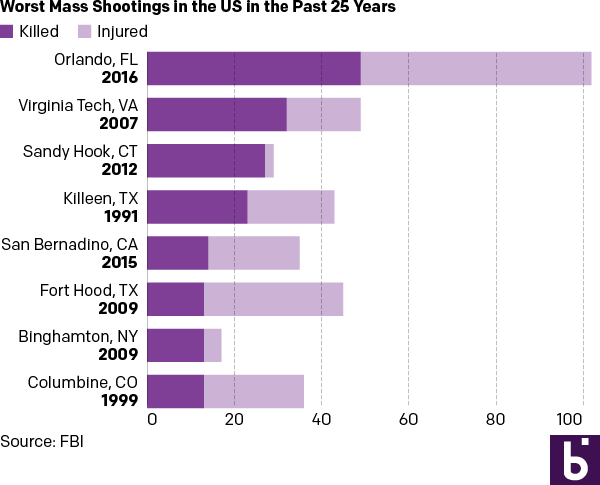
But let us presume we want a graphic because everyone wants everything to be visual and graphic. Here are two different options. The first takes the table/graphic from the BBC and converts it into a straight stacked bar chart, again with emphasis on the dead. I consolidated the list into a single column so one need not split their reading across both the horizontal and vertical.

As a stacked bar chart

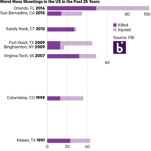
And then if you examine the dates, one can find an interesting component of the data. Of the top-eight shootings, all but two occurred within the last ten years. So the second version takes the graphic component of the stacked bars from the first and places them on a timeline.

In a timeline
In a timeline

For those that wonder about the additional effort needed to create three different options from one data set, I limited myself to an hour’s worth of time. A little bit of thought after examining the data set can save a lot of time when trying to design the data display.

Tables of Insight

Yesterday I opined about how simple tables can convey meaningful information without the aid of unnecessary chart elements. And while we will get back to that post, I did want to take a moment to share an older piece from the New York Times I recalled and that has been updated since Orlando.

The piece uses a table to compare the gun homicide rates for various countries and compares it to other causes of death. Being killed by a gun in the Netherlands is as likely as dying by accidental gas poisoning in the United States. It puts the absurdly high gun homicide rates in the United States in a new light.

A table of death
A table of death

Credit for the piece goes to Kevin Quealy and Margot Sanger-Katz.

Not All Charts Are Necessary

I will be trying to do a longer piece on the data visualisations surrounding the shootings in Orlando later this week. But for starters, a simple point through this piece from the BBC—not that they are the only culprits of this. Not all data-driven stories need visualisations. Sometimes a nicely typeset table will do the job better and faster.

Green circles?
Green circles?

An actual table with typographic emphasis on the tables would have been better and clearer than this. Or with a little more time and effort—not that those always exist in a journalism organisation—something more appropriate to the type of data could have been designed.

Credit for the piece goes the BBC graphics department.

Independent Candidates

Well, the election battleground has been set: Trump vs. Clinton. (Yes, I know the District of Columbia has yet to vote.) For those unhappy with the choices presented, the question of “what about a third party candidate?” arises. (Yes, I know there is both a Libertarian Party and Green Party already.) Months ago, FiveThirtyEight looked at where Michael Bloomberg fell as a third party candidate, a run he briefly considered. Turns out he too moved out of the middle and into one of the four corners of the board.

The lay of the land for outsider candidates, ca January

Credit for the piece goes to Nate Silver.

Counterbalancing Presidential Support

The night after the California primary—or as an East Coaster should say, the night of the New Jersey primary—we take a look at how US presidents often experience a counterbalancing political force in state, gubernatorial, House, and Senate races. The content comes from the Washington Post and it makes use of nicely annotated graphics, including the screenshot below.

How Senate control changed

What I enjoy about the piece, however, is how it responds to a narrower browser, like one might see on a mobile phone. The screenshot to the right shows how the data visualisation changes. You can see how some of the annotations disappear, like the note about Nixon’s support growing.

The same adaptation to the display occurs for the other graphics throughout the piece, with axes and orientations changing to take advantage of the more vertical orientation.

I also think it is worth pointing out that the more illustrative ornamentation of the piece, i.e. the presidential illustrations, drop off completely. I could have lived without them as they do not contribute directly to the data story. I also think the white lines on the charts above could be removed to make the narrower margins more visible on the charts.

Credit for the piece goes to Stephanie Stamm.

Fact Checking Trump’s Small Multiples

Today marks the end of primary season for the US presidential election. By all accounts, at night’s end Hillary Clinton will be the Democratic nominee, but Bernie Sanders, while unlikely to win, could make California interesting tonight. And then there is Donald Trump. He is the Republican Party’s presumptive nominee and man, can that guy tweet.

Thursday he retweeted a set of small multiple charts arguing that President Obama’s legacy is an absolute disaster.

Trump's retweeted charts
Trump’s retweeted charts

Friday the Washington Post went through all nine points and fact-checked the charts, this being the refutation of the Food Stamps chart.

Food stamps are actually going back down

The whole thing is worth a quick read.

Credit for the piece goes to Philip Bump.

Your State and the Google

Well today has arrived and it is finally Friday. So if you are a Pennsylvanian like me, according to research by Estately (hat tip to a good friend and regular reader), the question I am likely asking is “When is X-Files?”. What did your state enquire of the Google?

Where is the Internet? Who is Spain?  Why is Hitler?
Where is the Internet? Who is Spain? Why is Hitler?

I mean I liked the new series. Even if just for the rush of nostalgia.

Credit for the piece goes to Ryan Nickum.

Bonus points if you get the reference.

Basketball Finals

So the basketball finals begin tonight with the Cleveland Cavaliers taking on the Golden State Warriors. This is also the part of the post where I fully admit I know almost nothing about basketball. I did, however, catch this so-labelled infographic from ESPN contrasting the two teams.

Point differential
Point differential

What I appreciate at this piece is that ESPN labelled it an infographics. And while the data might be at times light, this is more a data-rich experience than most infographics these days. Additionally the design degrades fairly nicely as your browser reduces in size.

The chart formats themselves are not too over-the-top (that seemed like a decent basketball pun when I typed it out) with bars, line, and scatter plots. Player illustrations accent the piece, but do not convey information as data-encoded variables. I quibble with the rounded bar charts for the section on each team’s construction, but the section itself is fascinating.

I might not know most of the metrics’ definitions, but I did not mind reading through the piece.

Go Red Sox.

Credit for the piece goes to Luke Knox and Cun Shi.

World Income

Over the weekend I found myself curious about the notion of a growing global middle class. So I dug up some data from the Pew Research Center and did some analysis. The linked piece here details that analysis.

The growth in middle income populations

I go into more detail than just a map. Hopefully you enjoy the piece and find the analysis informative if not useful.

Credit goes to myself on this one.

Why All the Nationalism?

Brexit is coming, Brexit is coming. Something about red coats? I couldn’t resist. But, the prospect of the United Kingdom leaving the European Union is real, though still not likely according to the latest polling data. What drives the sentiment to get out, kick out the illegal immigrants, and restrict new immigrants from arriving—where have I heard that before—? Well, the Washington Post takes a look at a plausible economic cause.

Comparing British recessions

And because I am pretty sure I have heard something similar, the article makes a case for countries beyond the British Isles.

Credit for the piece goes to Matt O’Brien.