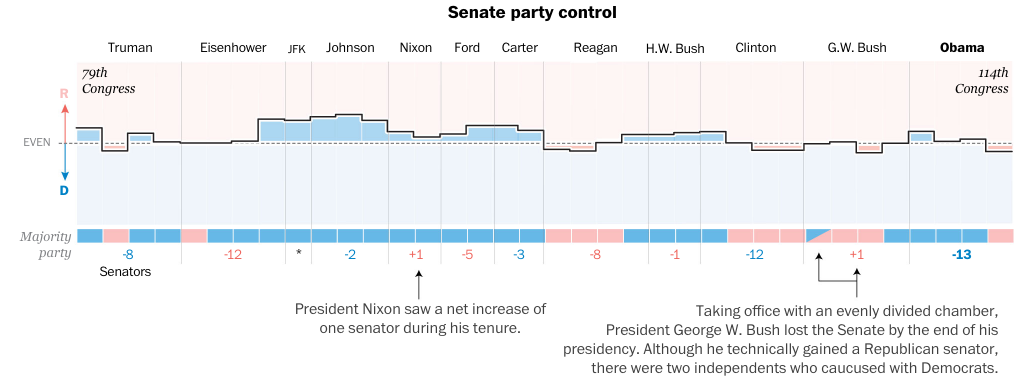
The night after the California primary—or as an East Coaster should say, the night of the New Jersey primary—we take a look at how US presidents often experience a counterbalancing political force in state, gubernatorial, House, and Senate races. The content comes from the Washington Post and it makes use of nicely annotated graphics, including the screenshot below.


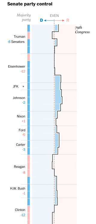
What I enjoy about the piece, however, is how it responds to a narrower browser, like one might see on a mobile phone. The screenshot to the right shows how the data visualisation changes. You can see how some of the annotations disappear, like the note about Nixon’s support growing.
The same adaptation to the display occurs for the other graphics throughout the piece, with axes and orientations changing to take advantage of the more vertical orientation.
I also think it is worth pointing out that the more illustrative ornamentation of the piece, i.e. the presidential illustrations, drop off completely. I could have lived without them as they do not contribute directly to the data story. I also think the white lines on the charts above could be removed to make the narrower margins more visible on the charts.
Credit for the piece goes to Stephanie Stamm.
Leave a Reply
You must be logged in to post a comment.