How We’re Talking to New Horizons

So New Horizons is long since gone from Pluto. But it will still take 16 months to send back all the photographs and science. Why so long? Because so far away. 3 billion miles away. Put another way, light from the sun takes eight minutes to reach Earth as it travels at, well, the speed of light. Radio signals that travel at the speed of light take 4.5 hours to reach Earth from Pluto. So imagine trying to send large data files that far away at a download speed less than that of a 56k modem, for those of you old enough to remember such a thing.

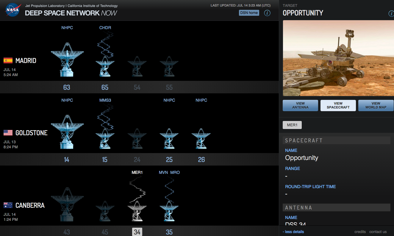
But what receives these radio signals? NASA’s Deep Space Network of antennae that allow NASA to communicate with spacecraft and such things that are in, wait for it, deep space. These antennae are scattered throughout the world, but in this screenshot taken Monday, you can see just what the antennae at the various complexes are doing. Here, we see New Horizons (NHPC) just prior to its flypast communicating with the large antenna at the Madrid complex. The lack of signal lines indicates that it is preparing to setup, takedown, or is tracking the spacecraft.

From early Monday night

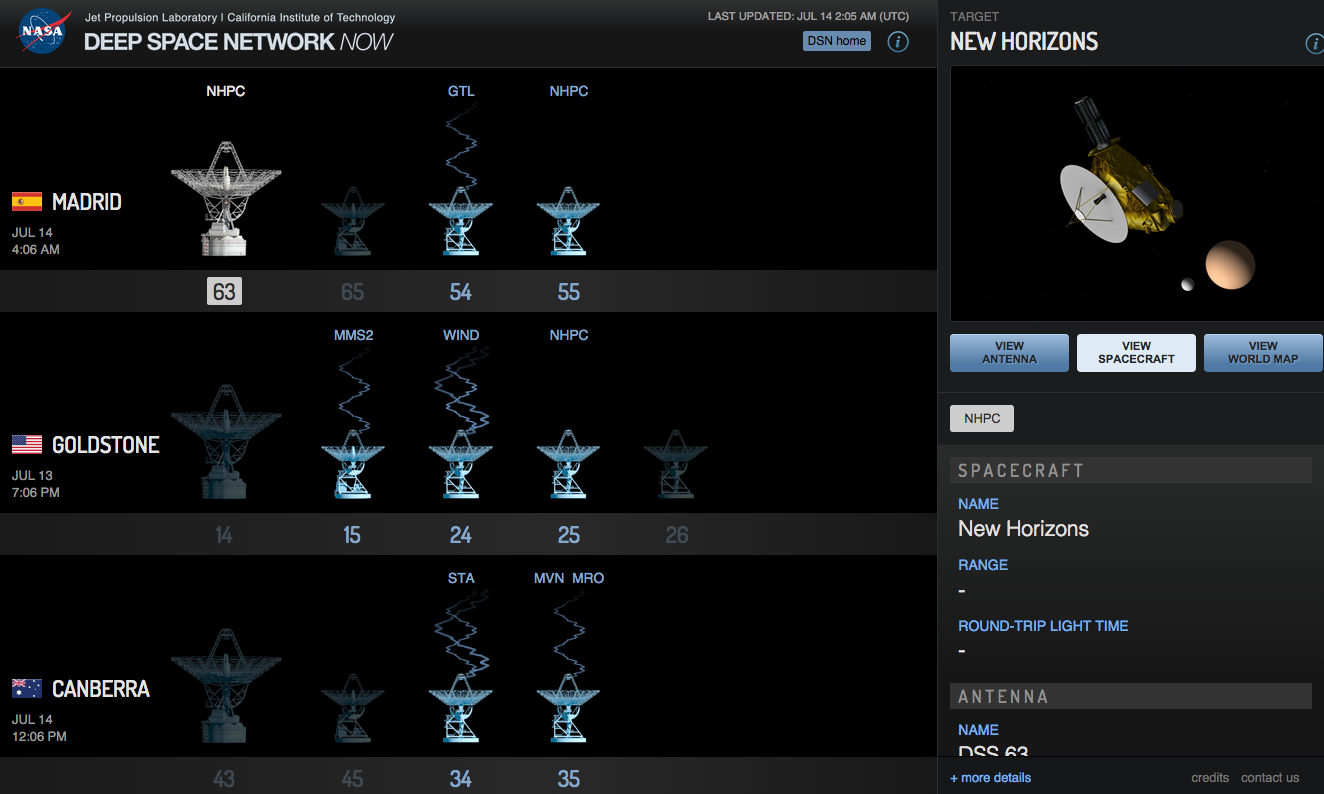
As a fun aside, I left the tab open in the browser and a few hours later came back to find the Deep Space Network sending signals to the Mars rover Opportunity (MER1), the Chandra X-Ray Observatory (CHDR), and the Mars Reconnaissance Orbiter (MRO) amongst others.

Opportunity is still chugging along on Mars

Credit for the piece goes to the NASA graphics department.

Your Guide to the Solar System

As New Horizons will soon begin sending back photographs of Pluto, Charon, and the other moons, I figured it would be a good to share a Wall Street Journal piece that looks at the other photographed bodies of the system.

Field Guide to the Solar System

Credit for the piece goes to Jon Keegan, Chris Canipe, and Alberto Cervantes.

New Horizon’s Flypast

A little after 07.30 EDT, New Horizons began its race past Pluto, what your author grew up learning as the ninth planet in the Solar System—the last planet to be explored. I recall thinking that when it launched back in 2006 I had no idea what I would be doing nine years later. Or at least I think I thought that. It launched nine years ago, almost a third of my life. Regardless, I was definitely one of those upset with the decision to downgrade Pluto from planet to dwarf planet. Anyway, a decade on, there New Horizons is. By the time this post goes live, she will be barreling away towards the Kuiper Belt while transmitting her photographs and science data.

This piece from the New York Times looks at what happened earlier today in, for Americans, the wee hours of the morning.

What New Horizons is doing

Credit for the piece goes to Jonathan Corum.

Putting Tatooine to Shame

While the title sounds science-fiction-y, it is true. Star Wars has a famous scenece where a landscape is shown with a binary star system in the sky. But we now know of a quintuple-star system that has two separate sets of binary stars. This BBC article takes a look at how the system is structured.

Two binary star systems

Credit for the piece goes to the BBC graphics department.

Night Tube

Transport for London (TfL), the organisation that runs the London Underground or Tube, has announced a nighttime service called Night Tube. It is not for the entire system, but only a few specific lines. That means that TfL needed a new map. And that means that everyone will want to create their own version of the Night Tube map. So this article at City Metric looks at just that. The TfL version is shown below.

The official TfL map

Credit for the original goes to Transport for London.

ISIS Throughout the World

ISIS is still a threat to the Middle East, evidenced by the US announcing yesterday that it is intensifying strikes against the quasi-state in both Syria and Iraq. But just where has ISIS spread? And are its attacks spreading? This New York Times piece looks at just those two questions. The first through an obvious map.

The geographic reach of ISIS at all points over time

What the map does is show you where ISIS has attacked around the world over all time. So yes, it has global reach. But the map alone cannot show you if things are improving or getting worse. For that you need a visualisation type that can plot things over time. And as aforementioned, the piece includes that as well.

A spike in attacks this winter presaged a summer of terror

Unfortunately, it appears that yes, ISIS is attacking or at least attempting to attack more targets in more countries both within and without the Middle East and its declared provinces.

Credit for the piece goes to Karen Yourish, Derek Watkins, and Tom Giratikanon.

Greek Referendum Results

So when I initially planned to do this post for today, I thought the results would be a lot closer and the data display more interesting. But, I was wrong. It turns out the Greeks voted overwhelmingly against the European Union’s offer in a greater than 60–40 result. But, here we go anyways, a whole lot of no in this piece from the Guardian.

Turns out Greeks don't want austerity
Turns out Greeks don’t want austerity

Credit for the piece goes to the Guardian’s graphics team.

The Spellecy’s Wisconsin Land Grant

I have returned from my trip up north to Minnesota and Wisconsin. Unfortunately, from the research side it was not the most successful of trips. I did find some records, but none that answered any of the big questions I had. If anything, I now have far more questions. Most of the information I learned deals with the homesteaded land that John Spellecy received in 1888, at the young age of 70. It turns out by the time he was given the land by the US government, he had already made one contract to sell a portion of it. And so to make some semblance of it, I made this animation to show how the land grant disappeared over only a 12 year period.

How the Spellecy plot disappeared

For the curious, the background image is a digitisation of the US government’s original land survey. The A.160 denotes 160 acres, the maximum allowed by a homestead claim.

The Supreme Court’s Recent Liberalism

Last week the Supreme Court ruled in favour of the Affordable Care Act, better known colloquially as Obamacare, and said that the federal tax subsidies are, in fact, constitutional. But, this piece is not so much about that one individual ruling, but rather the surprising trend of the recent Roberts’ court terms to skew liberal instead of the expected conservative. In this Upshot piece from the New York Times, an interactive graphic backs up the article explaining just what has been going on in the Supreme Court.

The court has been conservative for decades

Credit for the piece goes to Alicia Parlapiano, Adam Liptak, and Jeremy Bowers.

What It Means to be Black in the US…Census

As I said yesterday, I’m up in northern Wisconsin. But sometime later today I should be starting a long drive back to Chicago. So let me continue with one more piece of genealogy- and information-related content that is especially relevant given recent events. Vox posted an article a couple of days ago that looked at the definition of black via census options. Of particular interest is the supplemental  or sidebar information: whether you could choose your own race or whether it was chosen for you by the enumerator.

A history of choices

Maybe it’s only a coincidence that the 1890 census records went up in flames.

Credit for the piece goes to the Vox graphics department.