Tag: London
-
A House by Any Other Address
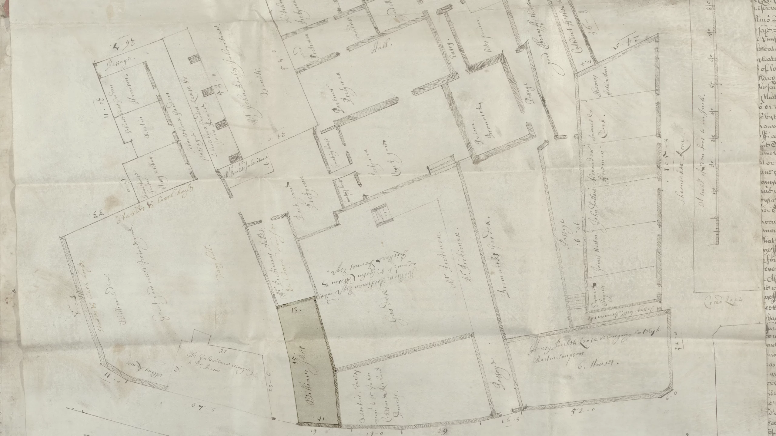
Yesterday, the BBC reported a William Shakespeare expert’s research into unrelated materials uncovered the lost address of a home owned by the Bard in Central London. Ironically, the very spot the researcher, Professor Lucy Munro of King’s College, identified is presently marked by a blue plaque—a marker system used in the UK to identify sites…
-
Some People Never Had Experience with…
Air is an art project by Marina Vitaglione and written about by the BBC. The project seeks to raise awareness of the air pollution in and around London. She used cyanotypes to capture the pollution in the area. She collected evidence of the pollution in circular areas on paper and then exposed them as cyanotypes.…
-
A Very Loud Tube
As all my readers probably know, I love London. And in loving London, I love the Tube and the Oyster Card and all that goes along with Transport for London. But, I have noticed that sometimes when I take the Underground, there are segments where it gets a bit loud, especially with the windows open.…
-
Treasury of Atreus
Oh, hello. Apologies for the break from posting, however, after the Thanksgiving holidays I fell ill. Consequently I spent the entirety of December either sick or on holiday. Neither of which is conducive to posting. But I have largely recovered and so we begin a new year with a new post. This piece comes from…
-
The London Job Exodus
Brexit is bad for Britain. Here is some proof from an article by Bloomberg that looks at where London-based banking jobs are headed post-Brexit. Spoiler alert, not elsewhere in Britain. The article purports to be more of a tracker in that they will add on data about jobs moving places when news breaks. But I…
-
Labour Marches On (into Tory Housing?)
We have a nice little piece from the Economist today, a look at the electoral majority for London-area constituencies and how their housing prices may begin to draw out priced-out Labour votes from London proper. What I really like from the design side is the flip of the traditional choropleth density. In other words, we normally…
-
Home Vacancies in Kensington and Chelsea
I added Chelsea to make doubly certain for my Philadelphia audience that you did not think I was referring to Philly’s Kensington. Why? Because today’s piece comes from the Guardian and refers to the neighbourhood where the Grenfell Tower caught fire and the inferno killed dozens of people. This is not the most complex piece,…
-
London in Small Multiple Form
You all know that I love small multiples. And we have been seeing them more often as representations of the United States. But today we look at a small multiple map of London. The piece comes from the Economist and looks at the declining numbers of pubs in London. With the exception of the borough…
-
The Grenfell Fire
This weekend, the New York Times published an online piece explaining the spread of the Grenfell Tower fire in London. The story uses small animated graphics and videos to show the origin and progression of the fire from an exploding refrigerator on the fourth floor to its trapping of residents on the 23rd and final…