Today’s post is not news-related for a change. (Don’t worry, I’ll likely get back to that next week.) Instead, we have a new collection of mobile data visualisations curated by Sebastian Sadowski. You can choose to see either smartphone or tablet visualisations and then filter by visual form.
Smartphone Data Visualisation
Credit for the site goes to Sebastian Sadowski, to the various works to the various designers.
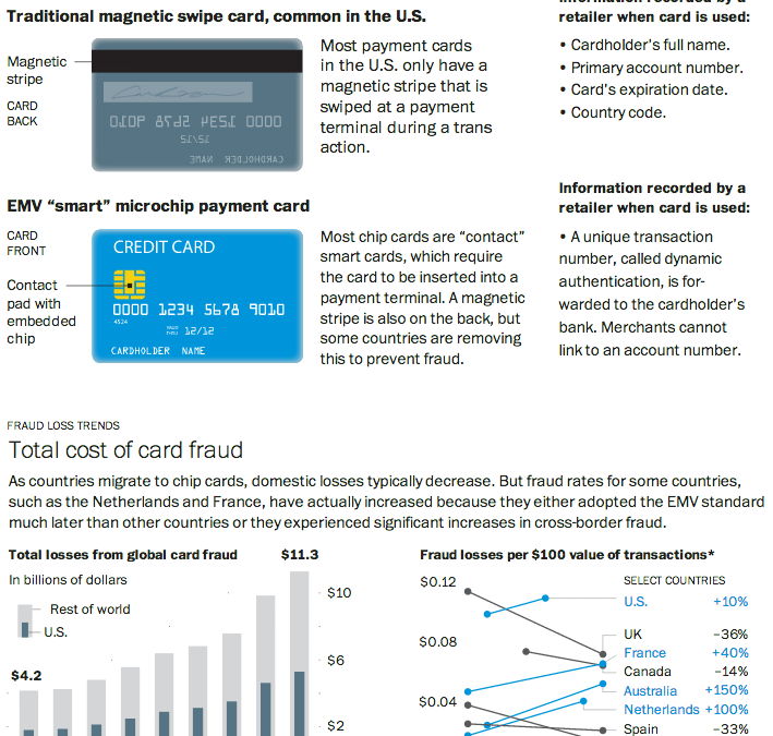
As I noted in my Friday post, I spent last week in Lithuania for work. That same Friday night, I had a conversation with a few coworkers over dinner and a beer about credit cards. They teased me that for all of America’s technological advances and advantages, even in Lithuania they were using more secure forms of bank card payment: chipped cards. And that story seems a perfect segue into today’s post from the Washington Post.
Through a combination of charts, maps, and illustrations—a cropping of which is shown below—the Post details the advantages of using microchipped cards in preventing certain types of fraud. Additionally, because of the integration of the visuals with the written explanations, text can be used to provide longer anecdotes to explain exceptions and outliers when and where necessary.
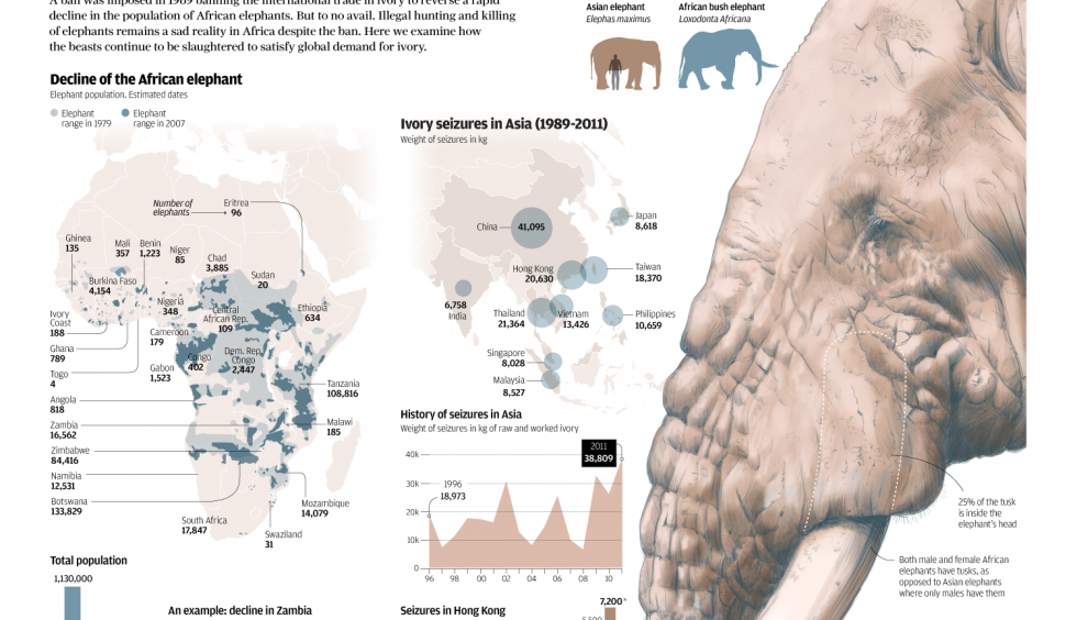
The South China Morning Post had a fantastic infographic detailing the hunting of elephants for their ivory. Despite bans to make such hunting illegal, the problem continues and is worsening because of the Asian trade in ivory.
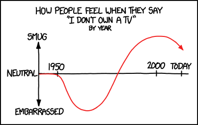
Another from xkcd, this time on television ownership. If you are among those trending towards the embarrassed. Well, it’s Christmas season. So get ready to go buy one.
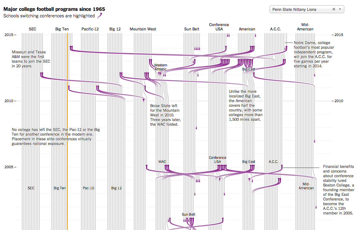
Your author graduated from art school. That means my college sports consisted of…a fencing team. And dancers. And some of them were cheerleaders for the Eagles I heard. Does that count? I did, however, attend Penn State for a year. So in this interactive graphic from the New York Times that tracks conference membership for various college football teams, I clicked Penn State.
Penn State football history
Colour is effective in this piece. The use of purple to highlight key stories off the grey background becomes even more important when they are offset from the selected schools in orange. If you cannot find your particular line of interest, a drop-down menu makes for an easy selection.
Bonus points—not shown here—for using spark lines in the introductory paragraph. A solid piece overall.
Credit for the piece goes to Mike Bostock, Shan Carter, and Kevin Quealy.
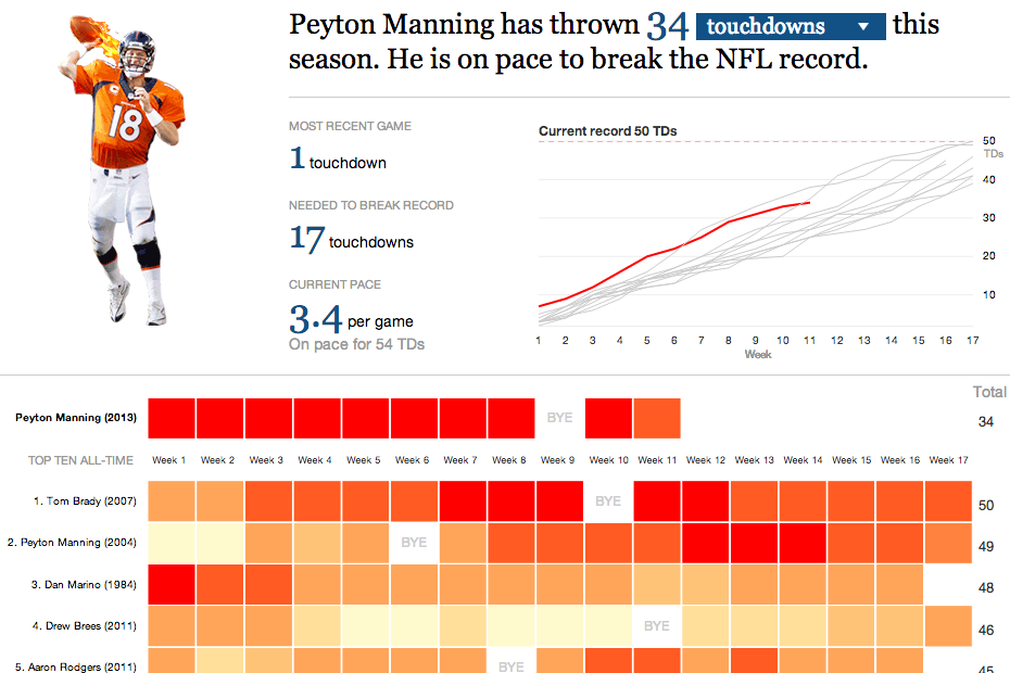
On Sunday night the Denver Broncos played the New England Patriots. The contest sported two of the game’s best quarterbacks: Tom Brady and Peyton Manning. This interactive graphic by the Guardian detailed how, in this season alone, Manning is putting up record numbers.
Comparing Manning’s stats
Credit for the graphic goes to the Guardian US interactive team.
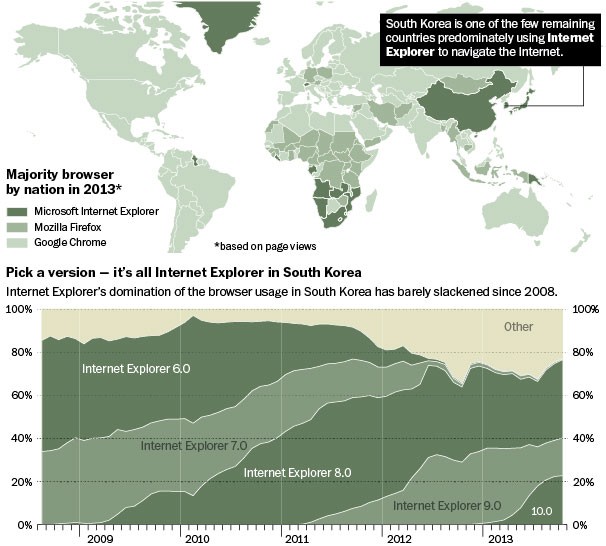
The Washington Post had an interesting story on how, in South Korea, Internet Explorer dominates the internet. I won’t spoil the story, it is kind of fascinating and worth a short read, but the accompanying graphics show just how dominant the browser has been in a leading technology country in Asia.
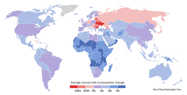
Last week the Washington Post published a piece that looked at demographic trends and their impact on the world’s different geographies. None of the graphics in the piece are revolutionary, nor are they mind-blowing fantasticness. They are, however, clear and concise and show the story. In fact the overall piece is well done because while the graphics show the trends and trajectories, the written word above and below the graphics explains some of the underlying causes and potential effects. In short, a solid piece that is worth the read.
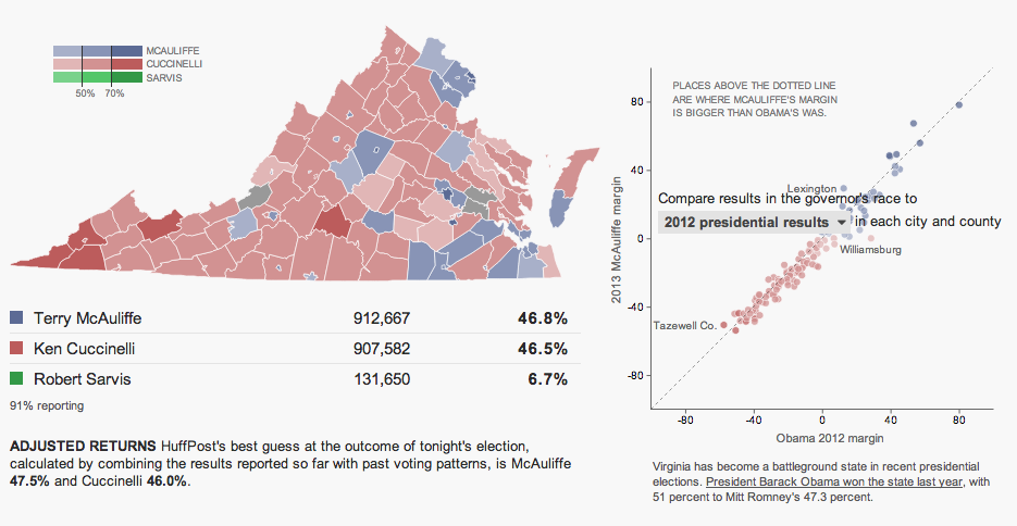
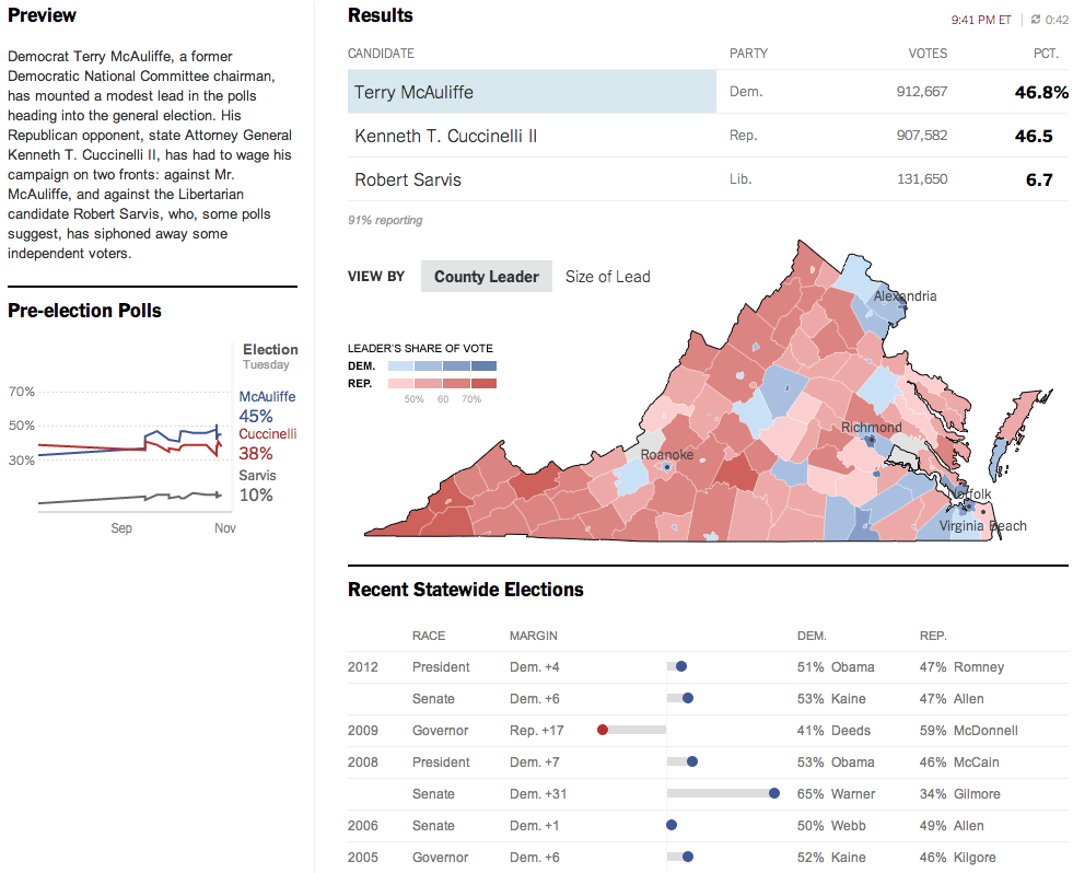
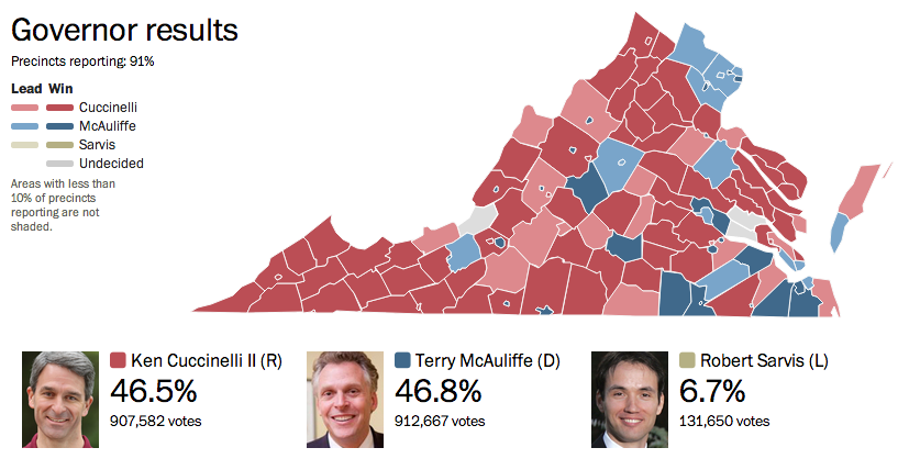
Last night was election night. Okay, maybe not the big midterm, but there were still a few interesting races. The one I want to look at it, however, is the gubernatorial race in Virginia. Maps are pretty much the default in big, statewide races like these and it is no surprise that the three screenshots here are use a map as an anchor component.
The Huffington Post uses a scatterplot to compare the margin of victory for Terry McAuliffe to that of Barack Obama in 2012. A technical flaw places the drop down menu atop the plot, unfortunately, but the component works to show differences in just one year.
Huffington Post results
Over at the New York Times, the Virginia results were given a nice overview. Here they used a text summary to explain the race in short. They used a small amount of space to show polling results over time. And then beneath the map they looked at recent elections across the state.
New York Times results
The Washington Post, which reports to the northern counties of Virginia, had a much simpler piece. They used solely a map to present the data.
Washington Post results
Credit for the Huffington Post piece goes to Aaron Bycoffe, Jay Boice, and Hilary Fung.
Credit for the New York Times piece goes to the New York Times’ graphics department.
Credit for the Washington Post piece goes to the Washington Post’s graphics department.