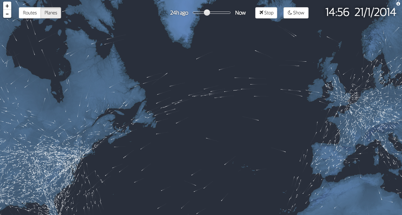
100 years ago we began to fly commercially. We moved beyond daredevil stunts and novelty and created air travel into a business. To commemorate the history, the Guardian commissioned this interactive graphic story to celebrate said history. It includes charts, narration, and near real-time data on actual flights mapped out as in the introductory element captured below.
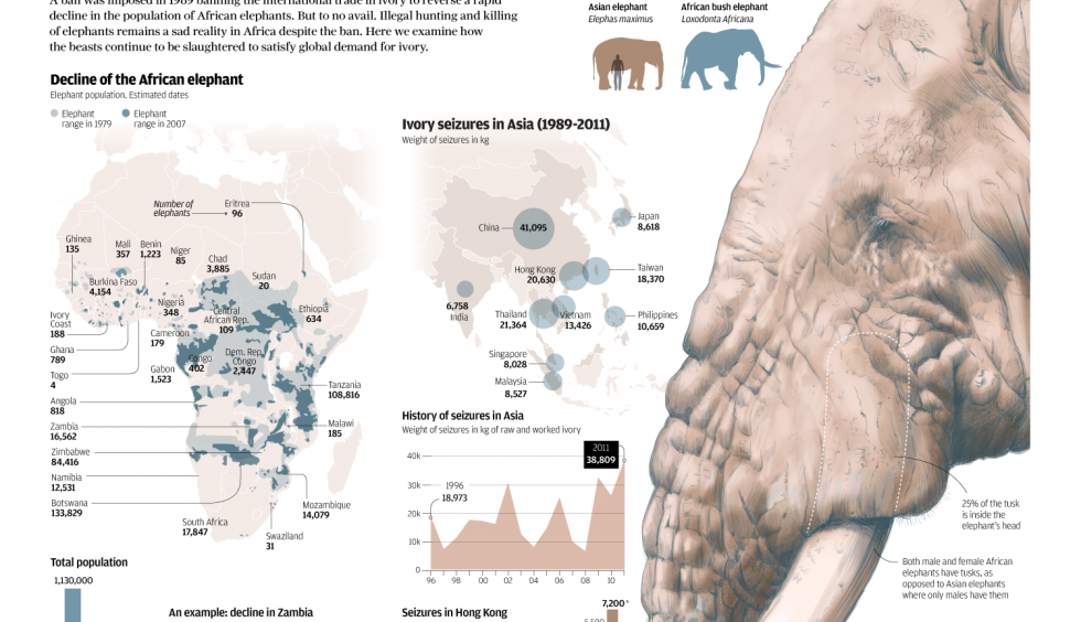
The South China Morning Post had a fantastic infographic detailing the hunting of elephants for their ivory. Despite bans to make such hunting illegal, the problem continues and is worsening because of the Asian trade in ivory.
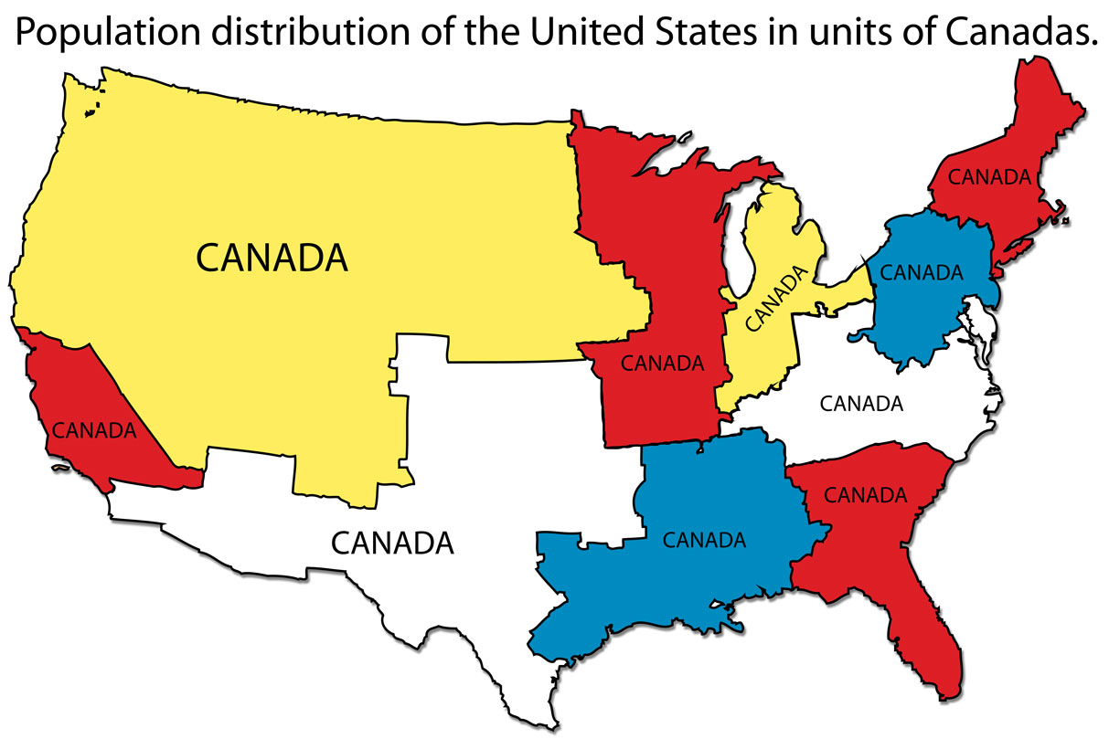
Last week I was asked what was the population of Canada. I first said 30 million. I then figured that was too small so I said more like 50–60 million. Turns out I was closer to being correct the first time. A Google search that cites the World Bank among its sources listed the population as nearer to 35 million. But what does that mean?
Over at I Love Charts, the United States was broken down into units shaped by the size of the population of Canada. Roughly, the United States = 10 Canadas.
How many Canadas in the US?
Credit for the piece goes to an unknown individual. If discovered, I would appreciate being informed.
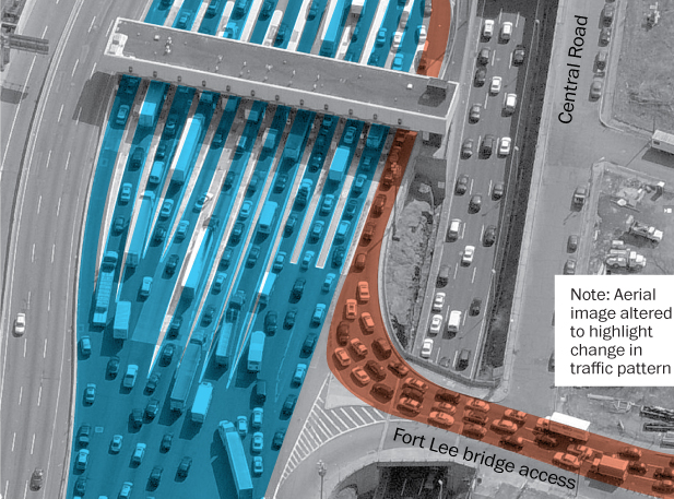
A lot of people have been talking about Bridgegate, a scandal in New Jersey wherein the governor’s office allegedly abused its power to negatively impact the residents of Fort Lee, New Jersey. What actually happened for a few days this past fall? The Washington Post uses aerial photography and illustration to diagram the normal traffic flow and the flow during the traffic “study”.
Traffic on the George Washington Bridge
Credit for the piece goes to the Washington Post graphics department.
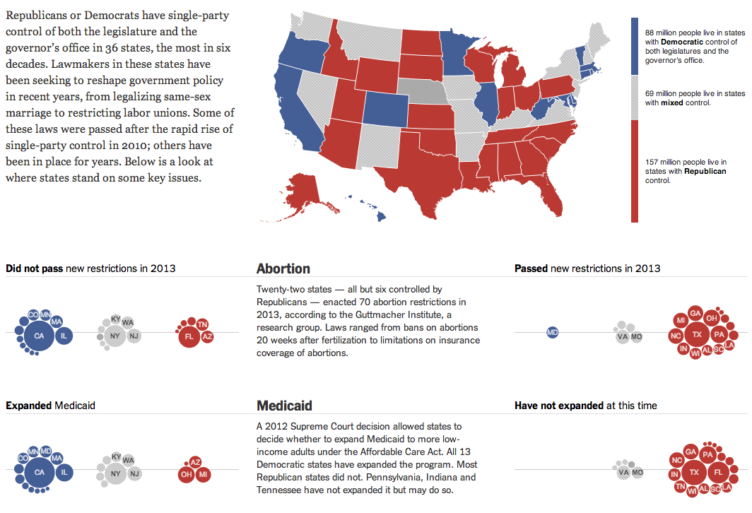
Today’s piece comes from this past weekend. The New York Times looked at how states fell on various politically sensitive issues, e.g. abortion and same-sex marriage, depending upon the political control of the executive and legislative functions of each state. In other words, which states have passed legislation to regulate abortion or same-sex marriage? States controlled by Democrats, or states controlled by Republicans?
The overall lay of the land and two issues
I am not terribly keen on the clustered bubbles. Showing the population of each state could be handled better by different chart forms. But to a certain extent in this piece, the population figures are secondary to the aggregate of people living in blue or red states. And in that case, while you cannot easily visualise the number of people living in the aggregates, you can at least get a feel for which group is home to more people.
Credit for the piece goes to Haeyoun Park, Jeremy Ashkenas, and Mike Bostock.
For those of you unaware of the shenanigans going on in New Jersey, this won’t make any sense. But for those that are, it sucks to be a commuter in North Jersey as this comic map illustrates.
Okay, we have all watched enough science fiction to know that there is not one future, but multiple futures. All options existing as if taken in parallel universes. Today’s post is not about a specific graphic, but rather a short article in the New York Times examining data visualisation. Through the work of Eric Rodenbeck of Stamen Design, it looks at how we may need to change our current vocabulary, if you will. Naturally the article offers a counterpoint nearer the end about how older forms are still useful.
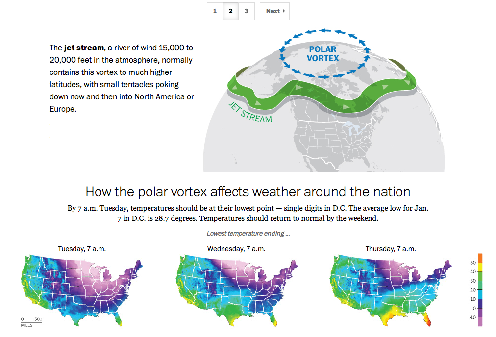
If you live in the United States, you probably have heard the term polar vortex by now. People have been using the term to describe the bitterly cold temperatures affecting the eastern two-thirds of the country. But the term polar vortex is a meteorological term that means a specific phenomenon. In other words, it’s more than a hashtag along the lines of snowmageddon. The Washington Post explains what the polar vortex is.
The Post explains the polar vortex
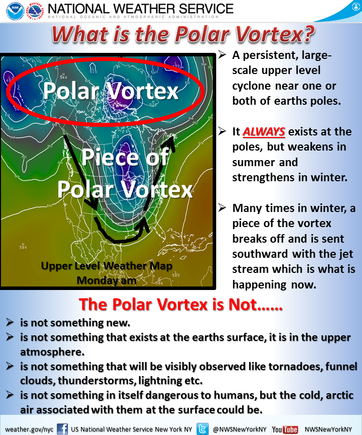
My caveat for this piece is that from my understanding, it’s not entirely correct. Or perhaps not detailed enough. In brief, we turn to the National Weather Service out of New York for a more technically correct, but more poorly designed graphic.
National Weather Service explanation
Poor type, poor colours, poor hierarchy. Those are abundantly clear, but the important part is that the NWS wants to correct many of the popular misconceptions. Somewhere between the well-intended but less-than-entirely-clear Post piece and the accurate-but-also-unclear National Weather Service piece is an opportunity to explain the concept to the public.
Credit for the Washington Post piece goes to Bonnie Berkowitz, Richard Johnson, Katie Park, and Gene Thorp.
Credit for the National Weather Service goes to the graphics team at the National Weather Service of New York.
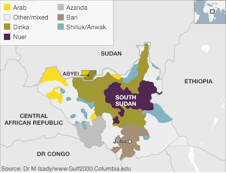
I’ve been away for over two weeks on holiday. So to spread good cheer to all, today I am sharing an image from a series of maps the BBC put together to try and explain the civil war in South Sudan.
Ethnic groups and tribes of South Sudan
Credit for the piece goes to BBC graphics department.
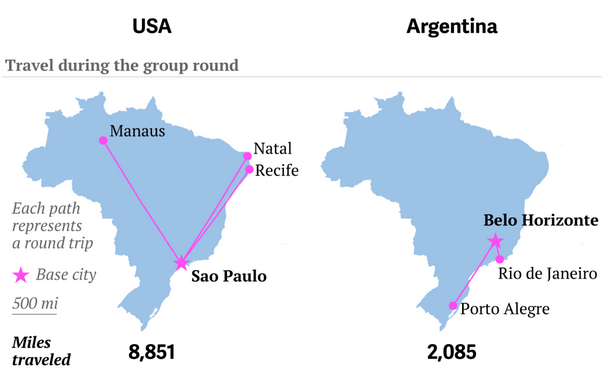
Well, travel for the teams, not you. It’s a big issue in Brazil because unlike the last couple of times, the teams need to travel big distances to reach the cities where they play their matches. Thankfully, to explain just how far some of these distances are for some of these teams, Quartz put together a nice article with quite a few graphics.
This graphic in particular juxtaposes the travels of the US team and the Argentinian team. Who do you think has it easier?
US and Argentinian travels
Credit for the piece goes to Jason Karaian and Ritchie King.