Indonesia’s Sunken Submarine

A few years ago, I created a piece about the missing Argentine submarine ARA San Juan. For those that do not remember, back in 2017, the Argentine Navy Type 1700 submarine ARA San Juan disappeared on a voyage from Ushuaia to Mar del Plata. At the time, people thought it may have sunk over the continental shelf where the seafloor was shallow enough the boat could have survived and not imploded. A year later, surveyors discovered the wreck at a much deeper depth east of the continental shelf. But at the time of the loss I made a graphic trying to show how the submarine was much smaller than the standard American submarine, the Los Angeles class, and how much deeper the Los Angeles class can dive.

So when the news broke this week that an Indonesian submarine, KRI Nanggala disappeared north of Bali, Indonesia, I decided to update the graphic. Since I finished the piece, however, the Indonesian Navy discovered the wreck in three pieces at 850 metres, far below even the presumed crush depth of the Los Angeles class. In other words, at that depth there was never any hope to find survivors.

Another 1970s era German-designed U-boat sank, this one was found within days however.

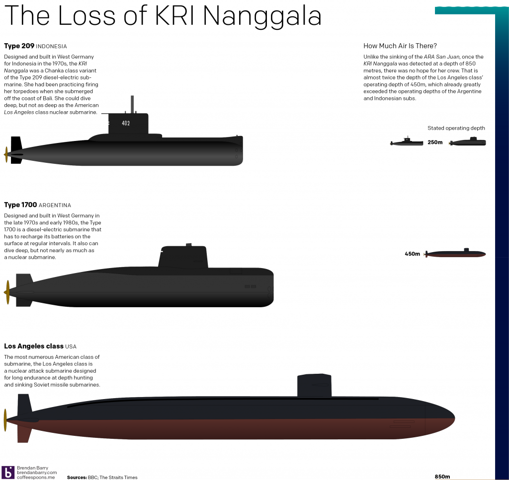
The Indonesia submarine is an even smaller than the Argentine boat, both having an operating depth of about 250 metres—actual depths are generally not disclosed because, well, military secrets. But the graphic shows just how far below that depth the sub’s wreckage rests.

Credit for the piece is mine.

Americans Retreat, Turks Invade, Syrians Return, Kurds Die

I did not have a lot of time to cover this story last week. So let us try to get into it a little bit today. The New York Times published this morning an article about what is next for Syria, titling the online version 4 Big Questions About Syria’s Future. So I went with four statements about what is happening today for the title of this post.

If you somehow missed it, President Trump announced that American forces were retreating from the Syrian–Turkish border because Turkey wanted to invade Syria and crush the Kurds, a minority population in Syria, Iraq, and Turkey. There, in Turkey, Kurdish separatists have fought a war for autonomy if not independence from Ankara. (I am dramatically oversimplifying this.) The group that organised these attacks, which Turkey considers terrorism, has ties to the Kurds in Syria that have organised a relatively peaceful and stable region of Syria during the Syrian Civil War—no small feat. But because of those ties, and because Turkey fears an independent Kurdistan on its border, Ankara decided to invade Syria and crush the Kurds and has launched heavy and devastating airstrikes alongside a ground invasion to that end.

Of course the Syrians would like to regain control of their entire country. But they had left the Kurds in relative peace as the Syrians shifted most of their forces from the northeast to places like Homs and Aleppo where they fought the various opposition forces and then the jihadists and then ISIS. The Syrians and Kurds did occasionally skirmish, but these were often far smaller engagements than the heavier fighting in the west of the country.

But now the Syrian army and air force, weary but battle hardened, having retaken control over most of western and central Syria, can move back into northeastern Syria where the Kurds have power and re-exert control. The Kurds have asked the Syrians (and the Russians) for help repelling the Turkish invasion and both countries seem eager to oblige.

Amidst all of this, Kurds die.

But the New York Times article does a really nice job explaining all of this and it frames the answers to its questions around three maps. This screenshot is from the main one that shows the sites of Turkish airstrikes and Turkey’s desired buffer zone (though there are reports Turkish forces are pushing well past that line).

It's all a mess right now
It’s all a mess right now

The maps uses the four colours to represent the four main power blocs. The others provide additional context, especially in terms of the ethnic makeup of Syria. Overall it is a solid piece that goes a long way towards showing just how messed up things have gotten since Wednesday.

Here, the annotations help identify key battlegrounds and locations. But since being published this is already out of date, as there are reports that the Syrians alongside Russian troops have retaken the town of Manbij. Suffice it to say this is a fluid situation and by tomorrow this could all be different.

Credit for the piece goes to Anne Barnard, Anjali Singhvi, Sarah Almukhtar, Allison McCann, and Jin Wu.

The Retreat from Ilovaisk

Five years ago, I covered the Russian invasion of Ukraine a little tiny bit. Five years on and Russia has formally annexed Crimea and Russian “patriotic volunteers” continue to destabilise the Donbass. About two weeks ago, this article from the BBC caught my eye as it recounted the story of Ukraine’s deadliest day in the conflict. Initially I read it simply because I have long been fascinated by that undeclared war.

Since at least high school, but probably most definitely earlier, I have long been interested in military history. And I distinctly recall being awestruck by maps depicting the bombing of Pearl Harbour, or the Roman defeat at Cannae, or the Battle of Waterloo.

So I loved scrolling through the article and finding this graphic.

A long and bloody road

It’s a fairly simple map, showing the alignment of forces. It’s not quite a tactical map showing unit size/formations, but it does show the Ukrainian forces essentially surrounded. And how their retreat brought them through essentially a shooting gallery of Russian artillery.

Credit for the piece goes to the BBC graphics department.

Burden Sharing in NATO

Late last week we heard a lot about contributions to NATO. Except, that was not true. Because the idea of spending 2% of GDP on NATO is actually about a NATO member spending 2% of its GDP on its military. And within that 2%, at least 20% must be spent on hardware or R&D. There is a separate operating budget to which countries actually contribute funds. But before we look at all of this as a whole, I wanted to explore the burden sharing, which is what NATO terms the 2% of GDP defence expenditures.

I did something similar a couple of years ago back in 2014 during the height of the Russia–Ukraine crisis. However, here I looked at a narrower data set from 2011 to 2018 and then across all the NATO members. In 2014, NATO met in Wales and agreed that over the next ten years all members would increase their defence spending to 2% of GDP. We are only four years into that ten year plan and so most of these countries still have time to reach that level.

That's still a whole lot spent on defence
That’s still a whole lot spent on defence

Credit for the piece is mine.

Where Syria Struck with Chemical Weapons

Friday night the US, UK, and France struck targets in Syria that play a role in the chemical weapons programme of the Bashir al-Assad regime. This is despite “eliminating” his chemical weapons several years ago. And so not surprisingly the media this past weekend covered Syria and the airstrikes. This print piece from the New York Times, however, looked backwards at the history of the chemical attacks Syria has unleashed against its own people.

Note the timeline in the lower-right to provide context of when and how frequent the chemical attacks have been

The map is straightforward and the timeline helpful. Though I would probably have added a point on the timeline highlighting the Ghouta attack of August 2013. That attack prompted the international community to pressure the Assad regime to, again, “eliminate” its chemical weapon stocks. Clearly it hid some sarin and chlorine gas has industrial uses, making it a classic dual-purpose object that is tricky to classify as a weapon. (Though using it against civilians is clearly a weaponised use of the element.)

On a side note, I wanted to point the editorial design here. The overall page is quite nice.

The whole article is well laid out

The map falls squarely within the middle of the article, with a nice gallery of photographs running along the top. It also features a devastating pull quote describing the Syrian government’s use of chemical weapons. The article fits almost entirely above not just the fold, but also another terrible line of text, in this case the title of another article: Officials Have Lost Count of How Many Thousands Have Died in Syria’s War.

Overall, this was a solid piece providing a backdrop and historical context for the news.

Credit for the piece goes to the New York Times graphics department.

The Russian Threat

A few days ago a former Russian spy and his daughter were poisoned with a nerve agent, e.g. VX, in Salisbury, England. Over a decade ago, another former Russian spy, Alexander Litvinenko, died in London after being poisoned with polonium, a highly radioactive substance produced inside nuclear reactors, placed inside his tea. Russia’s spies are still a threat in the 21st century, at least attempting to assassinate people they choose in Western cities and capitals.

All that made me think back to an issue of the Economist I received a few weeks ago. It had a special report on the future of warfare and this map on the threat posed by Russian conventional forces.

The Russian threat
The Russian threat

It does a good job of showing that in just a conventional sense, Russia remains a dangerous threat to NATO. The Baltic states of Estonia, Latvia, and Lithuania are incredibly vulnerable, all but surrounded by Russia and its allies/proxies.

But as this week’s news highlights, Russia remains a threat in the unconventional space as well. (As also pointed out by the red colour sitting in the formerly Ukrainian Crimean peninsula, seized by unmarked “little green men” in 2014.)

Credit for the piece goes to the Economist graphics department.

Undersea Mining

Today’s piece isn’t strictly about data visualisation. Instead it’s a nice article from the BBC that explores the nascent industry of undersea mining. What caught my interest was the story of Soviet submarine K-129, which sank mysteriously in the middle of the Pacific. But that isn’t even half the story, so if you are interested go and read the article for that bit.

But that sinking may have created the beginning of the undersea mining industry. And so as I read on, I found a nice mixture of text, photography, and graphics explaining processes and such. This screenshot is a comparison of the size of an undersea mining zone compared to a land-based copper mine.

An undersea mine vs. a surface mine

Some of the graphics could use some polish and finesse, but I do appreciate the effort that goes into creating pieces like this. You will note that four different people had to work together to get the piece online. But if this is perhaps the future of BBC content, this is a great start.

Credit for the piece goes to David Shukman, Ben Milne, Zoe Barthlomew, and Finlo Rohrer.

All Your Base Are Belong to Internets

Over the weekend news broke that since November, plans for military bases around the world were available to anyone and everyone on the internets. How? Why?

Well, it turns out that soldiers using wearable tech to track their rides or cycling routes had forgotten to disable that feature whilst on military installations. And so when the company collecting the data published a global heatmap of activities, well, this happened.

You can even make out the perimeter of the former British airfield.

This is not one of the worst offenders, because this is the site of what was formerly Camps Leatherneck and Bastion, the American and British, respectively, military bases in Helmand Province, Afghanistan. But we all know those bases exist and where they are. But, what is interesting and perhaps worrying for military planners is that sites like this do not show up on publicly available sites like Google Maps, for example. Take the same heatmap and look at it on satellite view and you get…a whole lot of nothing.

A view of the two military bases from well before they were constructed.

The problem is that when this technology is applied to places like, say, Syria. Given the civil war there, it is far more likely that users of wearable tech belong to or are working with one of the western military forces operating in the country. After all, the rest of the country is dark. So what is this set of rectangles and a grid-like pattern?

A bunch of rectangles and squares. It looks like a built up area, if not base.

Well, by looking at the satellite photography, it is clearly a field situated between two small hamlets.

Nothing to see…I just run very straight routes through the middle of Syrian fields…

Most likely it is an American base. Could be Russian, though. But now we know where it is and have a rough understanding of its layout. You can see why military planners are concerned.

And it all owes to the ubiquity of tracking data on wearables, mobiles, vehicles, &c. And as we continue to generate data and want to see it visualised, are there or should there be boundaries? Alas, not a conversation for this blog to solve, but a conversation we should all continue to have.

Credit for the piece goes to the Strava design team.

Data Displays

This past weekend I saw the film Darkest Hour with one of my mates. The film focuses on Winston Churchill at the very beginning of his term as prime minister. Coincidentally I was walking through some of the very rooms and corridors depicted in the film—and rather accurately I should say—just one week prior.

One of the things in the real place that caught my eye in particular was the Map Room Annex. Most people know about the Map Room proper, from which the British Empire’s war effort was coordinated, but the annex contained data on wartime casualties, material production, &c. Consequently the walls were lined with displays of that data. But this was also the early 1940s and so none of it was computerised. Instead, we had handmade charts.

Alas, the space is quite narrow and the museum was quite crowded. So I only managed a snapshot or two, but I think this one does some justice to the hardworking folks producing charts about the war.

They were not made to be mobile-friendly or responsive…

Credit for the piece goes to some junior officer/staffer back in the day.

The Sinking of the Vasa

In 1628, Sweden launched one of its largest and most powerful warships not just in Sweden, but in all of Europe. She was to participate in the wars with Poland and Lithuania as Sweden sought to expand her growing empire. After two years of construction in Stockholm’s naval yard she set sail into a calm day with a light breeze.

After a strong gust pushed her hard to port, she righted herself and continued to set sail to a fortress to load 300 troops for the war. But only 20 minutes into her maiden voyage, a second gust of wind pushed her again hard to port so much so that water began to flood in via her open lower gunports. As the continued to rush in, she never righted herself and sank, not to be recovered for 300 years.

The recovery itself is a great story, but the question was why did she sink? This model in the large Vasa museum, built to host the recovered and preserved ship, shows just how dangerously she was designed. Take careful note of the faint blue waves signifying the waterline of the ship and how close they are to the lower gunports.

Note the waterline on the lower crossbeam of the barrel to which the model is connected

The short takeaway is that the ship was top-heavy and she needed to be both wider and deeper to support her displacement. I like the model here, but my one complaint with it is the waterline. Even when I was standing in front of it, I did not notice the waves at first. A little bit more emphasis or paint, perhaps to show the water beneath the ship, would really help to convey just how little of the ship was below the waterline.

Credit for the piece goes to the Vasa Museum design staff.