School Segregation in New York

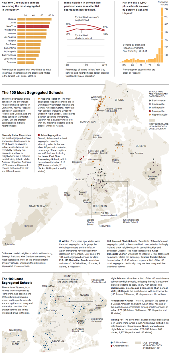
This weekend the New York Times looked at segregation in New York City schools by mapping the least (and most) diverse and offering quick comparisons to other large cities. (Is it really a surprise that the country’s largest cities also would need the largest demographic shifts to create diverse education environments?) Probably the best thing, seemingly as always, in the piece is the annotations that provide stories and context and explain the outliers that are all otherwise visualised in the infographic.
School segregation in New York

Credit for the piece goes to Ford Fessenden.

Playing Politics

The election campaign for the presidency has begun in earnest. The President launched his official campaign over the weekend and Mitt Romney’s nomination is all but official. So what to do over the next six months? Lots of television adverts—thankfully I’m thinking of cutting my cable—and random events that shape public opinion. And, thanks to the New York Times, you can now play politics by dragging states into either the Obama camp or the Romney camp or you can read through the Times’ take on different scenarios.

Split Electoral College, my own scenario

Personally, I am going for the politically fascinating split electoral college route. Bonus points if you know what happens in this scenario—no cheating. And extra bonus points to the Times for splitting up the electoral votes of both Maine and Nebraska, look up what Obama did in 2008 to see how this can happen.

Nope, It’s Just Clouds in the Shapes of Birds and Planes.

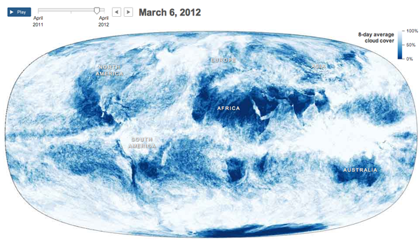
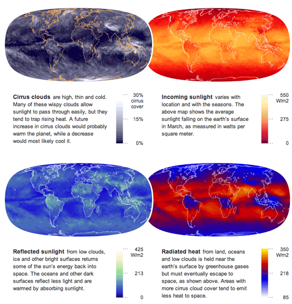
Supporting an article about how the clouds are the last great hope for the climate change skeptics, the New York Times published an interesting infographic that looks at cloud cover and insolation, the amount of solar energy that irradiates the planet.

The main feature is an animation of a year’s worth of cloud cover. The mapped data begins to clearly show the difference between air circulation over the oceans and over land, with the interface between the two creating the rough outlines of the continents.

Cloud map
Cloud map

Supplementing the animation are four small multiples of different measures that look at energy and its conservation across the planet.

Energy maps
Energy maps

Credit for the piece goes to Jonathan Corum.

Kickstarter Fundraising

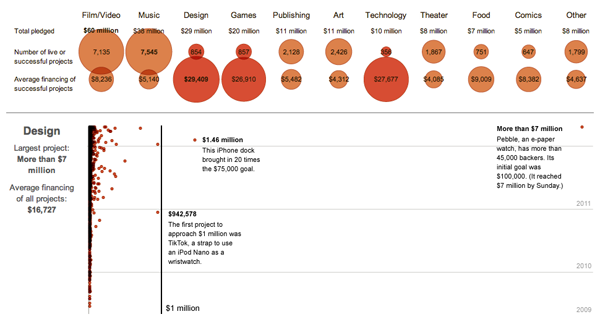
Kickstarter has been around for a little while now, financing some interesting projects. The New York Times has an infographic about how much each project earned. And while there is nothing particularly fancy about each, they are all scatter plots, the quirk is that the time and value axes have been reversed from their customary positions. While unusual, it supports the longer range for the monetary figures and the short range for the three years of Kickstarter history.

Kickstarter fundraising

Furthermore, the data is broken out into different industries, e.g. design, food, and dance, that have adjusted value scales to make intra-industry comparisons easier. Nothing fancy, but an attentive care to the detail of the data.

Let’s Talk About the Weather

Global warming is probably not the worst-branded concept out there, but it is not particularly effective. Mostly because it implies the world will warm and warm evenly. In truth, some parts will get colder, some parts drier, some parts wetter, and yes, some parts warmer. Hence the better term is climate change.

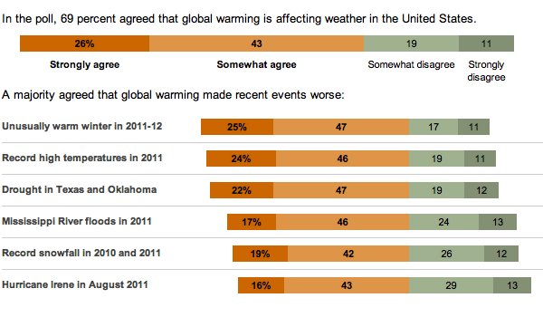
In the US, we have a tendency to be rather skeptical of climate change and the degree to which, if not whether entirely, it is due to mankind. So, the New York Times released the results of a survey about whether Americans believe recent weather events are related to global warming—their word choice, not mine.

Survey on global warming

While not all bars sum to 100, probably due to rounding, note how the bars are all aligned against the point of divergence between the scales of agreement and disagreement and then sorted according to agreement.

Setting the Stage for the Sinking of RMS Titanic

Saturday will be the 100th anniversary of the sinking of the RMS Titanic. She struck an iceberg just before midnight—at the time the crew thought merely as a glancing blow—and within three hours she would be headed towards the seabed. By the time the survivors were all picked up, over 1500 people would die in what is perhaps the most (in)famous sinking in human history.

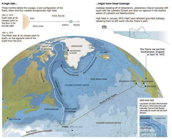
But, what about the iceberg? There are of course the reports that a ship scouring the sea for survivors after the sinking found the killer berg. But how did it get there? The New York Times put together an infographic exploring the science behind how the RMS Titanic might have ended up colliding with what originally was part of (probably) a Greenlandic glacier.

The Titanic Iceberg
The Titanic Iceberg

Also in the piece are explanations of how it is possible that the SS Californian did not come to the rescue of the stricken RMS Titanic.

Credit for the piece goes to Mika Gröndahl and Joe Burgess.

Santorum Quits. Goodbye…and Thanks for all the Varicose Veins.

So Rick Santorum is now out of the race. Mitt Romney is basically now set to run against the President. But why should Santorum go out without an infographic looking back at the Republican primary race. (Since neither Newt nor Ron come even close to running the same race as Rick.)

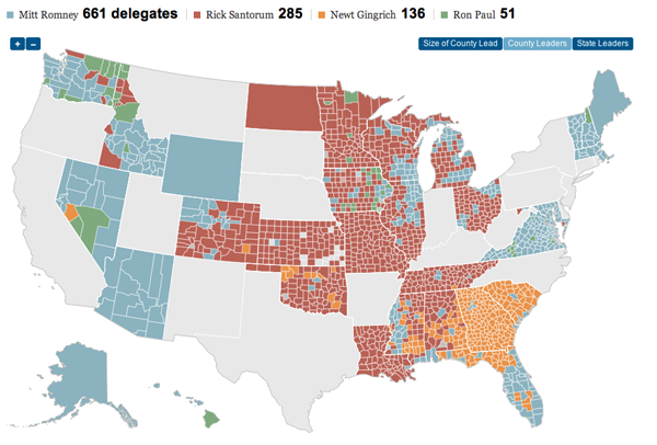
The New York Times put out an infographic looking at Rick Santorum’s campaign. And as one can see, he did do well in the evangelical and Christian conservative heartland of the United States. It just was not quite enough to beat Romney’s supporters.

County leaders in Republican primary states

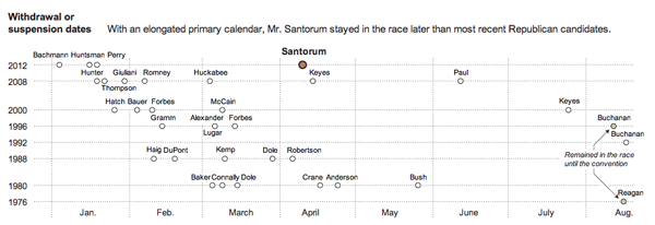
But, Santorum did manage to last longer in the race than many others have in recent years. So who knows, depending on how the election in November turns out, we may just see more of Rick in the future.

A timeline of withdrawal

Executive Compensation

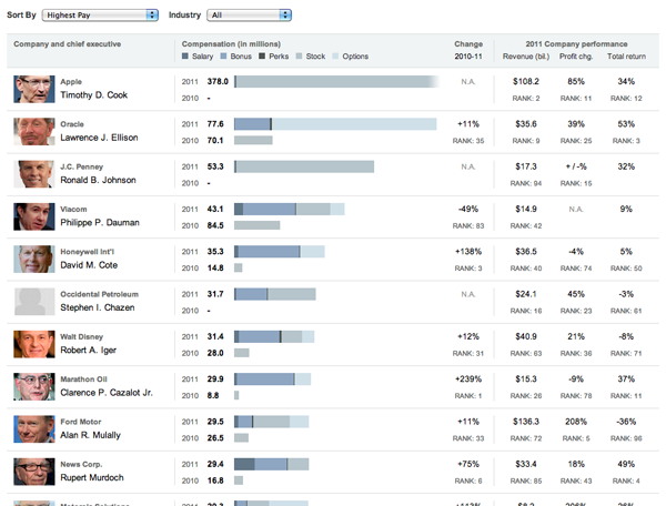
Everybody knows that executives make a lot of money. But not all of it comes from just salary, some comes from bonuses, stocks, options, and other perks. So who makes the most?

The New York Times put together an interactive piece with data from Equilar about the 50 most-highly paid chief executives from companies over $5 billion in size. The data is arranged as stacked bars, with—when available—2010 data to compare to 2011. The order can be sorted a number of different ways and the executives on display can be filtered by what industry his or her—granted only 3/50 are women—company works in.

Executive compensation

Credit for the piece goes to Lisa Waananen, Seth Feaster, and Alan McLean.

Cholera

Cholera. It’s more than just a disease on the Oregon Trail. It exists in the 21st century, though typically we do not experience it in the industrialised Western world. Where one does see it crop up are in places with poor sanitation, which is usually in the developing world. But, if one were to take a developing country and then in a few seconds wreck the national infrastructure in a devastating earthquake, one could see the creation of the right conditions for an outbreak.

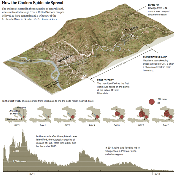
Sadly, that is exactly what happened—and to a lesser degree is still happening—in Haiti. The New York Times wrote about the problem in an article in the Sunday edition. The article was accompanied by an infographic that mapped the spread of the outbreak geographically and then its intensity over time.

Cholera outbreak
Cholera outbreak

Credit for the piece goes to Joe Burgess and Lisa Waananen.

Comparing Surgeries

We have an obesity problem in the United States. And in some cases, obesity leads to diabetes. A study was commissioned to discover whether surgery is more effective than the usual prescription of drugs, diet, and exercise. It turns out that surgery may very well be more effective.

The New York Times produced an infographic to explain the three types of surgery investigated in the study.

Comparing surgeries
Comparing surgeries