The Urban Future

Today’s selection is a little old—dating from July of last year—but is still a nice example of an inline graphic supporting the premise of its accompanying article. The New York Times looks at what was then data published by the United Nations on urban growth out to 2030. The article talks about the growth of megacities in lower income countries and those in the tropical regions. So smack in the middle of the article are two stacked bar charts breaking down urban populations into those two categories.
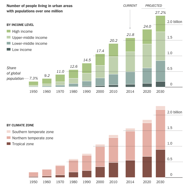
Urban population makeup

Personally I would have preferred a series of line charts to better compare the growth—the lack of a common baseline makes it very difficult to compare segments of the bars. But below the stacked bar charts we have a nice table. Those are always good to see. They organise information clearly and make it quick to find what is relevant.

Credit for the piece goes to the New York Times graphics department.

Chris Christie Is Well Know But Not Well Like

As election season begins to heat up, Five Thirty Eight looks at the probability of a Chris Christie candidacy. The scatter plot below examines the favourability and name recognition. The public knows the “brand” of Christie. But they do not have a favourable view of him. I would be curious how much of that is due to his East Coast-iness.

Christie is well known, but not well liked

Credit for the piece goes to Five Thirty Eight.

Creating Geographies

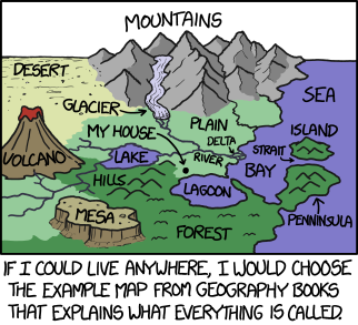
When I was much younger I invented a game where you essentially managed the development of civilisations. xkcd pretty much explains why the idea appealed to me. Minus all the power, obviously. Because that house is by far the best place for a deep water port for the import/export of valuable commodities. This, however, is missing all the tanks and battleships.

Defining geographies

Credit for the piece goes to Randall Munroe.

Shovelling Out of Boston

Boston and the rest of Massachusetts are attempting to dig out of the blizzard that struck them earlier this week. The Boston Globe has provided its readers with a step by step set of directions for how to best extricate people and cars from snowed in homes.

Shovelling out
Shovelling out

Credit for the piece goes to James Abundis and Javier Zarracina.

How to Better Alight an Aircraft

Alighting an aircraft is a time consuming pain in the arse. Probably number one for me, after security. Anyway, Vox looked at the slow boarding and alighting process and how to improve it. And why, most likely, airlines are not terribly interested in improving it. Hint, follow the money.

Doing it right
Doing it right

Credit for the piece goes to Menkes van den Briel.

Trains, Planes, and Automobiles: A Comparison (Kind of)

Travelling by plane can often be a hassle because getting from the airport to the destination is not always easy. Suffice it to say your humble author has—on a few occasions—been almost stranded at Philadelphia International because of no way to get where I was going. A lot of that comes down to poor public transit options. In my cases, it mostly stemmed from terrible weather delaying my flight until the wee hours of the morning after which train service stops.

Thankfully, Five Thirty Eight took a look at the public transit vs. car options for various cities/airports and seeing which option is faster. Ultimately Philly is awarded an honourable mention because the R1 (what some people now call the Airport Line) is convenient if your timing is right. Mine, obviously, has never been.

Travel times to downtowns

Credit for the piece goes to Allison McCann.

Big Dollar Baseball Pitchers

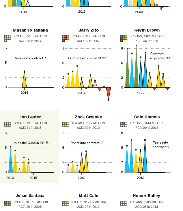
For those knowing baseball, Max Scherzer has almost officially signed with the Washington Nationals for lots and lots of cold hard cash. Over $200 millions’ worth. But how do these big dollar contract pitchers compare over the years? Thankfully the Washington Post took a look at that for us.

A few of the $100 mn plus contract pitchers

Credit for the piece goes to Todd Lindeman.

Boko Haram Attacks

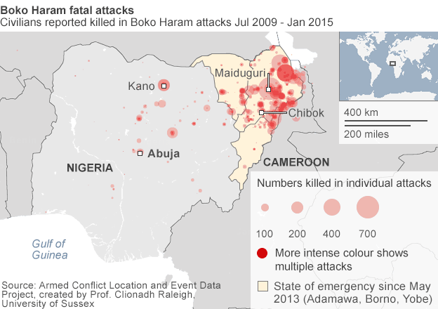
For those of you don’t know, there is an Islamist group operating in northeastern Nigeria. And they have been for a few years now. But recently they devastated a town and killed somewhere between 150 and 2000 people. Now they have taken to kidnapping Cameroonians, who live across the border, but whose government has been taking military action against Boko Haram. In this context, the BBC put together a map that shows the spread and scale of Boko Haram attacks in Nigeria.

The fatal attacks
The fatal attacks

Credit for the piece goes to the BBC graphics department.

All the Goats

Today is Friday. And that means it is time for the seriousness. So here you go, folks. Goats. All the goats. The US Agricultural Census recorded all the goats as of 2012. And so people can map that out. Thankfully the Washington Post did it for me.

Note the exclamation point

Credit for the piece goes to the Washington Post graphics department.