Impact of Climate Change

As someone who likes cooler weather, climate change sucks. Because that generally means warmer weather. Yes, yes, I know it means equally good chances for extreme cold temperatures and in general more extreme weather, but mostly I hate hot weather. So a new report by Risky Business Project, a group led by former New York mayor Michael Bloomberg, Henry Paulson, and Tom Steyer, looks to quantify some of the impact.

But in short, nothing good is going to happen. And basically, I will never move to the South.

Impact of climate change

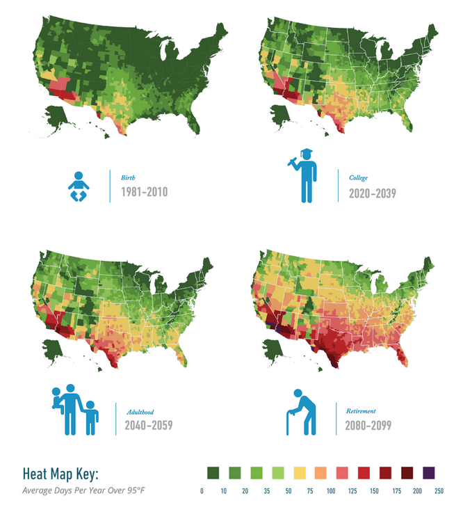
Credit for the piece goes to the graphics team behind Risky Business.

Where Guns Are Easier to Find Than Knowledge

I loved the title of this piece from the Washington Post that I had to borrow it myself. Of course all credit goes to that particular copywriter. The Washington Post looked at counties and states where gun stores outnumbered museums and libraries. Thankfully my home county has more knowledge than guns. Sadly, the same cannot be said for large areas of the country.

Guns vs. Museums
Guns vs. Museums

And of note, while Pennsylvania is narrowly more gun than knowledge, the city of Philadelphia ranks second in terms of ratio of libraries/museums to gun stores at 16.93. Only New York City ranked higher.

Credit for the piece goes to Christopher Ingraham.

Defining the Midwest

Last Friday, we looked at how one individual defined the state of Florida. Today, we look at how FiveThirtyEight attempted to get lots of people to define the Midwest.

Defining the midwest

Personally, as someone from Philadelphia I tend to side with the author of the article, Walter Hickey. He writes he’s “from New York, and [he] generally consider[s] anything west of Philadelphia the Midwest.” That’s pretty much the truth.

And if you like this piece, check out the subsequent piece on defining the South.

Credit for the piece goes to Allison McCann. 

Wisconsin Politics

Today we dive into state-level politics north of Chicago, in the state of Wisconsin. The Milwaukee Journal Sentinel published an in-depth article looking at the political divide in the Milwaukee metropolitan area. While one could publish an article of that nature with just lots and lots of words, the Journal Sentinel chose to use maps and charts to support their arguments.

Comparing Milwaukee urban vs. suburban voting patterns

Credit for the piece goes to Craig Gilbert and Allan James Vestal.

Indoor Plumbing

Today’s post is a small interactive map—nothing fancy there—about indoor plumbing. As it turns out not every home in the United States has it. Of course, last weekend I ended up driving through those dark counties in western Pennsylvania. And I can believe it. And I can definitely say I saw a few outhouses.

Lack of indoor plumbing in western Pennsylvania

Credit for the piece goes to Christopher Ingraham.

Baseball Nation

Baseball is back. And thankfully the New York Times has mapped out most of Major League Baseball’s fans. The glaring exception is, of course the omission of Canada/Ontario, home to the Toronto Blue Jays. The piece maps the data of Facebook likes down to the zip code and then offers details on a few border regions in particular.

Baseball nation, except Canada

And apparently back home, I am not the only person cheering for Boston.

I go for Boston, but most everyone else here is a Phillies phan

Credit for the piece goes to Kevin Quealy, Josh Katz, David Leonhardt, and Tom Giratikanon.

Chicago’s Disappearing Middle Class

President Obama has made a big deal recently about income inequality. The story in short is that the rich in the country are getting rich; the poor are getting poorer; and the people in the middle are fewer in number. Here in Chicago, this has meant that over the last few decades, many of the former middle-class neighbourhoods have been gutted of, well, the middle class. Daniel Kay Hertz has created a series of maps to show just how drastic the change has been since 1970.

Chicago's disappearing middle class
Chicago’s disappearing middle class

Credit for the piece goes to Daniel Kay Hertz.

Smoking in the US

Today’s piece comes from the New York Times. It fits within a broader article about smoking in the United States. The map is a choropleth that compares the smoking rate across counties and states in 1996 and 2012. However, as the article talks about how difficult it has been to decrease the smoking rates among the poor, I wonder if even just a third map would be useful. This map could have shown the actual decline, perhaps in percentage points, of counties between 1996 and 2012. Or another related graphic could have tried to correlate income and said change.

Map of Smoking in 2012

Credit for the piece goes to the New York Times graphics department.

Mobile Data Visualisation

Today’s post is not news-related for a change. (Don’t worry, I’ll likely get back to that next week.) Instead, we have a new collection of mobile data visualisations curated by Sebastian Sadowski. You can choose to see either smartphone or tablet visualisations and then filter by visual form.

Smartphone Data Visualisation

Credit for the site goes to Sebastian Sadowski, to the various works to the various designers.