President Obama has made a big deal recently about income inequality. The story in short is that the rich in the country are getting rich; the poor are getting poorer; and the people in the middle are fewer in number. Here in Chicago, this has meant that over the last few decades, many of the former middle-class neighbourhoods have been gutted of, well, the middle class. Daniel Kay Hertz has created a series of maps to show just how drastic the change has been since 1970.
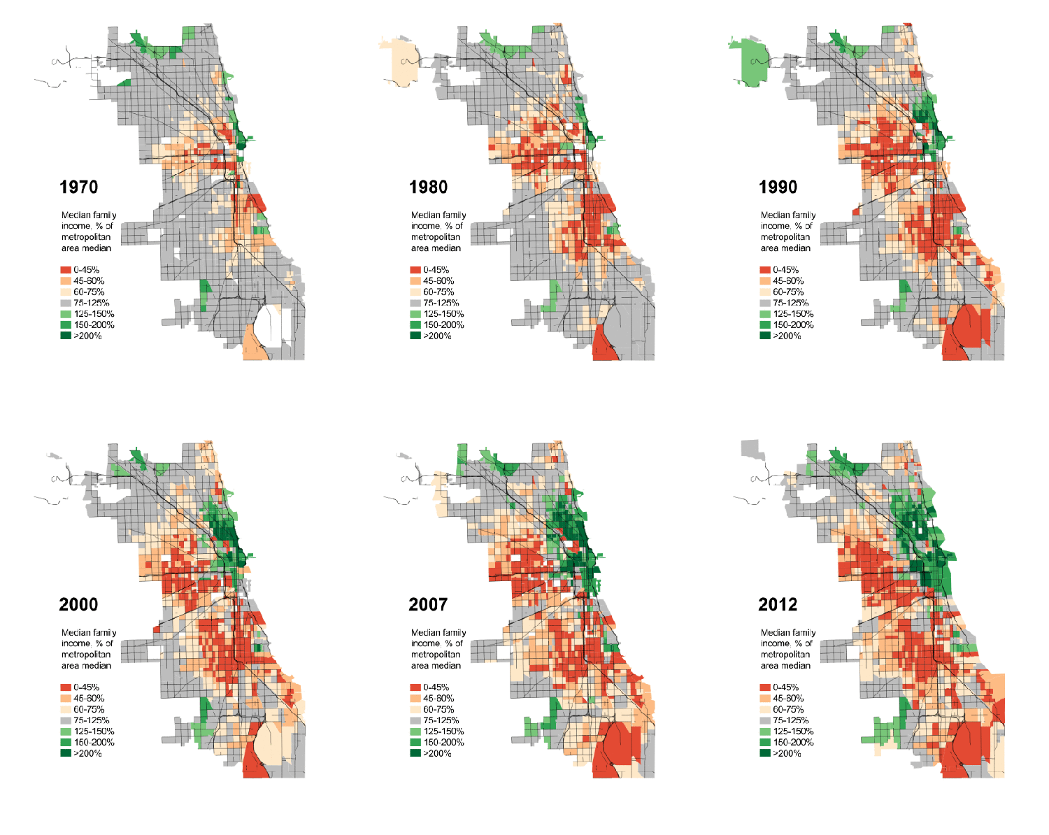
Credit for the piece goes to Daniel Kay Hertz.
Author: Brendan Barry
I am a graphic designer who focuses on information design. My day job? Well, they asked me not to say. But to be clear, this blog is my something I do on my own time and does not represent the views of…my employers. I think what I can say is that given my interest in information design—be it in the shape of clear charts, maps, diagrams, or wayfinding systems—I am fortunate that my day job focuses on data visualisation. Outside of work, I try to stay busy with personal design work. Away from the world of design, I have become an amateur genealogist and family historian. You will sometimes see that area of work bleed into my posts.
View all posts by Brendan Barry