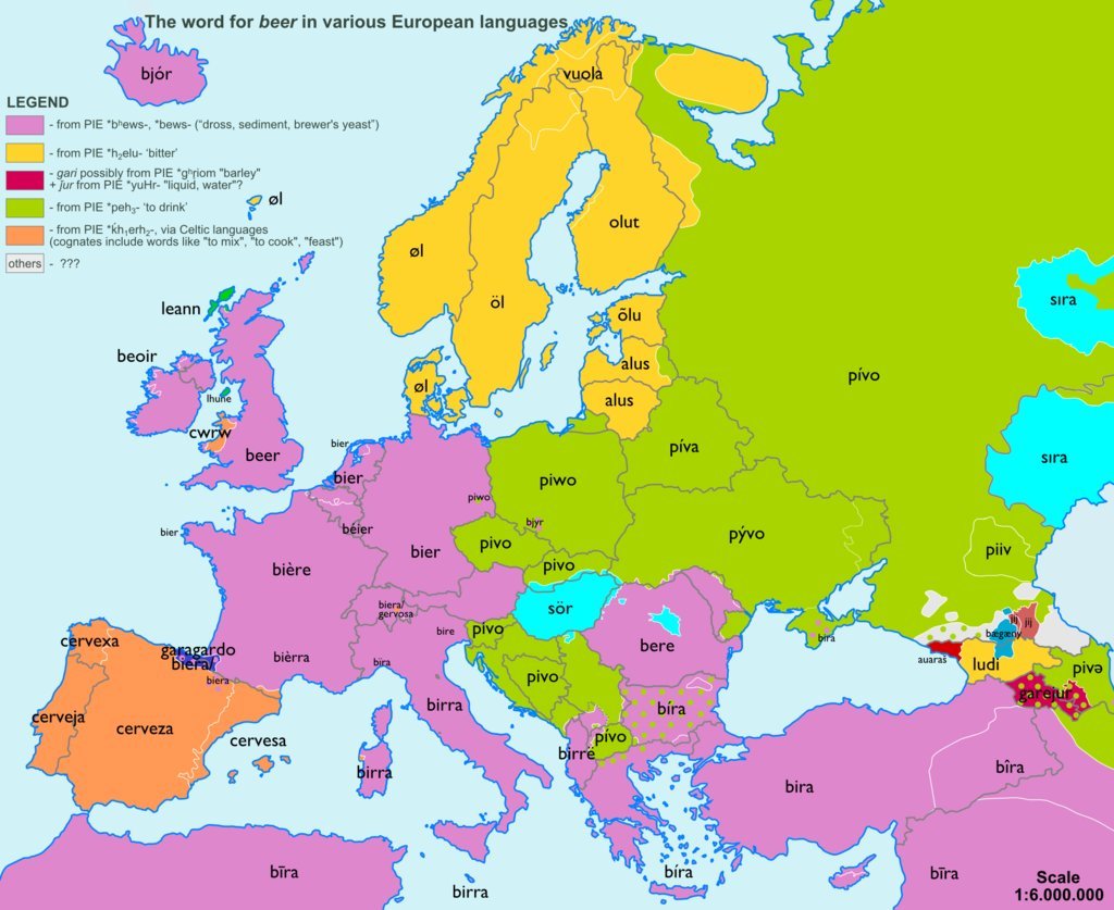
Today’s post comes via Business Insider. They linked to work by reddit user sp07 who mapped out words used for common objects across Europe and then looked at those words by their origin. But of all words, this is probably the most important.
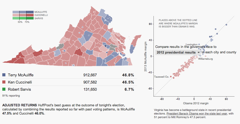
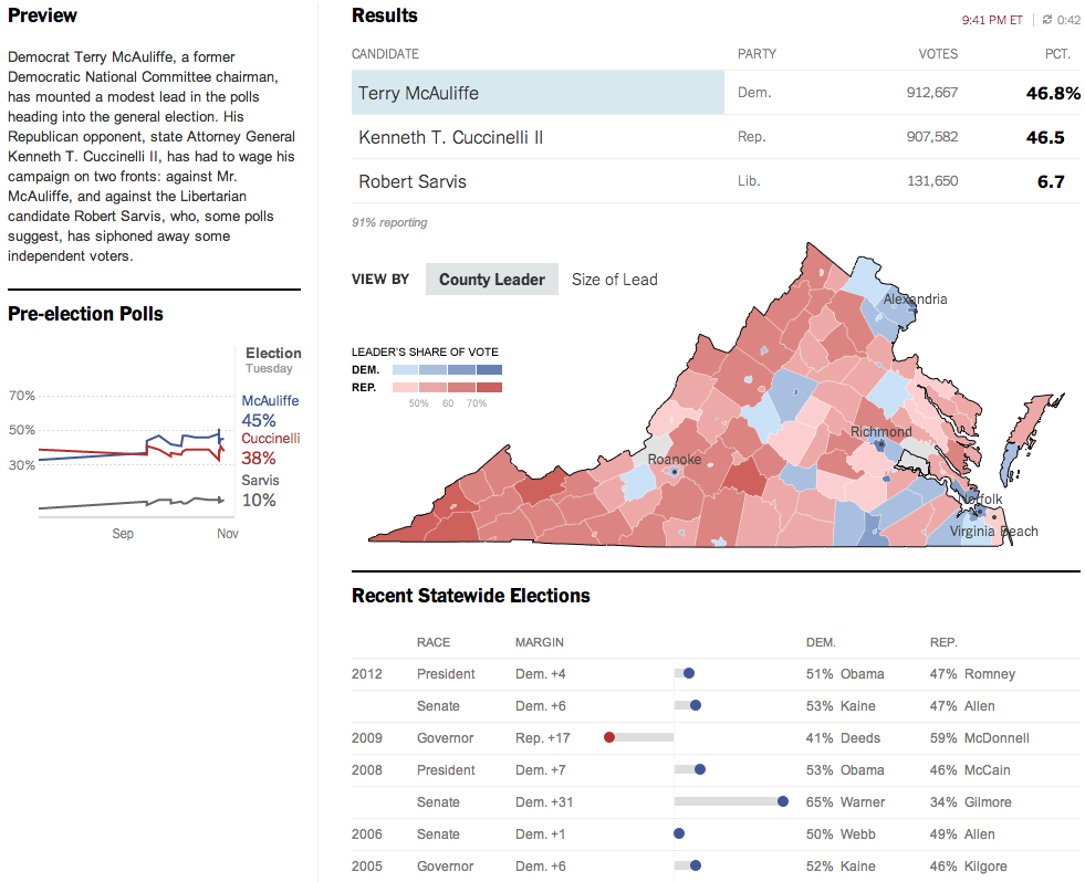
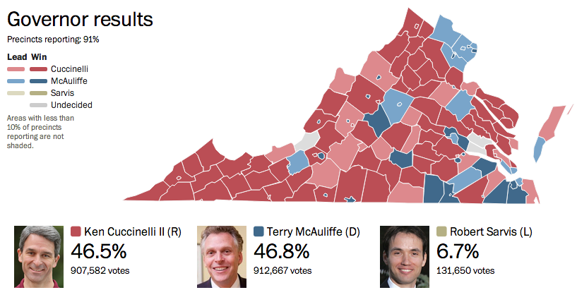
Last night was election night. Okay, maybe not the big midterm, but there were still a few interesting races. The one I want to look at it, however, is the gubernatorial race in Virginia. Maps are pretty much the default in big, statewide races like these and it is no surprise that the three screenshots here are use a map as an anchor component.
The Huffington Post uses a scatterplot to compare the margin of victory for Terry McAuliffe to that of Barack Obama in 2012. A technical flaw places the drop down menu atop the plot, unfortunately, but the component works to show differences in just one year.
Huffington Post results
Over at the New York Times, the Virginia results were given a nice overview. Here they used a text summary to explain the race in short. They used a small amount of space to show polling results over time. And then beneath the map they looked at recent elections across the state.
New York Times results
The Washington Post, which reports to the northern counties of Virginia, had a much simpler piece. They used solely a map to present the data.
Washington Post results
Credit for the Huffington Post piece goes to Aaron Bycoffe, Jay Boice, and Hilary Fung.
Credit for the New York Times piece goes to the New York Times’ graphics department.
Credit for the Washington Post piece goes to the Washington Post’s graphics department.
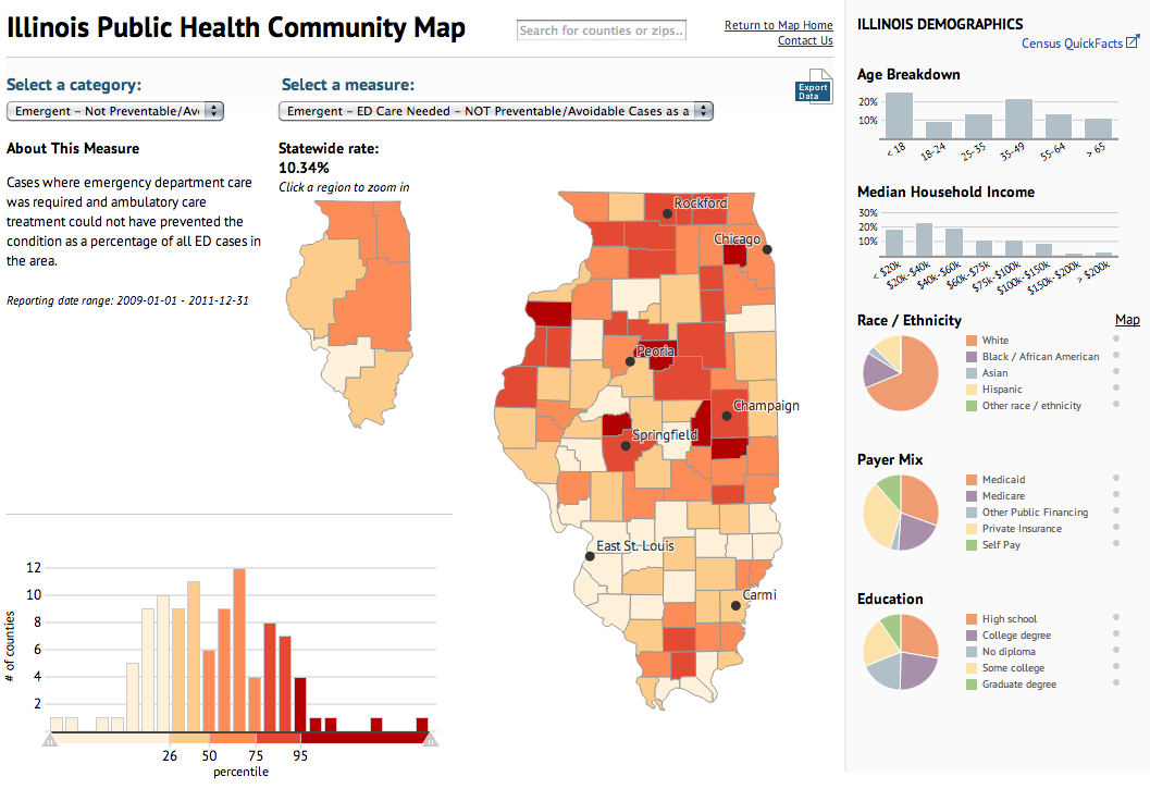
Today’s piece maps and charts comes from the Illinois Department of Public Health. The piece combines maps and charting components to detail preventable hospitalisations and emergency room use in the state of Illinois.
Public health map
Ordinarily I would prefer just one map, however, in this case the designers realised that a regional map—with its larger surface area—need not be as large as the county map. Some additional elements worth noting is the area devoted to the human explanation of the categories, which might otherwise be difficult to understand.
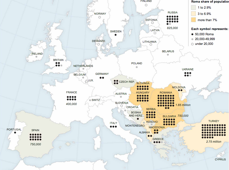
The Roma, or the Gypsies, are a displaced population living throughout Europe. They have been in the news recently. In France, a family was deported to Kosovo after their asylum appeal was rejected after a few years. However, the deportation removed a girl from a French school and the outcry was sufficient that President Hollande intervened. The girl—but not her family—is being allowed to return to France to complete her education. Also last week, Greek police picked up a fair-skinned, blonde-haired, green-eyed girl from a Roma camp because she did not look like her family. They performed a genetic test and found she was of no relation and fear the child was kidnapped. A bit earlier than last week, the French interior minister said that most Roma were not capable of integrating into French society and that they should leave France. And so the New York Times put together a piece supporting an article about the Roma population in Europe that is worth a quick look if you want to better understand the Roma diaspora.
The Roma diaspora
Credit for the piece goes to the New York Times graphics department.
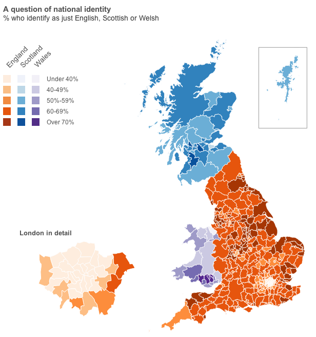
Well, you will have to click through to the article for that data visualisation. But, I will provide you with the choropleth map of national identities. That is, how English do citizens in English authorities consider themselves? Scottish in Scotland? Welsh in Wales?
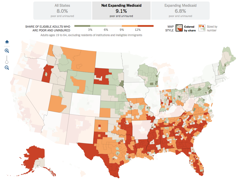
Last summer, the Supreme Court ruled that most of the Affordable Care Act, also known as Obamacare, was constitutional. The one exception, however, was the plan to force states to expand their Medicaid coverage. Medicaid is the government plan tasked with helping to provide health insurance to the poor. But between the poverty level and the income level for subsidies for the new state exchanges, there is a gap. That gap was supposed to be covered by the state expansion of Medicaid.
Because the states are not being forced to expand their coverage, there now exists state-by-state gaps in health insurance coverage. This excellent interactive graphic from the New York Times looks at the poverty and insurance coverage segregated into those states that are and are not expanding their coverage. A good number of those states with high rates of poor and uninsured are Republican, deep-South states. If you’re really clever, you’ll compare this map to my map from earlier this week about the Conservative Party. Notice any overlaps?
States not expanding Medicaid
Credit for the piece Robert Gebeloff, Haeyoun Park, Matthew Bloch, and Matthew Ericson.
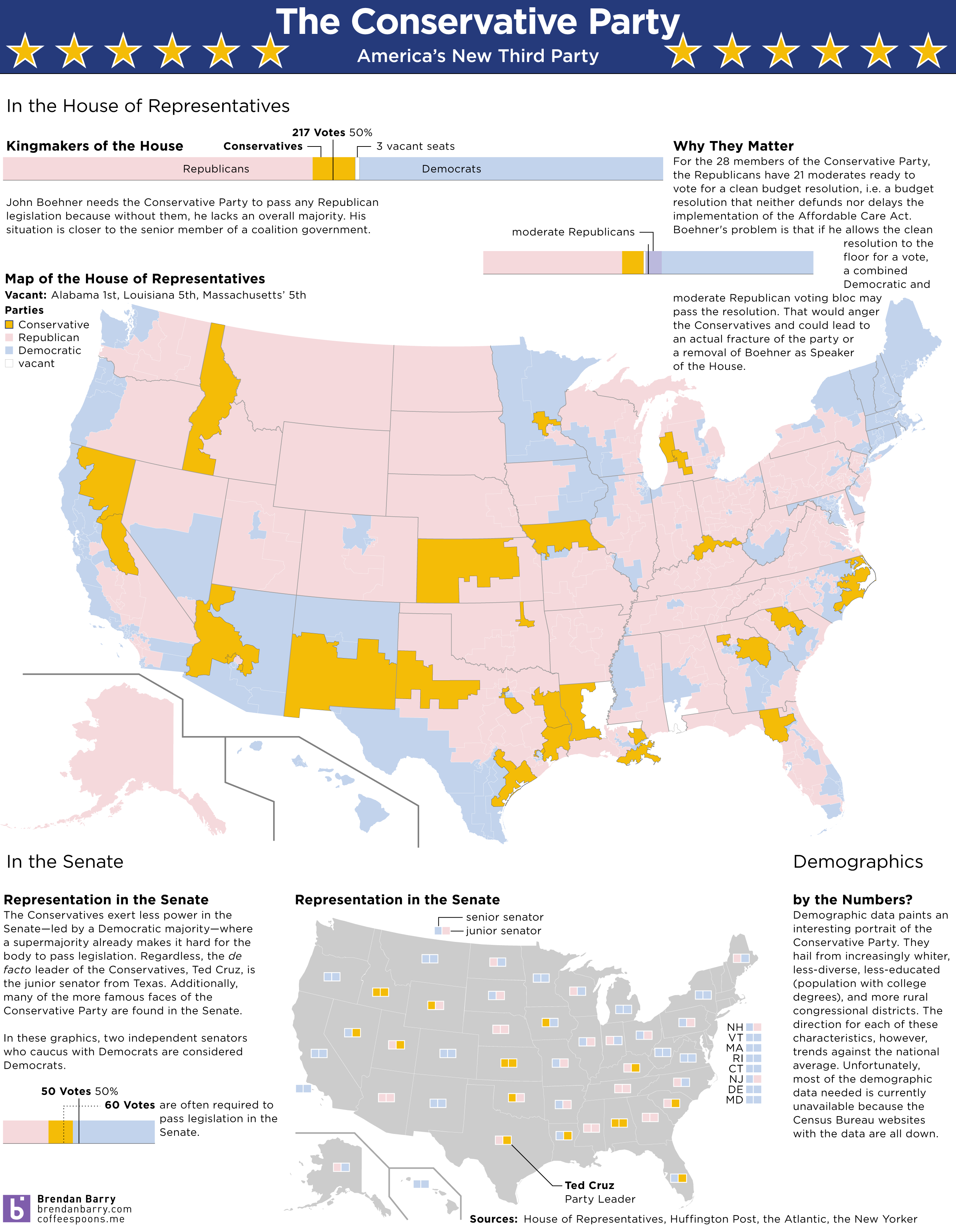
We enter our second week of the government shutdown. Of course, blame for the shutdown falls largely upon a small number of conservative Republican members of the House, bolstered by Senator Cruz (R-TX) and his allies in the Senate. But we already know that there are a number of moderate Republicans who want to pass a clean budget resolution. So one way of looking at this new conservative faction is as a new minor party in a coalition government with Ted Cruz as Party Leader.
The idea is not mine. Ryan Lizza first wrote about the “Suicide Caucus”, a topic that Philip Bump expanded upon several days later. However, as a thought experiment, I was curious to see what would happen if this third party, a Conservative Party, would look in data visualisation terms. So here’s a quick stab at America’s newest third party.
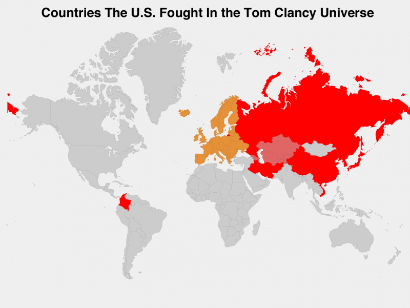
Tom Clancy died this week. Among other novels, he authored the Hunt for Red October, Clear and Present Danger, and Patriot Games—those three were made into movies. So you may very well have heard of the man. Over at Business Insider, they mapped out the Clancy world by colouring those countries against which the United States has gone to war.
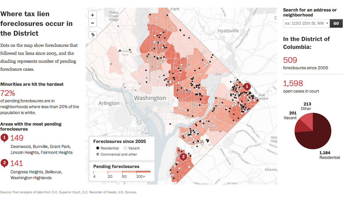
Today’s post comes from the Washington Post. It is a single interactive graphic, a map, that supports a long-form article about foreclosures in Washington.
DC foreclosure map
Credit for the piece’s graphics goes to Ted Mellnik, Emily Chow, and Laura Stanton.
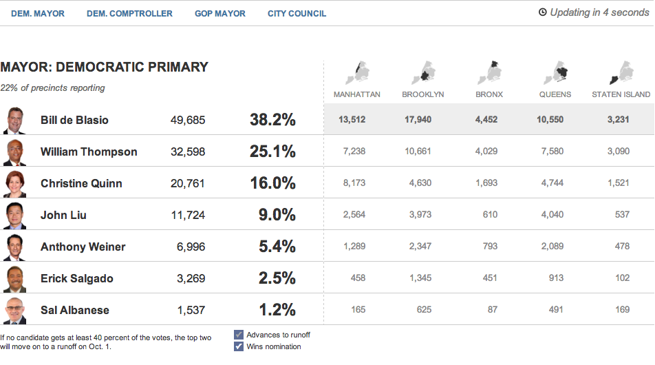
Tuesday was election day in New York (among other places) where voters went to the polls for the mayoral primary (among other positions). For those living underneath what I can only presume was a very comfortable rock, this is the whole Anthony Weiner comeback election. Anyway, a bunch of different websites, most tied to the New York area, were covering the election results. So I wanted to share just a few.
First we have the Huffington Post with the most straightforward presentation. Their table covers the main candidates and their results at a borough level and at a city-wide level.
The Huffington Post’s tabular results
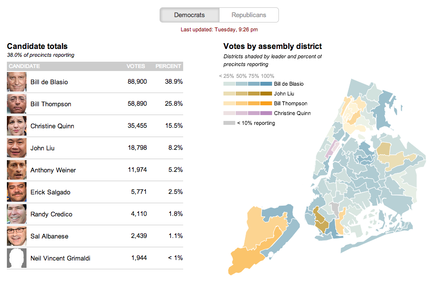
The second is from the Wall Street Journal. This uses a choropleth map with different colours assigned to a select few persons running—also the only ones with a real chance of winning. Tints of these colours in each district indicate how much of the district has voted.
The Wall Street Journal reports at the district level
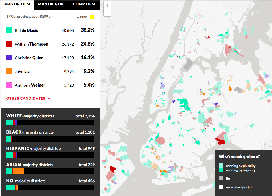
From WNYC we have our third example—another choropleth where different colours represent different candidates. However, unlike the Wall Street Journal, the colours here have only one tint. And instead of showing assembly districts, WNYC provides a further level of data and looks at precinct results. It does not represent the amount of the precinct that has voted, but rather whether the candidate is winning by a plurality or by a majority. Beneath the legend a second charting element is used; this details the breakdown of the vote by districts as separated into racial majority. This is an interesting addition that hints at filtering results by related data.
WNYC looks at who’s winning and how
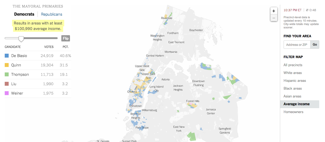
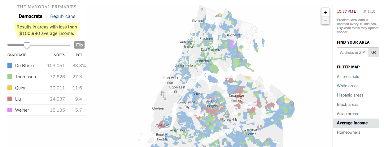
And that filtering brings us to the New York Times’ piece, which does offer filtering. It highlights districts on its maps—also precinct-level and not district aggregates—based upon the metric and the specific properties of said metric. In this case, I have chosen income. And the story of different voting patterns (at this particular point in the evening) based on income is quite clear. Look at Christine Quinn’s support.
Results from people earning more than $100kVotes from people earning less than $100k
Credit for these:
Huffington Post: Aaron Bycoffe, Jay Boice, Andrei Scheinkman, and Shane Shifflett
Wall Street Journal: the Wall Street Journal’s graphics team
WNYC: Steven Melendez, Louise Ma, Jenny Ye, Marine Boudeau, Schuyler Duveen, Elizabeth Zagroba, and John Keefe
New York Times: New York Times’ graphics department