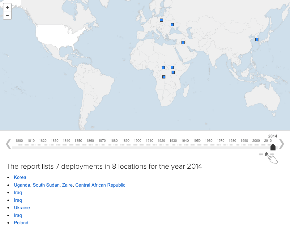
The United States has a long history of deploying troops overseas. How long? And where to? Well, ABC (as in the Australian Broadcasting Corporation) mapped out every US deployment dating back to 1798. I captured the year 2014, but if you are curious, you should check it out for yourself.
US Deployments Abroad
A neat little bonus, watch the growth of the borders of the United States from 1798.
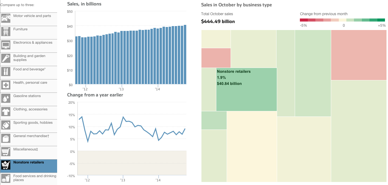
Today’s piece comes from the Wall Street Journal. It looks at US retail and foodservice spending through different types of stores.
Retail sales by store type
I take issue with a few things, firstly the tree map. Because it’s not really a tree map. Another thing I am not keen on is the comparison feature in the piece. The user can select up to three types of stores to compare. And while the result works in the line chart—three lines—the bar chart devolves into a near useless component. There is no easy way to compare the actual lengths of the individual bars short of mousing over and scribbling down each individual datapoint. In the particular case here, I likely would have changed from bars to line. Because that way I can compare the actual magnitude of each store type.
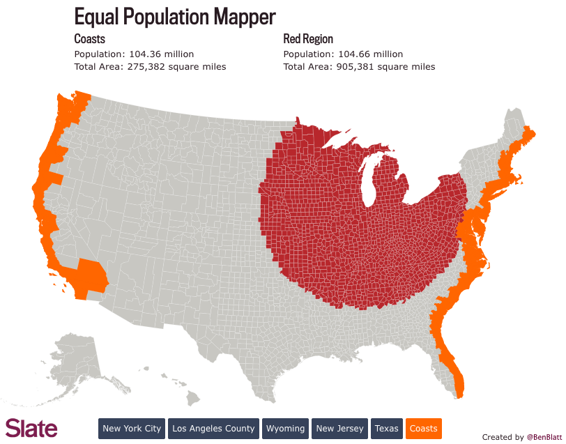
After a week of some depressing material. Let’s lighten things up. Since, you know, it is a Friday.
Two weeks ago we looked at comparisons of actual geographic area. These are sometimes useful comparisons. But more often than not we are talking about the people that live in said areas. And speaking as someone who has lived in either suburbs of big cities or within big cities my entire life, comprehending the not-do-dense rural flyover states is a bit hard to do. Thankfully Ben Blatt over at Slate put together a nice interactive piece that allows you to get a better sense of just how empty the middle of the country really is. (Hint, it is empty.)
Here we take a look at comparing the East and West coasts to Chicago. Turns out you have to go pretty far from the shores of Lake Michigan to equal the population of the two coasts. That’s a lot of flyover.
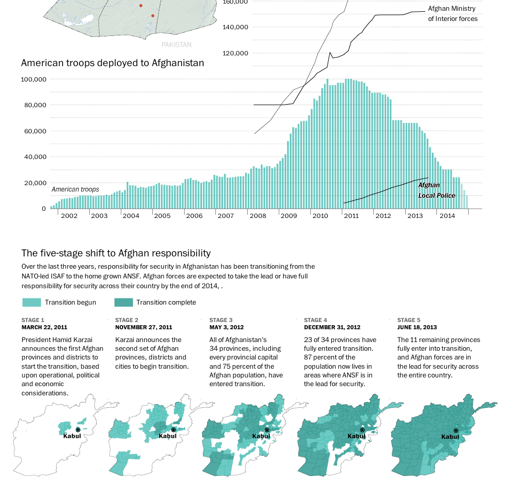
The United States and its allies are slowly beginning to pull out of Afghanistan. While several thousand troops will remain, the total will be nowhere near the peak figure a few years ago. This graphic from the Washington Post details just how this transition has been occurring.
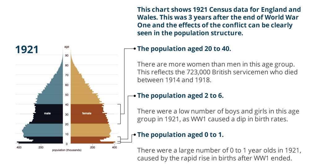
Today is Armistice Day, alternately known as Remembrance Day or Veterans Day. Originally the date remembered the armistice that ended World War I (hence those two names). The war ended at the 11th hour on the 11th day of the 11th month. But in the preceding years, millions of Europeans died along with just over a hundred thousand Americans. (We entered the war quite late.) This had a dramatic impact on the populations of European countries. In the United Kingdom, the Office of National Statistics put together a page for Remembrance Day 2014 that looks at four charts detailing the changes to the UK’s population structure. Suffice it to say there were lasting effects.
UK population in 1921
Credit for the piece goes to the ONS graphics department.
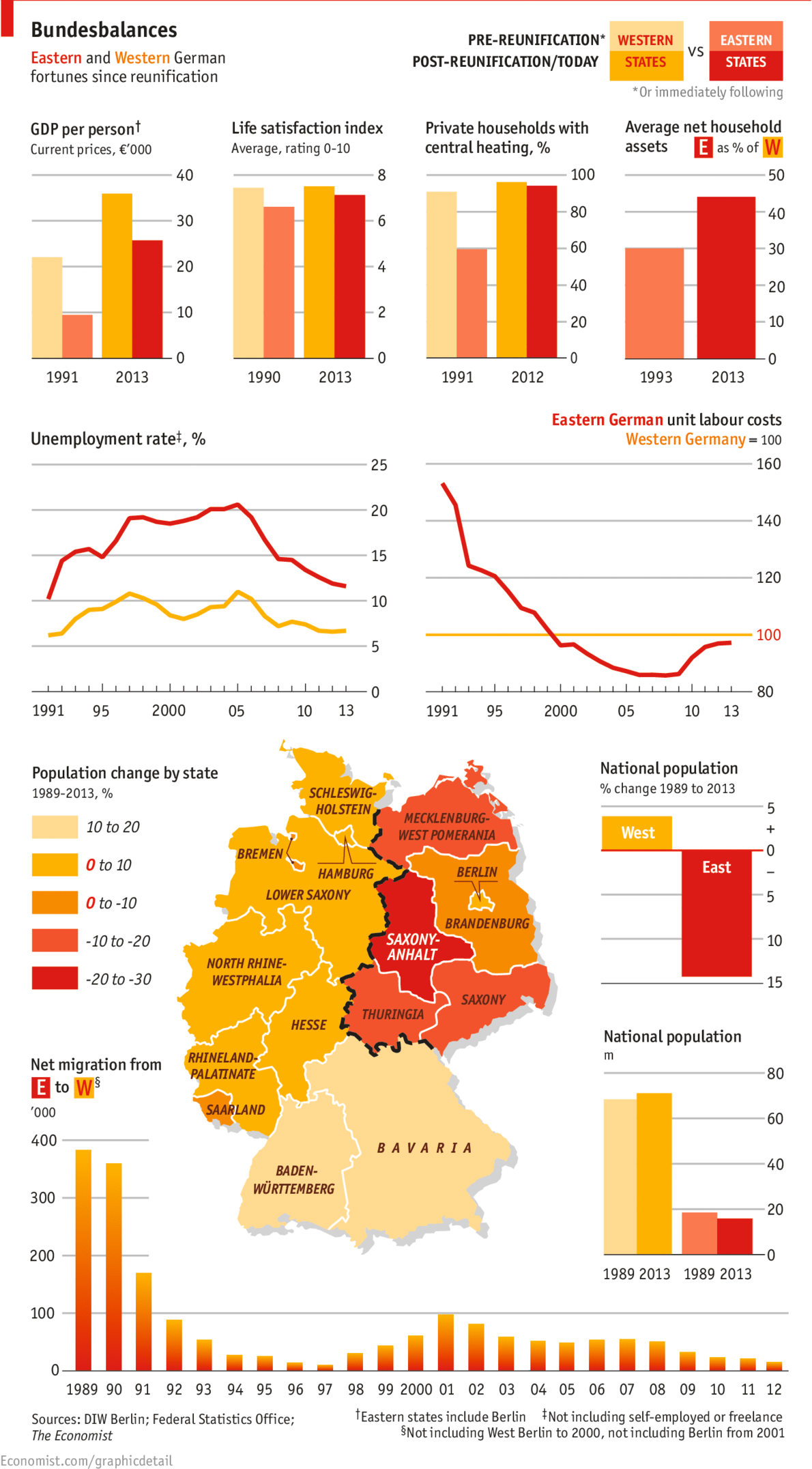
Yesterday marked the 25th anniversary of the fall of the Berlin Wall. But with the reunification of Germany a year later, has the former East Germany been able to catch up to what was West Germany? The Economist looks at the results in this graphic and the answer is yes. And no.
East vs. West. 1989 vs. 2013.
Credit for the piece goes to the Economist’s graphics department.
Nine years after the impact of Hurricane Katrina upon the city of New Orleans, the touristy French Quarter has returned according to an article in the National Journal. However, the new New Orleans beyond the French Quarter is different from what once was. In short, the new city is whiter and more Hispanic.
And while this graphic that accompanies the piece does a fair job of showing the title, a snapshot, I wish the focus would have been on more of a comparison between pre and post, old and new.
A quick look at New Orleans
I would not necessarily chosen the same components to tell the story. But, I really want to see more direct comparisons of even just the 2000 census and data to that of 2010.
Credit for the piece goes to the National Journal’s graphics department.
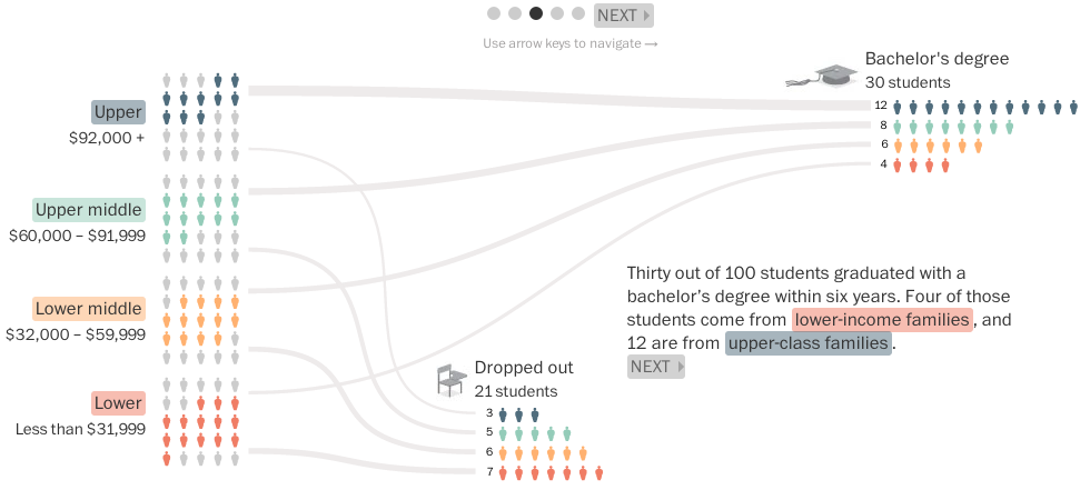
Today’s piece from the Washington Post examines the graduation rates of 100 people who enrolled at university in 2002. The data set tracked them over the following six years.
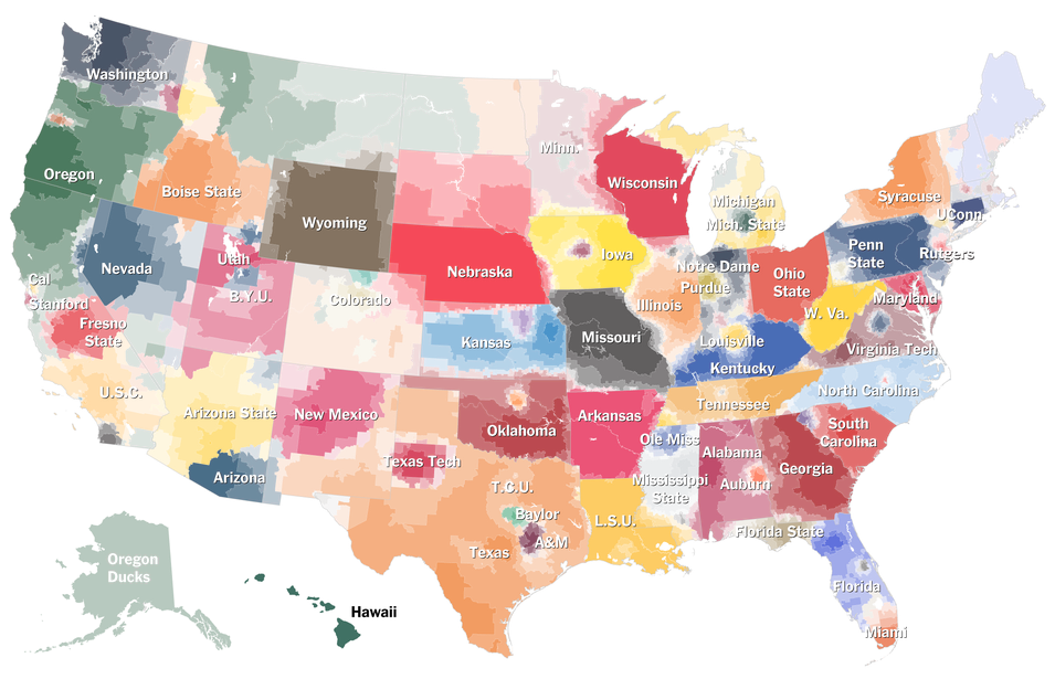
American college football. This is not a thing that Northeasters like myself understand. And it is not just because yours truly attended the University of the Arts whose only competitive sporting team was, I believe, fencing. Here in the Midwest, many things are strange and alien. One of them is their affinity for said sports that do not make sense. Thankfully the New York Times has attempted to explain specific programme affinities much like they did with their baseball map. (Which made infinitely more sense.)
Click the big map at the article’s beginning to get to the interactive version
Credit for the piece goes to Tom Giratikanon, Josh Katz, David Leonhardt, Kevin Quealy, and Marc Tracy.
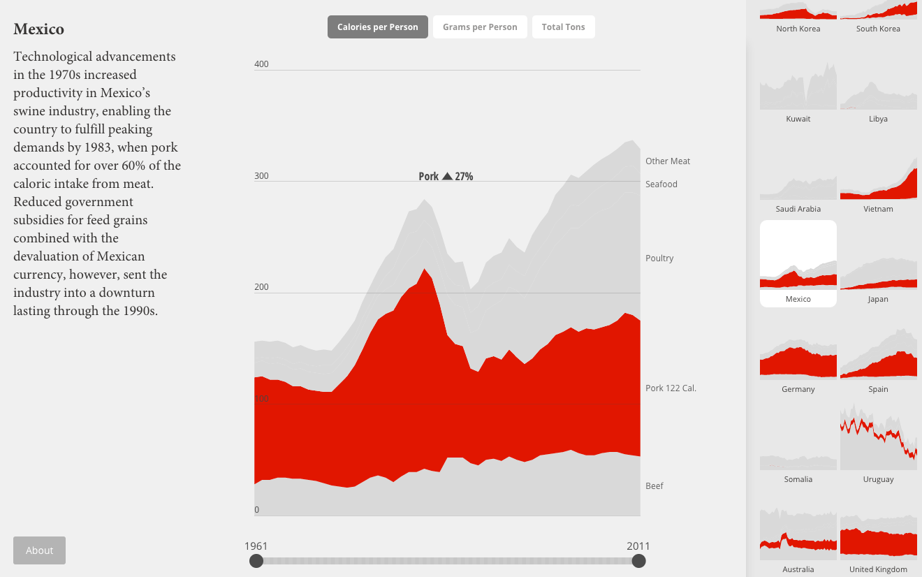
National Geographic recently published a piece designed and built for them by Fathom Information Group. Content-wise, they looked at the historic consumption of food by several different countries. What do individual food groups contribute to the overall nutritional breakdown? For the piece this basically amounted to morphing donut charts. I get the reference, but do not care for the result.
Instead more interesting is the second main view of the piece: meat consumption. Using stacked line charts, National Geographic explores changes in consumption patterns over the last 50 years. Some countries change a bit, others not so much. But as always the best examples are called out with an explanation as to why the changes. Mexico, for example, has the story about slashes in government subsidies and economic problems as to a decline in pork consumption.
Mexican pork consumption
Clearly I still have issues with the data visualisation. I would much rather see the selected view isolate the selection off the common baseline. But a nice touch is the small multiples from the country selection mechanism appearing to the right.
Credit for the piece goes to Fathom Information Design.