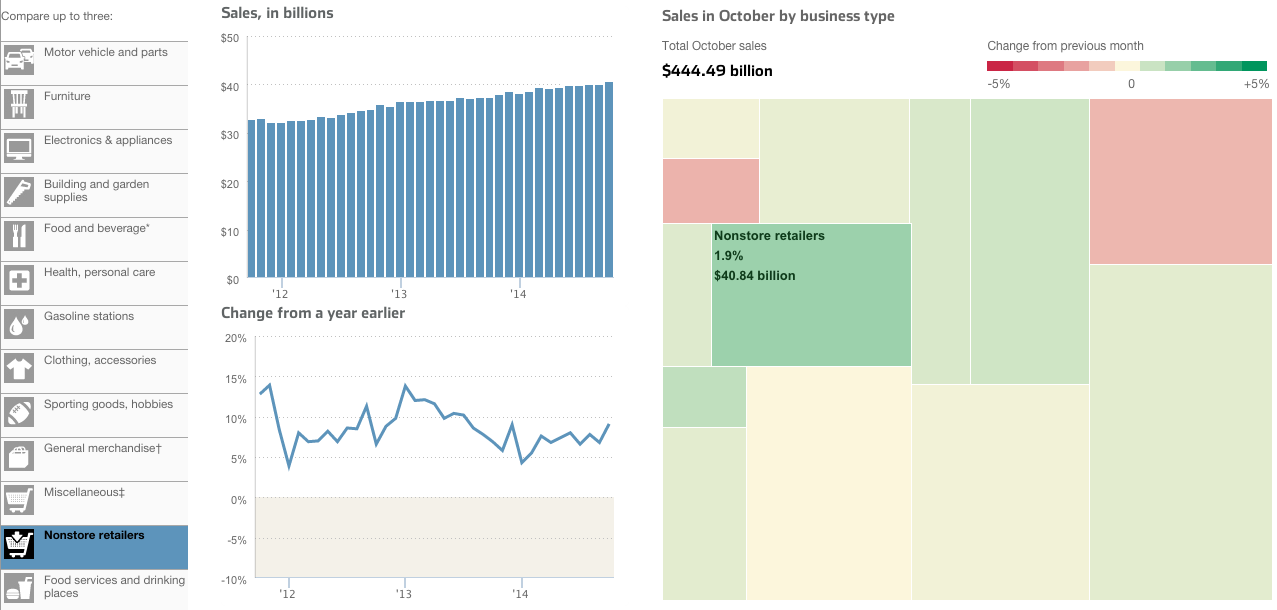
Today’s piece comes from the Wall Street Journal. It looks at US retail and foodservice spending through different types of stores.

I take issue with a few things, firstly the tree map. Because it’s not really a tree map. Another thing I am not keen on is the comparison feature in the piece. The user can select up to three types of stores to compare. And while the result works in the line chart—three lines—the bar chart devolves into a near useless component. There is no easy way to compare the actual lengths of the individual bars short of mousing over and scribbling down each individual datapoint. In the particular case here, I likely would have changed from bars to line. Because that way I can compare the actual magnitude of each store type.
Credit for the piece goes to Dan Hill.
Leave a Reply
You must be logged in to post a comment.