England and Wales: 500k More People Than Expected

Census data fascinates me from a data visualisation perspective; one can look at it so many different ways. Last week I looked at some of the Slovakian census data on the Carpatho-Rusyns that live in the northeastern mountains of Slovakia. But yesterday, the British Office of National Statistics released the results from their census of England and Wales (Scotland reports later and Northern Ireland did so already, yay devolution.) One of the big news stories was that England and Wales had 500,000 more people than had been expected. That doesn’t sound like a lot of people, but to put it roughly into American proportions, that would be like finding that there was a whole new city the size of Chicago somewhere in the United States.

But while many organisations and individuals will certainly be looking at the census data in the coming days, weeks, and months, the ONS released its own interactive application. Basically it looks at the population pyramid for England and Wales from 1911 to 2011, a century’s worth of data. But what makes this different from the GE population pyramids, for example, is the context that the ONS has added that strict data pulls lack.
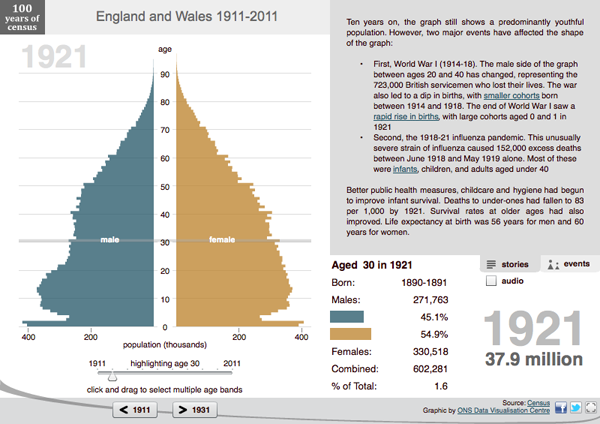
1921 pyramid
1921 pyramid

Here in 1921, rolling over a particular cohort reveals the details of those aged 30 in 1921. There is a clear difference between the number of men and women. But why? The text block’s first note details how 700,000 men aged 20–40 died during World War I and thus altered the basic structure of the English and Welsh population.
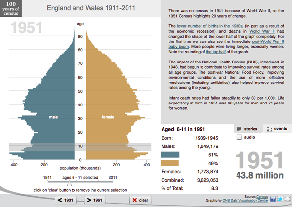
1951 pyramid
1951 pyramid

And in 1951 we begin to look at the British baby boom in the post-war era. Again, while the Baby Boom might be expected, the ONS also points out that the NHS, the British National Health Service, had also recently started and was positively affecting life expectancy and the general health of the British public. These are again things that would not likely appear in more data-focused pieces.

But everybody loves to compare things to other things. So, the ONS also released a more data-focused application that allows the user to select two different census geographies and compare them. This is more as one would expect, comparing overlays vs. side-by-side looks at different population pyramids. The example below compares London to Birmingham.

Credit for the pieces go to the ONS Visualisation Centre.

How Fat Are You?

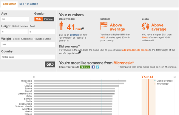
The BBC is letting you see how fat you are. They take inputs of age, weight, gender, and then your country of residence to compute your BMI and compare that across multiple countries for which the data exists. It compares you to your national average and then provides a country whose average best fits your BMI.

BMI comparison
BMI comparison

My 300lb., 6’0″ avatar is apparently overweight. And most like someone from Micronesia.

Rusyns of Slovakia

The Slovakian government has published the results from its 2011 census. The census looked at many things, including nationality and language. This should allow the government in Bratislava to better fund and support the ethnic minorities in Slovakia.

Of course, some of my ancestors were one of the small ethnic minorities in Slovakia. Ergo, I have a personal interest in the data. The result is a quick infographic about the Carpatho-Rusyns of Slovakia. Click on the cropping below to learn more, meaning, see a bigger and fuller version.

Cropping of the Rusyns of Slovakia

Credit for the work goes to me. For the data, the statistics office of Slovakia.

The Future of Those Without Health Insurance

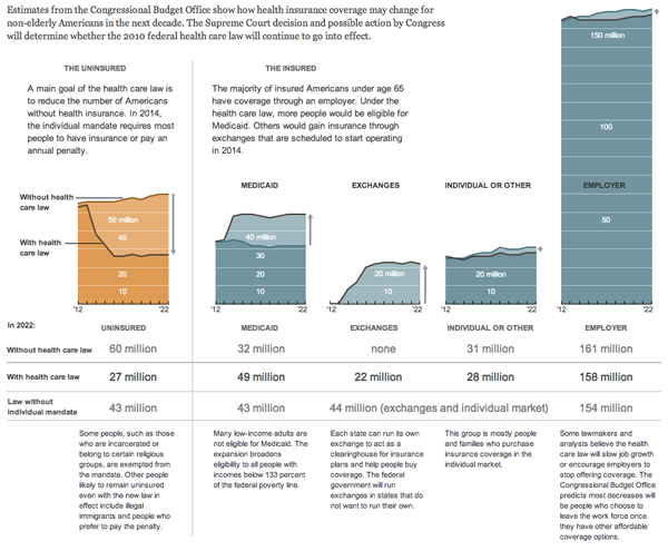
As the Supreme Court is likely to scrap the mandate provision of the health care law—without which sick people are left to pay higher premiums if they can get coverage at all—later today, the New York Times looks at the impact of removing the health care law changes the number of people without health insurance.

The numbers of the uninsured

Credit for the piece goes to Lisa Waananen.

Cancer

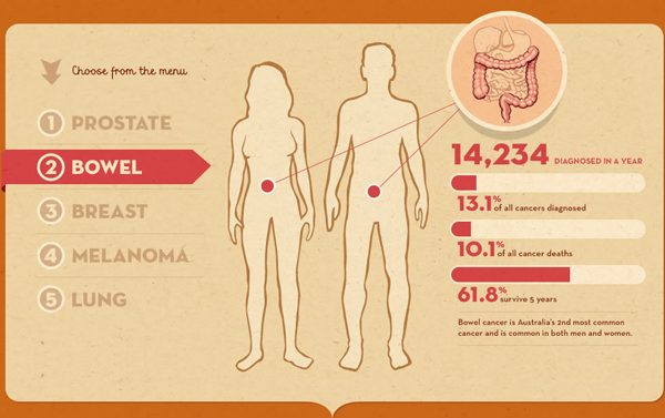
From the Sydney Morning Herald, we have a link to an interactive infographic published by the Cancer Council of Australia, a non-profit that seeks to reduce the impact of cancer upon Australia. It is not the most graphical by way of charts, but offers the user “playful” interactions with statistics to better inform him or her about the causes and impacts of cancer. The format is also interesting in that it mimics the fad in infographics of the long, vertical scroll page. But here it is done to much better and ostensibly more useful effect. Useful in the sense of trying to help people.

Bowel cancer
Bowel cancer


Brotherly Love

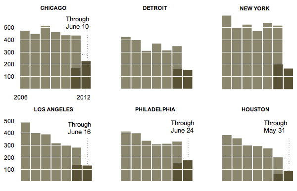
From the New York Times we have a graphic that looks at homicides across several different US cities. And in Chicago, they are up significantly from this point last year. So too is Philly, but I like to think of that as an outpouring of brotherly love.

Homicides
Homicides

Greece vs. Germany

It appears as if the Greeks, who voted in parliamentary elections for the second time in as many months, have narrowly voted for pro-bailout parties. But whether the pro-bailout parties can put aside their other political differences and form a coalition government remains to be seen.

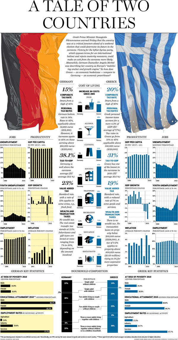
Until we see that, thanks to the National Post, we can see an infographic comparison between Greece and Germany, arguably the worst and the best European economies.

Greece and Germany compared

I appreciate the mirror approach, but wonder if the comparisons might not have been clearer if measured directly? Or what would have happened without the mirror approach and compared the two countries in single but slightly larger charts? Regardless, one can easily see that Greece has some serious problems.

Credit for the piece goes to Andrew Barr, Mike Faille, and Richard Johnson.

I Just Want to Retire

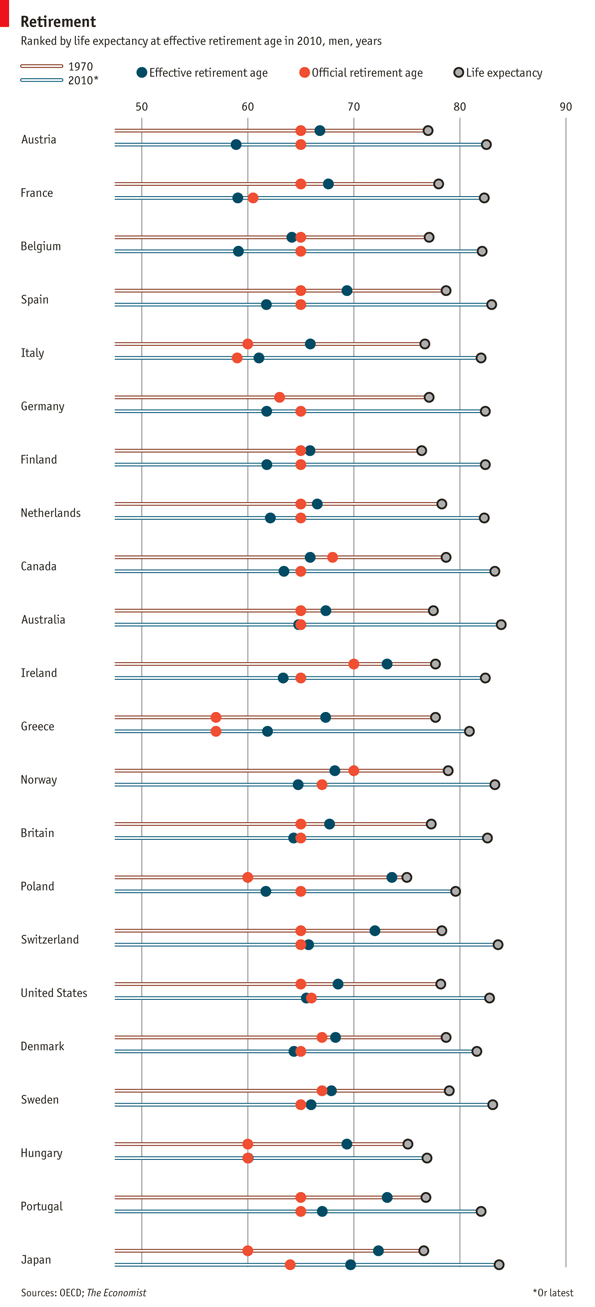
I don’t know about you, but I’ve got goals in life. Namely to retire. So thankfully the Economist put together this infographic on retirement age across the OECD (a cool club of rich countries), specifically to look at how retirement ages have changed between 1970 and 2010 alongside life expectancy.

retirement
retirement

God Save the Queen

For the Queen’s Jubilee I had been looking for a good infographic or two about how the United Kingdom had changed over the length of her reign, at least thus far. Alas, I found not a great deal of substantial work. This is an infographic from the Guardian that looks at quite a few single figures.

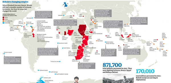
But it also has a map looking at the decline/unravelling of the British Empire.

Decline of the British Empire

God Save the Queen.