Malaysia Airlines Flight 370

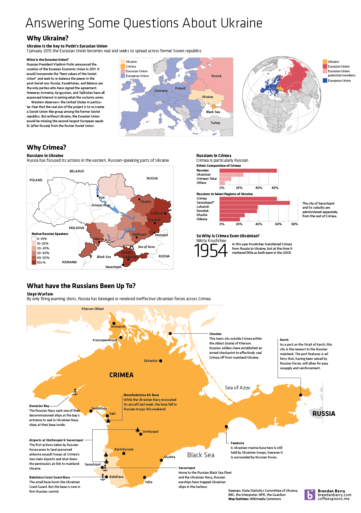
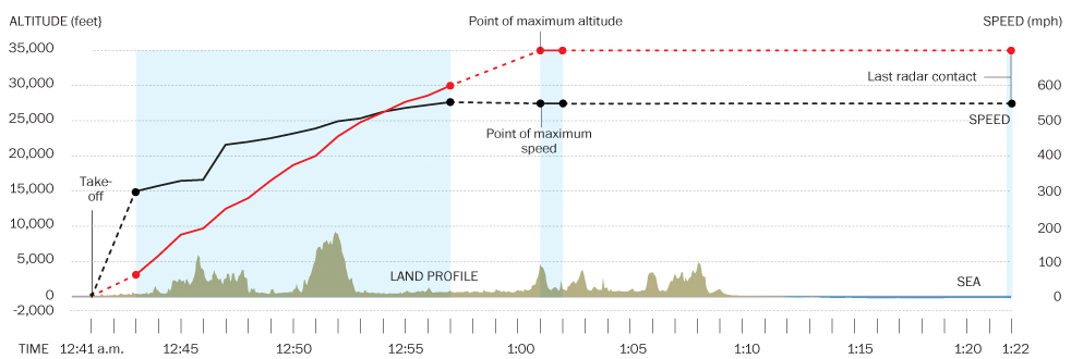
Ukraine has dominated the news much of the last few weeks. But the new 24/7 international news story is the missing aircraft (at least as of my writing this) that was Malaysia Airlines Flight 370. There are presently two nice graphics I have seen attempting to explain the story. The first, a cropping of which is below, is from the Washington Post.

The Washington Post piece

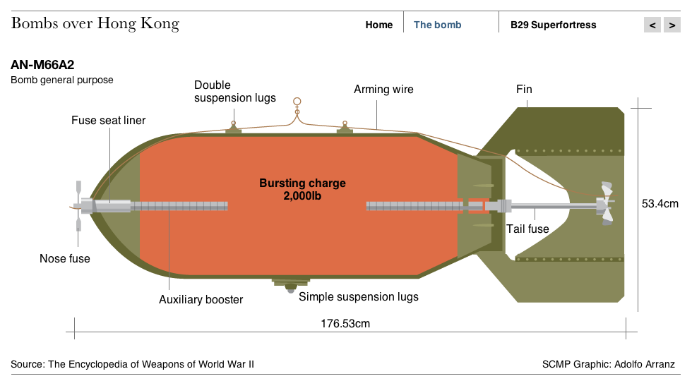
The second piece, again another cropping, is from the South China Morning Post.

South China Morning Post's graphic
South China Morning Post’s graphic

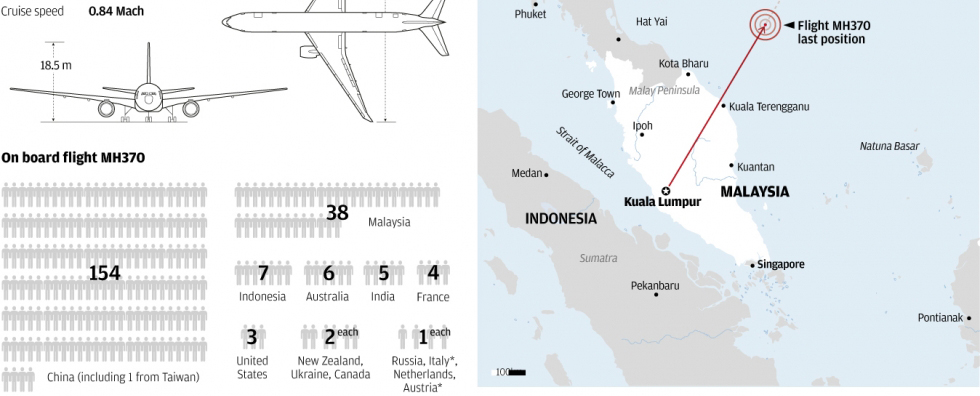
Credit for the Washington Post piece goes to Gene Thorp, Alberto Cuadra, Laris Karklis, and Richard Johnson.

Credit for the South China Morning Post piece goes to the South China Morning Post graphics department.

Answering Some More Questions About Ukraine

So Ukraine is even more of a mess and in less than a week’s time, the Crimean people will vote in a referendum on whether they want to remain a part of Ukraine or rejoin Russia. This graphic of mine is an attempt to answer some questions—though hardly all I wanted—about Ukraine, Crimea, and about what the Russians have been doing. (To be fair, the Russians still don’t admit that the troops and soldiers are theirs. But really, I mean come on, we all know they are.)

Why Crimea?
Why Crimea?

World War II Bombs in Hong Kong

Last month, police in Hong Kong defused a 2000 pound (900 kilogram) bomb found undetonated since World War II. The South China Morning Post created a small graphic to diagram just what the bomb was and how it was delivered (by US aircraft) to Hong Kong.

The 2000 pound bomb
The 2000 pound bomb

Credit for the piece goes to Adolfo Arranz.

Around the World

If you’ll allow your humble author a humblebrag, I often complain about having to daily deal with people around the world living in a lot of different time zones. How do I keep track of business hours around the world? I don’t. Well, not easily. But thanks to xkcd, this is no longer a problem.

Clearly, I wrote this in the evening

This is only a screenshot. But the actual image actually generally follows the Earth’s rotation. You know, until it stops. Or until we hit daylight saving time. Whichever comes first.

Credit for the piece goes to Randall Munroe.

The Science Behind the Thoroughbred

I do not know a thing about horses. I leave that knowledge to others in my family. However, this piece from the South China Morning Post explains quite a bit of why the thoroughbred is such a famous type of horse for racing.

The science behind thoroughbreds

Credit for the piece goes to Alberto Lucas López.

Potholes

Today’s piece is from the Washington Post. However, it is less data visualisation and more of a neat little motion graphic explaining the formation of pot holes. Since it seems to be about that time of year when roads are destroyed by the things.

Potholes
Potholes

Credit for the piece goes to Sohail Al-Jamea and Bonnie Berkowitz.

Speed Skating

Today’s post comes from a co-worker and looks at the increase of speed in speed skating in the Winter Olympics since 1924. It does a nice job of showing the increase in the speed. Because to a degree, the increase has not been linear. Instead, it really only increased in two spurts and recently has remained fairly constant.

Then to show how slight differences in speed impact an actual race. The times are plotted against the distance in a simulated race. That shows that seemingly incremental increases in speed can have a drastic impact on where one finishes a race.

Race around the rink

Credit for the piece goes to  Andrew Garcia Phillips.

Drawing the World

The inability of people to understand geography beyond their own borders is not new. But today’s post uses that to create a new map—albeit from a limited sample. The creator of this map merged 30 different, hand-drawn maps into one to reveal the world as imagined by his sample.

Composite map
Composite map

Credit for the piece goes to Zak Ziebell.

Depicting Radiation

Today’s post is more about a means of illustrating radiation, less about quantifying it. Unfortunately the article is in German and I speak none of it. But, the context is that of the Fukushima Disaster. Make sure you click through to see the illustrations in action.

Radiation
Radiation

Credit (I think) goes to Interactive Things and Neue Zürcher Zeitung.