Analysing Your (Facebook) Social Networks

Earlier this week, Wolfram Alpha released some findings from its analytics project on Facebook. While the results offer quite a bit to digest, the use of some data visualisation makes it a little bit easier. And a lot more interesting.

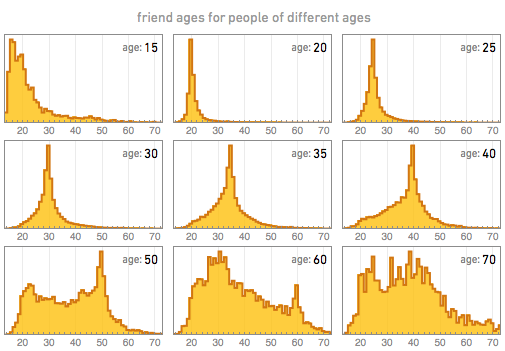
The results offer quite a bit of detail on interests, relationship statuses, geographic locations, and ages. Below is just one of the small multiple sets, this one looks at the number of friends of different ages for people of different ages. Basically, how many young or old people are friends of young people? Friends of old people?
Friends of Friends for the Ages

But I was most interested in the analysis of social networks. The mosaic below is indicative of the sheer size of the survey, but also begins to hint at the variance in the social structures of the data donors.
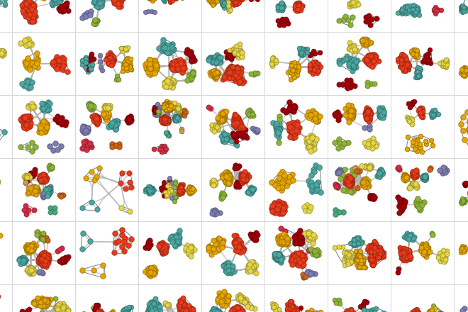
Just Some of the Networks

While these views are all neat, where it begins to get really interesting is Wolfram Alpha’s work on classifying the different types of social networks. By aggregating and averaging out clusters, simple forms begin to emerge. And after those forms emerged, they were quantified and the results are a simple bar chart showing the distribution of the different types of networks.

Simplified Cluster Distribution

Overall, some very interesting work. But one might naturally wonder how their own networks are structured. Or just be curious to look at the data visualisation of their own Facebook profile. Or maybe only some of us would. Fortunately, you still can link your account to a Wolfram Alpha account (you have to pay for advanced features, however) and get a report. Below is the result of my network, for those who know me semi-well I have labelled the different clusters to show just how the clustering works.
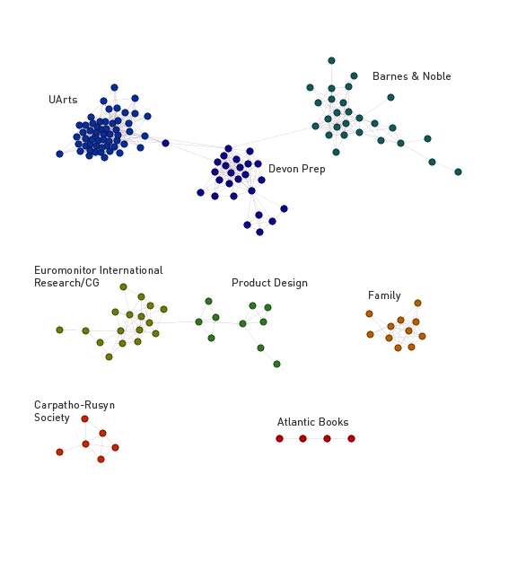
My Social Networks
My Social Networks

Credit for the piece goes to Wolfram Alpha.

More Effective Cartograms

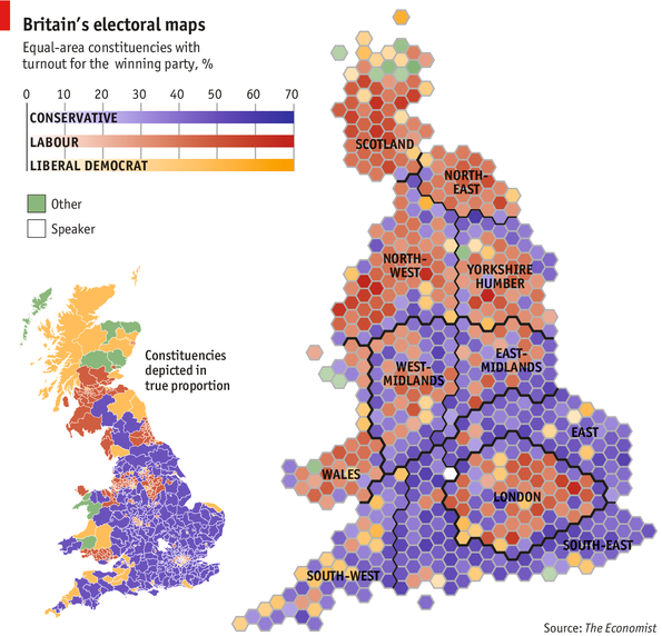
The other day I posted an example of a good cartogram, actually a pair of good ones from the New York Times. Today, I wanted to share another good example. The Economist created this cartogram, map of Great Britain’s constituencies. What is perhaps most effective in this chart, even more so than in the Times’, is its use of a “traditional” map form for comparison. You quickly get a sense of how large rural Britain’s constituencies are compared to those of London.

Mapping Britain
Mapping Britain

Credit for the piece goes to the Economist.

Immigrants’ Paths to Citizenship

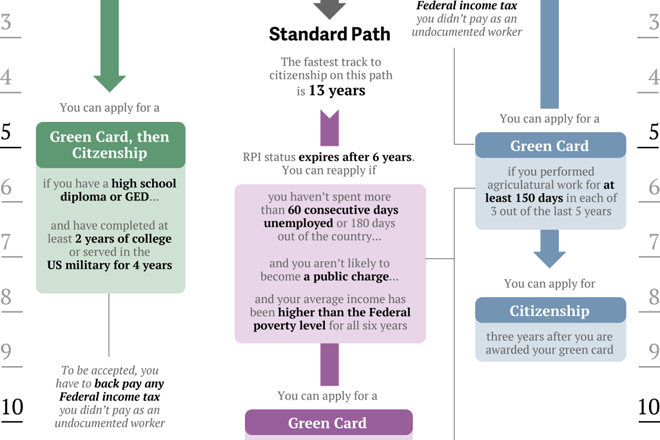
Last week several important stories were drowned out by the bombings in Boston. One of those stories was that a group of senators agreed on a compromise immigration bill that would offer undocumented workers in the United States definite plans to citizenship. Of course now that we know the suspects in the Boston bombings were legal, documented immigrants—one of whom was a naturalised citizen—the immigration debate might take on an entirely different character.

Here is a cropping from a graphic put together by Quartz that explains how the different paths work.

Cropping of different paths to US citizenship

Credit for the piece goes to Ritchie King.

Recapping the Boston Marathon Bombing

After the capture this weekend of the second suspect in the Boston Marathon bombing, the Washington Post published an interactive piece that looked at the entirety of the story. It captured the bombing, looked at the investigation, then the manhunt, and finally the capture of one of the suspects.

The piece incorporated static diagrams along with video and interactive navigation to tell the story in day-sized chunks on the screen. When taken together as one whole piece, it is quite impressive.

The capture of one of the suspects

Credit for the piece goes to what may well be the entire graphics staff of the Washington Post: Wilson Andrews, Darla Cameron, Emily Chow, Alberto Cuadra, Kat Downs, Laris Karklis, Todd Lindeman, Katie Park, Gene Thorp, and Karen Yourish.

The Universe Keeps Getting Bigger

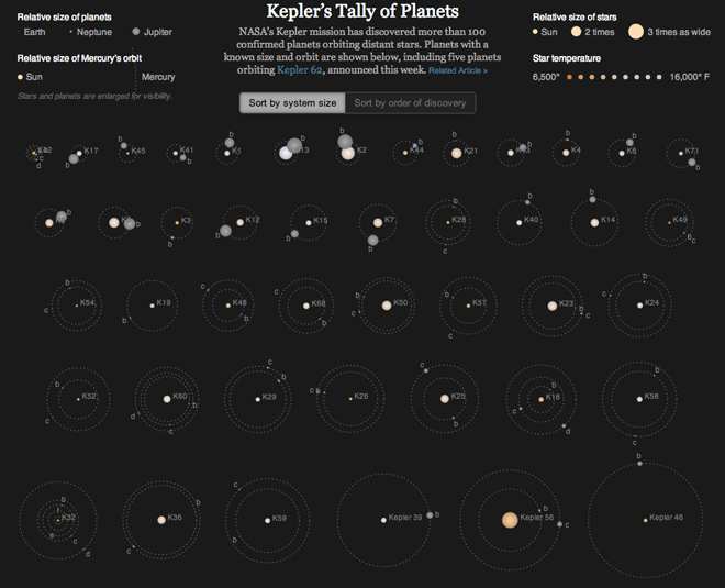
The Kepler observatory is responsible for finding Earth-like planets in distant solar systems. It was launched only in 2009, but has been incredibly successful. Earlier this week scientists announced the discovery of Kepler 62, a star system that has five planets. Two of those planets exist within the Goldilocks zone, where conditions are just right for habitable planets (for Earth-like organisms) to form and exist. Of course, not all planets in such zones are habitable, look at Venus and Mars for examples. But still, the news is quite significant.

Over at the New York Times, Jonathan Corum plotted all the data on all the systems so far discovered by Kepler, including that new information on Kepler 62. The result is a mesmerising view of star systems beyond our own. The stars are planets are enlarged for visibility and the orbits are made a bit more circular, but the overview is still fantastic.

The chart shows the relative sizes of the stars and their temperatures and allows you to compare the orbits of the planets so far known. You can also sort the chart either by size or time of discovery. It also shows the relative times of the planets’ orbits. That is, they move…

The Kepler star systems

Fans of this will remember that in 2011, the New York Times used a similar, albeit static, method to explain the discovery of planets at Kepler 20, whose planets all orbit closer to their star than Mercury to ours.

Credit for the piece goes to Jonathan Corum.

Terrorism in the United States

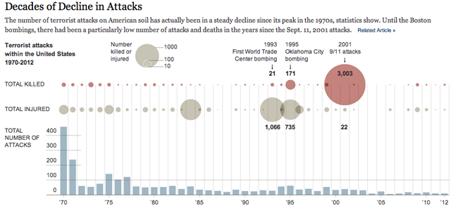
Terrorism is not new to the United States. As this graphic from the New York Times shows, even in recent decades, we experienced quite a lot of it. In 1970 there were over 400 attacks. However, since 2001, the United States has seen far fewer attacks. Fortunately the Boston Marathon bombing is not as bad as it could have been. But even then, thankfully the bombing is a relative anomaly.

Incidence of Terrorist Attacks in the United States

Credit for the piece goes to the graphics department of the Times.

The Boston Marathon Bombing in More Detail

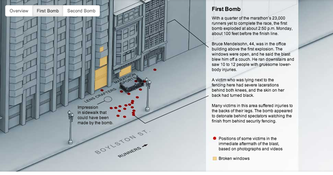
Today’s post comes from the New York Times and offers more detail on the twin terror bombings Monday. While the topic is surely gruesome, the interactive graphic is clean without the inclusion of photos or videos of the violence. It focuses on the facts without the fanfare or sensationalism to which we are accustomed from a media that too often needs it to draw and sustain viewership. A sober and informative piece from the New York Times.

Details of the Boston Marathon Bombing

Credit for the piece goes to the graphics department of the Times.

How Dragonflies Hunt

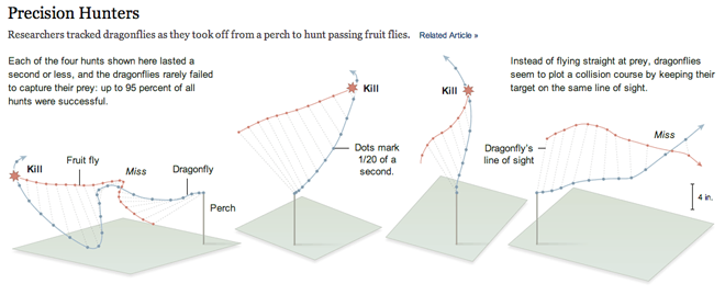
Today’s post is certainly smaller, but it’s always interesting to see how infographics and information design can help us better understand science and nature. This is a piece from the New York Times that illustrates how a dragonfly hunts its prey, fruit flies. Instead of flying straight at the fruit fly, the dragonfly plots a course that keeps it on the same line of sight with the fruit fly. The dragonfly often captures its prey where those two lines intersect, as show below.

How dragonflies hunt

What is really nice about this graphic is the dots that mark out 1/20 second intervals and allow you to plot the course of both animals with respect to each other. The annotations of course explain what is going on, for example when lines intersect by the dragonfly misses.

Credit for the piece goes to the New York Times.

Cartograms

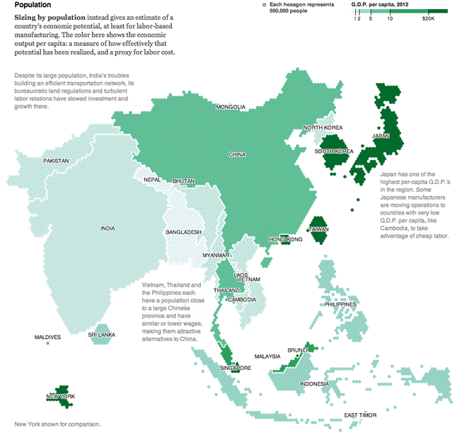
Continuing this week’s map theme, we have an example of a cartogram from the New York Times. This piece supplements an article about how some manufacturing companies are starting to look away from China as a place for their facilities. There are two maps, the first (not shown here) looks at economic output overall. The second (below) takes that output and accounts for population.

GDP per capita
GDP per capita

Hexagons are used instead of the more familiar squares to represent 500,000 people and the colour is the GDP per capita. The text accompanying the graphic explains how this is a measure of economic potential being (or not being) realised. But what the hexagons allow the map to do is better represent the shapes of the countries. Squares, more common in cartograms, create awkward box-like outlines of countries. That would be fine if countries were often shaped like squares, but they are not.

I am not often a fan of cartograms, but I find this one well executed and the annotations and explanatory text make what might otherwise be confusing far simpler to understand. All in all, a solid piece.

Credit for the piece goes to Mike Bostock and Keith Bradsher.