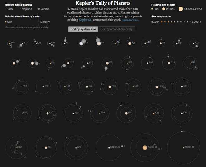
The Kepler observatory is responsible for finding Earth-like planets in distant solar systems. It was launched only in 2009, but has been incredibly successful. Earlier this week scientists announced the discovery of Kepler 62, a star system that has five planets. Two of those planets exist within the Goldilocks zone, where conditions are just right for habitable planets (for Earth-like organisms) to form and exist. Of course, not all planets in such zones are habitable, look at Venus and Mars for examples. But still, the news is quite significant.
Over at the New York Times, Jonathan Corum plotted all the data on all the systems so far discovered by Kepler, including that new information on Kepler 62. The result is a mesmerising view of star systems beyond our own. The stars are planets are enlarged for visibility and the orbits are made a bit more circular, but the overview is still fantastic.
The chart shows the relative sizes of the stars and their temperatures and allows you to compare the orbits of the planets so far known. You can also sort the chart either by size or time of discovery. It also shows the relative times of the planets’ orbits. That is, they move…

Fans of this will remember that in 2011, the New York Times used a similar, albeit static, method to explain the discovery of planets at Kepler 20, whose planets all orbit closer to their star than Mercury to ours.
Credit for the piece goes to Jonathan Corum.
Leave a Reply
You must be logged in to post a comment.