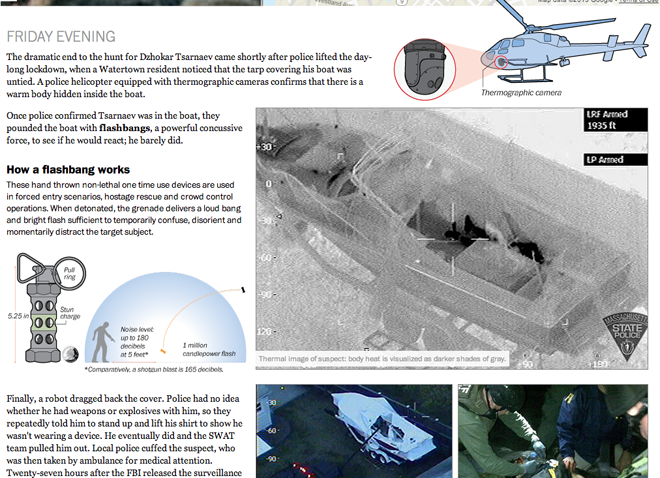
After the capture this weekend of the second suspect in the Boston Marathon bombing, the Washington Post published an interactive piece that looked at the entirety of the story. It captured the bombing, looked at the investigation, then the manhunt, and finally the capture of one of the suspects.
The piece incorporated static diagrams along with video and interactive navigation to tell the story in day-sized chunks on the screen. When taken together as one whole piece, it is quite impressive.

Credit for the piece goes to what may well be the entire graphics staff of the Washington Post: Wilson Andrews, Darla Cameron, Emily Chow, Alberto Cuadra, Kat Downs, Laris Karklis, Todd Lindeman, Katie Park, Gene Thorp, and Karen Yourish.
Leave a Reply
You must be logged in to post a comment.