Brand New Year, Same Old Politics

Today’s piece comes from this past weekend. The New York Times looked at how states fell on various politically sensitive issues, e.g. abortion and same-sex marriage, depending upon the political control of the executive and legislative functions of each state. In other words, which states have passed legislation to regulate abortion or same-sex marriage? States controlled by Democrats, or states controlled by Republicans?

The overall lay of the land and two issues

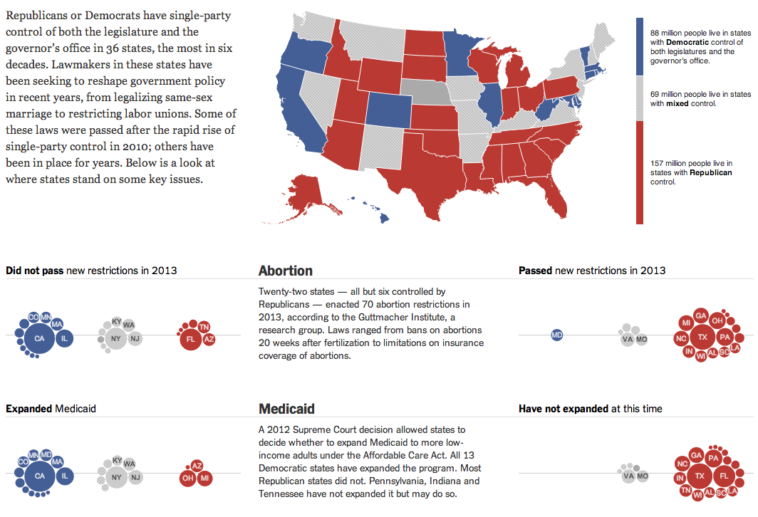
I am not terribly keen on the clustered bubbles. Showing the population of each state could be handled better by different chart forms. But to a certain extent in this piece, the population figures are secondary to the aggregate of people living in blue or red states. And in that case, while you cannot easily visualise the number of people living in the aggregates, you can at least get a feel for which group is home to more people.

Credit for the piece goes to Haeyoun Park, Jeremy Ashkenas, and Mike Bostock.

Tracking You While You Text

Today’s post comes from the Washington Post, which looks at further revelations about the NSA surveillance programme. Specifically, the Post details how the NSA tracks Americans by what is called co-traveler analytics. The piece does a really nice job of explaining how the tracking works through illustrative examples.

Tracking via co-traveler analytics

Credit for the piece goes to the Washington Post graphics department.

The Next Cold War?

The New York Times has a nice piece about the Arctic, which is increasingly fought over by the nations north of the Arctic Circle. Maps like these are always opportunities I enjoy to see the world in an infographic that is not a standard projection, e.g. Mercator or Robinson. The slight change in fill or opacity also serves to highlight the focus of the piece on the area north of the Arctic Circle while areas even more distant slowly fade to white.

Map of the Arctic
Map of the Arctic

Credit for the piece goes to Baden Copeland and Derek Watkins.

Old Healthcare Policy Renewal

Let’s start this week off with cartograms. Sometimes I like the idea, sometimes not so much. Here is a case where I really do not care for the New York Times’ visualisation of the data. Probably because the two cartograms, a before and after of health policy renewals, do not really allow for a great side-by-side comparison. I imagine there is probably a way of condensing all of that information into a single chart or graphic component.

The before map
The before map

Credit for the piece goes to Keith Collins, Josh Katz, Katie Thomas, Archie Tse, and Karen Yourish.

Explaining Why Some People Are Losing Their Health Insurance Plans

I have received a few questions in the non-blog world about why certain people have been receiving notices in the post that they are about to lose their insurance plans. The short answer for many of those people is that they likely bought individual, private plans and those plans fall short of the new minimum requirements. But, if you are not satisfied with that explanation, the New York Times does a much better job explaining it than I ever could. It is a piece worth a quick read.

The private insurance market

Credit for the piece goes to Larry Buchanan, Alicia Parlapiano, and Karen Yourish.

Scale of Syria’s Refugees

So that civil war in Syria thing, yeah, it’s still going on, folks. And lots of people—7,000,000 of them—have been forced to flee to either external or internal locations. Al Jazeera has attempted to put that number into context for Americans using US census data and maps.

Here is a look at both Philadelphia and Chicago for comparison’s sake. The interactive application has a few pre-selected options, or you can find your own US locale.

Syrian refugees based on Philadelphia's population
Syrian refugees based on Philadelphia’s population
Syrian refugees based on Chicago's population
Syrian refugees based on Chicago’s population

Credit for the piece goes to Michael Keller.

Virginia Election Results

Last night was election night. Okay, maybe not the big midterm, but there were still a few interesting races. The one I want to look at it, however, is the gubernatorial race in Virginia. Maps are pretty much the default in big, statewide races like these and it is no surprise that the three screenshots here are use a map as an anchor component.

The Huffington Post uses a scatterplot to compare the margin of victory for Terry McAuliffe to that of Barack Obama in 2012. A technical flaw places the drop down menu atop the plot, unfortunately, but the component works to show differences in just one year.

Huffington Post results

Over at the New York Times, the Virginia results were given a nice overview. Here they used a text summary to explain the race in short. They used a small amount of space to show polling results over time. And then beneath the map they looked at recent elections across the state.

New York Times results

The Washington Post, which reports to the northern counties of Virginia, had a much simpler piece. They used solely a map to present the data.

Washington Post results

Credit for the Huffington Post piece goes to Aaron Bycoffe, Jay Boice, and Hilary Fung.

Credit for the New York Times piece goes to the New York Times’ graphics department.

Credit for the Washington Post piece goes to the Washington Post’s graphics department.

The Calderon Connections

I am not terribly familiar with local politics outside of my local areas. So the background and details of this piece escape me. However, this interactive graphic and story from the Los Angeles Times does a really great job of leading the reader through the story.

First, the piece starts with a general overview or flowchart of the network of connections. Mouseovers do a fine job of highlighting and filtering for the appropriate piece. For example, a person shows the entities to which he is connected whereas the entities show the people to which it is connected.

The flow diagram of connections

Secondly, the piece then goes in detail about the different connections. The example screenshot below shows how each story is highlighted by a red dot as the user scrolls down the page. When that story is highlighted, the network diagram to the left changes, either replacing the contacts or highlighting the contacts specifically noted in the story.

Example of the connections in this story

As I said at the outset, this is a very nice piece that step-by-step shows and explains how all the connections work while filtering out the momentarily irrelevant data. Very well done.

Credit for the piece goes to Byron Lutz.

Illegal Arrivals to Australia

This article on Yahoo by the AFP has an interesting graphic on the problem facing Australia of illegal arrivals via boat that, in part, probably cost Kevin Rudd and the Labor Party of Australia the recent election.

Illegal arrivals to Australia

I like the overall graphic, but I feel that the data labels are unnecessary on the line chart and the bar chart. They distract from the overall shape of the data and are anyways hinted at by the axes labels within the charts themselves. Also, I am a bit unclear as to the meaning of the grey bars in the line chart.

Credit for the piece goes to John Saeki.