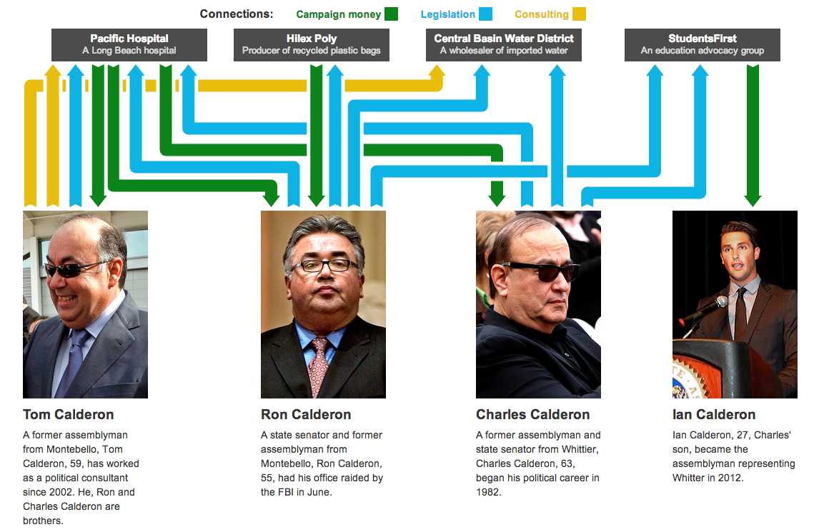
I am not terribly familiar with local politics outside of my local areas. So the background and details of this piece escape me. However, this interactive graphic and story from the Los Angeles Times does a really great job of leading the reader through the story.
First, the piece starts with a general overview or flowchart of the network of connections. Mouseovers do a fine job of highlighting and filtering for the appropriate piece. For example, a person shows the entities to which he is connected whereas the entities show the people to which it is connected.

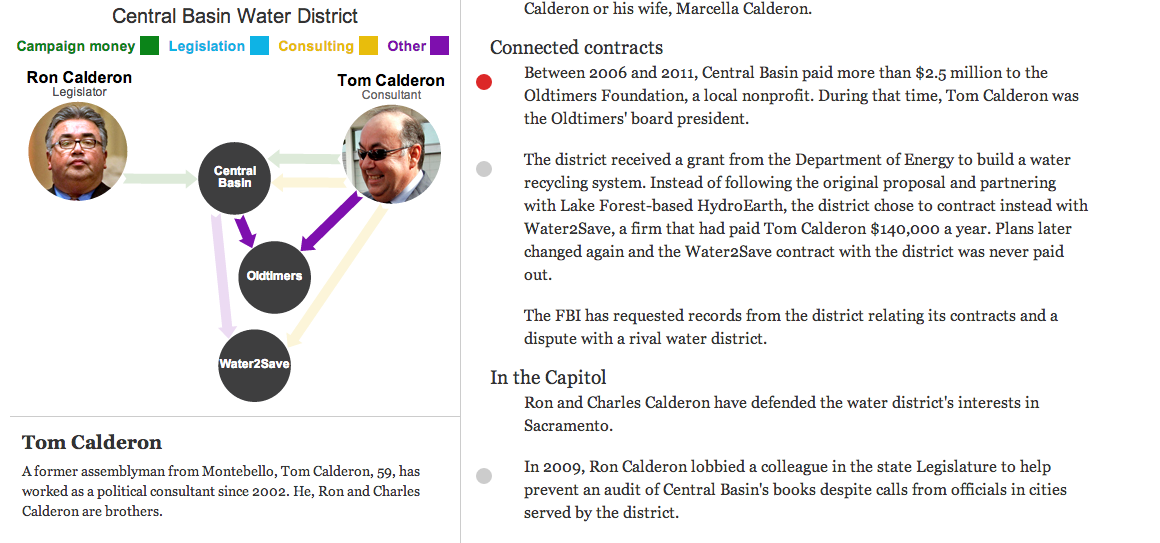
Secondly, the piece then goes in detail about the different connections. The example screenshot below shows how each story is highlighted by a red dot as the user scrolls down the page. When that story is highlighted, the network diagram to the left changes, either replacing the contacts or highlighting the contacts specifically noted in the story.

As I said at the outset, this is a very nice piece that step-by-step shows and explains how all the connections work while filtering out the momentarily irrelevant data. Very well done.
Credit for the piece goes to Byron Lutz.
Leave a Reply
You must be logged in to post a comment.