Trumpsylvania

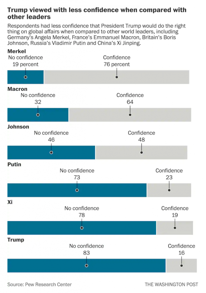
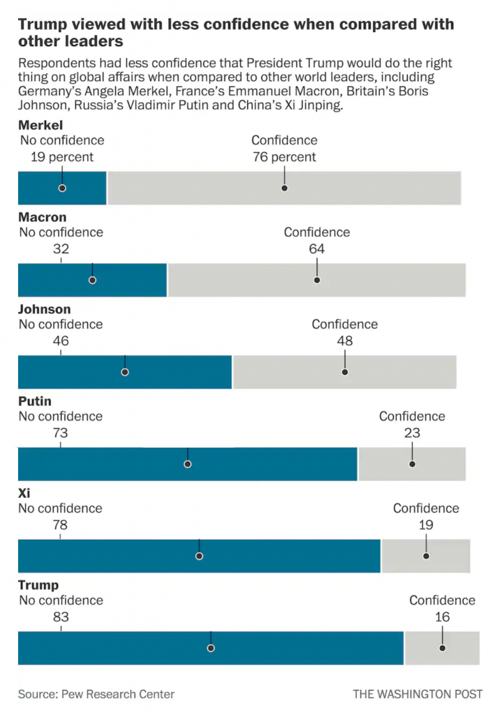
After working pretty much non-stop all spring and summer, your humble author finally took a few days off and throw in a bank holiday and you are looking at a five-day weekend. But, because this is 2020 travelling was out of the question and so instead I hunkered down to finish writing/designing an article I have been working on for the last several weeks/few months.

The main write-up—it is a lengthy-ish read so you may want to brew a cup of tea—is over at my data projects site. This is the first project I have really written about for that since spring/summer 2016. Some of my longer-listening readers may recall that the penultimate piece there I wrote about Pennsyltucky was inspired by work I did here at Coffeespoons.

To an extent, so is this piece. I wrote about Trumpsylvania, the political realignment of the state of Pennsylvania. 2016 and the state’s vote for Donald Trump was less an aberration than many think. It was the near-end result of a decades-long transformation of the state’s political geography. And so I looked at the data underlying the shift and how and where it occurred.

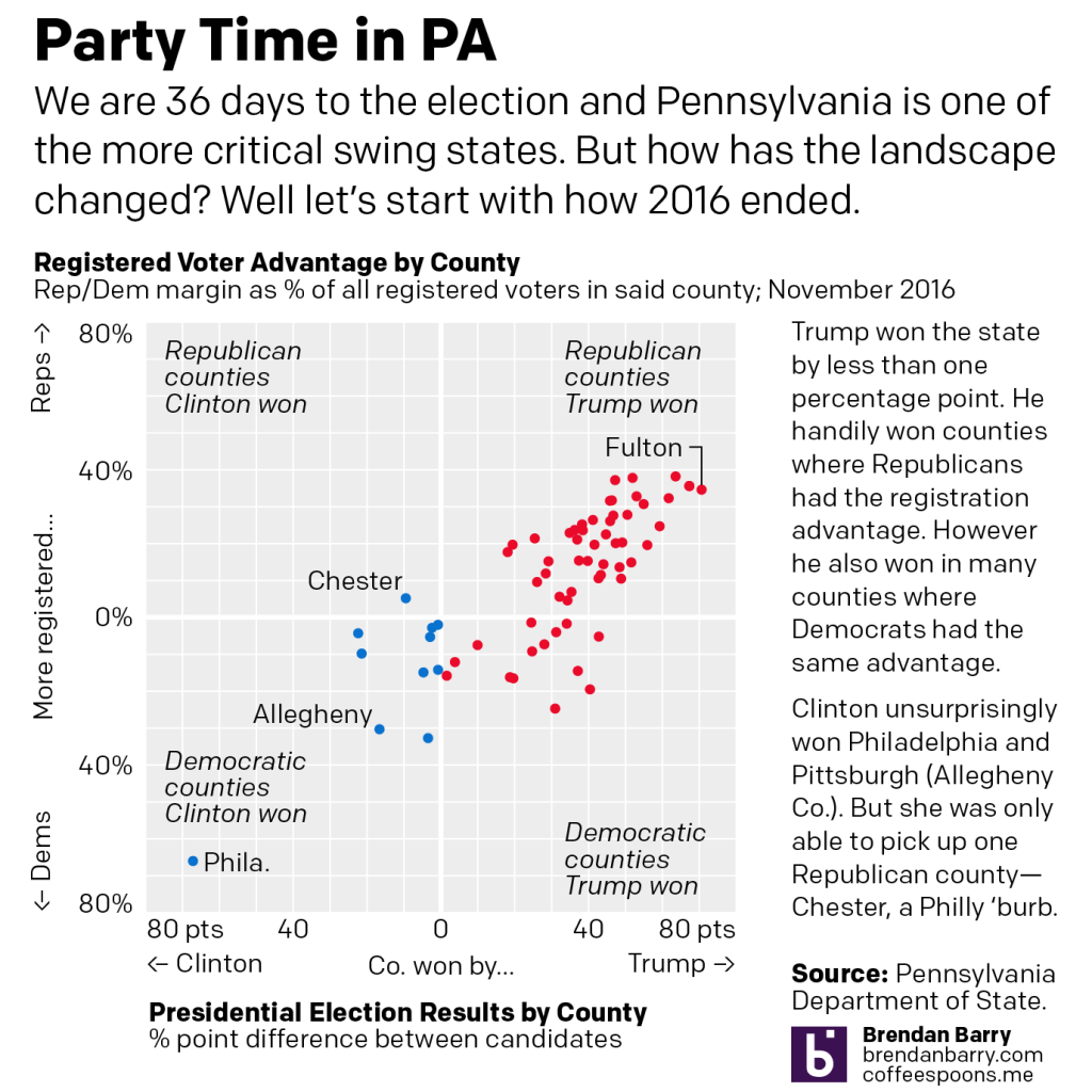
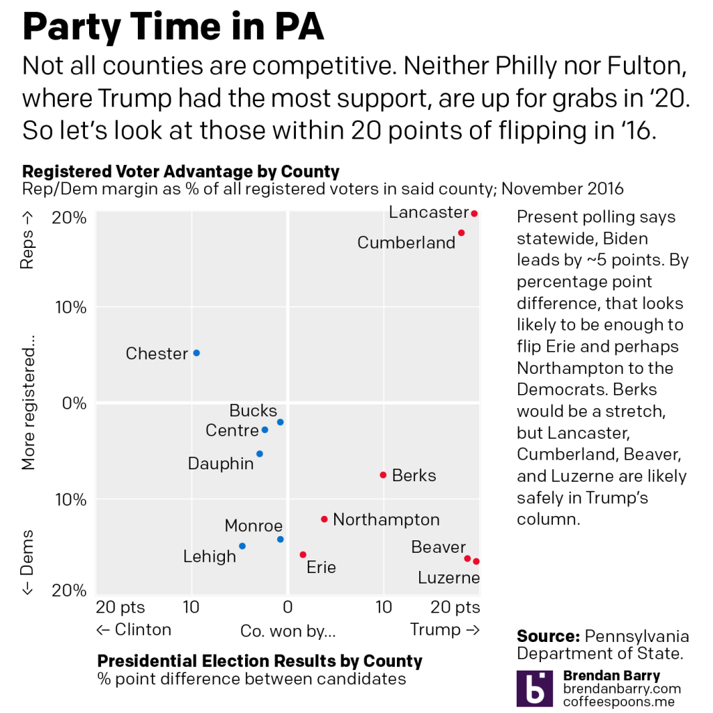
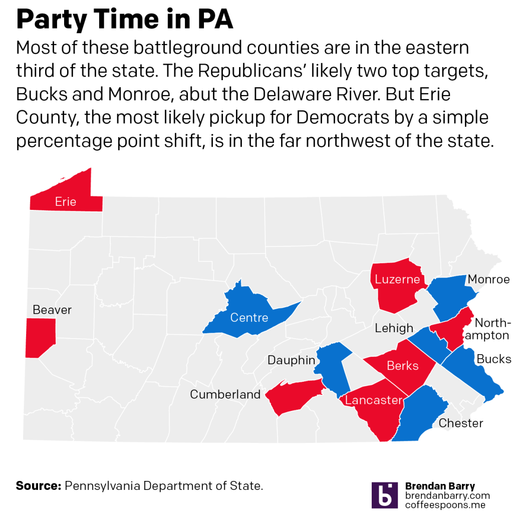
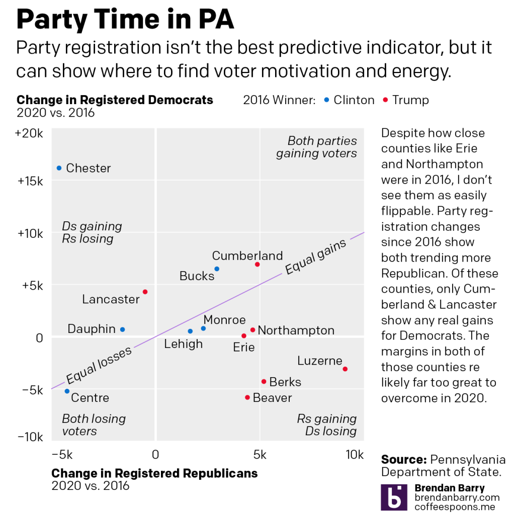
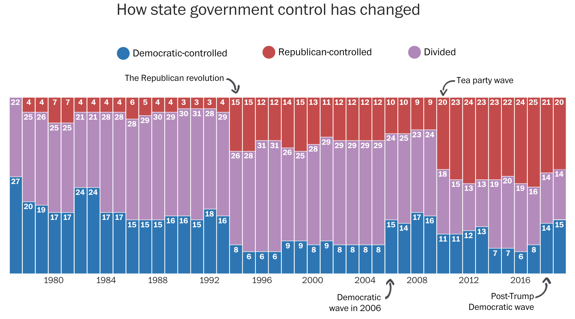
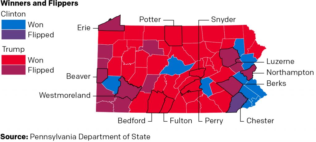
And originally, I had a slightly different conclusion as to how this related to Pennsylvania in the upcoming 2020 election. But, the whole 2020 thing made me shift my thinking slightly. But you’ll have to read the whole thing to understand what I’m talking about. I will leave you with one of the graphics I made for the piece. It looks at who won each county in the state, but also whether or not the candidate was able to flip the county. In other words, was Clinton able to flip a Republican county? Was Trump able to flip a Democratic county?

Who won what? Who flipped what?

Let me know what you think.

And of course, many, many thanks to all the people who suffered my ideas, thoughts, and early drafts over the last several weeks. And even more thanks to those who edited it. Any and all mistakes or errors in the piece are all mine and not theirs.

Credit for the piece is mine.

Parties in Pennsylvania

This is from a social media post I made a few days ago, but think it may be of some relevance/interest to my Coffeespoons followers. I was curious to see at 30+ days from the general election, how has the landscape changed for the two parties since 2016?

Well, this project has driven me to a related, but slightly different project that has been consuming my non-work time. Hopefully I will have more on that in the coming days. Without further ado, the post:

Pennsylvania will likely be one of the more critical battleground swing states in this year’s election. In 2016, then candidate Trump won the state by less than one percentage point. But four years is a long time and I was curious to see how things have changed.

In the first chart on the right we see counties won by Trump and on the left, Clinton. The further from the centre, the greater the candidate’s margin of victory over the other. The top half plots registered Republicans’ margin over Democrats as a percentage of all registered voters in the county (including independents and third party) and the bottom half does the same for Democrats. Closer to the centre, the more competitive, further away, less so.

Trump’s key to victory was the white, working class voter clustered in the west and the northeast of the state–old mining and steel towns. There Democrats normally counted on organised labour support as registered Democrats. That all but collapsed in 2016. The bottom right shows a number of nominally Democratic counties Trump won, whereas Clinton only picked up one Republican county, Chester.

But what are PA’s battlegrounds?

In the second chart we ignore places like Philly and Fulton County and zoom in on more competitive counties within 20 point margins. Polls presently point to a Biden lead of about 5 points in PA. If every dot moved left by 5 points (it doesn’t really work like that), we only see Erie and Northampton with potential to flip.

But Trump’s realignment of politics is accelerating (more on this another day) a realignment of PA’s political geography.

In the fourth chart, neither Erie nor Northampton show any real movement via party registration back to Democrats. Erie may flip, but Northampton’s likely a stretch. Places like Cumberland and Lancaster counties are too solidly Republican to flip this year. Instead Trump is more likely to flip counties like Monroe and Lehigh red, even if he loses the state.

Because, not shown, the key to a Biden victory will be running up the margins in Philly & Pittsburgh, and to a lesser extent Philly’s four collar counties, including Chester, which appears to be rapidly shifting in Democrats’ favour.

Credit for the piece is mine.

Positioning Is Important

Yesterday Pew Research released the results of a survey of how the rest of the world views select countries throughout the world. The Washington Post covered it in an article and created some graphics to support the text. The text, of course, was no big surprise in that the rest of the world views the United States poorly compared to just several years ago and that, in particular, President Trump is a leader in whom the world has no confidence.

But that’s not what I want to talk about. Instead, I want to address a design element in the one of their graphics. (But you should go ahead and read about the survey results.)

The issue here is the positioning of the labels for each bar, representing a world leader. At the very top of the graphic, things are in a good way. We have Merkel with a small space beneath that text then another label, “No confidence, 19 percent”, and then a connecting line to a dot to the blue bar. We then have a small space and the label Macron, meaning we have moved on and are on the next world leader.

But what if the reader sees the title and starts towards the bottom? They want to see the leaders in whom the world has no confidence. Now look at the bottom of the chart and the positioning of the labels for Trump, and above him, Xi, Putin, and maybe even Johnson. Because the “No confidence, x percent” labels have moved further to the right, there is an enormous space between the leader’s name and their coloured bar. Visually, this creates a link between the leader’s name and the preceding bar. For example, Trump appears to have a no confidence value of 78 with an unlabelled bar chart beneath him.

I suggest that there are two easy fixes to better link the labels to the data. The first is to move the leaders’ labels down, once the “No confidence” label has moved sufficiently far to the right. Like so.

The leader is now very clearly attached to his or her data with little confusion.

My second option is to fix the “No confidence” labels permanently to the left of the chart so as not to create that visual space in the first place, like so.

Here, after seeing the first option, I wonder if there is enough visual space at all between the leaders. But, this is only a quick Photoshop exercise. If I wanted to really tweak this, I would consider putting the data point or number in bold to the right of the label.That would eliminate an entire line of type that could be repurposed as a visual buffer between leaders.

I think either option would be preferable because of increased clarity for the reader.

Credit for the piece goes to the Washington Post graphics department.

Axis Lines in Charts

The British election campaign is wrapping up as it heads towards the general election on Thursday. I haven’t covered it much here, but this piece from the BBC has been at the back of my mind. And not so much for the content, but strictly the design.

In terms of content, the article stems from a question asked in a debate about income levels and where they fall relative to the rest of the population. A man rejected a Labour party proposal for an increase in taxes on those earning more than £80,000 per annum, saying that as someone who earned more than that amount he was “not even in the top 5%, not even the top 50”.

The BBC looked at the data and found that actually the man was certainly within the top 50% and likely in the top 5%, as they earn more than £75,300 per annum. Here in the States, many Americans cannot place their incomes within the actual spreads of income. The income gap here is severe and growing.  But, I want to look at the charts the BBC made to illustrate its points.

The most important is this line chart, which shows the income level and how it fits among the percentages of the population.

Are things lining up? It's tough to say.
Are things lining up? It’s tough to say.

I am often in favour of minimal axis lines and labelling. Too many labels and explicit data points begin to subtract from the visual representation or comparison of the data. If you need to be able to reference a specific data point for a specific point on the curve, you need a table, not a chart.

However, there is utility in having some guideposts as to what income levels fit into what ranges. And so I am left to wonder, why not add some axis lines. Here I took the original graphic file and drew some grey lines.

Better…
Better…

Of course, I prefer the dotted or dashed line approach. The difference in line style provides some additional contrast to the plotted series. And in this case, where the series is a thin but coloured line, the interruptions in the solidity of the axis lines makes it easier to distinguish them from the data.

Better still.
Better still.

But the article also has another chart, a bar chart, that looks at average weekly incomes across different regions of the United Kingdom. (Not surprisingly, London has the highest average.) Like the line chart, this bar chart does not use any axis labels. But what makes this one even more difficult is that the solid black line that we can use in the line charts above to plot out the maximum for 180,000 is not there. Instead we simply have a string of numbers at the bottom for which we need to guess where they fall.

Here we don't even a solid line to take us out to 700.
Here we don’t even a solid line to take us out to 700.

If we assume that the 700 value is at the centre of the text, we can draw some dotted grey lines atop the existing graphic. And now quite clearly we can get a better sense of which regions fall in which ranges of income.

We could have also tried the solid line approach.

But we still have this mess of black digits at the bottom of the graphic. And after 50, the numbers begin to run into each other. It is implied that we are looking at increments of 50, but a little more spacing would have helped. Or, we could simply keep the values at the hundreds and, if necessary, not label the lines at the 50s. Like so.

Much easier to read
Much easier to read

The last bit I would redo in the bar chart is the order of the regions. Unless there is some particular reason for ordering these regions as they are—you could partly argue they are from north to south, but then Scotland would be at the top of the list—they appear an arbitrary lot. I would have sorted them maybe from greatest to least or vice versa. But that bit was outside my ability to do this morning.

So in short, while you don’t want to overcrowd a chart with axis lines and labelling, you still need a few to make it easier for the user to make those visual comparisons.

Credit for the original pieces goes to the BBC graphics department.

From Order to Chaos?

A few weeks ago we said farewell to John Bercow as Speaker of the House (UK). Whilst I covered the election for the new speaker, I missed the opportunity to post this piece from the BBC. It looked at Bercow’s time in office from a data perspective.

The piece did not look at him per se, but that era for the House of Commons. The graphic below was a look at what constituted debates in the chamber using words in speeches as a proxy. Shockingly, Brexit has consumed the House over the last few years.

At least climate change has also ticked upwards?

I love the graphic, as it uses small multiples and fixes the axes for each row and column. It is clean, clear, and concise—just what a graphic should be.

And the rest of the piece makes smart use of graphical forms. Mostly. Smart line charts with background shading, some bar charts, and the only questionable one is where it uses emoji handclaps to represent instances of people clapping the chamber—not traditionally a thing that  happens.

Content wise it also nailed a few important things, chiefly Bercow’s penchant for big words. The piece did not, however, cover his amazing sense of sartorial style vis-a-vis neckties.

Overall a solid piece with which to begin the weekend.

Credit for the piece goes to Ed Lowther & Will Dahlgreen.

Casual Fails?

In a recent Washington Post piece, I came across a graphic style that I am not sure I can embrace. The article looked at the political trifecta at state levels, i.e. single political party control over the government (executive, lower legislative chamber, and upper legislative chamber). As a side note, I do like how they excluded Nebraska because of its unicameral legislature. It’s also theoretically non-partisan (though everybody knows who belongs to which party, so you could argue it’s as partisan as any other legislature).

At the outset, the piece uses a really nice stacked bar chart. It shows how control over the levers of state government have ebbed and flowed.

You can pretty easily spot the recent political eras by the big shifts in power.

It also uses little black lines with almost cartoonish arrowheads to point to particular years. The annotations are themselves important to the context—pointing out the various swing years. But from an aesthetic standpoint, I have to wonder if the casualness of the marks detracts from the seriousness of the content.

Sometimes the whimsical works. Pie charts about pizza pies or pie toppings can be whimsical. A graphic about political control over government is a different subject matter. Bloomberg used to tackle annotations with a subtler and more serious, but still rounded curve type of approach. Notably, however, Bloomberg at that time went for an against the grain, design forward, stoic business serious second approach.

Then we get to a choropleth map. It shows the current state of control for each state.

X marks the spot?

X marks the spot?However, here the indicator for recent party switches is a set of x’s. These have the same casual approach as the arrows above. But in this case, a careful examination of the x’s indicates they are not unique, like a person drawing a curve with a pen tool. Instead these come from a pre-determined set as the x’s share the exact same shape, stroke lengths and directions.

In years past we probably would have seen the indicator represented by an outline of the state border or a pattern cross-hatching. After all, with the purple being lighter than the blue, the x’s appear more clearly against purple states than blue. I have to admit I did not see New Jersey at first.

Of course, in an ideal world, a box map would probably be clearer still. But the curious part is that the very next map does a great job of focusing the user’s attention on the datapoint that matters: states set for potential changes next November.

Pennsylvania is among the states…

Here the states of little interest are greyed out. The designers use colour to display the current status of the potential trifecta states. And so I am left curious why the designers did not choose to take a similar approach with the remaining graphics in the piece.

Overall, I should say the piece is strong. The graphics generally work very well. My quibbles are with the aesthetic stylings, which seem out of place for a straight news article. Something like this could work for an opinion piece or for a different subject matter. But for politics it just struck a loud dissonant chord when I first read the piece.

Credit for the piece goes to Kate Rabinowitz and Ashlyn Still.

The Shifting Suburbs

Last we looked at the revenge of the flyover states, the idea that smaller cities in swing states are trending Republican and defeating the growing Democratic majority in big cities. This week I want to take a look at something a few weeks back, a piece from CityLab about the elections in Virginia, Kentucky, and Mississippi.

There’s nothing radical in this piece. Instead, it’s some solid uses of line charts and bar charts (though I still don’t generally love them stacked). The big flashy graphic was this, a map of Virginia’s state legislative districts, but mapped not by party but by population density.

Democrats now control a majority of these seats.

It classified districts by how how urban, suburban, or rural (or parts thereof) each district was. Of course the premise of the article is that the suburbs are becoming increasingly Democratic and rural areas increasingly Republican.

But it all goes to show that 2020 is going to be a very polarised year.

Credit for the piece goes to David Montgomery.

Revenge of the Flyover States

Just before Halloween, NBC News published an article by political analyst David Wasserman that examined what airports could portend about the 2020 American presidential election. For those interested in politics and the forthcoming election, the article is well worth the read.

The tldr; Democrats have been great at winning over cosmopolitan types in global metropolitan areas in the big blue states, e.g. New York and California. But the election will be won in the states where the metropolitan areas that sport regional airports dominate, i.e. Pennsylvania, Michigan, Wisconsin, and North Carolina. And in those districts, support for Democrats is waning.

The closing line of the piece sums it up nicely:

…to beat Trump, Democrats will need to ask themselves which candidates’ proposals will fly in Erie, Saginaw and Green Bay.

But what about the graphics?

We have a line chart that shows how support for Democrats has been increasing amongst those in the global and international airport metros.

Democrats aren't performing well with the non-global and international types of metros
Democrats aren’t performing well with the non-global and international types of metros

It uses four colours and I don’t necessarily love that. However, it smartly ties into an earlier graphic that did require each series to be visualised in a different colour. And so here the consistency wins out and carries on through the piece. (Though as a minor quibble I would have outlined the MSA being labelled instead of placing a dot atop the MSA.)

A lot of these global metros are in already blue states

The kicker, however is one of those maps with trend arrows. It shows the increasing Republican support by an arrow anchored over the metropolitan area.

Lot of Trump support in the battleground states

The problem here is many-fold. First, the map is actually quite small in the overall piece. Whereas the earlier maps sit centred, but outside the main text block, this fits neatly within the narrow column of text (on a laptop display at least). That means that these labels are all crowded and actually make it more difficult to realise which arrow is which city. For example, which line is Canton, Ohio? Additionally with the labels, because they are set in black text and a relatively bolder face, they standout more than the red lines they seek to label. Consequently, the users’ focus falls not on the lines, but actually on the labels—the reverse of what a good graphic should do.

Second, length vs. angle. If all lines moved away from their anchor at the same angle, we could simply measure length and compare the trending support that way. However, it is clear from Duluth and Green Bay that the angles are different in addition to their sizes. So how does one interpret both variables together?

Third, I wonder if the map would not have been made more useful with some outlines or shading. I may know what the forthcoming battleground states are. And I might know where they are on a map. But Americans are notorious for being, well, not great when it comes to geography. A simple black outline of the states could have been useful, though it in this design would have conflicted with the heavy black labelling of the arrows. Or maybe a purple shading could have been used to show those states.

Overall, the piece is well worth a read and the graphics generally help tell the narrative visually. But that final graphic could have used a revision or two.

Credit for the piece goes to Jiachuan Wu and Jeremia Kimelman.

Hoyle’s House

John Bercow is no longer the British Speaker of the House. He left office Thursday. Fun fact: it is illegal for an MP to resign. Instead they are appointed to a royal office, in Bercow’s case the Royal Steward of the Manor of Northstead, that precludes them from being an elected MP. Consequently the House of Commons then had to elect a new Speaker.

For my American audience, despite the same title as Nancy Pelosi, John Bercow had a very different function and came to it in a very different fashion. First, the position is politically neutral. Whoever the House elects resigns from his or her party (along with his or her three deputies) and the political parties abide by a gentlemen’s agreement not to contest the seat in general elections. (The Tories were so displeased with Bercow they were actually contemplating running somebody in the now 12 December election to get rid of him.) Consequently, the Speaker (and his or her deputies) do note vote unless there is a tie. (Bercow actually cast the first deciding vote by a speaker since 1980 back in April.)

Because the position is politically neutral, all MPs vote in the election and debate is chaired by the Father of the House, the longest continuously serving MP in the House. Today that was Ken Clarke, one of the 21 MPs Boris Johnson booted from the Tory party for voting down his No Deal Brexit and who is not standing in the upcoming election. The candidates for Speaker must receive the vote of 50% of the House. And so they are eliminated in successive votes until someone reaches 50% of the total votes cast, though not all MPs cast votes, since some have already started campaigning. (Today there were 562, 575, 565, 540 votes per round.)

Notably, today’s vote occurs just days before Parliament dissolves prior to the 12 December election. Bercow, who chose to retire on 31 October, essentially ensured that the next Parliament will have a Speaker not chosen what could well likely be a pro-No Deal Brexit, one of the things which the Tories have against him.

So all that said, who won? Well I made a graphic for that.

A very different accent will occupy the big green chair.

Credit for the piece goes to me.

Canadian Election Results

Yesterday Canada went to the polls for the 43rd time. Their prime minister, Justin Trudeau, has had a bad run of it the last year or so. He’s had some frivolous scandals with wearing questionable fashion choices to some more serious scandals about how he chose to colour his face in his youth to arguably the most serious scandal where an investigation concluded improperly attempted to influence a criminal investigation for political gain. (Sound familiar, American readers?) Consequently, there was some chatter about whether he would lose to the Conservatives.

But nope, Trudeau held on.

So this morning I charted some of the results. It was a bad night for Trudeau, but not nearly as bad as it could have been. He remains in power, albeit head of a minority government.

That's a steep drop in seats, but it could have been worse
That’s a steep drop in seats, but it could have been worse

Credit for the piece goes to me.