Understanding the Boston Subway System

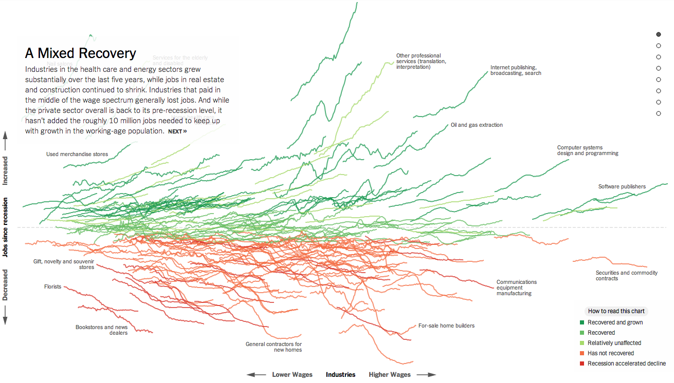
Today’s post is the graduate work of Michael Barry and Brian Card of Worcester Polytechnic Institute. The two looked at the available public data of the Massachusetts Bay Transportation Authority (MBTA)—the T to those that know—to better understand the Boston area subway system. Here the subway system refers to the heavy rail lines, i.e. the Blue, Orange, and Red lines.

T stations
T stations

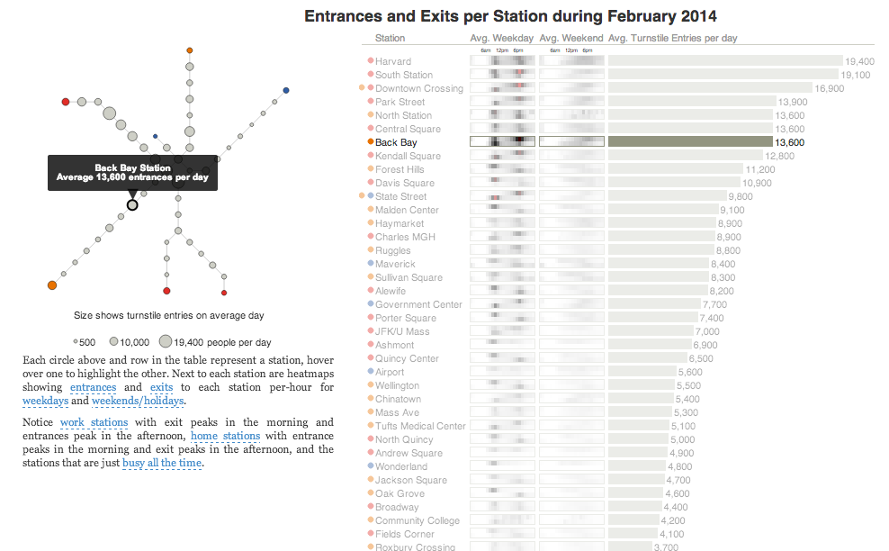
In short, the piece has a lot to look at that is worth looking at. This particular screenshot is an analysis of the stations across all times on average weekdays and weekends. You can see how in this particular selection, the size of the station markers pulse depending upon the time of day and the number of turnstile entries. Meanwhile the charts to the right show you the density through time of said entries and then compares the average number of turnstiles entries per day. Text beneath the system map to the left provides a short analysis of the data, highlighting work vs. home stations.

Credit for the piece goes to Michael Barry and Brian Card.

Viewing the Economy All at Once

Normally I try to reserve Fridays for the lighter stuff. But yesterday, the New York Times published a really fantastic piece about how the Great Recession changed the American economy through job growth or loss in each sector of the economy. Naturally this sounds very difficult because the American economy is both very large and very diverse.

Job growth in the American economy

If you check the piece out, however, you will find that you are offered a guided tour with analysis to provide context to an otherwise jumble of coloured lines. As a bonus, highlighted words in the text bring up small charts showing the actual job growth history for the particular sector. The jumble, however, is also organised along the x and y axes by two important metrics: wages and jobs since the Great Recession. This allows you to see whether low wage jobs have performed better than higher paying and whether either has created more jobs than the other. Line colouration denotes whether a particular sector has grown and recovered, recovered, not recovered, or recession accelerated a previous decline.

Then at the very end is another really great part of the piece. This is a collection of all the small charts arranged by areas of the economy.

View sectors individually as small multiples

Lastly, for those of you who have to work on smaller screens, don’t worry, they made it responsive. Overall, a great piece.

Credit for the piece goes to Jeremy Ashkenas and Alicia Parlapiano.

White Racism in America

Racism is a long-standing problem for humanity. But in the wake of the Donald Sterling scandal in the NBA, the New York Times put together a graphic looking at white attitudes towards blacks in the United States. The data reveals that while racist views are down from highs decades past, there is still a substantial amount.

Racism in America
Racism in America

From a design standpoint, I would have probably added some sort of axis label. Additionally, I would have removed that topmost segment and used the space for the labelling.

Credit for the piece goes to Amanda Cox.

Home Ownership

I am pretty much a sucker for small multiples. And so today I present a good one from the Washington Post. The story starts looking at the broad, national scope of the issue. And from there it breaks home ownership down by state.

Home ownership by state

Credit for the piece goes to the Washington Post’s graphics department.

Defence Spending

As troops and tanks and rumble around the Ukrainian–Russian border, I was left to wonder just how NATO has been doing with defence spending. So I took defence spending as a share of total GDP. In general, NATO countries have been spending less since the end of the Cold War. The Baltic states are a bit of an exception. I would guess that is based on their fears of their big Russian neighbour. A fear that, as Ukraine shows, is not entirely irrational. The United States, of course, has been spending a lot because of Afghanistan and Iraq. As for Russia, after the collapse of its economy in the late 1990s, it’s been spending more and more on the military.

Defence spending
Defence spending

The data comes from the World Bank.

Tax Day and Income Inequality

Tax Day for Americans seems like a great time to talk about income inequality. The article from which this chart comes talks about a recent book exploring the parallels of the 19th century’s inequality—as the article reminds us, the time of “Please, sir, may I have another?”—and the forecast for the 21st. Anyway, the graphic is a nice use of small multiples and highlights that despite the damage done to capital wealth by Great Depressions and two world wars, it is well on its way back to unequal levels.

Income inequality
Income inequality

Credit for the piece goes to the New York Times graphics department.

Recent Military Expenditure

The Crimean situation has highlight how much not just Ukraine is not ready to fight Russia, but also how much less Western Europe is prepared to fight. This piece from the Washington Post examines actual defence expenditure and then defence expenditure as a share of GDP. While Europe has remained steady or in decline, Russia has been ramping up its defence spending since the beginning of the 21st century.

Defence spending
Defence spending

Credit for the pieces goes to Patterson Clark.

Maps for the Search of MH 370

Yesterday we looked at the USA Today’s piece on the search for MH 370. Today we look at the New York Times, which has been running a series of maps that offer increasing amounts of detail on the context for the search.

Movement of buoys
Movement of buoys

Credit for the piece goes to Josh Keller, Sergio PeÇanha, Shreeya Sinha, Archie Tse, Matthew L. Wald, Tim Wallace, Derek Watkins, and Karen Yourish.

Maps Being Useful

I often rail against the use of maps. I often hear “They’re pretty!” or “They’re colourful!” or “But I really do know where Guatemala is!” or “I can see my house!”. They’re often just a crutch, unless you can use them to show an actual geographic distribution. Thankfully from Quartz we get a series of small multiple maps that look at the geographic distribution of top trading partners for a select set of geographies.

Global trade
Global trade

For this set, I think the colours could be the same and perhaps the chosen country perhaps outlined or otherwise signalled on the map. (Only because my utter lack of faith in people being able to identify countries on a map.) Still, it’s a good piece overall that makes nice use of maps.

Credit for the piece goes to David Yanofsky.

The Science Behind the Thoroughbred

I do not know a thing about horses. I leave that knowledge to others in my family. However, this piece from the South China Morning Post explains quite a bit of why the thoroughbred is such a famous type of horse for racing.

The science behind thoroughbreds

Credit for the piece goes to Alberto Lucas López.