Much Improved Mapping of American Migration

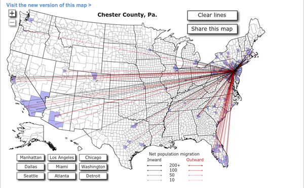
Forbes released Jon Bruner’s latest map of migration in the United States. It uses IRS figures to show inbound and outbound movement from counties across the United States. The work itself is an improvement from his map from last year, which was a bit more difficult to read. Beneath is the new version, and at the end, for comparison, the old.
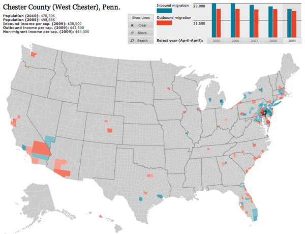
This year's migration map

Firstly, the colour palette is far more sophisticated. Secondly, and most crucially, the user can hide the lines on the map, which obscures a key part of the story of migration in urban areas—higher income people moving out of the city and into the suburbs. Thirdly, the map data now includes additional years, which are available by clicking the small chart in the upper right—a welcome addition that allows the data from last year’s map to become accessible this year. Fourthly, and to be fair this may have existed previously but not that I can recall, the new map is accompanied by essays.

These essays use the map and its data to tell stories and explain what one sees going on with the data. It is (relatively) easy for one to put together a piece of data visualisation from a data set. But, without knowing where to look, users may not actually find anything valuable in the visualisation. By pointing to these essays, the map—already much improved from a design perspective—takes on a much more rounded and mature character and becomes more about generating information and knowledge than simply figures and statistics.
Last year's migration map

Income Segregation in the Philadelphia Metro Area

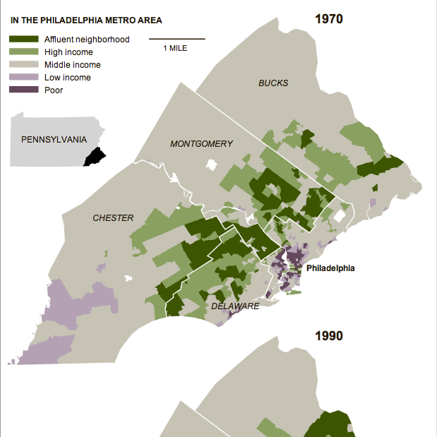
In an area very close to me…quite literally…the New York Times published an article about increasing segregation between the rich and the poor via the areas where they live. The study by Stanford University found that the Philadelphia metropolitan area saw the “sharpest rise” in segregation since the 1970s—the study used census data available through 2007. The accompanying graphic highlights the growth of the segregation from 1970, using small multiples of choropleths to compare 1970 to 1990 to 2007.

In 1970, much of the metro area was middle-income neighbourhoods. Certainly, the central core of Philadelphia was depressed. So too was Chester and rural southwestern Chester County. The upper-income neighbourhoods were in the close suburbs, note the townships stretching due west of the city and you see the Main Line, one of the most affluent areas of the United States, while other veins of wealth extend along other old rail lines leaving the city.

Neighbourhoods by Income in 1970

Those such as myself who are familiar with both the area and recent history should note that places like Coatesville and Downingtown are shown as middle-income. In the 1970s, areas like this and in similar places like Falls Township in Bucks County had robust steel and manufacturing sectors that employed a substantial portion of the local population.

But, compare this to 2007 and you will begin to see how many old factory towns of middle-income areas became dense pockets of depression while the city of Philadelphia itself saw a flight of wealth to the rest of the suburbs. The rural parts of Chester, Montgomery, and Bucks have seen high growth by means of new developments of upper-middle- and upper-income homes.

Hispanic Growth in the Plains

There is a scene in the re-imagined Battlestar Galactica where with the human population almost extinct, one character comments on the romances of two others by saying “they better start having babies”.

The demographics of the United States are changing. Not that they were not changing prior to recent years; Native American populations were reduced by English and Scottish settlers; the English and Scottish populations were diluted by Germans; then came the Irish and the Italians; then the Slavs; then Chinese—simplistic, but you get the idea.

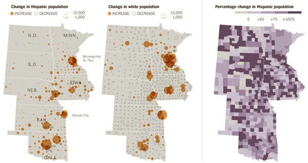
Now, in the Midwest, as the New York Times reports in both an article and its supporting graphic, the long-established relative decline of the United States’ white population is being checked by a surge in Hispanic growth, especially in the rural plains states.

Hispanic Growth in the Plains

I am never so much a fan of the circles as sizes of population—a choropleth would have worked equally well—but it does suffice for this graphic. My larger concern is that the graphic measures growth but does not state growth between what years. Presumably, though the data is sourced from Queens College Department of Sociology, it originates in census figures. That would most likely mean growth between 2000 and 2010.

7 Billion Is a Big Number

We have seven billion living on the planet today. Or at least we think we do. Really, who knows? But for the sake of this blog post and many others like it along with news stories and water cooler conversations, let’s just say we’re at seven billion, okay?

So where do you fit into the giant seven billion-ness of the world?

The BBC can tell you.

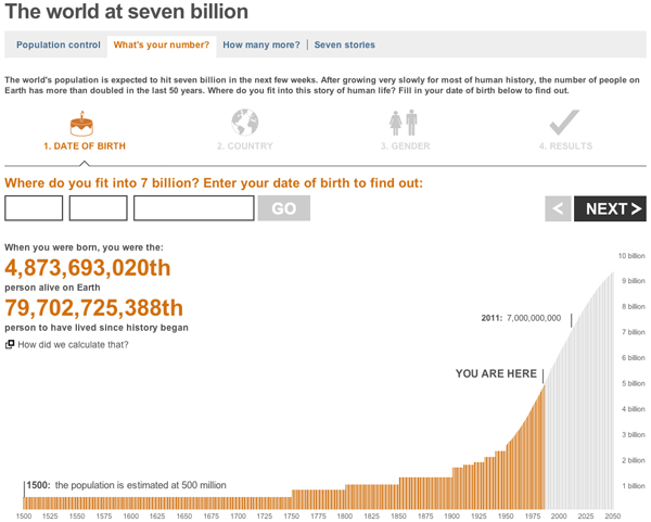
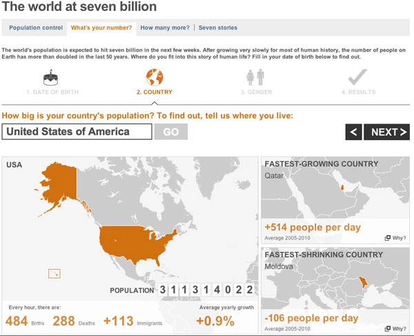
You enter a few data points such as your birthday and the country in which you live, and you get a customised you-are-a-unique-snowflake report on how special you are.

The graphs are not particularly fancy, but they work. More interesting of the whole set is the world population where you are placed in the context of the global population.

Where You Fit Within the World Population
Where Your Country of Residence Fits Within the World

Less interesting are the maps, which serve only to show you where in the world your country is located and then those of the greatest and least population growth or life expectancy. The secondary cases could be useful if the countries were small and relatively unknown. But in terms of life expectancy the highest growth is Japan most people know where Japan is located. The other countries noted, Qatar, Moldova, and the Central African Republic are probably less well-known by some, but could the data be better represented? Probably.

Riding the Rail to London?

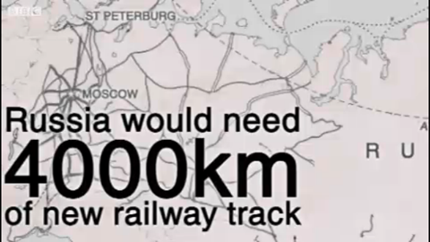
Long time readers know by now that I advocate high-speed rail and similar transport infrastructure investment. The following screenshot was taken from a BBC News video about the Russian proposal to build an underground passenger/freight tunnel beneath the Bering Strait to connect eastern Siberia to Alaska.

Screenshot from the video explaining the plan

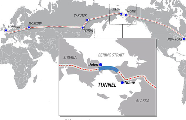
The video is not an infographic, strictly speaking, but as a motion graphic it depicts the routes needed and compares the length of the proposed tunnel to that of the Chunnel, the tunnel beneath the English Channel. Back in August the Daily Mail also reported on the story and provided the following map showing how exactly the system would then link the Eastern Hemisphere to the Western Hemisphere.

Map of the Proposed Route

Of course the big questions that remain are can Russia afford to build the tunnel, will the United States build the rails necessary to link it to the main US–Canadian rail network, and would anyone really use it?

The Northeast Passage

The Northeast Passage was supposed to be a shortcut to Asia from Europe through an open waterway in North America. Many tried to find the route. They failed. Because we have a mountain range running from the northernmost part of North America to the Isthmus of Darien where, perhaps desperate for the route, we dug the Panama Canal.

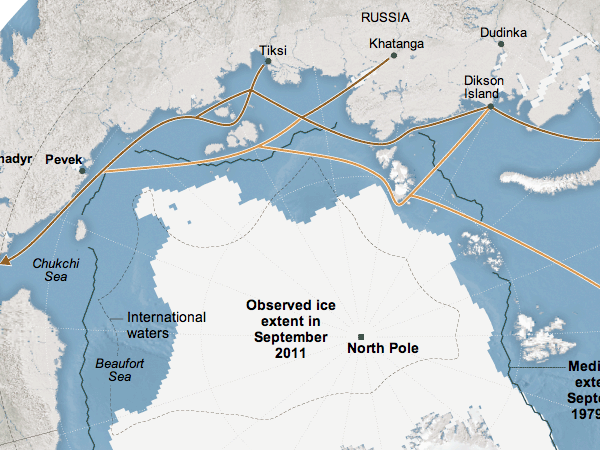
Climate change, however, is shrinking the Arctic ice cap and making the northern shores of Canada, Russia, the US and a few others navigable. True, the best times for travel are in summer. True, there are still icebergs the further from the coast you go. But you can now travel the Northeast Passage, sailing north from Japan, skirting the Russian coast and then down the North Sea into the commercial ports of northern Europe.

The New York Times has a piece about the improving business opportunities for those daring enough to ply the route. Accompanying the article is this map, a cropping of which appears below.

The Northeast Passage

Glaciers Aren’t So Slow After All…

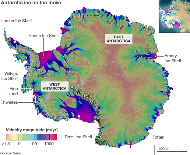
Antarctica is a continent way down at the southern end of the world. It is covered almost entirely by glaciers. But glaciers move, and NASA and the University of California unveiled a map looking at the speed of the glaciers’ movements. Along with it, an interesting little video showing the tributaries to the glacial flow.

Glacial Flow Map
Glacial Flow Map

from the BBC.

Back in the USSR

So, those of you a little bit older than me—not to date myself—probably remember the evil Reds of Soviet Russia. Some my age do as well. Younger than me, it’s probably all ancient history. And so for those of you who forget, the Union of Soviet Socialist Republics was, if I am to simplify, a Russian empire that featured a centralised, command and control economy and a dictatorial government. In 1991, the empire fell apart for a number of reasons and became 15 independent countries, Russia still being the largest. And a lot has happened in the twenty years between 1991 and 2011.

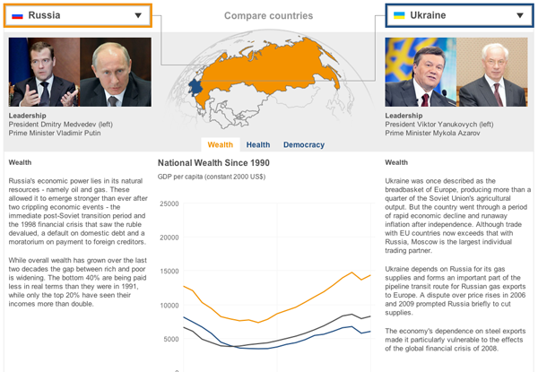
Twenty years being a long time, the BBC has remembered the event by creating a relatively simple piece that compares the fates of the various countries in the aftermath of the Soviet Union’s breakup. One takes one drop-down list and selects a country and then another country from the other list. And in the centre one can control whether the comparison is of wealth (GDP), health (life expectancy), or leadership (no. of times the presidency has changed hands).

Comparing Russia to the Ukraine

I have an issue with some of the metrics and whether they are the best suited to describe the wealth, health, and democracy of the former Soviet republics. But, I think the strength really is not so much the charts but the brief summaries for each country that try to capture the story of the past two decades.

Tracking This Hurricane Season

Living in Chicago, hurricane season means rather little. Perhaps at worst the city would see a major rain system moving up from Texas or the Gulf Coast. But, from all my time living on the East Coast makes hurricane season a bit more meaningful if now just as an outside observer. The Weather Channel has launched a site called the Hurricane Tracker that allows you to follow the current season’s storms.

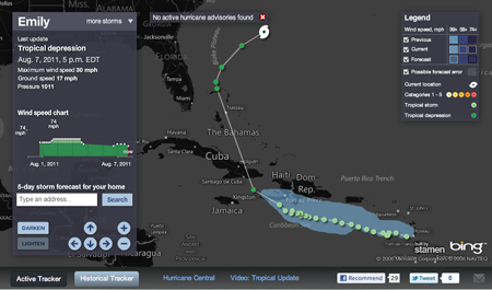
Active Tracker
Active Tracker

While there has yet to be any major activity, there have been a few named tropical systems that are present in what is called the Active Tracker. The storms are tracked geographically, showing you the precise locations where the storm was recorded and then filling out the path between points. The data includes information on strength—hurricanes are classed on a 1–5 scale with 5 being really most unpleasant—such as windspeed and pressure—hurricanes are enormous low pressure systems. The panel on the left of the screen provides a detailed history of the storm and links the recorded data points to the corresponding geographic points on the map. Currently, the storms have all been relatively minor and short-lived; watching a major storm of some duration through the charts and the map progression could be quite fascinating.

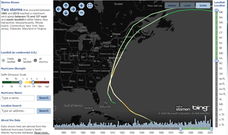
Historical Tracker
Historical Tracker

But there is also the Historical Tracker that catalogues an impressive number of previous storms. The view first loads with an overwhelming number of storm tracks, but filters for controlling the years—which includes a interactive mini-graphic of the total number of storms for each year that when clicked filters for only that year—and for location of landfall begin to significantly bring your search or exploration into focus. I have yet to find any detailed information about specific storms, the one in this screenshot being those that made landfall in the Northeast roughly during my lifespan. (I have memories of being at the shore during Hurricane Bob with the winds and rain and warning sirens making an impression.) You cannot click to focus on a particular storm, instead, a mouseover is the only way of discovering the name of a particular track. But, that may simply be an unavailable level of data, especially with the storms from the 19th and early 20th centuries.

Now I just hope we can use this sort of information to help develop better forecasting and modelling to help save lives and property.

Credit for the design goes to Stamen Design.