We have seven billion living on the planet today. Or at least we think we do. Really, who knows? But for the sake of this blog post and many others like it along with news stories and water cooler conversations, let’s just say we’re at seven billion, okay?
So where do you fit into the giant seven billion-ness of the world?
The BBC can tell you.
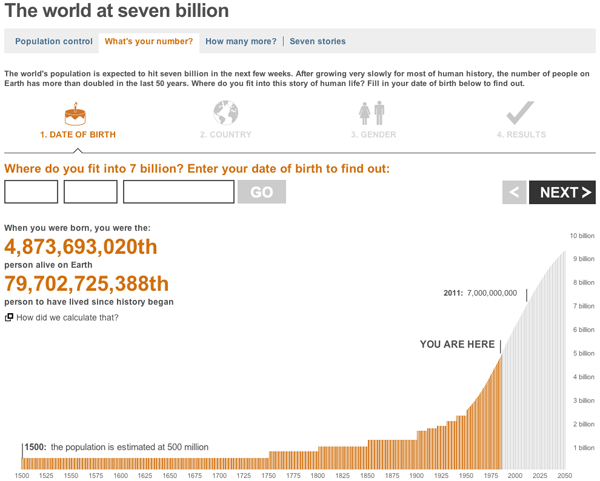
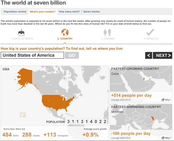
You enter a few data points such as your birthday and the country in which you live, and you get a customised you-are-a-unique-snowflake report on how special you are.
The graphs are not particularly fancy, but they work. More interesting of the whole set is the world population where you are placed in the context of the global population.


Less interesting are the maps, which serve only to show you where in the world your country is located and then those of the greatest and least population growth or life expectancy. The secondary cases could be useful if the countries were small and relatively unknown. But in terms of life expectancy the highest growth is Japan most people know where Japan is located. The other countries noted, Qatar, Moldova, and the Central African Republic are probably less well-known by some, but could the data be better represented? Probably.
Leave a Reply
You must be logged in to post a comment.