I am a graphic designer who focuses on information design. My day job? Well, they asked me not to say. But to be clear, this blog is my something I do on my own time and does not represent the views of…my employers. I think what I can say is that given my interest in information design—be it in the shape of clear charts, maps, diagrams, or wayfinding systems—I am fortunate that my day job focuses on data visualisation. Outside of work, I try to stay busy with personal design work. Away from the world of design, I have become an amateur genealogist and family historian. You will sometimes see that area of work bleed into my posts.
Seth Meyers debuted his new show last month. And in the debut he used Venn diagrams to tell jokes. And while I was going to poke fun at Arizona, the opportunity for the joke disappeared a few weeks ago. So instead, I will take the time to show another.
Today’s post is not news-related for a change. (Don’t worry, I’ll likely get back to that next week.) Instead, we have a new collection of mobile data visualisations curated by Sebastian Sadowski. You can choose to see either smartphone or tablet visualisations and then filter by visual form.
Smartphone Data Visualisation
Credit for the site goes to Sebastian Sadowski, to the various works to the various designers.
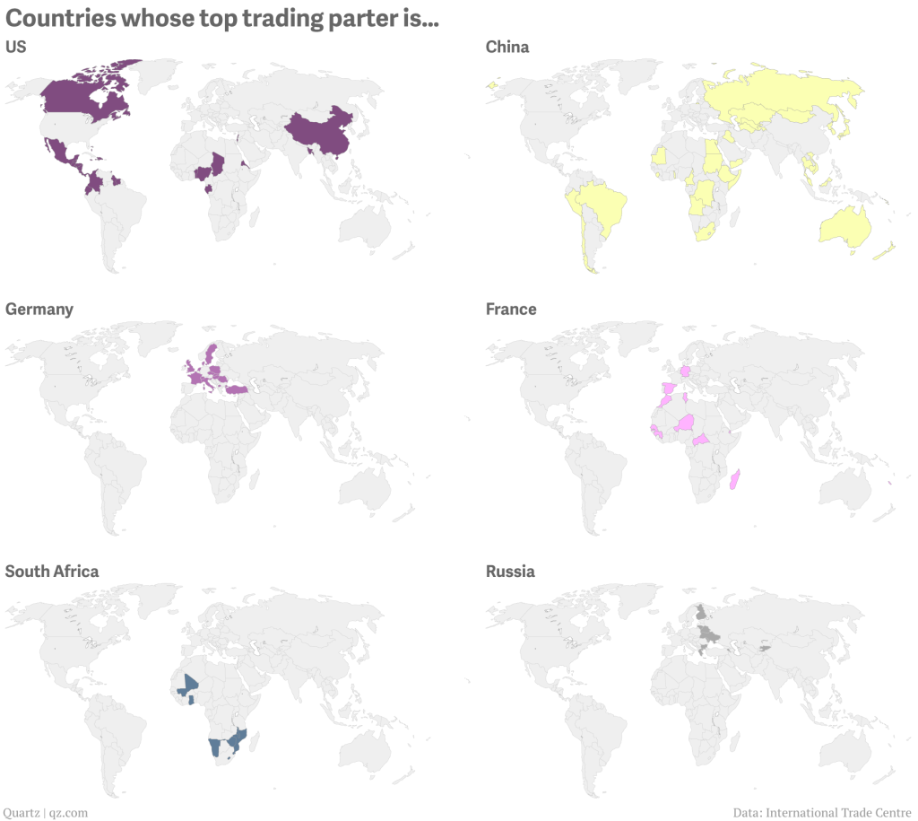
I often rail against the use of maps. I often hear “They’re pretty!” or “They’re colourful!” or “But I really do know where Guatemala is!” or “I can see my house!”. They’re often just a crutch, unless you can use them to show an actual geographic distribution. Thankfully from Quartz we get a series of small multiple maps that look at the geographic distribution of top trading partners for a select set of geographies.
Global trade
For this set, I think the colours could be the same and perhaps the chosen country perhaps outlined or otherwise signalled on the map. (Only because my utter lack of faith in people being able to identify countries on a map.) Still, it’s a good piece overall that makes nice use of maps.
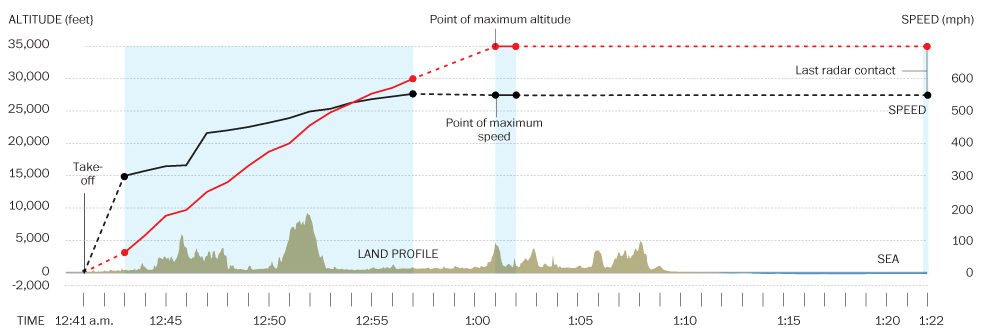
Ukraine has dominated the news much of the last few weeks. But the new 24/7 international news story is the missing aircraft (at least as of my writing this) that was Malaysia Airlines Flight 370. There are presently two nice graphics I have seen attempting to explain the story. The first, a cropping of which is below, is from the Washington Post.
The Washington Post piece
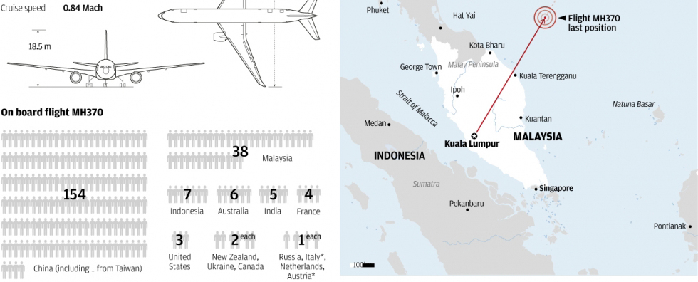
The second piece, again another cropping, is from the South China Morning Post.
South China Morning Post’s graphic
Credit for the Washington Post piece goes to Gene Thorp, Alberto Cuadra, Laris Karklis, and Richard Johnson.
Credit for the South China Morning Post piece goes to the South China Morning Post graphics department.
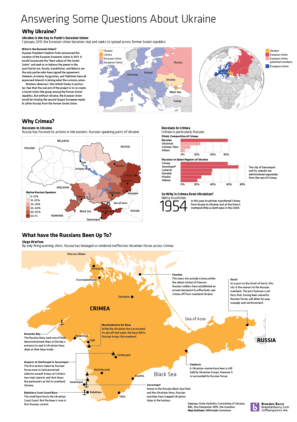
So Ukraine is even more of a mess and in less than a week’s time, the Crimean people will vote in a referendum on whether they want to remain a part of Ukraine or rejoin Russia. This graphic of mine is an attempt to answer some questions—though hardly all I wanted—about Ukraine, Crimea, and about what the Russians have been doing. (To be fair, the Russians still don’t admit that the troops and soldiers are theirs. But really, I mean come on, we all know they are.)
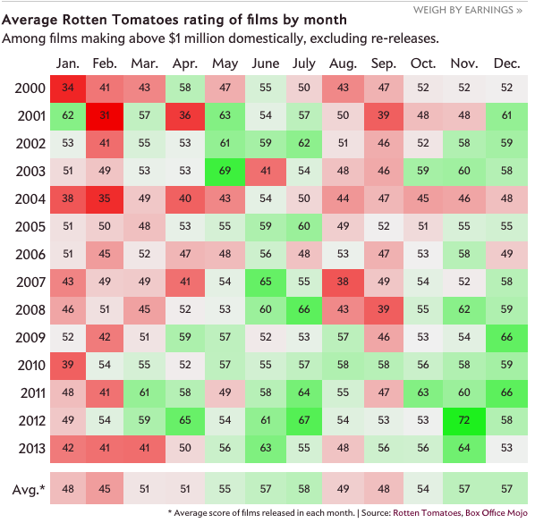
Did you go to the cinema in February? Well, according to some research done by Slate, what you watched probably sucked. I’m just glad I never went last month. Maybe March will be a little bit better.
Bad films seem to define February
Credit for the piece goes to Chris Kirk and Kim Thompson.
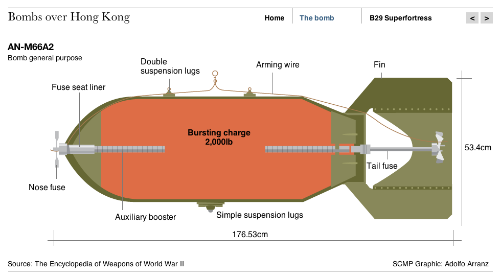
Last month, police in Hong Kong defused a 2000 pound (900 kilogram) bomb found undetonated since World War II. The South China Morning Post created a small graphic to diagram just what the bomb was and how it was delivered (by US aircraft) to Hong Kong.
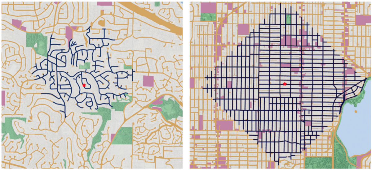
Business Insider posted a neat graphic that compared the walkability of a suburban neighbourhood outside Seattle to a dense urban neighbourhood in Seattle. Turns out you can walk a lot more and further in a gridded mile than in a faux-organic sprawl.
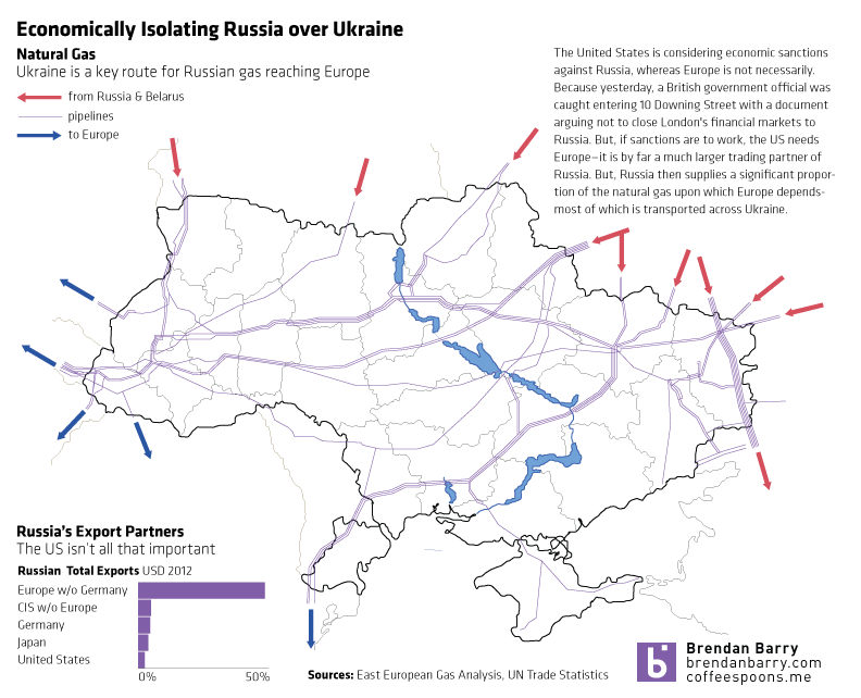
The West hesitates to use military force to push Russian troops out of Crimea. Likely with good reason as any such campaign would be neither cheap nor bloodless in addition to running the risk of spreading beyond the borders of Ukraine. So that leaves diplomatic and economic isolation. Diplomatic isolation is already underway—the G8 conference to be hosted in Sochi this summer is all but dead. But economic isolation is still being discussed.
Isolating Russia
The United States is generally in favour, but Europe—namely Germany—has been more cautious. But as my graphic shows, without Europe a sanctions regime would be largely toothless since half of Russia’s exports go to Europe. Except that Russia is also responsible for a significant proportion of Europe’s imported natural gas and sanctions on Russia could cause an interruption in that fuel to Western Europe. Naturally, most of that natural gas is, of course, transported through pipelines running across Ukraine.
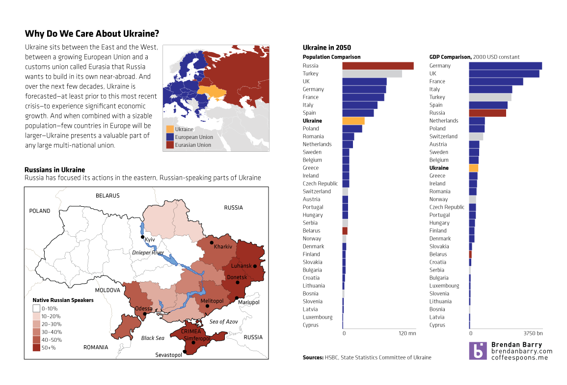
A lot of things happened in Ukraine this past weekend. Unfortunately, I was not able to quite capture all of the events and the background I wanted. So, until I do, this quick graphic will have to suffice. In short, Ukraine is a big European country, one of the largest prizes remaining in the struggle between the West/EU and the East/Russia. I took a look at the forecast for Ukraine in 2050 for both number of people and the size of the economy and put that in the context of Europe. And while forecasting that far out clearly has risks, one can see with a grain of salt that Ukraine is set to be an important middle-sized European nation.
A quick introduction to Ukraine
But, like I said, there is more to do. I just was not able to do it.