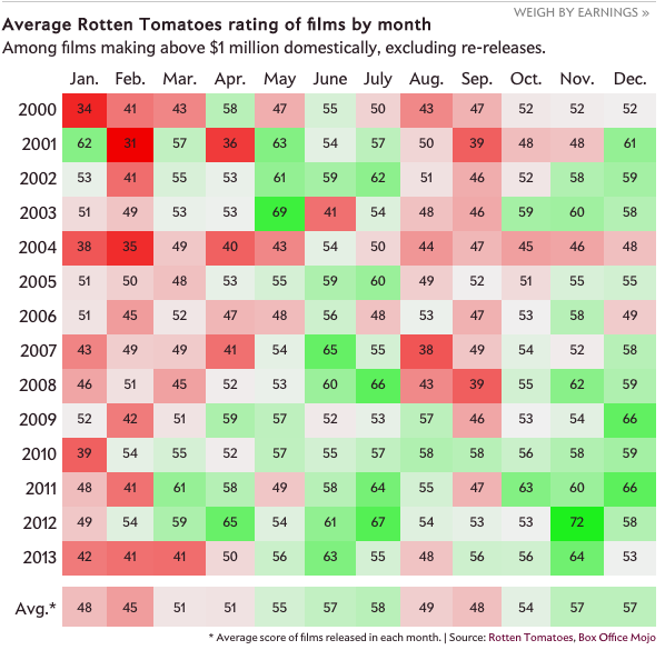
Did you go to the cinema in February? Well, according to some research done by Slate, what you watched probably sucked. I’m just glad I never went last month. Maybe March will be a little bit better.
Bad films seem to define February
Credit for the piece goes to Chris Kirk and Kim Thompson.
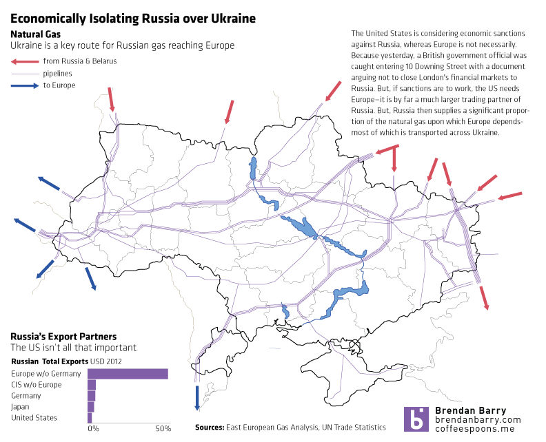
The West hesitates to use military force to push Russian troops out of Crimea. Likely with good reason as any such campaign would be neither cheap nor bloodless in addition to running the risk of spreading beyond the borders of Ukraine. So that leaves diplomatic and economic isolation. Diplomatic isolation is already underway—the G8 conference to be hosted in Sochi this summer is all but dead. But economic isolation is still being discussed.
Isolating Russia
The United States is generally in favour, but Europe—namely Germany—has been more cautious. But as my graphic shows, without Europe a sanctions regime would be largely toothless since half of Russia’s exports go to Europe. Except that Russia is also responsible for a significant proportion of Europe’s imported natural gas and sanctions on Russia could cause an interruption in that fuel to Western Europe. Naturally, most of that natural gas is, of course, transported through pipelines running across Ukraine.
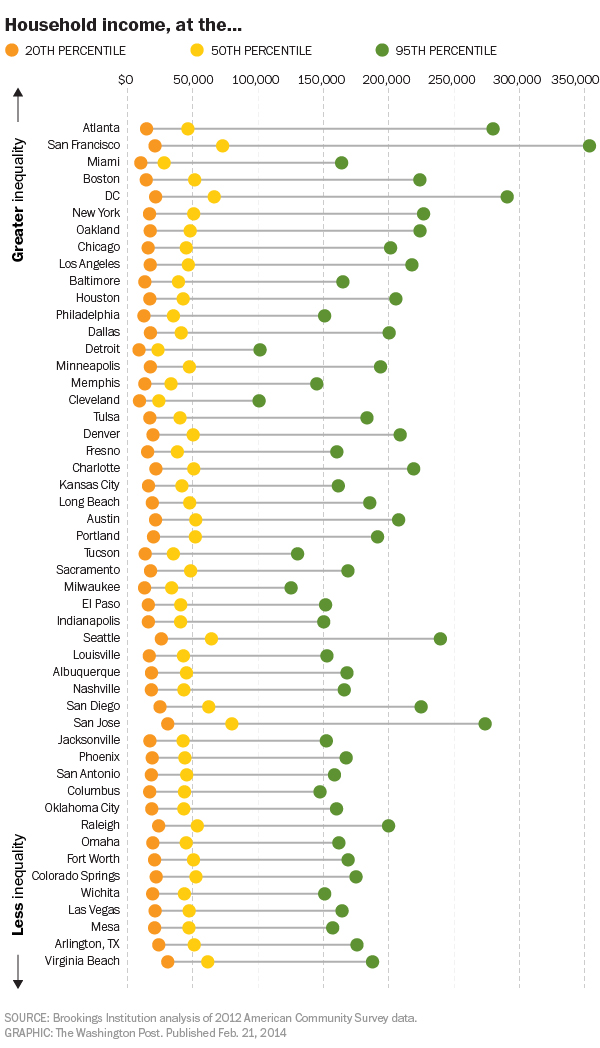
The Washington Post published this dot plot graphic to explore inequality in household income across numerous American cities.
Household income inequality
The chart, as most dot plots do, does a good job of showing where several distinct points within a set fall within the entire range of data. Or to put it into other words, where do the poorest, the richest, and the most middlest households in Philadelphia fall within all Philadelphia households? The data is interesting because you will begin to uncover some significant outliers. For example, by quick glance, the 50th percentile in both Detroit and Cleveland earn less than the 20th percentile in San Jose.
Credit for the piece goes to the Washington Post graphics department.
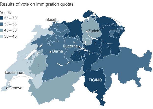
Last week, the Swiss people narrowly rejected the principle of freedom of movement. This principles serves as one of the foundations of the European Union. And while Switzerland does not belong to the EU, its economy benefits from access to the single market via that freedom of movement principle. That may be an oversimplification perhaps, but it provides some context to the consternation in Europe over the Swiss people rejecting the principle.
This graphic is not particularly complex. It is a choropleth of the vote results. However, it does show that the vote was not unanimous. Rather it was contained to the cantons (analogous to states in the US) more rural in character, i.e. less urban places like Geneva.
Swiss immigration vote results
Credit for the piece goes to the BBC graphics department.
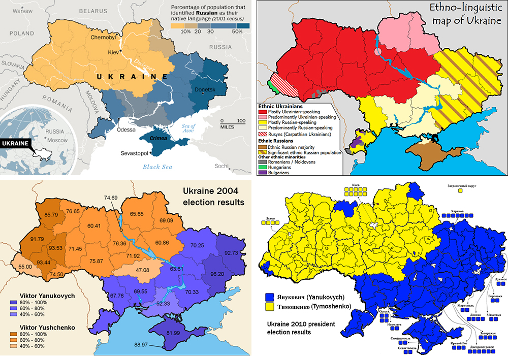
Not “the Ukraine” as it is (admittedly) fun to do in pop-culture references to Seinfeld. This comes from the Washington Post and the article tries to show that the protests in Kiev are not necessarily a vast majority against the government. Certainly the opposition is strong, but there is also a very strong pro-government movement. Why? Because in the broadest of senses, Ukraine is where the West, i.e. the European Union, meets the East, i.e. Russia.
A divided Ukraine
Credit for putting this all together goes to Max Fisher. Credit for each of the original graphics is to their respective designers whom I cannot identify.
As the Winter Olympics continue, the Economist looks at a different kind of race. The race between companies reaching a certain amount of revenue—along with the net profit from said revenue. How long does it take a company to reach $1 million in revenue? When all companies have reached the same amount of revenue, what percentage is net profit? It’s a neat little interactive. Thankfully you can skip the race and get straight to the results, a nice design feature.
Race to $1 million
Credit for the piece goes to R.J., G.S. and K.N.C.
To celebrate, here’s a cropping from an infographic about breakups. From a whole series of graphics about breakups. You can thank me with some dead and rotting flowers.
This piece from the Washington Post examines the idea of economic mobility. That is, what is the likelihood that children born and raised in an impoverished family will surpass their parents’ standard of living.
Economic mobility
Credit for the piece goes to Darla Cameron and Ted Mellnik.
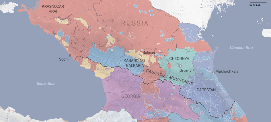
The Olympics opened in Sochi this past weekend. Many of us may well be familiar with photographs of urinals without piping, or unfinished hotel rooms, or many other infrastructure problems, but there is a bigger issue facing Sochi. It exists on what the New York Times terms the edge of a war zone. Their overall piece is more text-heavy than graphic-heavy, but several maps lend context to this complicated region of the Russian Federation. If you’re curious to better understand the region, this is a good primer.
The linguistics of the Caucasus
Credit for the piece goes to the New York Times graphics department.
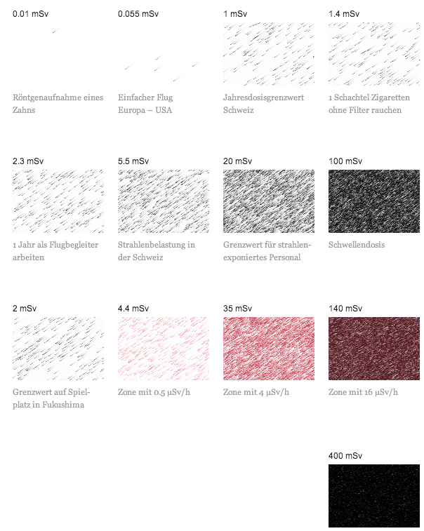
Today’s post is more about a means of illustrating radiation, less about quantifying it. Unfortunately the article is in German and I speak none of it. But, the context is that of the Fukushima Disaster. Make sure you click through to see the illustrations in action.
Radiation
Credit (I think) goes to Interactive Things and Neue Zürcher Zeitung.