Ebola

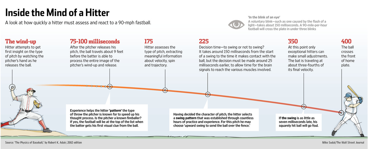
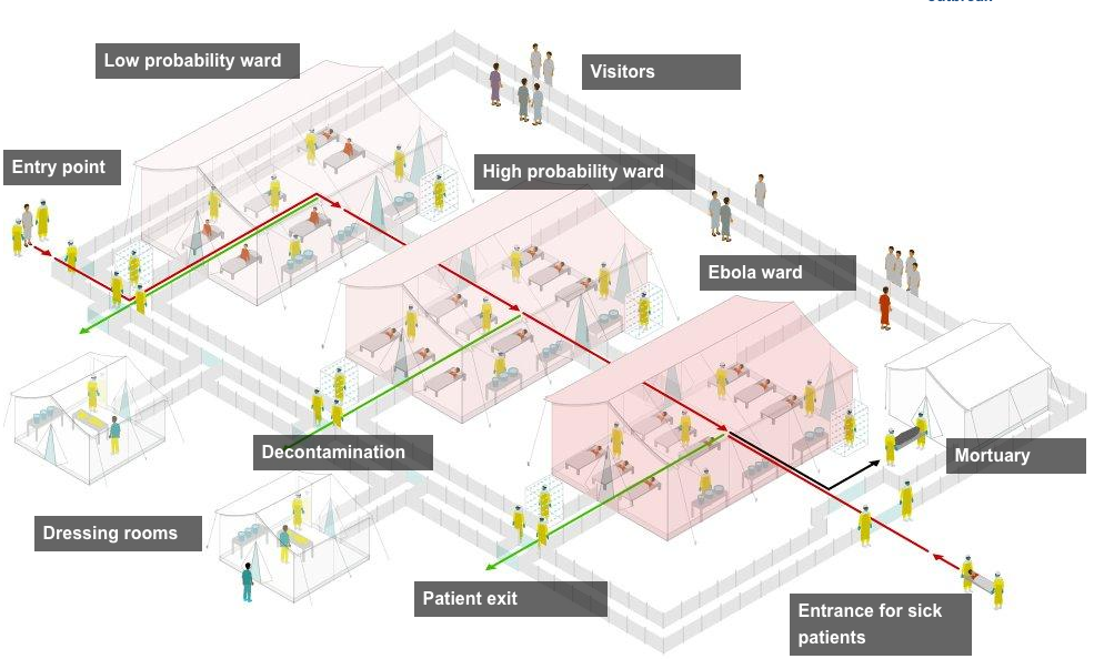
I really enjoy reading articles where graphics accompany the text and not just for the want of graphics. While the Ebola outbreak in West Africa is tragic, the data allows for some nice visualisation pieces. Additionally, one could say that the United States is victim to quite a bit of scaremongering as a result of a few isolated cases of Ebola in Dallas, Texas. Spoiler, an Ebola outbreak is not really a threat to the United States or Western Europe. Perhaps to relieve some of said scaremongering, the New York Times has a nice article titled Ebola Facts that outlines just that, the facts about Ebola. And guess what? The article is accompany by a number of useful inline graphics.

Ebola outbreaks
Ebola outbreaks

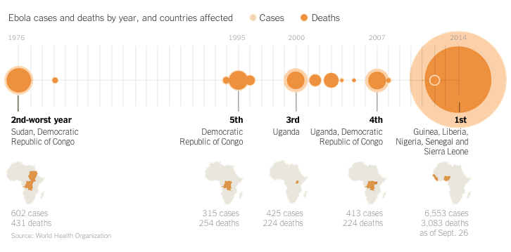
Credit for the piece goes to the New York Times’ graphics department.

Drinking by Decile

Happy Friday, everybody. I’m looking forward to a pint. But thanks to some research, as an American, I might actually be looking forward to 10 pints if I fall within the highest decile of American drinkers. They imbibe on average over 73 alcoholic drinks per week. Yep, that means over 10 per day. Bottoms up, Merica. The Washington Post brings up the graphic summary of the study.

Drink deciles

Credit for the piece goes to Christopher Ingraham.

Hitting a Baseball

Tonight is Game 5 of the National League Championship Series. For those of you who do not follow baseball, this is the semi-finals for the national championship called the World Series. Anyway, hitting a baseball is hard because you have so little reaction time. The Wall Street Journal has an article about how some baseball teams are beginning to experiment with neuroscience. The idea is to better train hitters to recognise pitches earlier, in essence, giving them said reaction time. The article is accompanied by an illustration showing just how little time there is to hit a pitch.

Think quickly
Think quickly

Credit for the piece goes to Mike Sudal.

Ebola Treatment Centres

Ebola is still a thing. And it is still getting worse. Or rather, with deaths and/or infections in both Europe and the United States, we are finally paying a bit more attention to it. We have no cure for Ebola, but we still need to treat people for symptoms, but most importantly we need to isolate those infected from the broader population. How and where is this done? Thankfully, the BBC put together an interactive graphic illustrating a typical treatment centre. Each main section is a clickable link that explains the functions and key points to the different areas.

A treatment centre
A treatment centre

The article goes on to explain in more detail what is going on and does so with photos and also a map of treatment centres in Guinea, Sierra Leone, and Liberia.

Credit for the piece goes to the BBC graphics department.

The Evolution of Art

I work in the field of graphic design—or visual communications design for those of you younger whippersnappers. Regardless of what you call it, the field itself generally did not become a discipline until the early parts of the 20th century. Obviously, painters and illustrators were performing many of the tasks in the 19th century and before then. But design comes from art, from painting and drawing. How old are those?

Well recent discoveries have just pointed to some really old paintings in Indonesia that rival the ages of what we already know in the cave paintings in France. The significance is that this means art likely did not spread from Europe to Asia as once thought. It either developed independently or stems from an earlier African ancestry. For the purposes of this blog, the writeup I found included an illustration of how these dates were determined.

Indonesian cave paintings

Credit for the piece goes to the original authors of the Nature report.

Losing Ground

If you want a better understanding of the difficulties facing Louisiana in the coming years and decades, you should start with Losing Ground. It’s a very nice experience that integrates data and narrative along with maps and written word and spoken word to show how badly the wetlands have degraded.

A look at Leeville, LA

Credit for the piece goes to Bob Marshall, Al Shaw, Brian Jacobs, Della Hasselle, Ellis Lucia. Edmund Fountain.

Judgmental Philly Map

Happy Friday, everyone. To help you waste some of your time today, here is a link to a set of maps of various cities. The twist? They are judgmental. So here is the map of Philadelphia. Though, to judge this piece, it looks more like it is a map of Jersey than Philly.

Judging Philly
Judging Philly

Credit for the piece goes to R Scott Fallon.

Autonomous Cars

Some days I do not enjoy the thought of driving to the office. For those days, I take mass transit. However, in the future, I may be able to sit back and allow my car to drive me. This illustration from the Washington Post examines just how one example of such vehicles functions.

Autonomous car
Autonomous car

Credit for the piece goes to Alberto Cuadra.

Does the Apple Fall Far from the Tree?

Last week Apple announced its plan for its new Apple Watch. I am not quite a watch aficionado, but I do have a preference for my light, minimalist design watches. So I find this comparison of the new smart watches from Bloomberg quite interesting. The only watch to which I aesthetically gravitate is the Moto 360. But for those of you more interested in some of the specs, they compare those figures via bar charts to the right of the illustration.

A watch comparison
A watch comparison

What about you, readers? Do you have a favourite of the new smart watches? Either based on specs or aesthetics?

Credit for the piece goes to Shawn Hasto and Keith Collins.

Super Moon

Monday witnessed Super Moon. It’s not a bird, nor a plane. It’s the Moon. But bigger. Thankfully the Guardian put together a nice graphic that explains what was going on and puts the Super Moon into context of regular, average guy Moon.

How the (regular) Moon was formed

Credit for the piece goes to Paul Scruton.