My Irishness

Yesterday was Saint Patrick’s Day and those who have followed me at Coffeespoons—or more generally know me—are well aware that my background is predominantly Irish. Those same people probably also know of my keen interest in genealogy. And that’s what today’s post is all about.

Irish genealogy is difficult because of the lack of records and lack of record access. My struggle is often in connecting an ancestor to a specific place in Ireland, necessary for any work to identify baptism, marriage, or death records. Starting with my maternal lines, it’s easy to see how ancestors were from “Ireland”, but I’ve been able to place precious few into a specific geographic context.

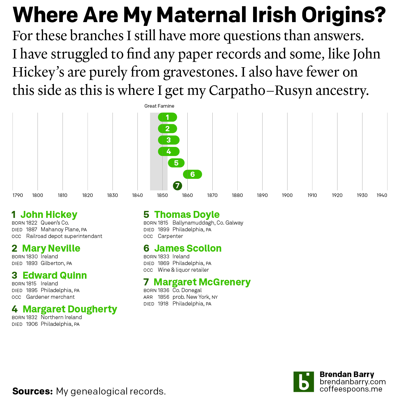
Thomas Doyle is the only ancestor I can place into a specific parish, and he wasn’t the key person who allowed it. For those interested in genealogy, it’s always worthwhile to investigate siblings, cousins, aunts, uncles, and sometimes even friends and neighbours because they often can provide clues, as it did in the case of the Doyles.

Sometimes you also need to step outside and get lost in a cemetery. I took a drive one weekend before the pandemic to find the graves of John Hickey and his family. Until that point, I knew nothing about the origins of him or his wife. Luckily his gravestone went one step beyond Ireland and stated he was born in Queen’s County, now County Laois. But I’ve still found no evidence of where in Laois he was born and so tracking the rest of his family is difficult, perhaps impossible.

Furthermore, you can also see that I have little specific information about when these ancestors all arrived. None were present in the 1850 US Census, so we can reasonably work from a starting hypothesis that they arrived after 1850 and then when each had children documented born in the US—or the rarer occasion of a US marriage record—we can reasonably assume they arrived between 1850 and the child’s birth.

On my maternal side there is a lot of work to do, which belies all the effort put into just getting this far over the last decade plus. Contrast that to my paternal side.

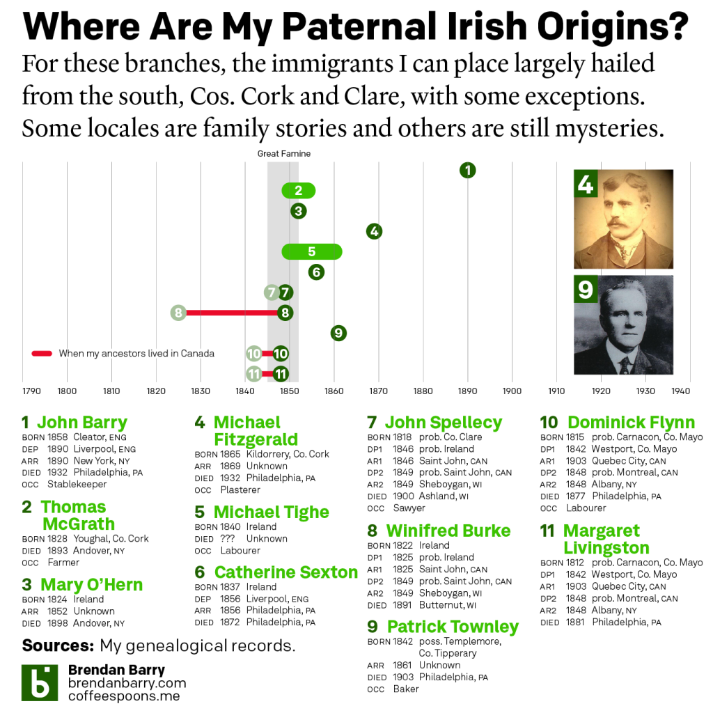
Here I have more Irish ancestors to investigate and I’m fortunate that I have more of an American paper trail, which when stitched together allowed me to get snippets of counties of birth or marriage, which, with some helpfully uncommon names, allowed me to dial in on specific parishes and towns. In other cases, my Irish ancestors first settled in Canada or the United Kingdom, which have much better preserved records. And finally a few have had family histories written and documented elsewhere, which allowed me to check the paper trail and validate the work.

And obviously when dealing with people in the mid-19th century, we don’t have a lot of photography and I’m lucky to have found a website—no longer extant, rest in peace Geocities—that had photos of my ancestors and a cousin over in Ireland who had a few photos sent my ancestors to their relations—though we’re not sure how they’re related, another story for another day—that I can put two faces to 18 names of direct Irish immigrant ancestors.

And of course the thing of note for all these people is that grey bar in the middle of the timeline: the Great Famine. In a roughly seven year period, over one million Irish died in Ireland and another over one million people left Ireland for places like the UK, Canada, the United States, Australia, New Zealand, among other places. It’s partly the reason for the massive Irish diaspora and why Saint Patrick’s Day is celebrated globally.

You can see some of my Irish ancestry is clearly unrelated, at least directly, to the Great Famine. But when you dig a bit deeper, you see the indirect connection. That John Barry who was an Irish stablekeeper who left Edinburgh for Philadelphia via Liverpool and New York, he was born to Irish parents in Cumberland, England—now Cumbria—who married there just after the end of the Great Famine and for whom there is no record prior to the Great Famine. In other words, they likely fled their home for fear of starvation and then in one generation their children all left England for America.

Irish genealogy is incredibly difficult, but it can also be incredibly rewarding. But you have have to keep digging and digging for even sometimes the shallowest roots.

Credit for the piece is mine.

Individualistic Immigrants

As many of you know, genealogy and family history is a topic that interests me greatly. This past weekend I spent quite a bit of time trying to sort through a puzzle—though I am not yet finished. It centred on identifying the correct lineages of a family living in a remote part of western Pennsylvania. The problem is the surname was prevalent if not common—something to be expected if just one family unit has 13 kids—and that the first names given to the children were often the same across family units. Combine that with some less than extensive records, at least those available online, and you are left with a mess. The biggest hiccup was the commonality of the names, however. It’s easier to track a Quinton Smith than a John Smith.

Taking a break from that for a bit yesterday, I was reminded of this piece from the Economist about two weeks ago. It looked at the individualism of the United States and how that might track with names. The article is a fascinating read on how the commonness or lack thereof for Danish names can be used as a proxy to measure the individualism of migrants to the United States in the 19th century. It then compares that to those who remained behind and the commonness of their names.

But where are the Brendans?

The scatter plot above is what the piece uses to introduce the reader to the narrative. And it is what it is, a solid scatter plot with a line of best fit for a select group of rich countries. But further on in the piece, the designers opted for some interesting dot plots and bar charts to showcase the dataset.

Now I do have some issues with the methodology. Would this hold up for Irish, English, German, or Italian immigrants in the 19th century? What about non-European immigrants? Nonetheless it is a fascinating idea.

Credit for the piece goes to the Economist Data Team.

Border Arrests

We move from one manufactured crisis to another today as we look at a piece by the Economist on the number of illegal immigrants arrested at the US southern border. Lately, here in the United States we have been hearing of an invasion on our southern border. Illegal immigrants streaming across the border. Except, that is not true. In fact, illegal immigration is at or near its lowest rate in recent years.

Note how few there have been in recent years…

The graphic does one thing really well and that is its unorthodox placement of the map. Instead of the usual orientation, here the designers chose to “tilt” the map so that the border segments roughly align with the sets of charts below them. I might have desaturated the map a little bit and cut off the gradient so Mexico does not bleed through underneath the bars, but the concept overall is really nice.

On the other hand, we have the bar charts arranged like funnels. This does allow the reader to see the slopes trending towards zero, however, it makes it incredibly difficult to see changes in smaller numbers. And without a scale on the axis, the reader has to take the bars and mentally transpose them on top of the grey bars in the bottom right corner. I wonder if a more traditional set of bar charts in small multiples could have worked better beneath the map.

Overall, however, I really do like this piece because of the way the map and the bar charts interact in their positioning.

Credit for the piece goes to the Economist Data Team.

Changes to Immigration Enforcement

Almost two weeks ago I read a piece in City Lab that used three maps to look at the changes to immigration enforcement in the first year of the Trump administration. I was taken by this final map in particular.

Some geographic patterns do emerge…

While the map does have some large areas of N/A, it still does show some interesting geographic patterns. I think New York showcases it the best. Counties that are less involved in enforcement operations are in the southern part, near New York City. But then you can begin to get a clear sense of what is “upstate” by that break roughly parallel to both the Connecticut and Pennsylvania northern borders.

To a lesser extent you can see the same pattern play out in Pennsylvania. While far more white—as in no change on the map—the counties of orange—more involvement—are located in the interior and western counties. That is perhaps somewhat in the same space as Pennsyltucky.

Immigration is clearly an engaging topic these days, and I found this map interesting not because of its design, but because of the geographic stories it tells.

Credit for the piece goes to Victoria Beckley.

Immigrations Impact on Economic Growth

Initially I was not going to post this work, if only because other things came up and I do have to prioritise what I post on my site. It had nothing to do with the work’s quality, which I think is actually quite good. What am I talking about? Well today’s piece is from a Pro Public article about the impact of immigration on economic growth. And it turns out the two are linked. Why? Well, the overly simplistic explanation is that we will need immigrants to pick up the slack in the labour force that will otherwise begin shrinking in years to come.

But why take my word for it when you can take charts’ word for it. The piece does a great job of showing how changes in immigration numbers can help grow or shrink economic growth. And if you recall, President Trump has promised growth rates of 4%. But, and this is why I decided to post this, yesterday it was announced that Trump will support legislation intending to halve immigration to the United States over the next ten years. As my screenshot captured, a reduction in immigration will actually lead to lower economic growth and put us further away from the 4% rate.

Reducing immigration takes GDP growth further away from the 4% target

Credit for the piece goes to Lena Groeger.

Trump’s Wall

Another day, another story about the administration to cover with data-driven graphics. We are approaching Trump’s 100th day in office, traditionally the first point at which we examine the impact of the new president. And well, beyond appointing a Supreme Court justice, it is hard to find a lot of things President Trump has actually done. But on his 99th day, he will also need to approve a Congressional bill to fund the government, or else the government shuts down on his 100th day. Not exactly the look of a successful head of state and government.

Why do I bring this up? Well, one of the many things that may or may not make it into the bill is funding for Trump’s wall that Mexico will pay for, but at an undetermined later date, because he wants to get started building the wall early, but late because he promised to start on Day 1.

Several weeks ago the Wall Street Journal published a fantastic piece on the current wall bordering Mexico. It examines the current state of fencing and whether parts of the border are fenced or not. It turns out a large portion is not. But, the piece goes on to explain just why large sections are not.

The wall today
The wall today

You should read the full piece for a better understanding. Because while the president says building the wall will cost $10 billion or less, real estimates place the costs at double that. Plus there would be lawsuits because, spoiler: significant sections of the border wall would cross private property, national parks, and Native American reservations. Also the southern border crosses varied terrain from rives to deserts to mountains some lengths of which are really difficult to build walls upon.

But the part that I really like about the piece is this scatter plot that examines the portion of the border fenced vs. the number of apprehensions. It does a brilliant job of highlighting the section of the border that would benefit most significantly from fencing, i.e. a sector with minimal fencing and a high number of apprehensions: the Rio Grande Valley.

Where would more fencing make more of a difference

And to make that point clear, the designers did a great job of annotating the plot to help the reader understand the plot’s meaning. As some of my readers will recall, I am not a huge fan of bubble plots. But here there is some value. The biggest bubbles are all in the lower portion of fenced sectors. Consequently, one can see that those rather well-fenced sectors would see diminished returns by completing the wall. A more economical approach would be to target a sector that has low mileage of fencing, but also a high number of apprehensions—a big circle in the lower right of the chart. And that Rio Grande Valley sector sits right there.

Overall, a fantastic piece by the Wall Street Journal.

Credit for the piece goes to Stephanie Stamm, Renée Rigdon, and Dudley Althaus.


Undocumented Irish Immigrants

You know, I was trying to find a nice and funny graphic that related to the Irish for today since today is St. Patrick’s Day. But, I keep circling back to that piece I posted last year. Because, unfortunately, these are not terribly uplifting times.

We make a great big deal about how we need to enforce deportation orders and build walls to keep out Mexicans and others from Latin America. But, the Irish are a far smaller, but still significant ethnic group that tends to arrive here and stay here in an undocumented fashion.

And somehow—though on this I would love to be wrong—I think the United States would generally make a bigger deal about Peter O’Toole being deported to Donegal than Pedro Toledo to Durango.

The point is that these are all people. And the Statue of Liberty does not say: “Give us your, wealthy, high-points earned on a merit system, looks like you and me, believes like you and me, and ready to contribute to society.”. No, it says, “Give us your tired, your poor, your huddled masses yearning to breathe free, the wretched refuse of your teeming shore. Send these homeless, tempest-tost to me, I lift my lamp beside the golden door.”

Surely that lamp wasn’t meant to flicker only a greenish glow.

That's a lot of people
That’s a lot of people

Mexican Immigration

So following on from my Wednesday post, let’s take another look at the “problem” of Mexican immigration. Because as these graphics from the Pew Research Center show, it’s not really a problem these days.

The unauthorised population is down

We're seeing more leave than enter
We’re seeing more leave than enter

Instead, immigration is down.

Credit for the piece goes to the Pew Research Center graphics department.

Deportation of Immigrants

Donald Trump announced how he wants to deport 2–3 million undocumented immigrants that have criminal convictions or that belong to gangs. I read up on the issue at FiveThirtyEight and came across the following graphic from the US Immigration and Customs Enforcement (ICE).

The government's chart on deportations
The government’s chart on deportations

However, when I review the graphic, I found it difficult to understand the FiveThirtyEight article’s point that President Obama has lessened the focus on deportation, but those deported are those convicted of serious criminal offences. So I expanded the size of the y-axis and broke apart the stacked bar chart to show the convicted criminals vs. the non-criminal immigration violators. This graphic more clearly shows the dramatic falloff in deportations, and the emphasis on those with criminal convictions.

A general decline in deportations has also seen a focus on convicted criminals over non-criminal immigration violators

Credit for the original goes to the graphics department of the US Immigration and Customs Enforcement. The other one is mine.

Irish Immigration

Illegal immigration is one of the big topics in the American presidential election. Some of us want to build a wall to keep out illegal Mexican immigrants. Today’s graphic is a number. Illegal immigrants are not limited to Latin America, but they come even from places like Ireland looking for a better life. The number is the estimated number of undocumented Irish living and working in the United States.

That's a lot of people
That’s a lot of people