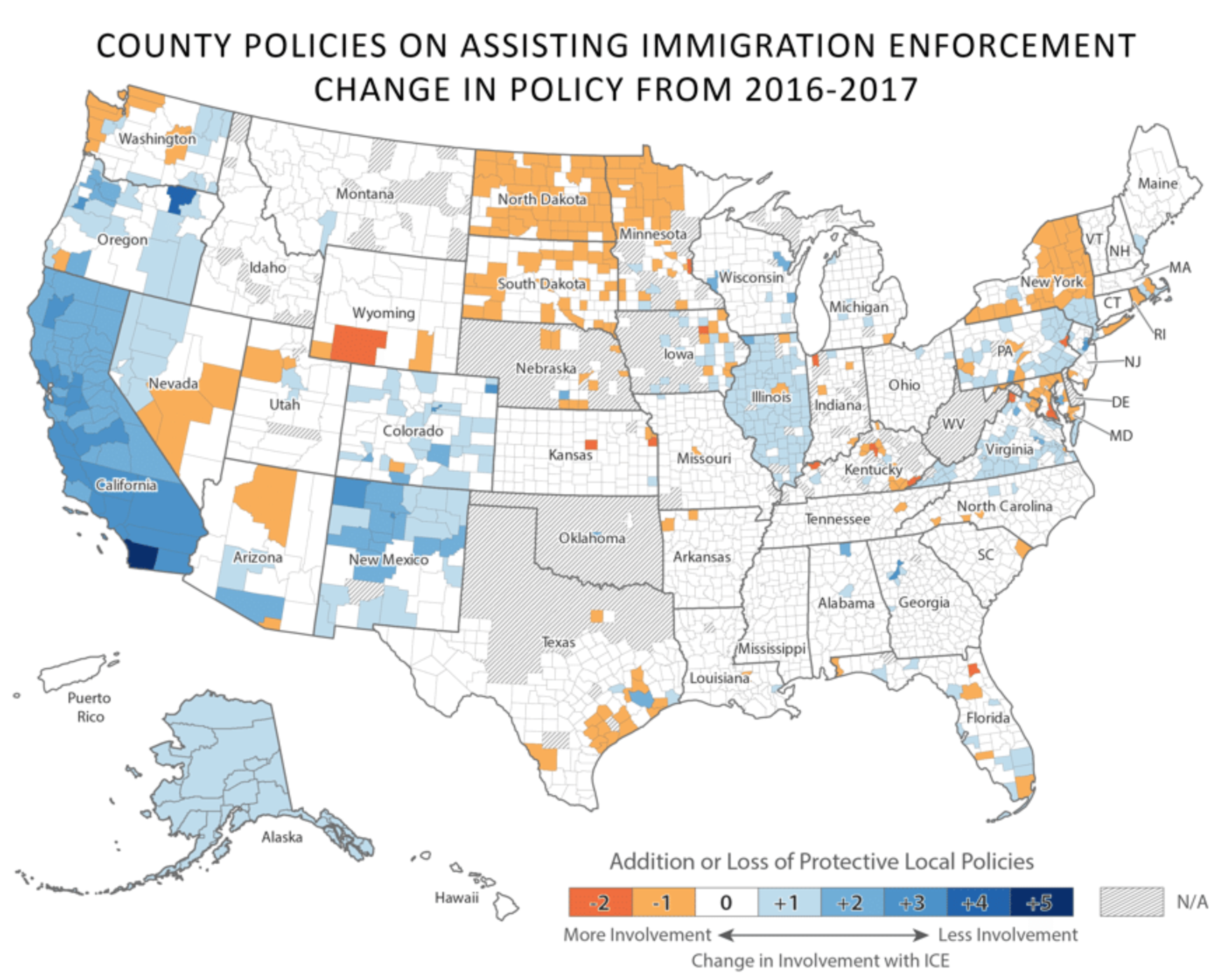
Almost two weeks ago I read a piece in City Lab that used three maps to look at the changes to immigration enforcement in the first year of the Trump administration. I was taken by this final map in particular.

While the map does have some large areas of N/A, it still does show some interesting geographic patterns. I think New York showcases it the best. Counties that are less involved in enforcement operations are in the southern part, near New York City. But then you can begin to get a clear sense of what is “upstate” by that break roughly parallel to both the Connecticut and Pennsylvania northern borders.
To a lesser extent you can see the same pattern play out in Pennsylvania. While far more white—as in no change on the map—the counties of orange—more involvement—are located in the interior and western counties. That is perhaps somewhat in the same space as Pennsyltucky.
Immigration is clearly an engaging topic these days, and I found this map interesting not because of its design, but because of the geographic stories it tells.
Credit for the piece goes to Victoria Beckley.
Leave a Reply
You must be logged in to post a comment.