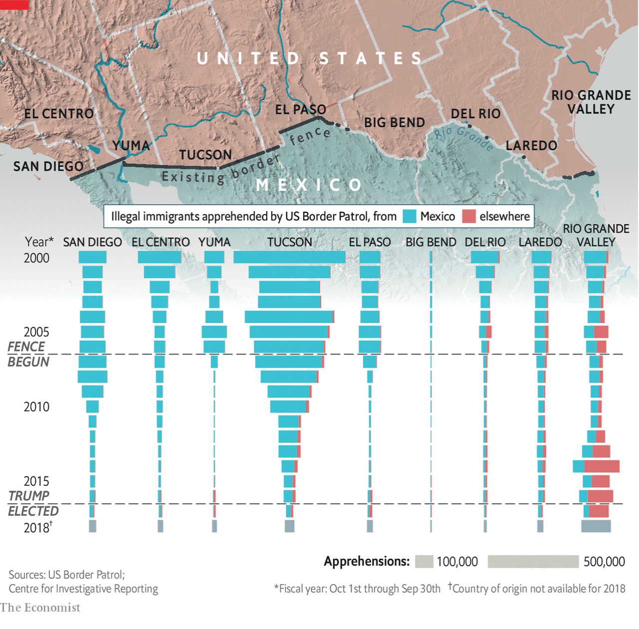
We move from one manufactured crisis to another today as we look at a piece by the Economist on the number of illegal immigrants arrested at the US southern border. Lately, here in the United States we have been hearing of an invasion on our southern border. Illegal immigrants streaming across the border. Except, that is not true. In fact, illegal immigration is at or near its lowest rate in recent years.

The graphic does one thing really well and that is its unorthodox placement of the map. Instead of the usual orientation, here the designers chose to “tilt” the map so that the border segments roughly align with the sets of charts below them. I might have desaturated the map a little bit and cut off the gradient so Mexico does not bleed through underneath the bars, but the concept overall is really nice.
On the other hand, we have the bar charts arranged like funnels. This does allow the reader to see the slopes trending towards zero, however, it makes it incredibly difficult to see changes in smaller numbers. And without a scale on the axis, the reader has to take the bars and mentally transpose them on top of the grey bars in the bottom right corner. I wonder if a more traditional set of bar charts in small multiples could have worked better beneath the map.
Overall, however, I really do like this piece because of the way the map and the bar charts interact in their positioning.
Credit for the piece goes to the Economist Data Team.
Leave a Reply
You must be logged in to post a comment.