
It’s Friday, everybody. Let’s take a bit of a break from the election stuff of this past week and look at the pipelines of your liquid consumption.

Credit for the piece goes to Randall Munroe.
It’s Friday, everybody. Let’s take a bit of a break from the election stuff of this past week and look at the pipelines of your liquid consumption.
Credit for the piece goes to Randall Munroe.
On Tuesday I tracked the results primarily with the New York Times and the Washington Post. I really enjoyed the Post’s coverage as they designed a homepage for the night’s results. The results were placed at the centre of the content, as you can see in the screenshot below. Below the map and table, content updated on the right with links to more static content on the left.
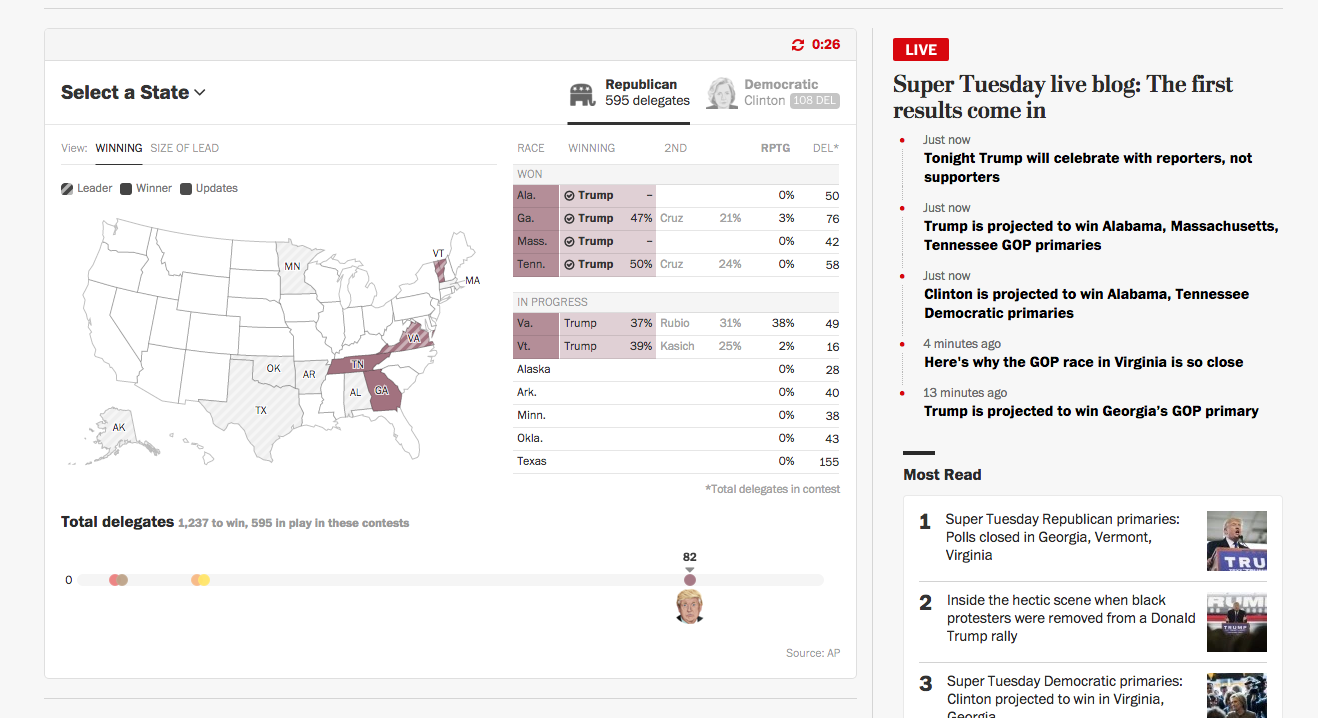
The map and table above naturally updated throughout the course of evening. I found their decision to move states from one table to the other when the race was declared a brilliant little decision. When reinforced with a small checkmark, the movement from the lower table to the final table at the top gave a real sense of progress—maybe momentum—to the victories of both Donald Trump and Hillary Clinton.
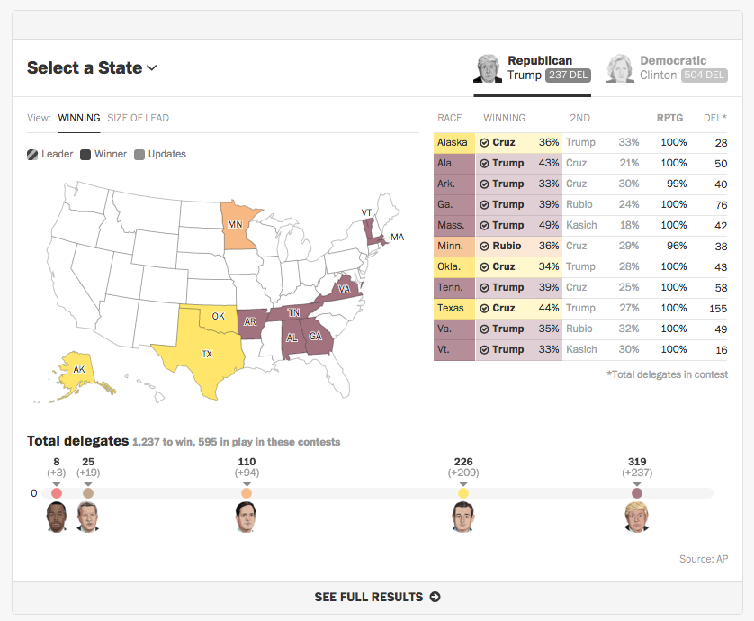
Overall, this was a very helpful site for me to follow the results streaming in Tuesday night.
Credit for the piece goes to the Washington Post graphics department.
Well, Super Tuesday is over. And if you spent last night under a rock, Donald Trump and Hillary Clinton cleaned almost enough house to brush away their competition. Almost. The political analysis begins…now. But we will leave that for another day. I liked this one particular chart from FiveThirtyEight’s coverage.

We have a nice set of small multiples—please kill the cute illustrations of the candidates’ heads—comparing the number of items in Google News and Google Searches. The graphic goes a long way in showing just how much coverage Trump has received over the past few months against very little for others.
Credit for the piece goes to FiveThirtyEight’s graphics department.
Super Tuesday is the first test of an American presidential candidate’s ability to run—and win—a semi-national campaign. Unlike the one-off primaries or caucuses in places like Iowa or New Hampshire, for today, each candidate has had to prepare for votes in 11 states. And these states are as varied as Alabama to Texas to Massachusetts to Alaska. Consequently, Super Tuesday also means lots of delegates are at stake.
So before the results are announced, let’s look at Bloomberg Politic’s piece that is basically a delegate counter with explanations. (Because right now super-delegates are not at stake.) In the interactive graphic side, we have a counter for every pledged delegate.
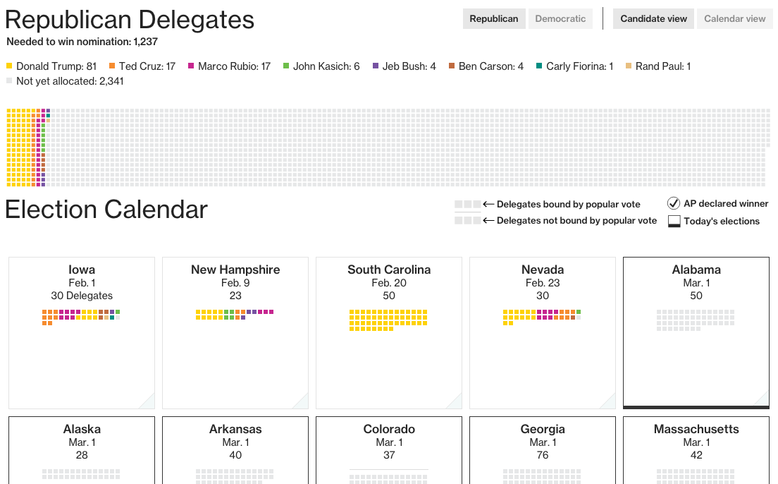
I think in the big box up top, the only missing element is some visual measure of just how far each candidate remains from the magic number. In the Republican case, that is 1237 delegates. Below that, however, I really love the tiles that summarise the individual state results, both in delegates and vote share. (After all, some states are entirely proportional, some semi-proportional, and some none-at-all/winner-take-all.)
Credit for the piece goes to Alex Tribou and Jeremy Scott Diamond.
As I mentioned earlier this week, I visited London for work for a week and then took some rollover holiday time to stay around London and then visit Dublin. But now I am back. And this week that has meant all the jet lag. And while everybody experiences jet lag and recovers from it differently, I wanted to take a look at my experience. The data and such is below. But the basic point, it is about four days before I return to normal.
What is missing, unfortunately, is the Chicago-to-London data. Because anecdotally, that was far, far worse than the return flight.
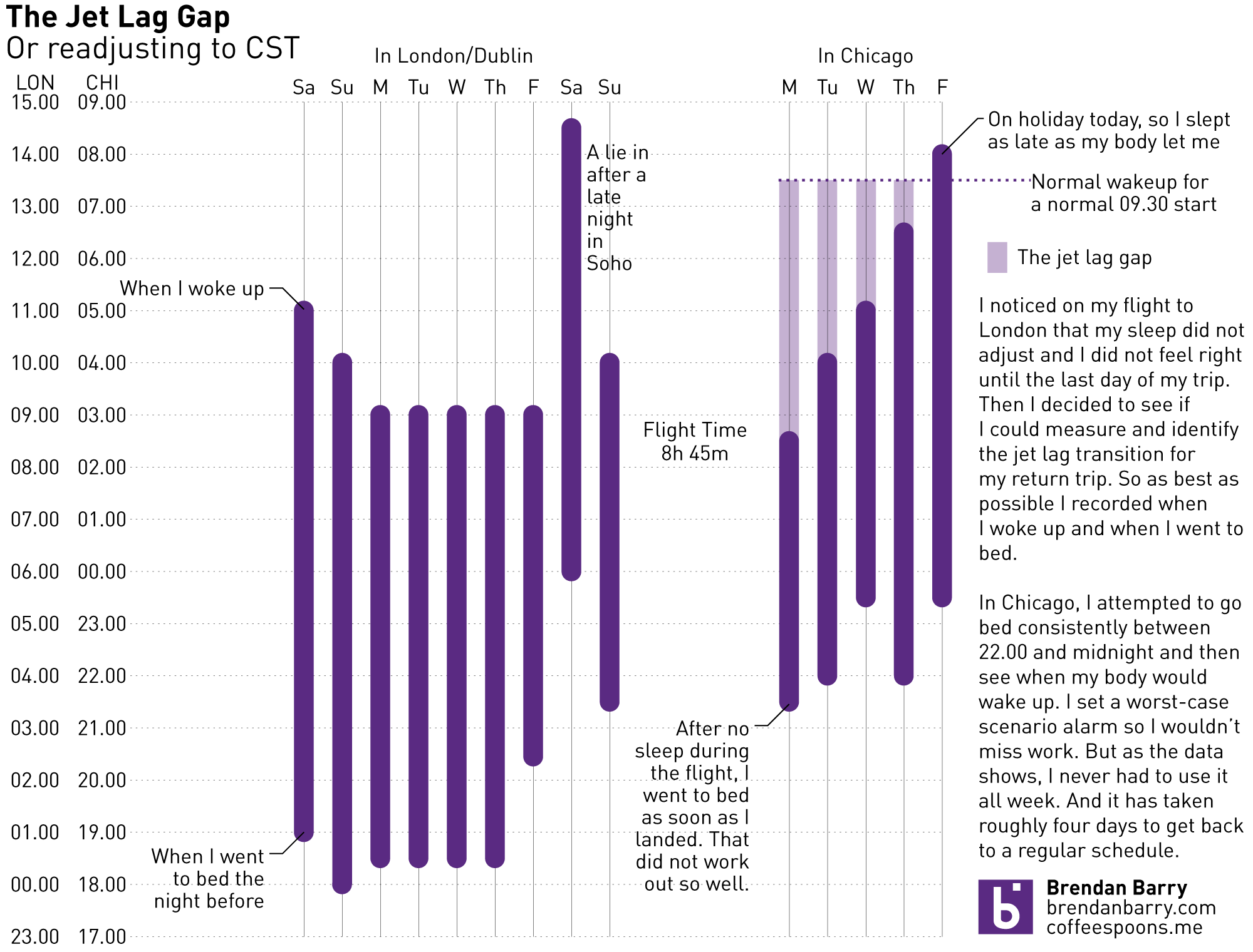
Credit is my own.
We hear ever more about the Zika virus that currently plagues South America. But the fact is that the mosquito that carries it could inhabit some regions of the United States as well as the South American tropics. Over at the Daily Viz, there was an article about just what the potential numbers could be.
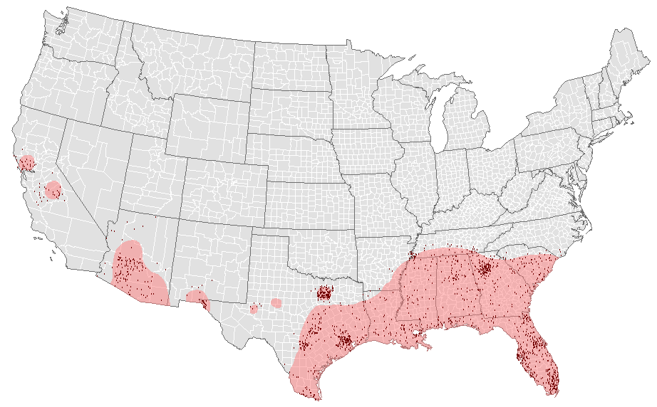
The piece is a nice reminder that not every important story needs a super-complicated graphic. It just needs a clean, clear, and concise graphic. The threat here is to parts of the American south. But, as yesterday’s post showed, ever more people are moving there and so that puts roughly 80 million Americans in harm’s way.
Also, another validation of my dislike of warm weather.
Credit for the piece goes to Matt Stiles.
When I was over in London and Dublin, most days were cool and grey. And a little bit rainy. Not very warm. (Though warmer than Chicago.) But, that is weather—highly variable on a daily basis. Climate is longer-term trends and averages. Years, again, can be highly variable—here’s looking at you kid/El Niño. But, even in that variability, 2015 was the warmest year on record. So the New York Times put together a nice interactive piece allowing the user to explorer data for available cities in terms of temperature and precipitation.
You can see the big chart is temperature with monthly, cumulative totals of precipitation. (I use Celsius, but you can easily toggle to Fahrenheit.) Above the chart is the total departure of the yearly average. Anyway, I took screenshots of Philadelphia and Chicago. Go to the New York Times to check out your local cities.
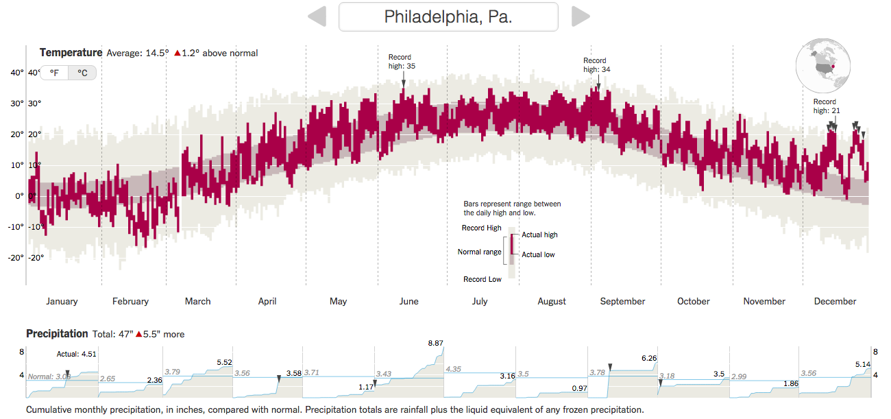
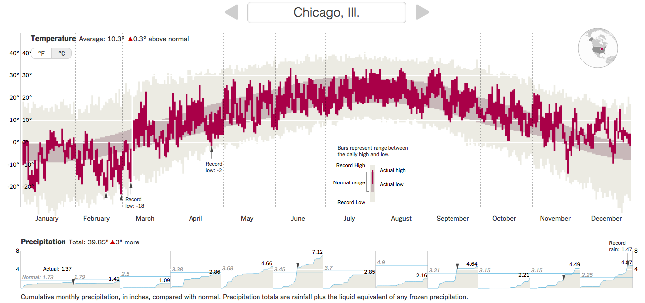
Credit for the piece goes to K.K. Rebecca Lai and Gregor Aisch.
Sorry for the two-week absence, everybody. I travelled to the UK for work and then stayed there and Ireland on holiday. But I have returned, but with the inevitable jet lag waking me up early this morning, I had no reason not to post something.
Late last year, the Washington Post published a small article examining trends in US migration data. The crux of the article? During the recession, people stopped moving from the Northeast and Midwest to the Sunbelt. (I was a rare exception heading from the Northeast to the Midwest.) But, now that the economy is not so sluggish, that movement of people has resumed. Naturally, there are charts to go alongside it.
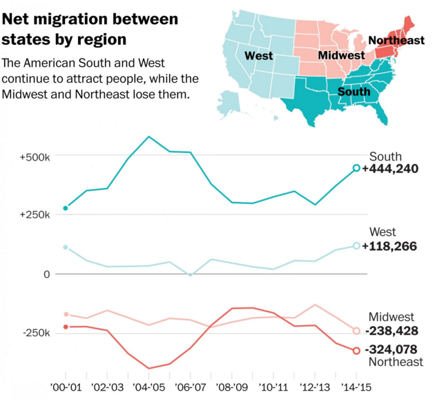
I selected the above because while generally fine, I quibble with one design decision. In the locator map in the upper right, take the South, which is coloured dark green for a winner in the game of migration. However, in another map earlier in the piece, Mississippi, Alabama, Louisiana are all losing people. I likely would have left the white states lines off the map. Or reused the same earlier map, but with a thicker stroke to indicate the US Census Bureau regions.
Credit for the piece goes to Darla Cameron.
Happy Friday, everybody. Just to lighten the mood a wee bit here is a chart about chipmunks from Last Week Tonight.

Credit for the piece goes to the Last Week Tonight’s graphics department.
Back to the Iowa Caucus results for a moment. A lot of the day-of forecasting for elections is done by entrance and exit polls. So in this piece from the Washington Post, we take a look at entrance poll results. This is basically a two-parter. The first is showing each candidate and the group they won and a number indicates by how much they won the demographic group.

If you click on any of the demographic groups in particular, you are brought to the part of the page with the actual full results for the demographic. The format is simple a basic heat map with table. Nothing fancy, but nothing fancy is required for that type of data. Interestingly, the colour denotes not the share, but the result. I am not sure I would have done that, but it is a minor quibble.

Credit for the piece goes to Lazaro Gamio and Scott Clement.