Well, Super Tuesday is over. And if you spent last night under a rock, Donald Trump and Hillary Clinton cleaned almost enough house to brush away their competition. Almost. The political analysis begins…now. But we will leave that for another day. I liked this one particular chart from FiveThirtyEight’s coverage.
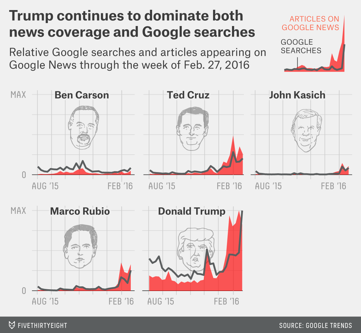
We have a nice set of small multiples—please kill the cute illustrations of the candidates’ heads—comparing the number of items in Google News and Google Searches. The graphic goes a long way in showing just how much coverage Trump has received over the past few months against very little for others.
Credit for the piece goes to FiveThirtyEight’s graphics department.
Leave a Reply
You must be logged in to post a comment.