On Tuesday I tracked the results primarily with the New York Times and the Washington Post. I really enjoyed the Post’s coverage as they designed a homepage for the night’s results. The results were placed at the centre of the content, as you can see in the screenshot below. Below the map and table, content updated on the right with links to more static content on the left.
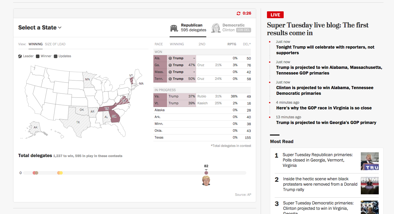
The map and table above naturally updated throughout the course of evening. I found their decision to move states from one table to the other when the race was declared a brilliant little decision. When reinforced with a small checkmark, the movement from the lower table to the final table at the top gave a real sense of progress—maybe momentum—to the victories of both Donald Trump and Hillary Clinton.

Overall, this was a very helpful site for me to follow the results streaming in Tuesday night.
Credit for the piece goes to the Washington Post graphics department.
Leave a Reply
You must be logged in to post a comment.