Sorry for the two-week absence, everybody. I travelled to the UK for work and then stayed there and Ireland on holiday. But I have returned, but with the inevitable jet lag waking me up early this morning, I had no reason not to post something.
Late last year, the Washington Post published a small article examining trends in US migration data. The crux of the article? During the recession, people stopped moving from the Northeast and Midwest to the Sunbelt. (I was a rare exception heading from the Northeast to the Midwest.) But, now that the economy is not so sluggish, that movement of people has resumed. Naturally, there are charts to go alongside it.
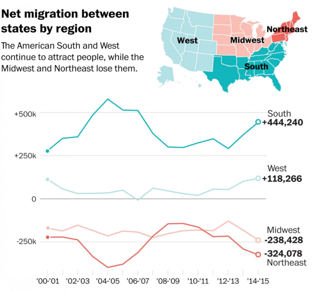
I selected the above because while generally fine, I quibble with one design decision. In the locator map in the upper right, take the South, which is coloured dark green for a winner in the game of migration. However, in another map earlier in the piece, Mississippi, Alabama, Louisiana are all losing people. I likely would have left the white states lines off the map. Or reused the same earlier map, but with a thicker stroke to indicate the US Census Bureau regions.
Credit for the piece goes to Darla Cameron.
Leave a Reply
You must be logged in to post a comment.