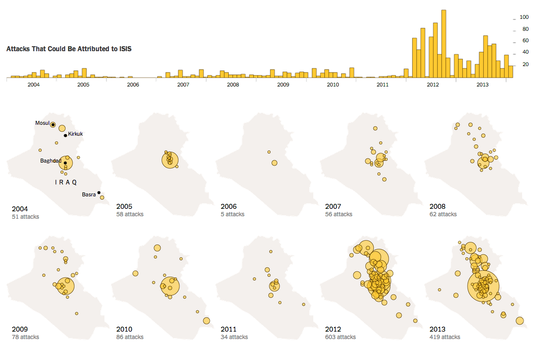
ISIS is the main militant group threatening Iraq (and Syria) these days. The New York Times put together a nice graphic showing how in recent years the group has grown ever more violent by launching ever more attacks within Iraq. Of course, the other country of ISIS operations is Syria, where it has been involved in civil war for years now. This creates a battle-hardened group of fighters that is now, thanks to the fall of Mosul and Iraqi banks and military bases, well funded and well equipped.
ISIS attacks in Iraq
Credit for the piece goes to the New York Times graphics department.
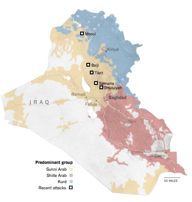
Well, Iraq is in the news again. Basically because the Islamist insurgency in Syria has now crossed the border—to be fair, though, that happened awhile back—and taken control over swathes of northern Iraq. Part of that swath includes the city of Mosul, Iraq’s second-largest city with a population of almost 2 million.
The New York Times has been putting together a series of maps to explain the background of why this is happening (hint: that Shia–Sunni divide we talked about years ago, well it’s back) as well as where this is happening.
The Shia–Sunni–Kurdish divide
Credit for the piece goes to Sarah Almukhtar, Jeremy Ashkenas, Bill Marsh, Archie Tse, Tim Wallace, Derek Watkins, and Karen Yourish.
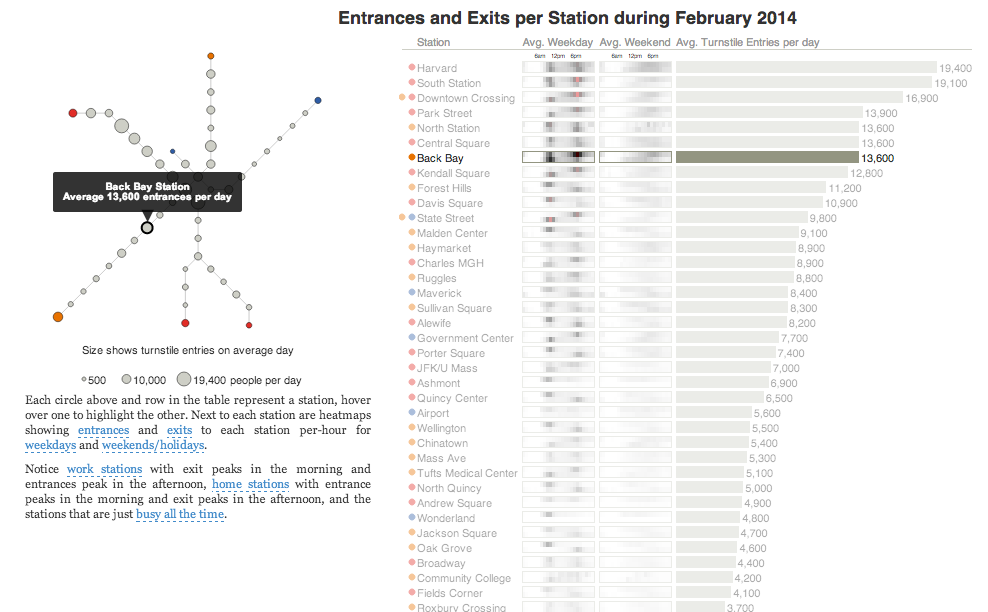
Today’s post is the graduate work of Michael Barry and Brian Card of Worcester Polytechnic Institute. The two looked at the available public data of the Massachusetts Bay Transportation Authority (MBTA)—the T to those that know—to better understand the Boston area subway system. Here the subway system refers to the heavy rail lines, i.e. the Blue, Orange, and Red lines.
T stations
In short, the piece has a lot to look at that is worth looking at. This particular screenshot is an analysis of the stations across all times on average weekdays and weekends. You can see how in this particular selection, the size of the station markers pulse depending upon the time of day and the number of turnstile entries. Meanwhile the charts to the right show you the density through time of said entries and then compares the average number of turnstiles entries per day. Text beneath the system map to the left provides a short analysis of the data, highlighting work vs. home stations.
Credit for the piece goes to Michael Barry and Brian Card.
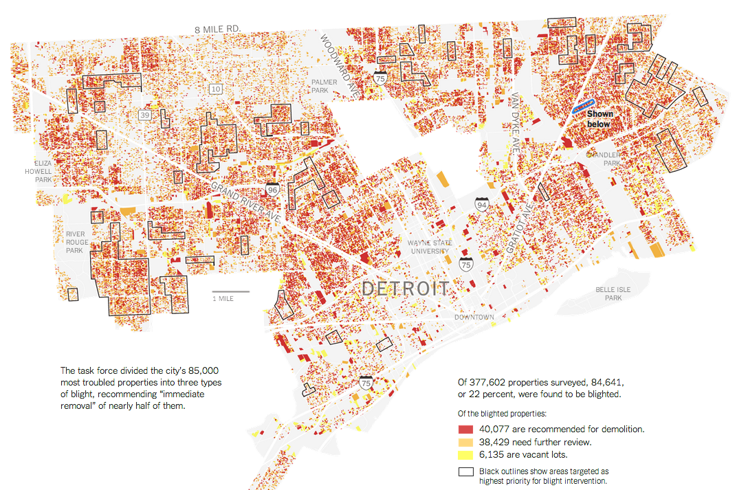
A little old, but this graphic from the New York Times explores urban blight in Detroit. The interesting feature about the map is the blue, highlighted section. The designers used Google Streetview to show an actual blighted street.
Detroit blight
Credit for the piece goes to the New York Times graphics department.
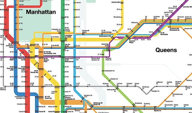
Massimo Vignelli died yesterday at the age of 83. Fastco has a much better article than I think I could read, this image is from their piece but is of Vignelli’s transit map for New York. I wrote about an interactive piece several years back that allowed you to compare Vignelli’s map to the new system map for the MTA.
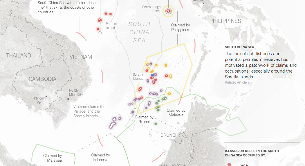
Over the last few weeks, tensions have been rising in the South China Sea. While most of the world has been focused on violence in Ukraine and Nigeria, fishing boats and other maritime vessels in the South China Sea have been clashing—thankfully without the use of guns or missiles. These clashes contribute to a growing fear that one day, one clash will spiral out of control and lead to something more than required paint jobs for fishing trawlers.
Thankfully, for those of you unfamiliar with who exactly owns what and what they think they own versus what they think others own—in short a mapped out version of the conflict—the New York Times has put together a nice map.
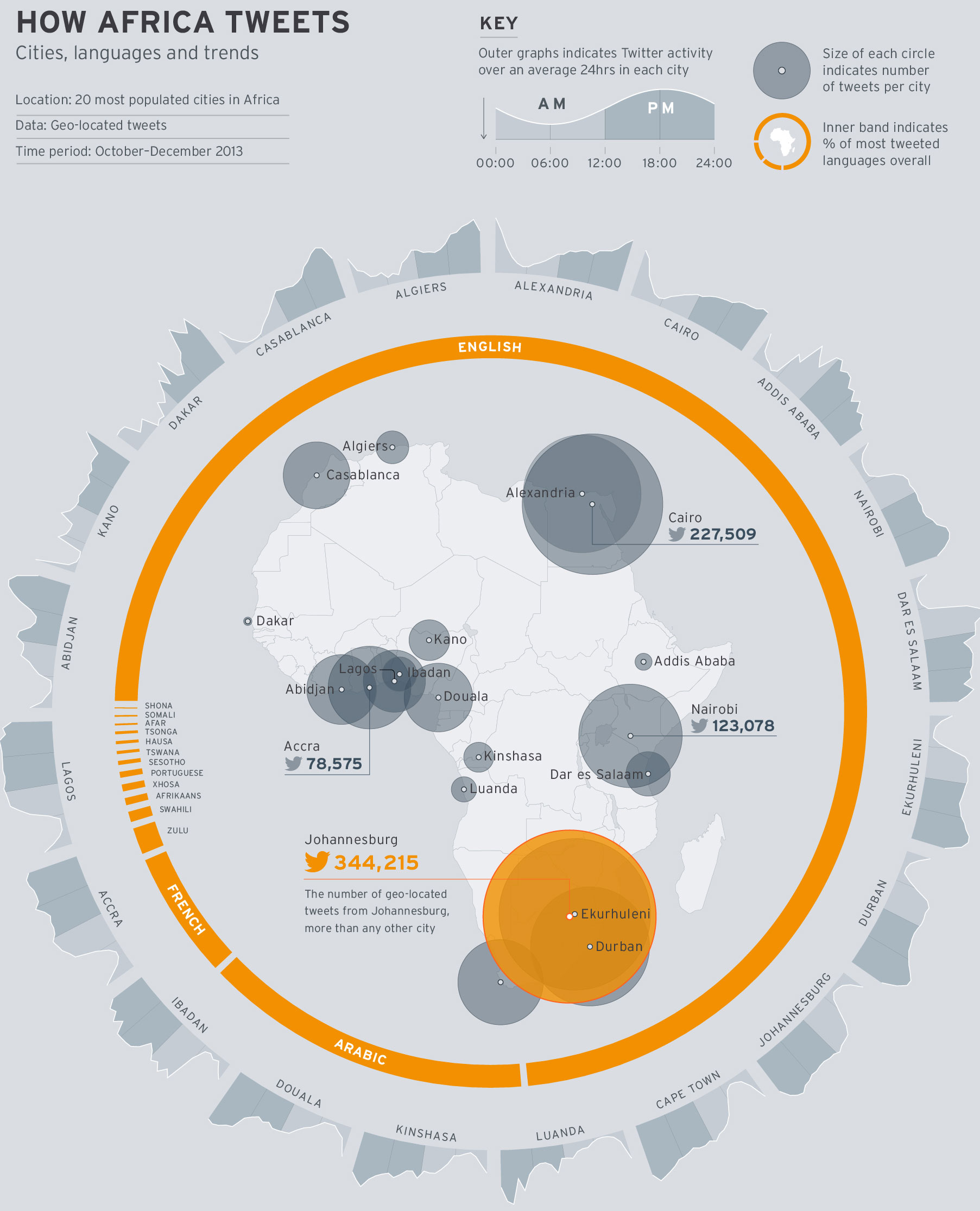
Today’s piece is hit and miss. It comes from the World Economic Forum and the subject matter is the use of Twitter across Africa. I think the subject matter is interesting; mobile communication technology is changing Africa drastically. The regional trends shown in the map at the core of the piece are also fascinating. Naturally I am left wondering about why certain countries. Does spending on infrastructure, GDP per capita, disposable income levels have any sort of correlation if even only on a national and not city level?
How Africa tweets
But what really irks me is the content that wraps around the map. First the donut chart, I think my objections to donuts—at least the non-edible kind—are well known. In this case, I would add—or sprinkle on—that the white gaps between the languages are unnecessary and potentially misleading.
Secondly, the cities are eventually displayed upside down. Thankfully the labels are reversed so that city names are legible. However, the continually changing angle of the chart makes it difficult to compare Douala to Luanda to Alexandria. A neatly organised matrix of small multiples would make the data far clearer to read.
In short, I feel this piece is a good step in the right direction. However, it could do with a few more drafts and revisions.
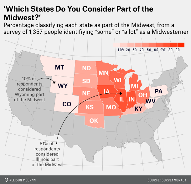
Last Friday, we looked at how one individual defined the state of Florida. Today, we look at how FiveThirtyEight attempted to get lots of people to define the Midwest.
Defining the midwest
Personally, as someone from Philadelphia I tend to side with the author of the article, Walter Hickey. He writes he’s “from New York, and [he] generally consider[s] anything west of Philadelphia the Midwest.” That’s pretty much the truth.
And if you like this piece, check out the subsequent piece on defining the South.
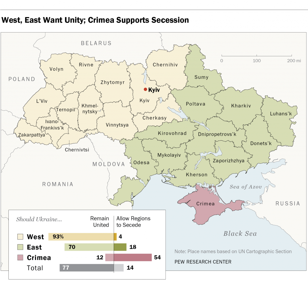
In the votes held this past weekend, the separatists in Donestk and Luhansk claim they received a mandate for independent states. However, according to polls conducted by Pew a few weeks back, most of Ukraine, with the notable exception of Crimea, wants to remain united as a single country. In fairness, this poll was conducted after Russia annexed Crimea but before the deaths of pro-Russian separatists in Odessa and Mariupol. (Anecdotally, those events have driven some to the separatist camp.) The map below is part of the Pew report. However, I have an issue with it that, again in fairness, might not be solvable given whatever raw data with which Pew was working.
Who wants secession? Only Crimea.
The map colours each oblast, roughly equivalent to a US state, according not to the results of the survey, but rather to which region the oblast belongs. For example, Kirovohrad is the same colour as Donetsk. Donetsk, however, is the epicentre of the unrest in Ukraine whereas I have at least seen no reports of unrest in Kirovohrad. Are they really reporting the same desire of unity or secession? Would the map not be clearer if each oblast was reported independently?
My guess is that results like these are clear to the Kremlin. And so I think while Donetsk and Luhansk will remain Ukrainian, Crimea will likely remain Russian.
Credit for the piece goes to the Pew Research Center’s graphics department.