The Sinking of the Bounty

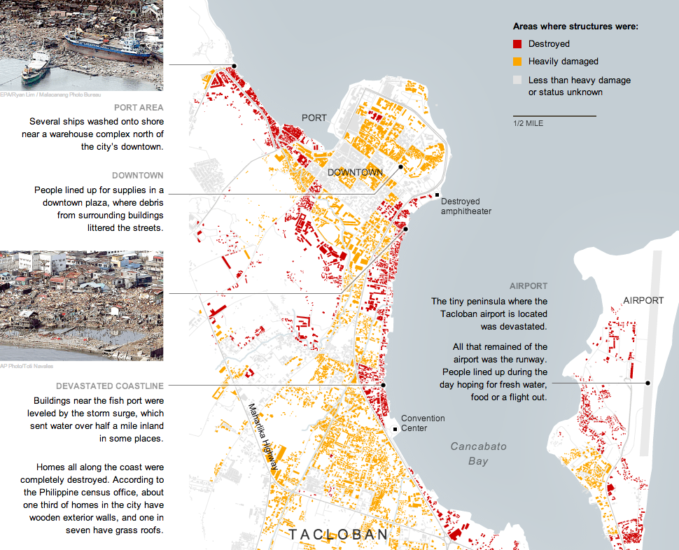
This time last year, the Northeast began to pick up what was left from Hurricane Sandy. There was a lot of rain, a lot of wind, flooding, and electrical outages. But not all the damage was ashore. In an excellent long-form narrative piece, the Tampa Bay Times covered the story of the Bounty, a functional replica of HMS Bounty from that famous story of a mutiny. This Bounty was used in the 1960s movie and had sailed ever since until it sank off Cape Hatteras, North Carolina.

A diagram of the Bounty

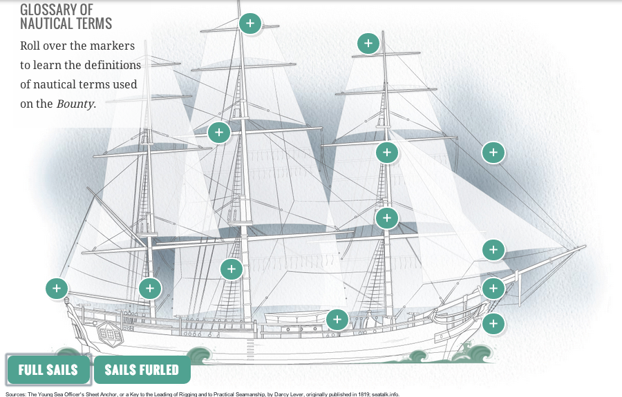
The piece doesn’t makes use of some charts and graphics to explain positioning and familiarise the reader with terminology. It’s a fascinating though ultimately tragic story. And like so many of these long-form pieces, the credit list is extensive.

Credit for the piece goes to Michael Kruse, Don Morris, Maurice Rivenbark, Carolyn Edds, Caryn Baird, Barbara Moch, Mike D’Andrea, Bill Duryea, Alexis N. Sanchez, and Lee Glynn.

Haiyan’s Destruction in Tacloban

On 8 November, Typhoon Haiyan made landfall in the Philippines, killing what may well be 10,000 people. The New York Times covered much of the damage in Tacloban, perhaps the hardest hit city, in this interactive graphic.

Structural damage in Tacloban

Credit for the piece goes to the New York Times graphics department.

Scale of Syria’s Refugees

So that civil war in Syria thing, yeah, it’s still going on, folks. And lots of people—7,000,000 of them—have been forced to flee to either external or internal locations. Al Jazeera has attempted to put that number into context for Americans using US census data and maps.

Here is a look at both Philadelphia and Chicago for comparison’s sake. The interactive application has a few pre-selected options, or you can find your own US locale.

Syrian refugees based on Philadelphia's population
Syrian refugees based on Philadelphia’s population
Syrian refugees based on Chicago's population
Syrian refugees based on Chicago’s population

Credit for the piece goes to Michael Keller.

Virginia Election Results

Last night was election night. Okay, maybe not the big midterm, but there were still a few interesting races. The one I want to look at it, however, is the gubernatorial race in Virginia. Maps are pretty much the default in big, statewide races like these and it is no surprise that the three screenshots here are use a map as an anchor component.

The Huffington Post uses a scatterplot to compare the margin of victory for Terry McAuliffe to that of Barack Obama in 2012. A technical flaw places the drop down menu atop the plot, unfortunately, but the component works to show differences in just one year.

Huffington Post results

Over at the New York Times, the Virginia results were given a nice overview. Here they used a text summary to explain the race in short. They used a small amount of space to show polling results over time. And then beneath the map they looked at recent elections across the state.

New York Times results

The Washington Post, which reports to the northern counties of Virginia, had a much simpler piece. They used solely a map to present the data.

Washington Post results

Credit for the Huffington Post piece goes to Aaron Bycoffe, Jay Boice, and Hilary Fung.

Credit for the New York Times piece goes to the New York Times’ graphics department.

Credit for the Washington Post piece goes to the Washington Post’s graphics department.

LAX Shootings

I didn’t see a lot of informative graphics regarding the shooting at LAX. But, here are two pieces. The first is from the Los Angeles TImes. Terminal 3 is rendered in three dimensions. Different buttons add views of the remainder of the airport.

Los Angeles Times' terminal diagram
Los Angeles Times’ terminal diagram

The Washington Post opted for a flat, two-dimension drawing in one graphic with both all of LAX and Terminal 3 in the same graphic.

Washington Post's terminal diagram
Washington Post’s terminal diagram

The thing about the three-dimensional rendering is that it adds too much complexity whereas the two-dimensional schematic strips most of it out. Is it important to know the specific details of a building? Or is it more important to see its general shape and an area inside of it?

Credit for the Los Angeles Times piece goes to Javier Zarracina, Raoul Ranoa, Lorena Iniguez, and Anthony Pesce.

Mapping Public Health Data

Today’s piece maps and charts comes from the Illinois Department of Public Health. The piece combines maps and charting components to detail preventable hospitalisations and emergency room use in the state of Illinois.

Public health map
Public health map

Ordinarily I would prefer just one map, however, in this case the designers realised that a regional map—with its larger surface area—need not be as large as the county map. Some additional elements worth noting is the area devoted to the human explanation of the categories, which might otherwise be difficult to understand.

Credit for the piece goes to Axis Maps.

Illegal Arrivals to Australia

This article on Yahoo by the AFP has an interesting graphic on the problem facing Australia of illegal arrivals via boat that, in part, probably cost Kevin Rudd and the Labor Party of Australia the recent election.

Illegal arrivals to Australia

I like the overall graphic, but I feel that the data labels are unnecessary on the line chart and the bar chart. They distract from the overall shape of the data and are anyways hinted at by the axes labels within the charts themselves. Also, I am a bit unclear as to the meaning of the grey bars in the line chart.

Credit for the piece goes to John Saeki.

The Roma of Europe

The Roma, or the Gypsies, are a displaced population living throughout Europe. They have been in the news recently. In France, a family was deported to Kosovo after their asylum appeal was rejected after a few years. However, the deportation removed a girl from a French school and the outcry was sufficient that President Hollande intervened. The girl—but not her family—is being allowed to return to France to complete her education. Also last week, Greek police picked up a fair-skinned, blonde-haired, green-eyed girl from a Roma camp because she did not look like her family. They performed a genetic test and found she was of no relation and fear the child was kidnapped. A bit earlier than last week, the French interior minister said that most Roma were not capable of integrating into French society and that they should leave France. And so the New York Times put together a piece supporting an article about the Roma population in Europe that is worth a quick look if you want to better understand the Roma diaspora.

The Roma diaspora
The Roma diaspora

Credit for the piece goes to the New York Times graphics department.

Redesigning the Traffic Map

This small graphic is one of several from a very smart piece on redesigning the traffic map. Have you ever looked at a Google or an Apple traffic map to find the quickest route home or to get an idea of how long it will take you to get to the ballpark? According to Josh Stevens, your traffic map is lying to you.

Potential solutions
Potential solutions

The article is a summary or overview of a research paper not-yet-published. When you have a few moments, the whole thing is worth the read for its analysis of popular transit map designs and the five big lies.

Credit for the piece goes to Josh Stevens.