This small graphic is one of several from a very smart piece on redesigning the traffic map. Have you ever looked at a Google or an Apple traffic map to find the quickest route home or to get an idea of how long it will take you to get to the ballpark? According to Josh Stevens, your traffic map is lying to you.
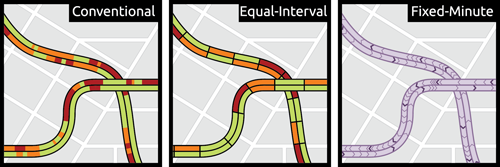
The article is a summary or overview of a research paper not-yet-published. When you have a few moments, the whole thing is worth the read for its analysis of popular transit map designs and the five big lies.
Credit for the piece goes to Josh Stevens.
Author: Brendan Barry
I am a graphic designer who focuses on information design. My day job? Well, they asked me not to say. But to be clear, this blog is my something I do on my own time and does not represent the views of…my employers. I think what I can say is that given my interest in information design—be it in the shape of clear charts, maps, diagrams, or wayfinding systems—I am fortunate that my day job focuses on data visualisation. Outside of work, I try to stay busy with personal design work. Away from the world of design, I have become an amateur genealogist and family historian. You will sometimes see that area of work bleed into my posts.
View all posts by Brendan Barry