The New American Center

NBC News and Esquire magazine published results from their August survey of some 2000+ respondents that attempted to define the New American Center, i.e. the political persuasions of the majority of the country excepting the radical right and the loony left. For the purposes of Coffee Spoons, I am most interested in looking at the data visualisation and the infographics that result.

Both NBC News and Esquire visualised the results. While I could write two long blog posts looking at both of them, for today, it is more important to look more at the fundamental design difference between the two.

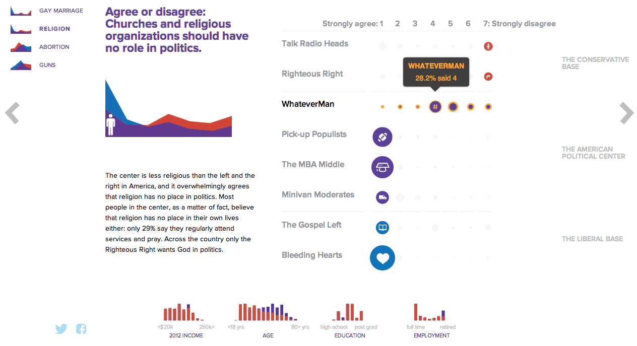
NBC News opted for a design direction emphasising data first. Perhaps because NBC is a news platform, their focus was on the clean communication of the data. Looking

NBC News results
NBC News results

On the other hand, Esquire opted for a more sensationalised direction. The same data points used for the screenshot above creates this graphic below. Not only is less data is contained, less context given, less subtlety and nuance captured, it also is just difficult to read. Is the 59% supposed to be the area of the cross filled in? Its length? Why is it three-dimensional? Where are the Snowdens of yesteryear? At first glance, I ignore the horizontal wings and focus solely on the vertical length of the main bar.

Esquire results
Esquire results

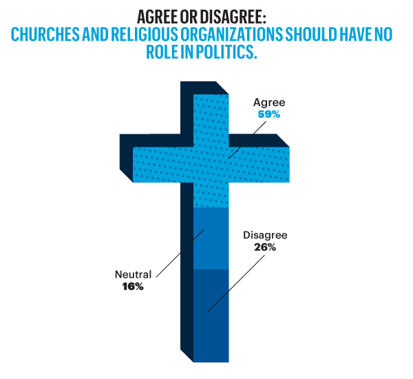
For a useful representation of data, I think NBC News clearly wins. But that both organisations used the same data to craft their separate results, this story on the New American Center is useful for comparing two different design directions and the results thereof.

No designers are specifically mentioned, at least not that I could find, so credit for each piece goes to its respective owner, i.e. NBC News or Esquire.

Where Medicaid is Not Expanding is Where it is Needed Most

Last summer, the Supreme Court ruled that most of the Affordable Care Act, also known as Obamacare, was constitutional. The one exception, however, was the plan to force states to expand their Medicaid coverage. Medicaid is the government plan tasked with helping to provide health insurance to the poor. But between the poverty level and the income level for subsidies for the new state exchanges, there is a gap. That gap was supposed to be covered by the state expansion of Medicaid.

Because the states are not being forced to expand their coverage, there now exists state-by-state gaps in health insurance coverage. This excellent interactive graphic from the New York Times looks at the poverty and insurance coverage segregated into those states that are and are not expanding their coverage. A good number of those states with high rates of poor and uninsured are Republican, deep-South states. If you’re really clever, you’ll compare this map to my map from earlier this week about the Conservative Party. Notice any overlaps?

States not expanding Medicaid

Credit for the piece Robert Gebeloff, Haeyoun Park, Matthew Bloch, and Matthew Ericson.

The Republicans Who Support a Clean Budget Resolution

Yesterday, we looked at the new Conservative Party of America. But those are the votes that John Boehner fears to upset—and possibly fracture his party and cost him his job—if he should let a clean budget resolution come to the floor and should it pass. But why would it pass if it needs 217 votes and there are only 200 Democrats? Well, now we have a nice interactive graphic from the Washington Post that explores the moderate Republicans. Which, if this count is accurate, would provide enough votes when combined with Democrats to pass a clean budget.

The moderate Republicans…

Why are these Republicans in favour of a clean budget resolution? The y-axis shows that they are in moderate or mixed congressional districts, i.e. not Conservative districts. The x-axis shows that a fair number of these moderates have a high proportion of federal workers within their respective district. And who’s not working/earning money during the shutdown? Yep, a lot of federal workers.

Credit for the piece goes to Aaron Blake, Dan Keating, Ted Mellnik, and Darla Cameron.

The Conservative Party of America

We enter our second week of the government shutdown. Of course, blame for the shutdown falls largely upon a small number of conservative Republican members of the House, bolstered by Senator Cruz (R-TX) and his allies in the Senate. But we already know that there are a number of moderate Republicans who want to pass a clean budget resolution. So one way of looking at this new conservative faction is as a new minor party in a coalition government with Ted Cruz as Party Leader.

The idea is not mine. Ryan Lizza first wrote about the “Suicide Caucus”, a topic that Philip Bump expanded upon several days later. However, as a thought experiment, I was curious to see what would happen if this third party, a Conservative Party, would look in data visualisation terms. So here’s a quick stab at America’s newest third party.

The Conservative Party of America

Paying Federal Employees

The Washington Post put together this infographic looking at paydays for federal employees who will still be working during the shutdown, e.g. military service personnel. Of course, if the shutdown drags on, the paychecks for those still working would be delayed.

Paying essential personnel

Credit for the piece goes to Lisa Rein and Todd Lindeman.

The US Government Shuts Down

So the House Republicans’ Tea Party wing added several different non-budget riders centred around the Affordable Care Act (which they have labelled Obamacare) to the budget. And then the whole House Republican caucus passed it despite threats of immediate vetoes from both the Democratic Senate and the White House. The House Republicans have shut down the US government because of their refusal to remove non-budget legislation from the budget. This after the Affordable Care Act was deemed to be constitutional. After 42 separate votes on scrapping it. After the 2012 elections where the Democrats, who ran on keeping the Affordable Care Act, won more votes than Republicans, who ran on scrapping it. But, it gets even more zany than that as this fantastic infographic shows the pinball-like refusal of the Tea Party to remove the Affordable Care Act knowing well in advance that the Senate Democrats were not going to allow the rider.

The back and forth
The back and forth

Credit for the piece goes to Karen Yourish and Archie Tse.

Protests Around the World

Today’s post features an animated map by a doctoral candidate at Penn State. It plots out month-by-month protests across the world. It moves a bit fast and could perhaps make use out of some guided navigation, e.g. focusing the user’s attention on specific areas at specific times, but is still an interesting view of the world.

Protests in time and space

Credit for the piece goes to John Beieler.

Paying a Bribe

Some say bribes grease the wheels of business. But if that is the case, where are the greasiest wheels? This interactive piece from the BBC showcases an interesting story. It maps who has paid bribes and the value thereof. Then it looks at corruption in the different sectors of the country and which is perceived to be the most corrupt.

A look at bribery
A look at bribery

Aesthetically this is not the finest piece. Some of the most interesting countries to view are in Africa and Southeast Asia, i.e. geographies near the equator. Unfortunately the designers here chose a map projection that emphasises Siberia and Arctic Canada at the expense of those very countries. Also, where did Greenland go? I know that the ice is melting, but I don’t think it’s melted that quickly. Furthermore, if the user clicks the “List” option, he or she is presented only with a list of geographies. None of them are selectable nor do they encode data. So why is the list there?

In short, the interface is a bit clunky and strangely designed. Line lengths are too long and it looks ugly. But, there are two interesting things going on here worth noting. First the legend here actually does not just show the range for the choropleth, but it also encodes the number of countries that fall within that range.  

Second, by clicking on a particular bin for the legend, the map filters for the selection. I think that from a design perspective, a lighter grey and a lighter stroke outline would have made the filtering a bit more prominent, but the idea is interesting. Unfortunately, I found no way of easily returning to an all-bin view of the map.

A piece for the BBC that misses a few, but also hits a few.

Credit for the piece goes to the BBC graphics team.

Hunger Strikes

Guantanamo Bay and the US military prison there almost always spark a debate. For some months now, prisoners have been staging a hunger strike. Increasingly, however, the strike is garnering attention not for itself, but for the US military’s treatment of the prisoners in force feeding them. The National Post looked at just how this is being done in this infographic. Pay particular attention to the illustration of the tube, which is drawn to actual size.

Force feeding Guantanamo's striking prisoners
Force feeding Guantanamo’s striking prisoners

Credit for the piece goes to Andrew Barr, Mike Faille, and Richard Johnson.

Covering the New York Mayoral Primaries

Tuesday was election day in New York (among other places) where voters went to the polls for the mayoral primary (among other positions). For those living underneath what I can only presume was a very comfortable rock, this is the whole Anthony Weiner comeback election. Anyway, a bunch of different websites, most tied to the New York area, were covering the election results. So I wanted to share just a few.

First we have the Huffington Post with the most straightforward presentation. Their table covers the main candidates and their results at a borough level and at a city-wide level.

The Huffington Post's tabular results
The Huffington Post’s tabular results

The second is from the Wall Street Journal. This uses a choropleth map with different colours assigned to a select few persons running—also the only ones with a real chance of winning. Tints of these colours in each district indicate how much of the district has voted.

The Wall Street Journal reports at the district level

From WNYC we have our third example—another choropleth where different colours represent different candidates. However, unlike the Wall Street Journal, the colours here have only one tint. And instead of showing assembly districts, WNYC provides a further level of data and looks at precinct results. It does not represent the amount of the precinct that has voted, but rather whether the candidate is winning by a plurality or by a majority. Beneath the legend a second charting element is used; this details the breakdown of the vote by districts as separated into racial majority. This is an interesting addition that hints at filtering results by related data.

WNYC looks at who's winning and how
WNYC looks at who’s winning and how

And that filtering brings us to the New York Times’ piece, which does offer filtering. It highlights districts on its maps—also precinct-level and not district aggregates—based upon the metric and the specific properties of said metric. In this case, I have chosen income. And the story of different voting patterns (at this particular point in the evening) based on income is quite clear. Look at Christine Quinn’s support.

Results from people earning more than $100k
Votes from people earning less than $100k


Credit for these:

Huffington Post: Aaron Bycoffe, Jay Boice, Andrei Scheinkman, and Shane Shifflett

Wall Street Journal: the Wall Street Journal’s graphics team

WNYC: Steven Melendez, Louise Ma, Jenny Ye, Marine Boudeau, Schuyler Duveen, Elizabeth Zagroba, and John Keefe

New York Times: New York Times’ graphics department