Examining How We Measure Our Lives
Commentary, critiques, and observations on information design and data visualisation
-
Read on…: Asshole
Well, it’s Friday. We made it to the weekend. So here’s a nice Venn diagram from Indexed that captures that guy we all know. Credit for the piece goes to Jessica Hagy.
-
Cannon, Howitzers, Mortars—Oh My!
Read on…: Cannon, Howitzers, Mortars—Oh My!For the last two days I have been writing about the Fort Pitt Museum and some infographics, environmental graphics, diagrams, and dioramas that help explain the strategic value and thus history behind the peninsula at the confluence of the Allegheny, Monongahela, and Ohio rivers. In particular, we looked at Fort Duquesne, the French attempt to […]
-
Fort Pitt
Read on…: Fort PittYesterday I discussed some of the work at the Fort Pitt Museum in Pittsburgh, Pennsylvania. Specifically we looked at Fort Duquesne, the French fortification that guarded the linchpin of their colonies along the Saint Lawrence Seaway and the Mississippi and Ohio River valleys. In 1753, the royal governor of Virginia dispatched a British colonial military […]
-
Diagramming and Diorama-ing Fort Duquesne
Read on…: Diagramming and Diorama-ing Fort DuquesnePittsburgh exists because of the city sits at the confluence of the Allegheny, Monongahela, and Ohio Rivers. As far back as the early 18th century, English and French colonists had recognised the strategic value of the site and as imperial ambitions ramped up, the French finally wrested control of the area from the English and […]
-
Datagraphics as Marketing Materials
Read on…: Datagraphics as Marketing MaterialsI spent the last two weeks out of town, and my post for the Friday before didn’t happen because there was a fire at my building—I and my unit are fine—that knocked out internet for about 24 hours. But now I have returned. One of the things I did was visit the city of Pittsburgh […]
-
We’re a Long Way from Kansas
Read on…: We’re a Long Way from KansasI had something else for today, but this morning I opened the door and found my morning paper. Nothing terribly special. No massive headline. No large front-page graphic. See what I mean? But then as I bent down to pick it up, I spotted a little tree map. But it turned out it wasn’t a […]
-
What It Is to be Asian American
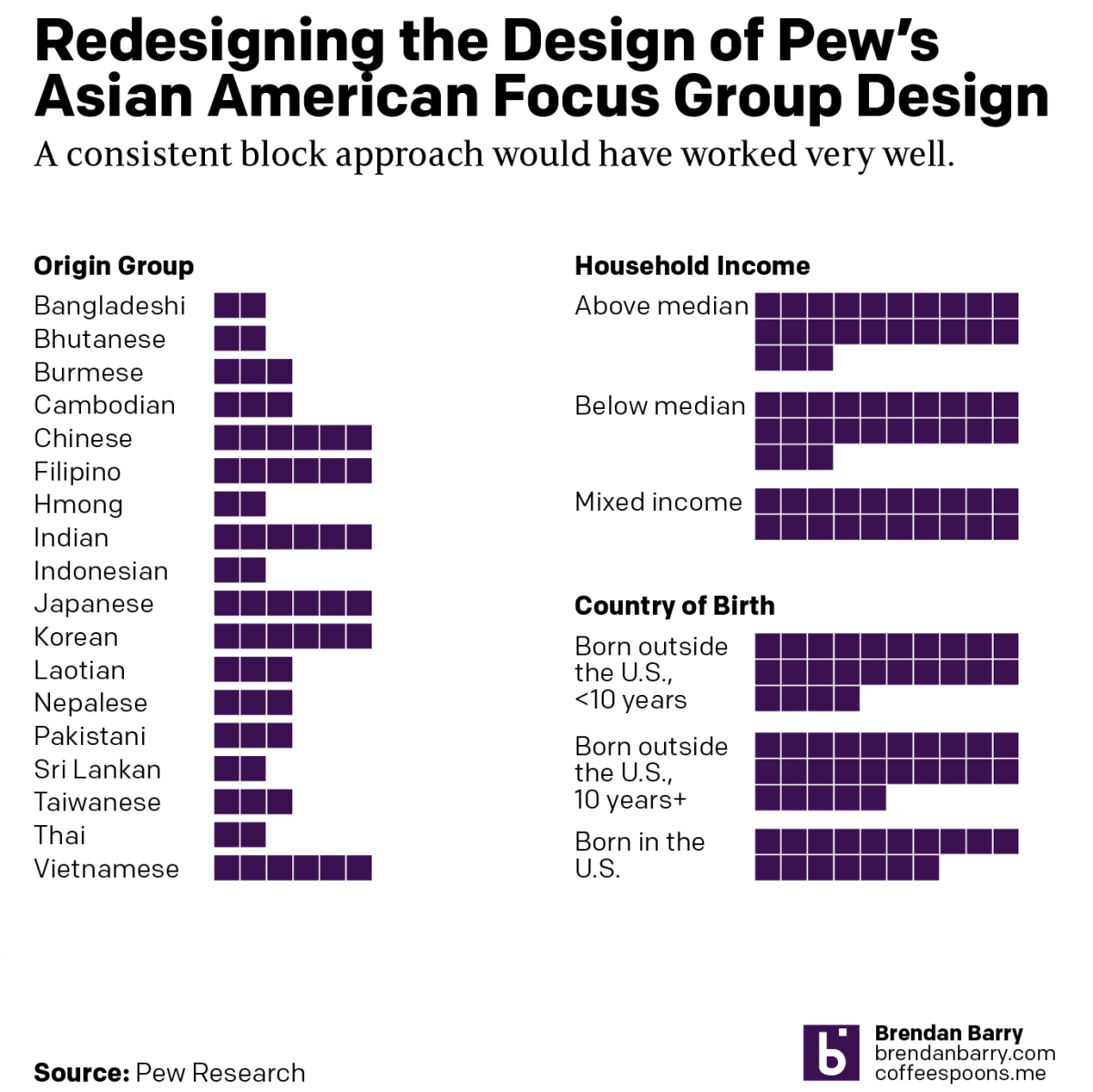 Read on…: What It Is to be Asian American
Pew recently released a report into the Asian American experience. The report used 66 different focus groups to gather feedback and then summarised that with quotes, video bits, and lots of text. But at the beginning of the report was a nice little graphic that detailed the composition of the focus groups. This is not […]
-
Europe By Rail
Read on…: Europe By RailMany of us have pent up travel demand. Covid-19 remains with us, lingering in the background, but it’s largely from our front-of-mind. For those of my readers in Europe, or just curious how superior European rail infrastructure is over American, this piece from Benjamin Td provides some useful information. It uses isochrones to map out […]
-
The Great British Baking
Read on…: The Great British BakingRecently the United Kingdom baked in a significant heatwave. With climate change being a real thing, an extreme heat event in the summer is not terribly surprising. Also not surprisingly, the BBC posted an article about the impact of climate change. The article itself was not about the heatwave, but rather the increasing rate of […]
-
A New Downtown Arena for Philadelphia?
Read on…: A New Downtown Arena for Philadelphia?I woke up this morning and the breaking news was that the local basketball team, the 76ers, proposed a new downtown arena just four blocks from my office. The article included a graphic showing the precise location of the site. For our purposes this is just a little locator map in a larger article. But […]