Tag: information design
-
Waiting for the Family Tree
I spent the past weekend in Harrisburg, Pennsylvania on a brief holiday to go watch some minor league baseball. That explains the lack of posting the last few days. (Housekeeping note, this coming weekend is Orthodox Easter, so I’ll be on holiday for that as well.) Whilst in Harrisburg I did other things besides watch…
-
Where Are We?
It’s been another week. And that’s why I thought of this post from Indexed last week. It seems to adequately describe where are at in this crazy world. But we all made it, so happy weekend, everyone. Credit for the piece goes to Jessica Hagy.
-
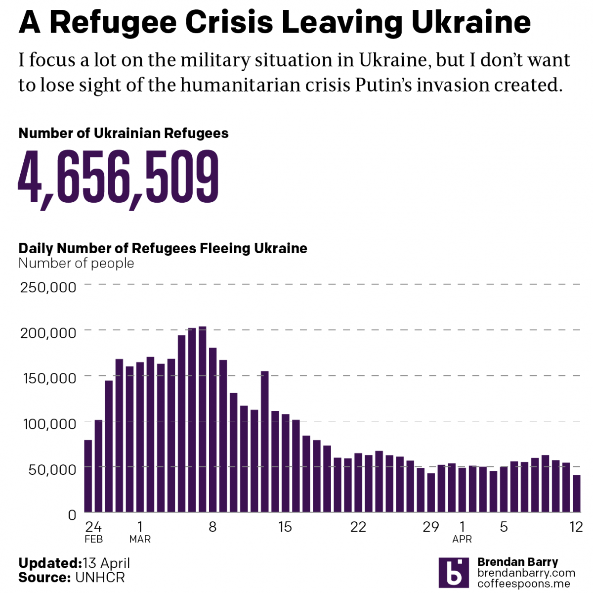
Russo-Ukrainian War Refugees: 12 April
Another week, more combat and refugees in Ukraine. I’m going to try and hold the war update until tomorrow pending some news that hasn’t been confirmed yet: the fall of Mariupol. Instead, we’re going to again look briefly at the refugee situation in Ukraine—technically outside. I haven’t seen a recent number on the internally displaced,…
-
The B-52s
Not the band, but the long-range strategic bomber employed by the United States Air Force. This isn’t strictly related to Ukraine, but it’s military adjacent if you will. I thought about creating a graphic a few years ago to celebrate the longevity of the B-52 Stratofortress, more commonly called the BUFF, Big Ugly Fat Fucker.…
-
Battalion Tactical Groups
As Russia redeploys its forces in and around Ukraine, you can expect to hear more about how they are attempting to reconstitute their battalion tactical groups. But what exactly is a battalion tactical group? Recently in Russia, the army has been reorganised increasingly away from regiments and divisions and towards smaller, more integrated units that…
-
Keeping Things in Scale
Another week of amazing, happy, awesome news. So let’s keep it all in perspective with this graphic from xkcd. We all made it to Friday, so enjoy your weekend, everyone. Credit for the piece goes to Randall Munroe.
-
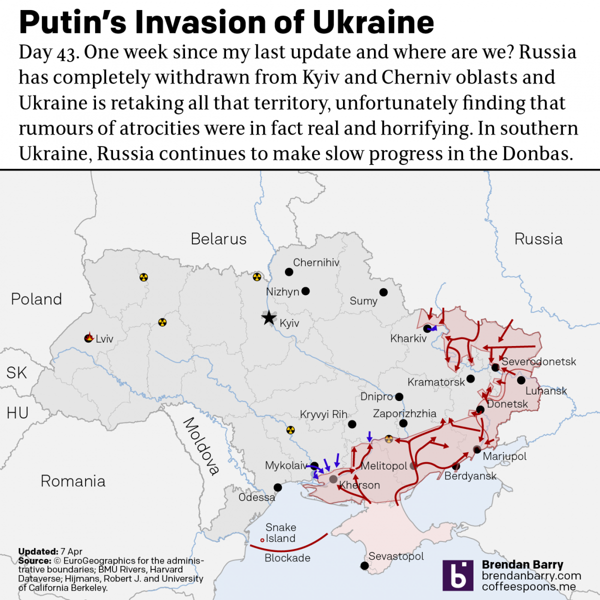
Russo-Ukrainian War Update: 6 April
It’s been a week since my last update and that’s in part because a lot has changed. When we last spoke, the Russians had announced they had successfully completed the first phase of the “special military operation”. They didn’t. Instead, Russian forces have completed a full-on retreat from northern Ukraine, sending troops and equipment back…
-
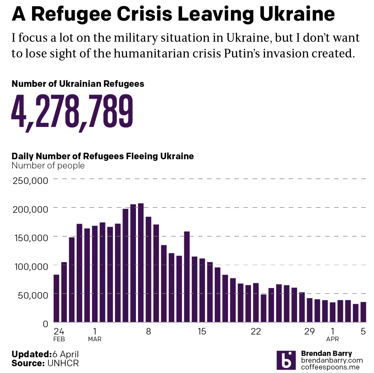
Russo-Ukrainian War Refugees: 5 April
Just a quick update as I try to update my battle map. Today we’re taking another look at the refugee crisis Putin created in eastern and central Europe. Over four million Ukrainians have left Ukraine and millions more have been displaced internally within Ukraine. Whilst we may hope they will eventually return home, the photos…
-
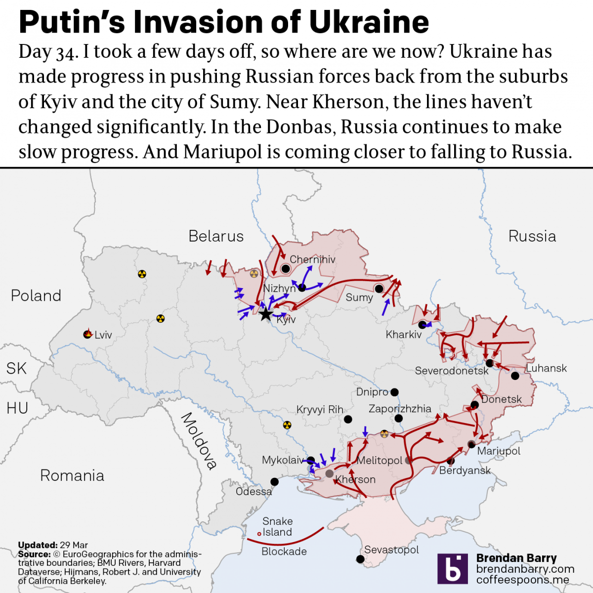
Russo-Ukrainian War Update: 29 March
I took a few days off from covering the war in Ukraine. Now it’s time to jump back in and catch up on things. Putin and his generals have declared the first phase of his “special military operation” over and that it was a success. They claimed that their goal was never the capture of…
-
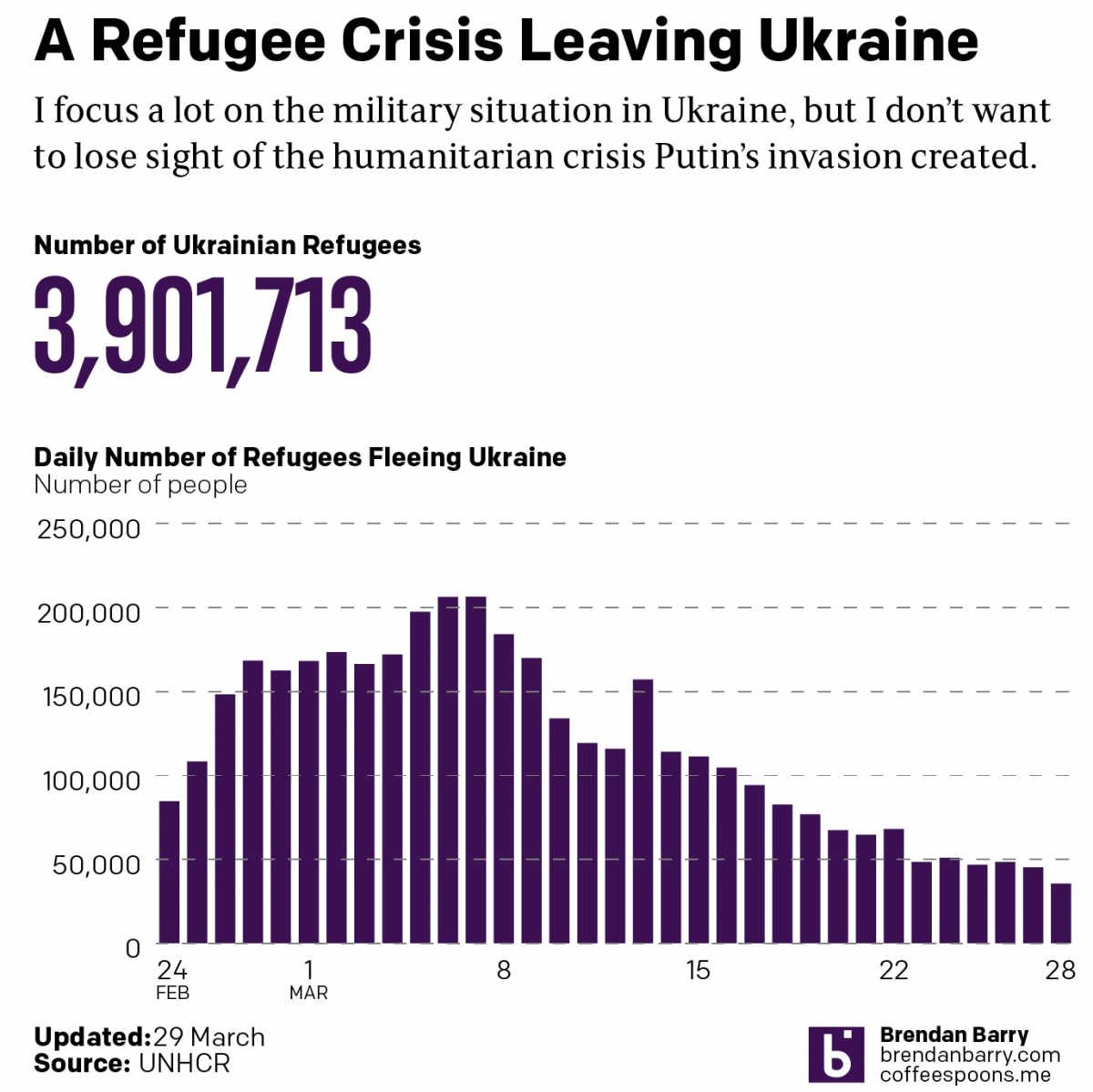
Russo-Ukrainian War Refugees
This data took far longer to clean up than it should have. And for that reason I’m going to have to keep the text here relatively short. We still see tens of thousands of refugees fleeing Putin’s war in Ukraine. Although, we are down from the peaks early on in this war. In total, nearly…