Tag: line chart
-
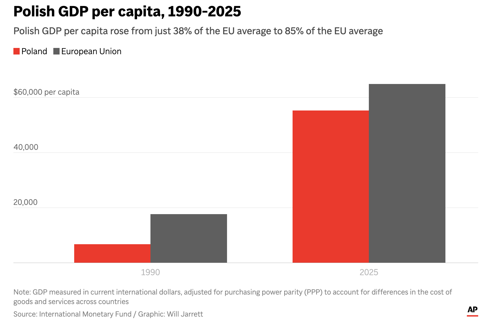
The Axis in Poland
Earlier this week I read an Associated Press (AP) article about Poland’s economic growth since the end of Communism in the former Soviet-bloc state. Generally speaking, things are good in Eastern Europe, though a revanchist Russia to Poland’s east rekindles memories of an earlier era and the disaster after the Molotov–Ribbentrop Pact. The article included…
-
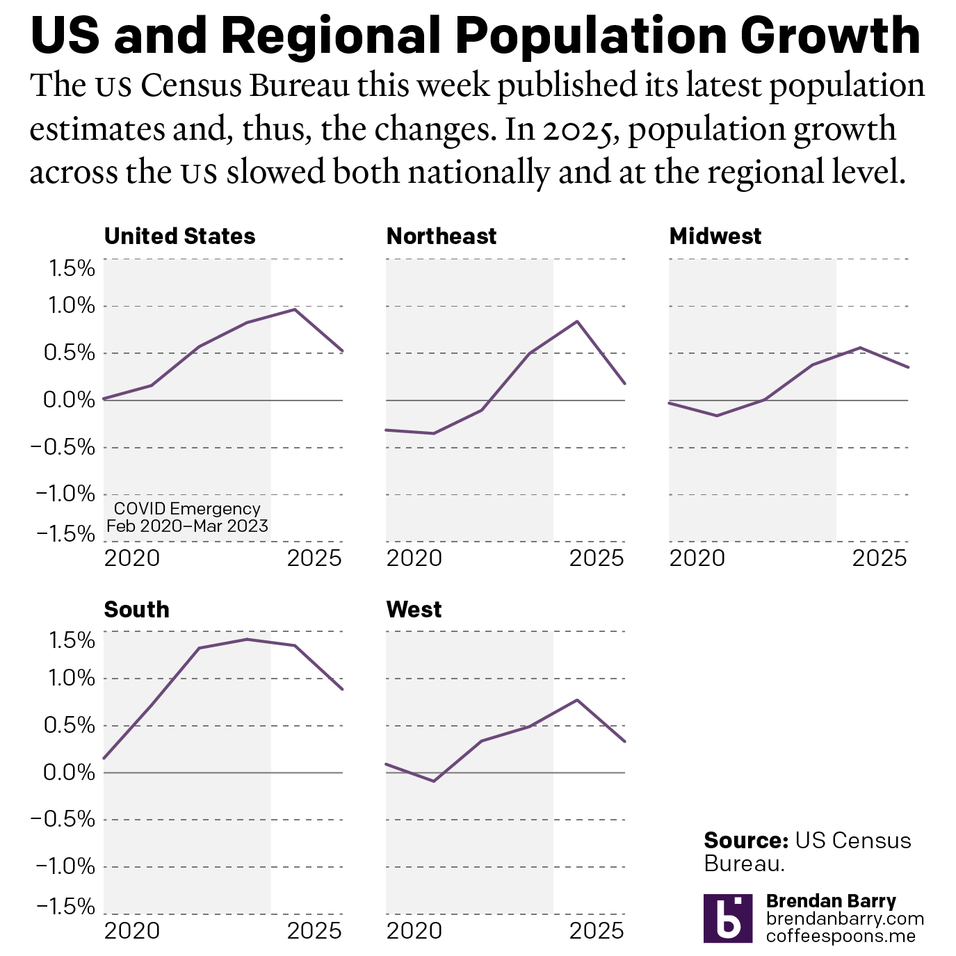
The Slowing of the Growth
This week the US Census Bureau released their population estimates for the most recent year and that includes the rate changes for the US, the Census Bureau defined regions, and the 50 states and Puerto Rico. I spent this morning digging into some of the data and whilst I will try to later to get…
-
Space Is Cool
Well we made it to Friday. One of my longtime goals is to see the aurora borealis, or Northern Lights. My plan for the winter of 2020 was to travel to Norway, maybe visit a friend, and then head north to Tromsø and take in the Polar Night and, fingers crossed, catch the show. Then…
-
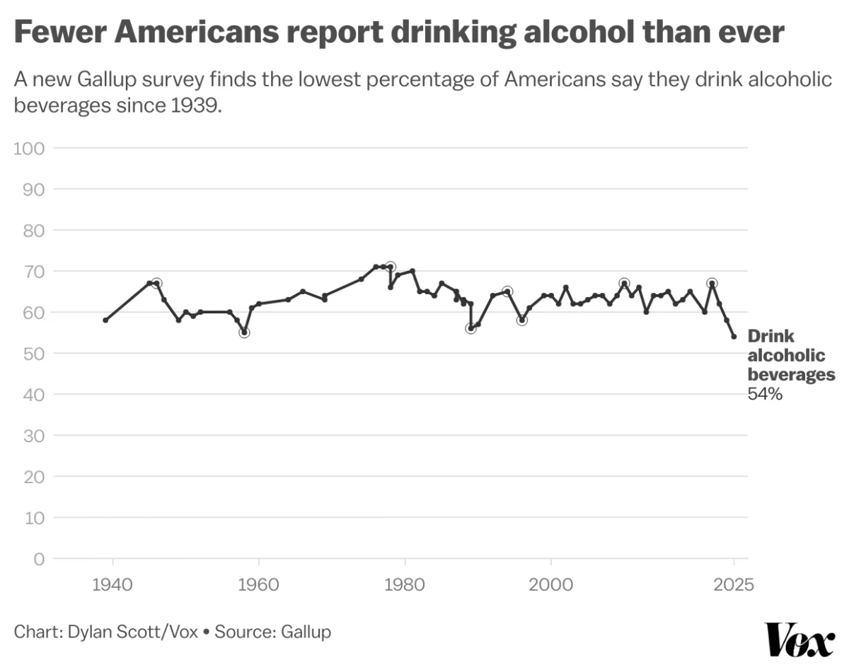
Pour One Out—For Your Liver
Last month Vox published an article about the trend in America wherein people are drinking less alcohol. They cited a Gallup poll conducted since 1939 and which reported only 54% of Americans reported partaking in America’s national tipple—except for that brief dalliance with Prohibition—making this the least-drinking society since, well, at least 1939. Vox charted…
-
Bring on the Beantown Boys
For my longtime readers, you know that despite living in both Chicago and now Philadelphia, I am and have been since way back in 1999, a Boston Red Sox fan. And this week, the Carmine Hose make their biennial visit down I-95 to South Philadelphia. And I will be there in person to watch. This…
-

2025 Red Sox Draft Breakdown
Monday and Tuesday, Major League Baseball conducted its amateur player draft, wherein teams select American university and high school players. They have two weeks to sign them and assign them. (Though many will not actually play this year.) Two years ago the Red Sox installed Craig Breslow as their new chief baseball organisation. He has…
-
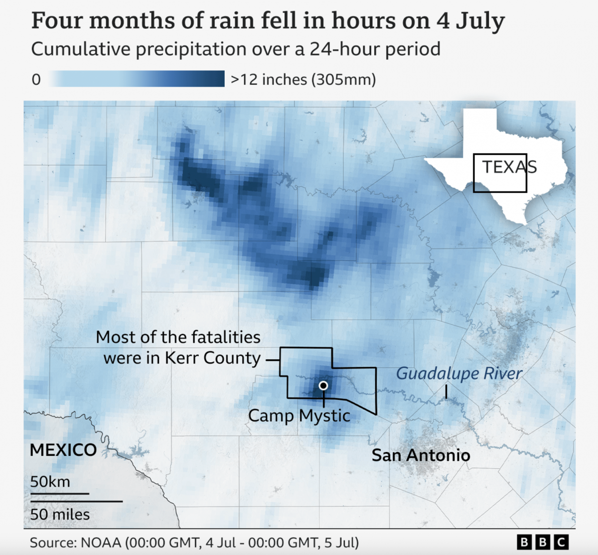
A Warming Climate Floods All Rivers
Last weekend, the United States’ 4th of July holiday weekend, the remnants of a tropical system inundated a central Texas river valley with months’ worth of rain in just a few short hours. The result? The tragic loss of over 100 lives (and authorities are still searching for missing people). Debate rages about why the…
-
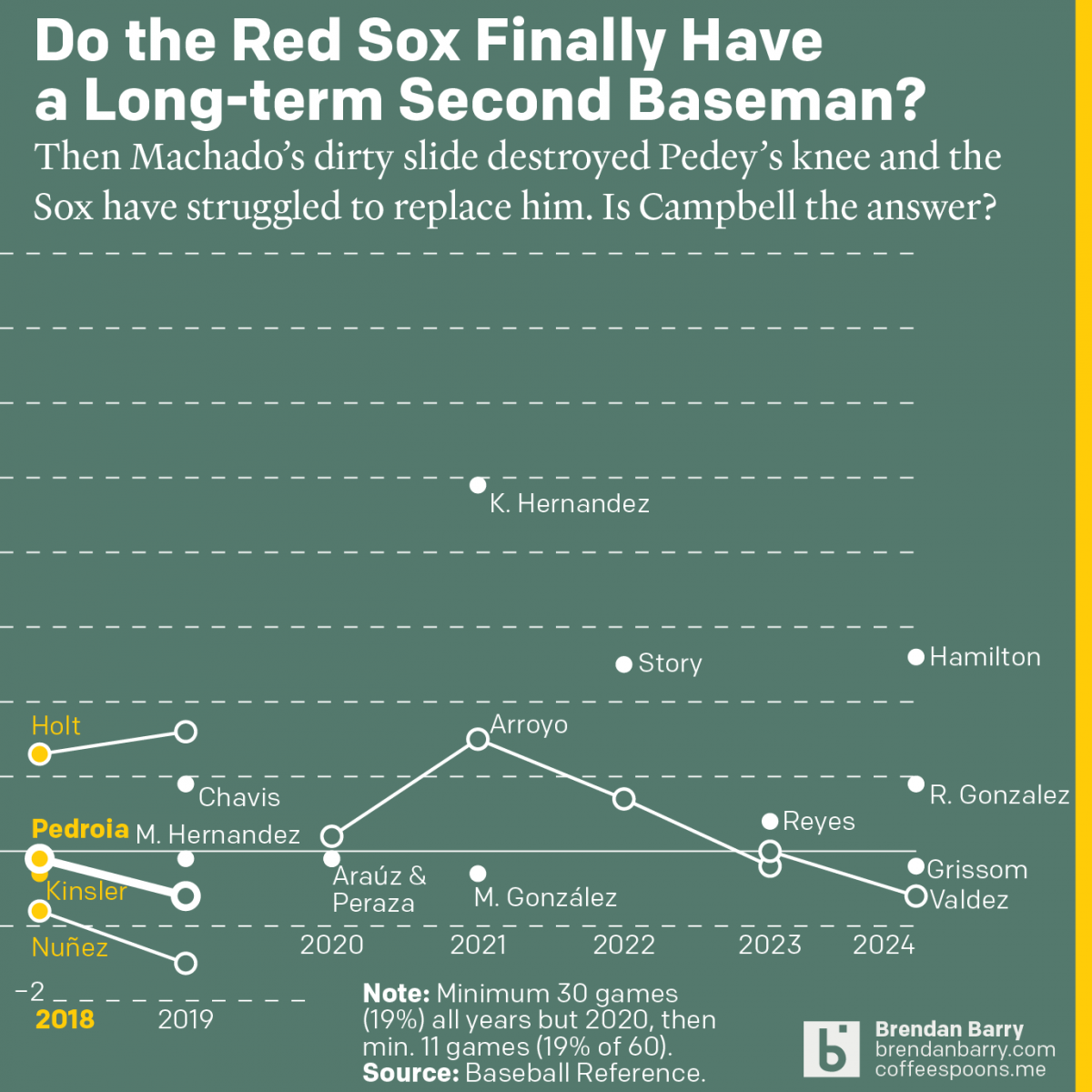
The Red Sox May Finally Have a Second Baseman
Last week was baseball’s opening day. And so on the socials I released my predictions for the season and then a look at the revolving door that has been the Red Sox and second base since 2017. Back in 2017 we were in the 11th year of Dustin Pedroia being the Sox’ star second baseman.…
-
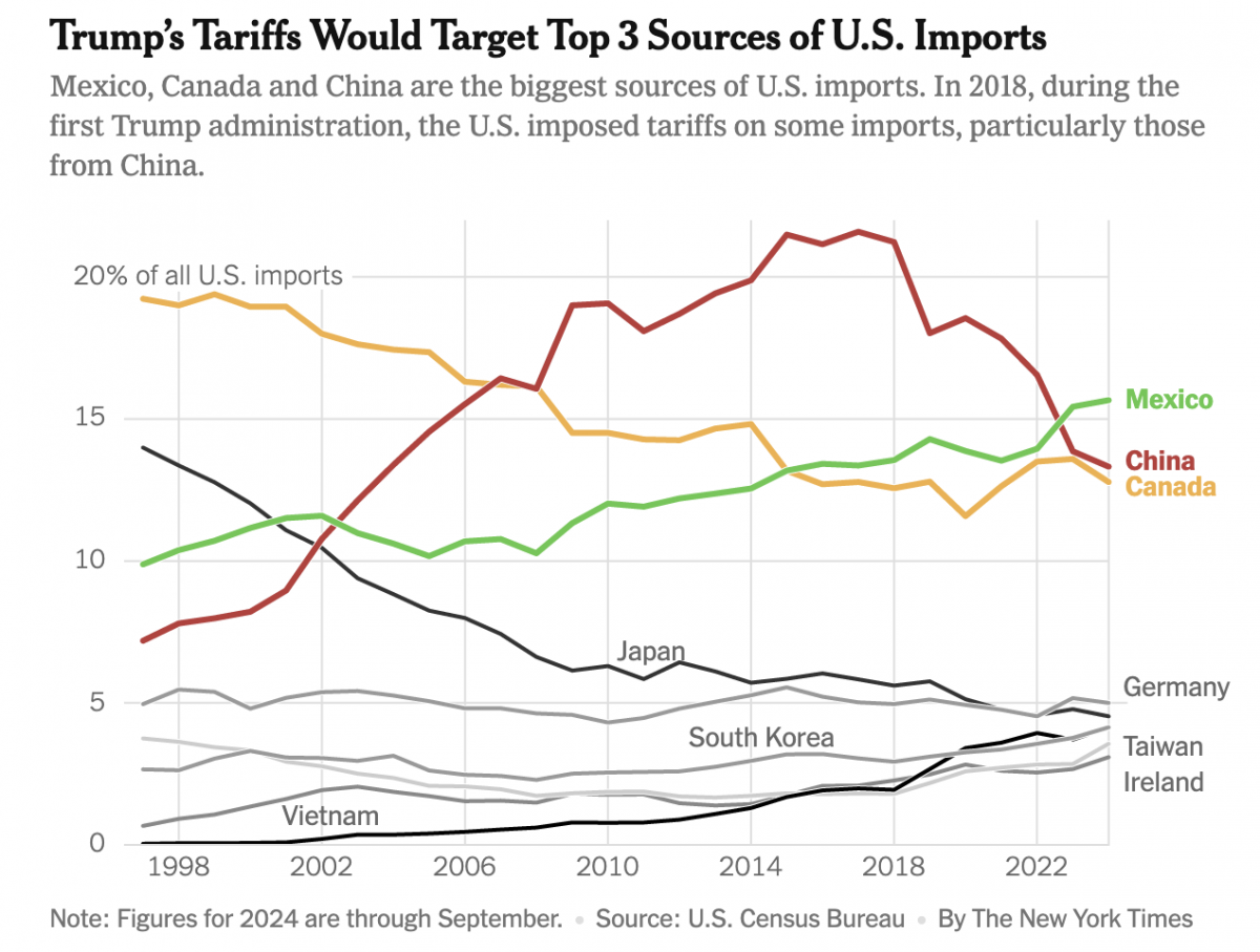
Imports, Tariffs, and Taxes, Oh My!
Apologies, all, for the lengthy delay in posting. I decided to take some time away from work-related things for a few months around the holidays and try to enjoy, well, the holidays. Moving forward, I intend to at least start posting about once per week. After all, the state of information design these days provides…
-
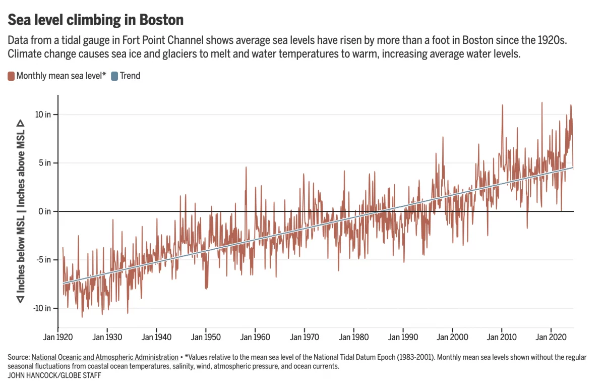
Fear the Floodwaters
This past weekend saw some flooding along the East Coast due to the Moon pulling on Earth’s water. In Boston that meant downtown flooding, including Long Wharf. The Boston Globe’s article about the flooding dwelt with more impact, causes, and long-term forecasts—none of which really warranted data visualisation or information graphics. Nonetheless, the article included…