While the title sounds science-fiction-y, it is true. Star Wars has a famous scenece where a landscape is shown with a binary star system in the sky. But we now know of a quintuple-star system that has two separate sets of binary stars. This BBC article takes a look at how the system is structured.
Two binary star systems
Credit for the piece goes to the BBC graphics department.
It’s Friday, everybody, so let’s lighten the mood with cruel and unusual punishment.
Don’t worry, it’s not as bad as it sounds. No, today we look at a simple two-axis plot or matrix used by Jon Stewart to classify means of death and whether or not they would unconstitutional based on the cruel and unusual clause.
The Cruel and Unusual Punishment Matrix
Credit for the piece goes to the Daily Show’s graphics department.
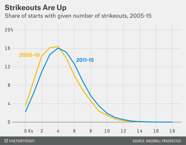
Baseball has changed in the last twenty years or so. (And I’m old enough to recognise it.) Gone are the days of the high strikeout/high pitch count starts from the likes of Roger Clemens, Pedro Martinez, Randy Johnson, and Kerry Wood. In are high strikeout/low pitch count games…
What does that mean? You can read this article from FiveThirtyEight to make the most sense of it. But this chart explains part of it:
More strikeouts per game
Basically, baseball is played with a lot more data than it used to be. We now know empirically that pitchers are most effective the first time through the lineup. Less so the second time. Even less so the third. The great pitchers, obviously, lose less effectiveness, but everybody does. So, if you can maximise your strikeouts (which come at a great cost of pitches thrown per arm—separate story that) by limiting a start to, say, twice through a lineup, you do so. Because then you can plug in hard-throwing relievers who, in their first and often only time through the lineup, can rack up a few strikeouts. So the result from that is higher strikeouts, lower pitch counts.
And that means that it is highly unlikely you will see games where a starting pitcher throws 120, 130, 140 pitches in a start and strikes out 16+ batters. Which is a shame, because I’m clearly old as those were my favourite ball games to watch.
Credit for the piece goes to the FiveThirtyEight graphics department.
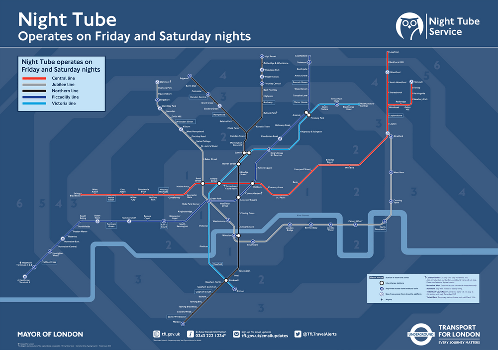
Transport for London (TfL), the organisation that runs the London Underground or Tube, has announced a nighttime service called Night Tube. It is not for the entire system, but only a few specific lines. That means that TfL needed a new map. And that means that everyone will want to create their own version of the Night Tube map. So this article at City Metric looks at just that. The TfL version is shown below.
The official TfL map
Credit for the original goes to Transport for London.
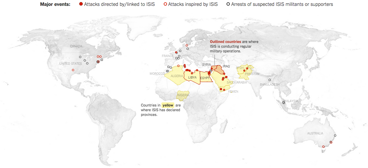
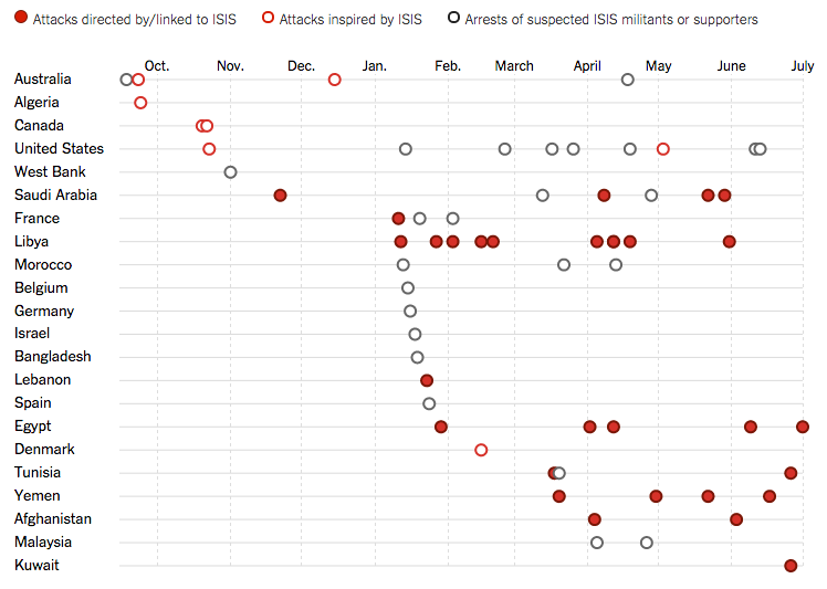
ISIS is still a threat to the Middle East, evidenced by the US announcing yesterday that it is intensifying strikes against the quasi-state in both Syria and Iraq. But just where has ISIS spread? And are its attacks spreading? This New York Times piece looks at just those two questions. The first through an obvious map.
The geographic reach of ISIS at all points over time
What the map does is show you where ISIS has attacked around the world over all time. So yes, it has global reach. But the map alone cannot show you if things are improving or getting worse. For that you need a visualisation type that can plot things over time. And as aforementioned, the piece includes that as well.
A spike in attacks this winter presaged a summer of terror
Unfortunately, it appears that yes, ISIS is attacking or at least attempting to attack more targets in more countries both within and without the Middle East and its declared provinces.
Credit for the piece goes to Karen Yourish, Derek Watkins, and Tom Giratikanon.
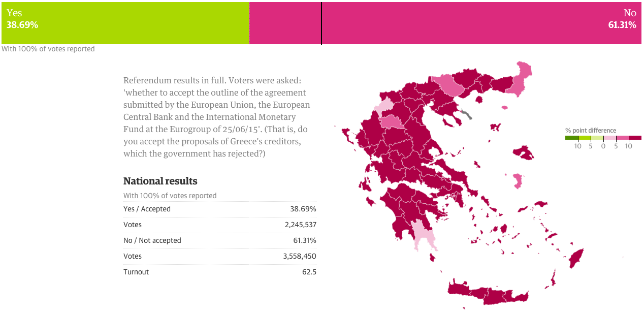
So when I initially planned to do this post for today, I thought the results would be a lot closer and the data display more interesting. But, I was wrong. It turns out the Greeks voted overwhelmingly against the European Union’s offer in a greater than 60–40 result. But, here we go anyways, a whole lot of no in this piece from the Guardian.
Turns out Greeks don’t want austerity
Credit for the piece goes to the Guardian’s graphics team.
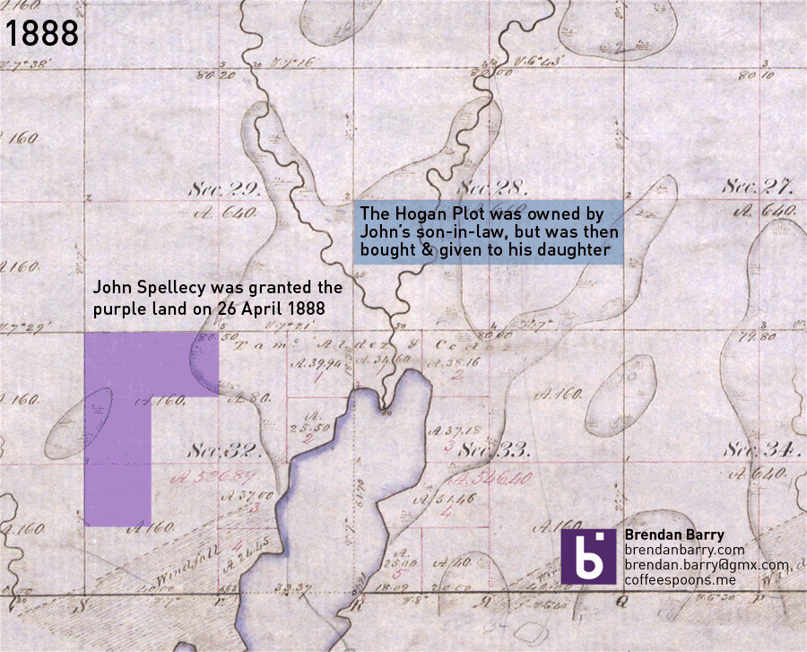
I have returned from my trip up north to Minnesota and Wisconsin. Unfortunately, from the research side it was not the most successful of trips. I did find some records, but none that answered any of the big questions I had. If anything, I now have far more questions. Most of the information I learned deals with the homesteaded land that John Spellecy received in 1888, at the young age of 70. It turns out by the time he was given the land by the US government, he had already made one contract to sell a portion of it. And so to make some semblance of it, I made this animation to show how the land grant disappeared over only a 12 year period.
How the Spellecy plot disappeared
For the curious, the background image is a digitisation of the US government’s original land survey. The A.160 denotes 160 acres, the maximum allowed by a homestead claim.
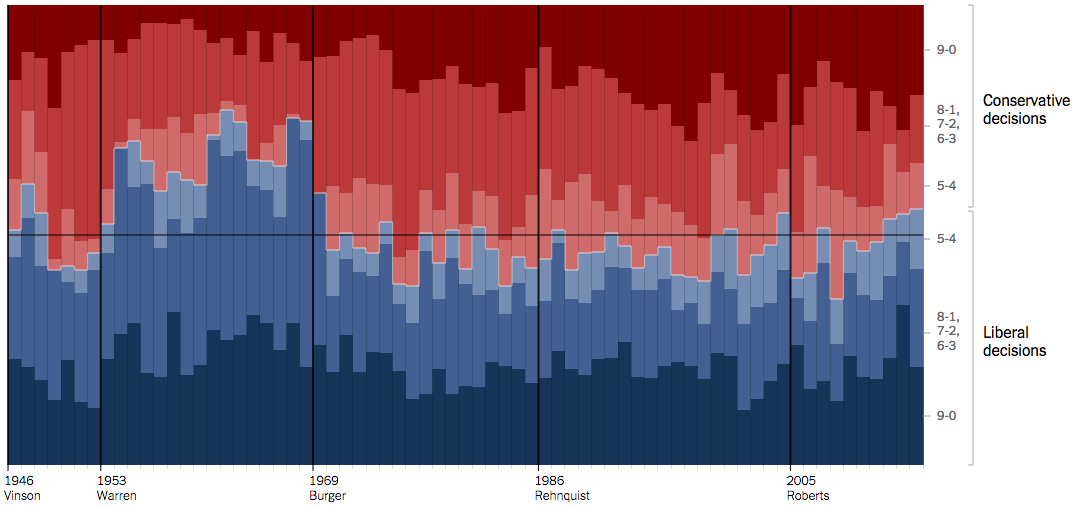
Last week the Supreme Court ruled in favour of the Affordable Care Act, better known colloquially as Obamacare, and said that the federal tax subsidies are, in fact, constitutional. But, this piece is not so much about that one individual ruling, but rather the surprising trend of the recent Roberts’ court terms to skew liberal instead of the expected conservative. In this Upshot piece from the New York Times, an interactive graphic backs up the article explaining just what has been going on in the Supreme Court.
The court has been conservative for decades
Credit for the piece goes to Alicia Parlapiano, Adam Liptak, and Jeremy Bowers.
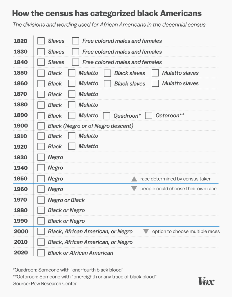
As I said yesterday, I’m up in northern Wisconsin. But sometime later today I should be starting a long drive back to Chicago. So let me continue with one more piece of genealogy- and information-related content that is especially relevant given recent events. Vox posted an article a couple of days ago that looked at the definition of black via census options. Of particular interest is the supplemental or sidebar information: whether you could choose your own race or whether it was chosen for you by the enumerator.
A history of choices
Maybe it’s only a coincidence that the 1890 census records went up in flames.
Credit for the piece goes to the Vox graphics department.
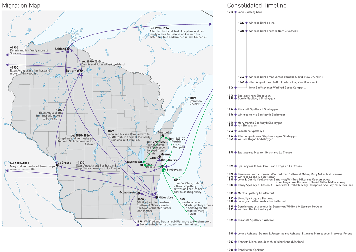
I’m presently off in the northern reaches of Wisconsin, Ashland in particular, researching part of my family’s history. To aid me in understanding just how this frontier-following family moved over one century, I put together a crude map and a timeline to give me context (and jog my memory) while searching through files in the courthouse.
The movements of the Spellacy family
I am calling the map a migration map. It shows the locations where family members moved to in 1849: Sheboygan (from New Brunswick, Canada). And then how they quickly began to disperse, but slowly head north to Ashland County, before most ultimately headed to the West Coast. (My direct ancestors are that group near the bottom that move back to the in-laws original home of western Massachusetts.)
What I struggle with keeping in mind is that here we are looking at a perfectly rendered and understood map of modern Wisconsin. But in 1849, the state was but one year old and most of the towns to which this family would be going were only a decade or so old and still very much frontier towns without amenities. (Which is why I imagine the women of the family stayed in Milwaukee until the settlements in the north were, well, settled.)
To the right is a timeline. The details are not terribly important and in fact it is poorly designed. But, it was quick to make and will hopefully help me keep the names straight and the places for which I am looking top-of-mind.
Put the two together and you have an example of how I create visualisations for myself just to help me with my own work and research.