An Increase in Sexually Transmitted Infections in Boston

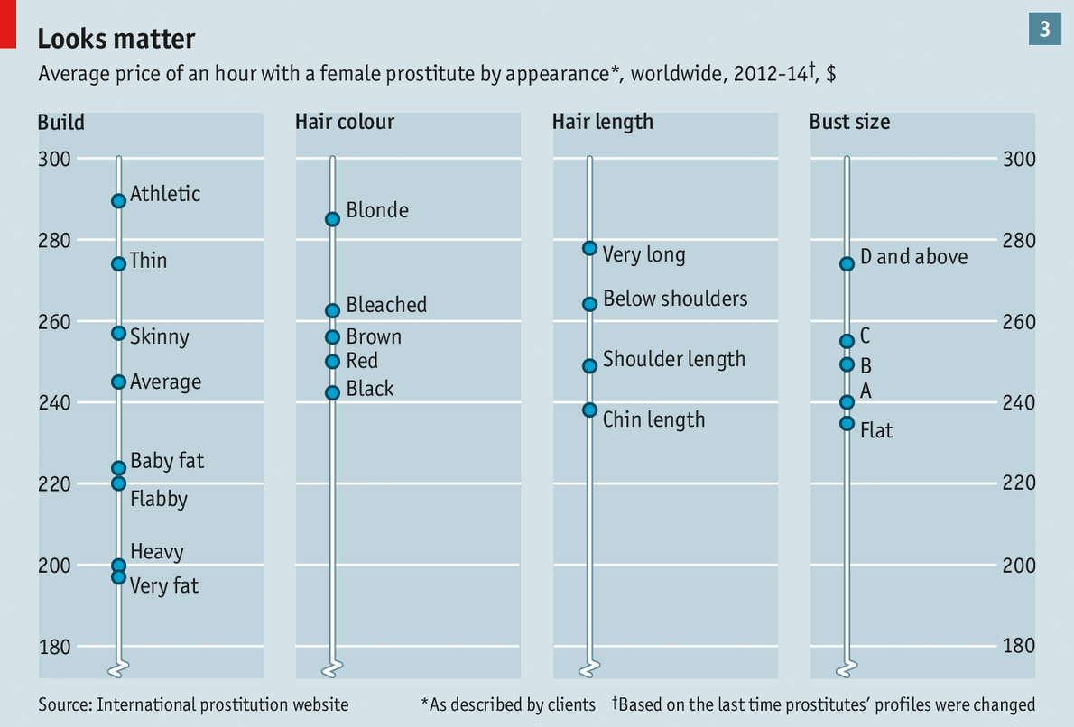
Your humble author has returned to Chicago from several days spent in Boston—among other places. So what better way to follow up on yesterday’s post about prostitution than a small piece from the Boston Globe about the increase in sexually transmitted infections (STIs) in Boston. The cause? Hook-up apps. Because, technology and young people.

Rise in STIs in Boston

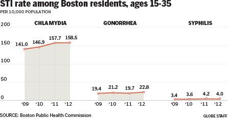
Credit for the piece goes to the Boston Globe’s graphics department.

Ballpark Beer

This evening I am going to be taking in a game at Fenway. So I leave you with today’s blog post comparing beer at different ballparks.

Fenway vs. Citizens Bank

Credit for the piece goes to Kevin Schaul, Kelyn Soong, and Dan Steinberg

The Distribution of Debt in the United States

In a good example of comparing share versus actuals, the National Journal looks at the state of debt across the United States. The choropleth map shows adult share of debt while the bar charts show the regional value of said debt. While the south holds more debt, the west and east coasts have more debt. They also, however, have higher incomes that make servicing or paying off said debt easier than lower income adults in the south.

The South's victory is debt
The South’s victory is debt

Credit for the piece goes to Nancy Cook and Stephanie Stamm.

The Liberal to Conservative Spectrum of American Cities

Yesterday we looked at the growth of inland cities. Today, we follow up with a piece from the Economist that examines the political leanings of America’s larger cities. As one might imagine, the larger cities generally trend liberal. But the most conservative American cities are actually not very conservative. They are better described as centre-right.

The liberal/conservative nature of American cities

Credit for the piece goes to K.N.C. and L.P.

Growth of Inland Cities

Some of the nation’s fastest growing cities are inland, away from the coast where housing prices are high. To support an article about the demographic shift, the New York Times created this map. Circle size represents growth over a six-year period while the colour of the bubble represents housing prices.

Fastest growing cities

Credit for the piece goes to the New York Times graphics department.

Coal vs. the Great Barrier Reef

Your humble author is away this week. But the Great Barrier Reef in Australia is still here. For now. The Guardian takes a look at the growing threat to the World Heritage site from the coal industry in Queensland, Australia. The author takes you through the narrative in a chapter format, using charts and maps to illustrate the points in the brief bit of text. A really nice job altogether.

Major ports and their volume

Credit for the piece goes to Nick Evershed.

Borehole Graphics

Long articles often mean lots of vertical space. But it is only every so often when an item can complement itself with a narrow, vertical graphic. The Los Angeles Times has just that in today’s piece, looking at the layers of sedimentation from a borehole.

What's in the borehole?
What’s in the borehole?

Credit for the piece goes to Thomas Curwen, Lorena Elebee, and Javier Zarracina.