Average Ticket Prices in 2013

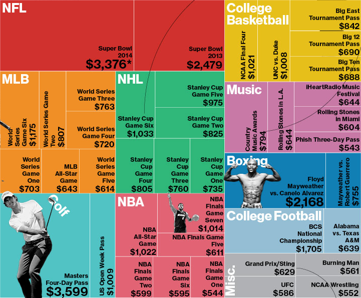
So yeah, the Super Bowl thing. Apparently tickets are expensive? Earlier, Bloomberg Businessweek took a look at average prices for the most expensive events of 2013. The only sentence supporting the graphic was that the most expensive event was not the Super Bowl. Okay, so what was?
Most Expensive Average Ticket Prices

I think this graphic actually makes it more difficult to tell. But beyond that, the decision to use the tree map confuses me. We are already looking at a subset of ticket prices—not all, but only the “most expensive”. What criteria determined that selection? After all, from my own experience and personal knowledge I know that Red Sox–Yankees game are also incredibly expensive. But those are not present in this set. And then if the idea is to undermine the common thought that the Super Bowl is the most expensive ticket, should the user be forced to find through each square—and no, the events are not squarified very nicely—the highest value?

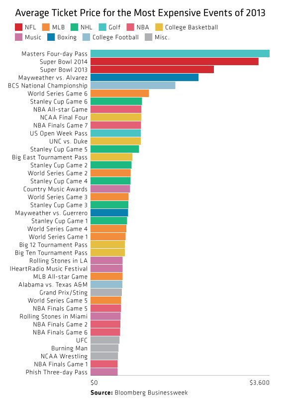
So I took an hour before the game to try a quick stab at quickly identifying the most expensive tickets. It turns out that the glorious bar chart more than suffices. It also then shows how quickly the remainder of the prices become quite comparable. (Ridiculous I suppose depends upon your preference for sport/event/disposable income.)
My quick take
My quick take

Credit for the original piece goes to Bloomberg Businessweek.

Smart Banking Cards

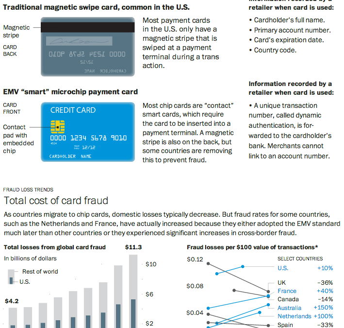
As I noted in my Friday post, I spent last week in Lithuania for work. That same Friday night, I had a conversation with a few coworkers over dinner and a beer about credit cards. They teased me that for all of America’s technological advances and advantages, even in Lithuania they were using more secure forms of bank card payment: chipped cards. And that story seems a perfect segue into today’s post from the Washington Post.

Through a combination of charts, maps, and illustrations—a cropping of which is shown below—the Post details the advantages of using microchipped cards in preventing certain types of fraud. Additionally, because of the integration of the visuals with the written explanations, text can be used to provide longer anecdotes to explain exceptions and outliers when and where necessary.

Cropping of microchipped card story

Credit for the piece goes to Todd Lindeman.

The Best Superbowl Match-up Ever?

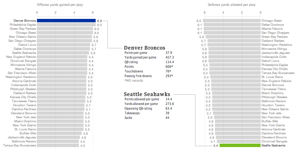
Last night the United States enjoyed a little (American, not rest-of-the-world) football match wherein two squadrons competed upon the pitch for the glory of their squadron colours. Thankfully for those of us who wanted a preview of the match on data’s terms, well, the Guardian put together a fantastic piece breaking down some of the numbers.

The Best Superbowl Match-up

The data is not terribly complicated—I still think baseball makes the most use of advanced metrics, though it helps they play more than 10 times as many games per season. The Guardian looked at yards gained or lost per play by the offence or defence, respectively. Click through the link to explore the other charting forms used, in particular the four quadrant scatter plot and the small multiples that follow. Also, a sophisticated and restrained colour palette allows the user to clearly understand when he or she is viewing the Denver–Seattle matchup or the historic match-ups of the NFL.

Regardless of the quality of the presentation, we shall see Monday morning—I am writing this Sunday afternoon—whether this piece will still hold with its talk of the best match-up ever.

And hey, for all this talk about the best offence, look at which squadron is ranked second. Fly, Eagles, fly.

Credit for the piece goes to the Guardian’s US Interactive Team.

It’s Cold Outside

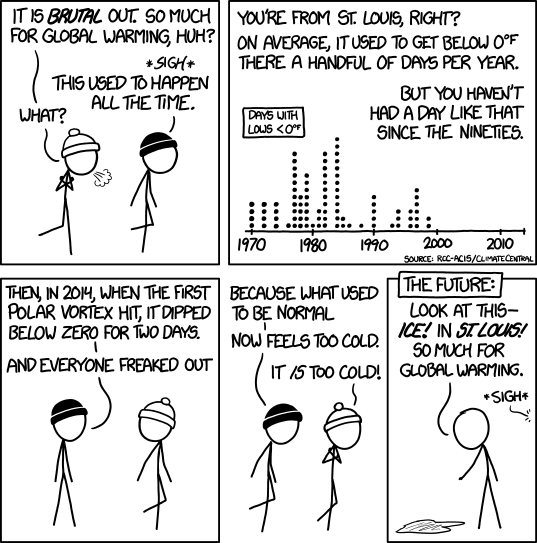
I have spent this past week in Lithuania for work. And it was cold. But it was colder still in Chicago. Thankfully on a Friday we have xkcd to put all this cold into a bit more perspective. Although his example uses St. Louis, I presume it holds for most cities.

It's cold outside
It’s cold outside

Credit for the piece goes to Randall Munroe.

Migration within the European Union

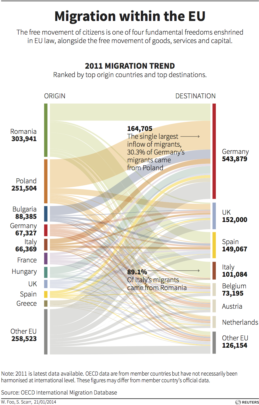
Today’s post comes via one of my coworkers. She sent me this graphic from Thomson Reuters that uses a Sankey diagram to show the movement of European Union citizens within the EU. As with my post yesterday, I feel this piece would benefit from even limited interactivity. Exploring individual countries or individual flows by touch or by mouse would be more useful than relying on annotations. But also as I said, that might not have been possible within the production constraints of this piece.

Migration within the EU

Credit for the piece goes to W. Foo and S. Scarr.

Wealth and Education

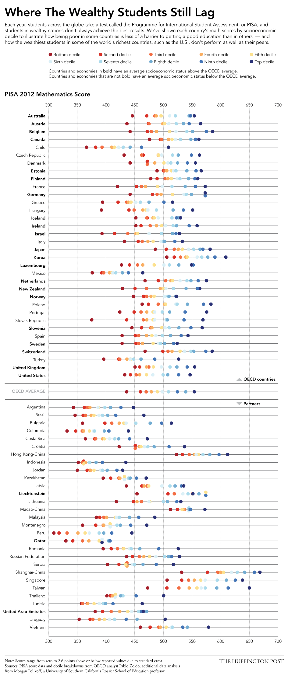
Today’s post looks at education across a set of 65 countries from a standardised test backed by the OECD, basically a group of wealthy countries. The test results found that some poor countries have surprisingly good education systems whereas some of the world’s wealthiest countries—here’s looking at you, United States—perform poorly. The Huffington Post created this graphic to plot the data.

Education scores
Education scores

I really enjoy this piece. It plots each income decile’s results, blocks the countries into OECD members versus their partners, and then each country’s average socioeconomic status is shown as being above or below the OECD average. This is the type of piece I see as a static image that I would want to see made interactively—though I fully understand how difficult and time-consuming that can be—so that I could begin to filter and re-arrange the data. Could discoveries be made by organising countries by geographic regions? Could one just look at the top or bottom deciles?

Credit for the piece goes to Jan Diehm.

Views on Gay Marriage Around the World

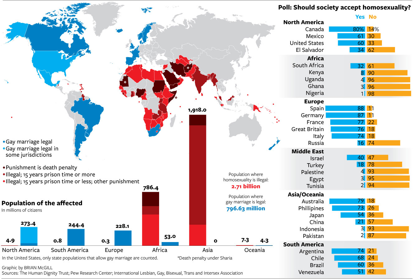
If you have been living under a rock, Sochi, Russia is hosting the winter Olympics this year. A year in which the Russian government passed legislation banning not same-sex relationships but advocacy for said relationships. Several countries, including the United States, take issue with the legislation. But this graphic from the National Journal hints that in order to reverse such barriers to same-sex marriages, the United States and like-minded societies have a long way to go to convince not just Russians, but many other societies across the world.

Views on gay marriage

Credit for the piece goes to Brian McGill.

Don’t Worry, You’ll Be Long Dead…

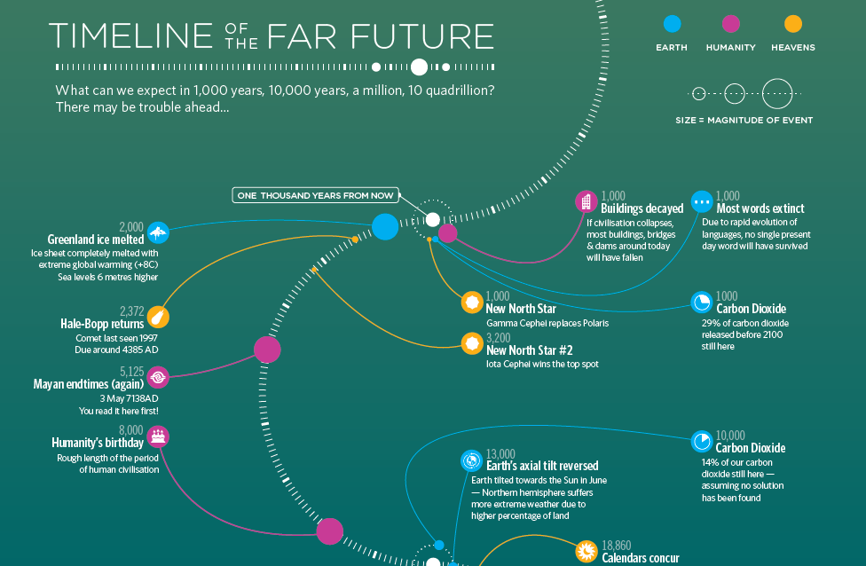
…before any of this occurs. Courtesy of BBC Future and the New Year, welcome to the end of the world as we know it. (Sing it, Michael.)

A long time in the future on a planet very—actually this planet

Credit for the piece goes to iibStudio.

Washington’s New Ferris Wheel

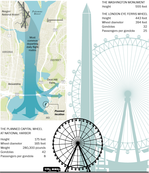
This past weekend I was having a discussion with some friends about the height of various Ferris wheels. Specifically we were wondering the height difference between the London Eye and the wheel at Chicago’s Navy Pier. Well, it turns out that Washington, D.C. is preparing to begin construction on its own wheel. Naturally, the Washington Post covered the story with a graphic to compare the Capital Wheel to the London Eye.

The Capital Wheel
The Capital Wheel

And for those wondering about Chicago’s wheel at Navy Pier, well it clocks in at 150 feet. That makes it 25 feet shorter than the Capital Wheel in D.C.

Credit for the piece goes to Richard Johnson.

A Century of Passenger Flight

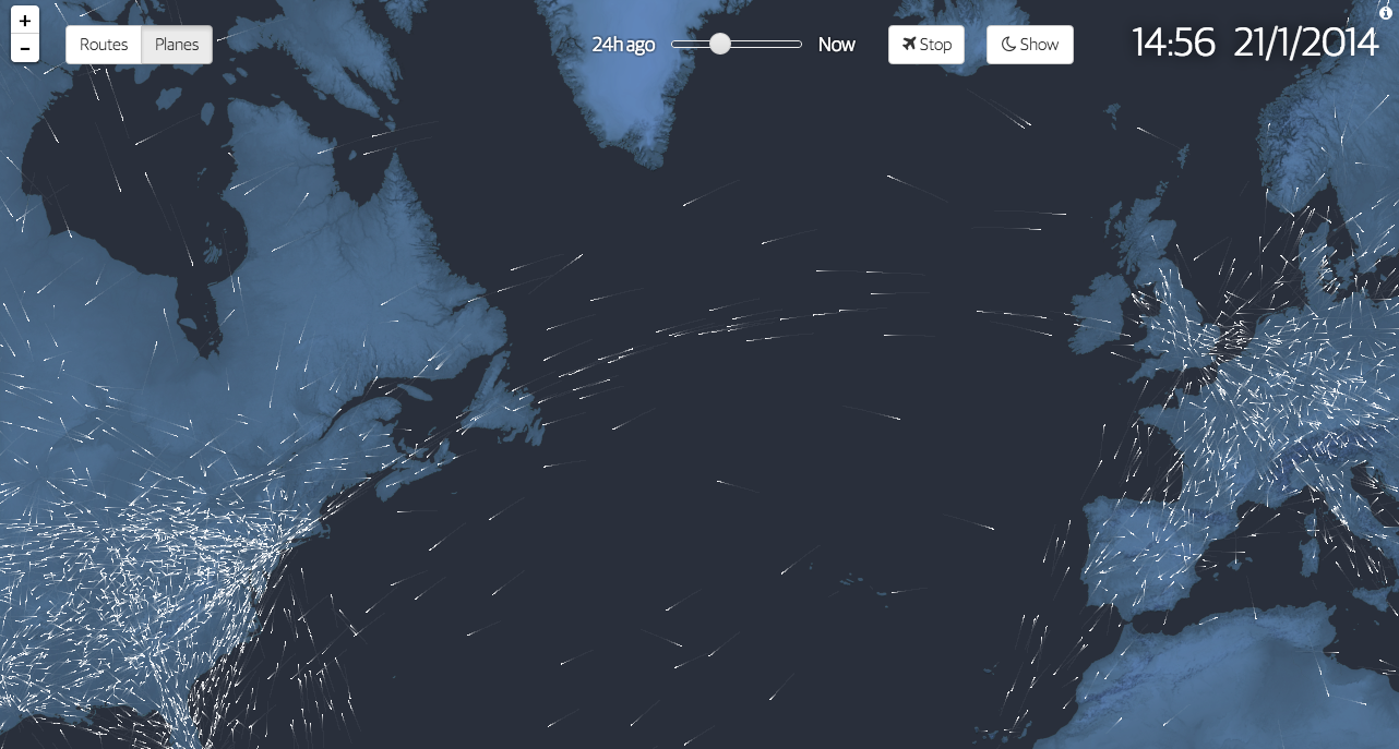
100 years ago we began to fly commercially. We moved beyond daredevil stunts and novelty and created air travel into a business. To commemorate the history, the Guardian commissioned this interactive graphic story to celebrate said history. It includes charts, narration, and near real-time data on actual flights mapped out as in the introductory element captured below.

Flight
Flight

Credit for the piece goes to Kiln.