Income Growth Gap

The Recession was not great for the 99%. It was, however, good for the 1%. How good? Well as data put together by the Economic Policy Institute indicates—and as reported by the Washington Post—it was very good. In only 1 of 49 states did the 99% fare better than the 1%. One state’s data was unavailable. This scatter plot compares the growth over the period of the two income groups. And as the reader can see, the growth was generally speaking not even close to being equal.

Comparing income growth

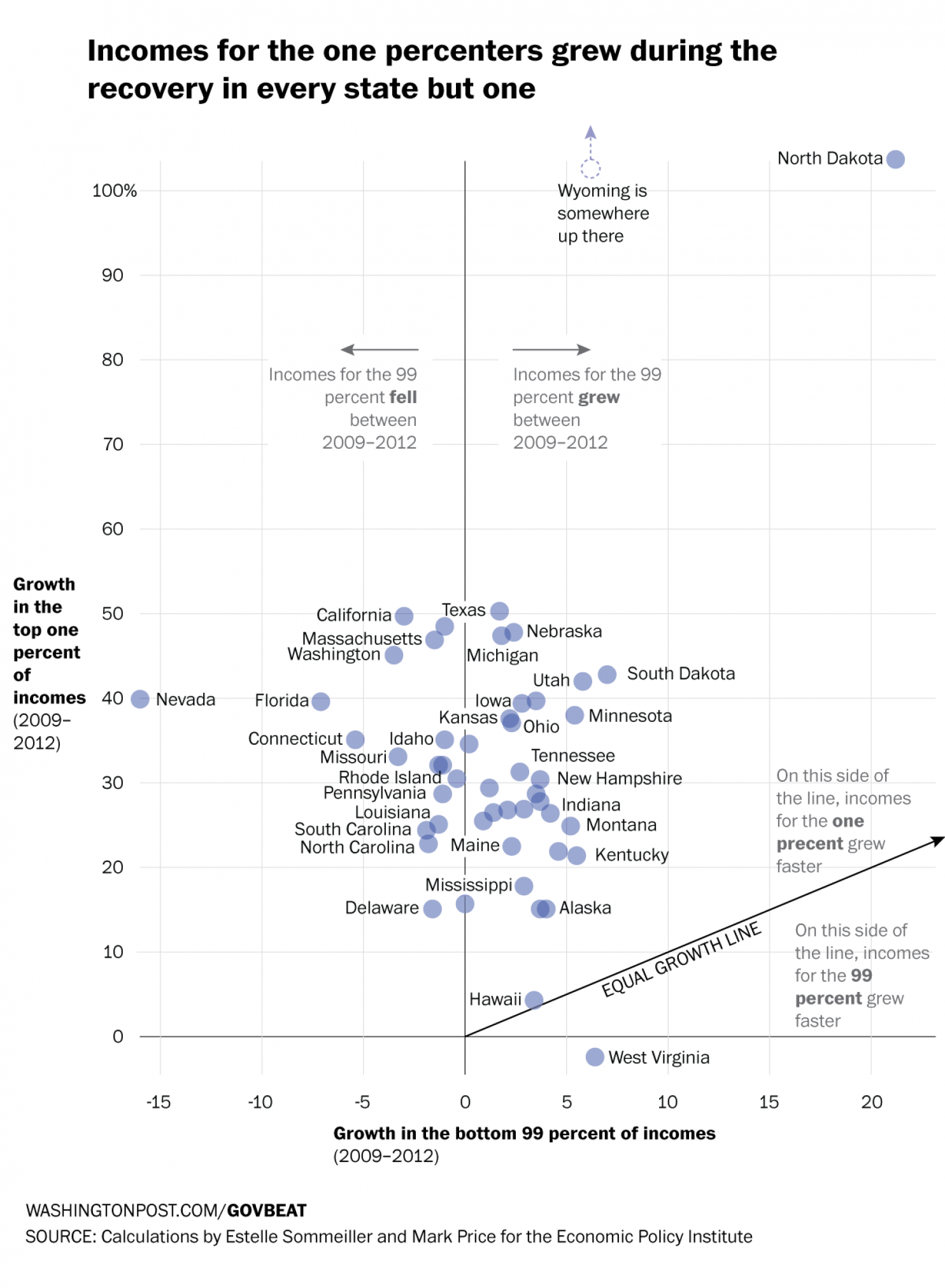
Credit for the piece goes to Niraj Chokshi and Jeff Guo.

Population Displacement in Ukraine

Ukraine continues to suffer the effects of a Russian invasion. Though we won’t call it that. This piece from Radio Free Europe looks at the displaced persons in the country. Unfortunately, it is not quite the best example of what to do.

Displacement in Ukraine

The line chart looks at the cumulative number of displaced persons. But, a monthly growth or absolute number for that month would tell a different story. See below. Hint, it slowed down, and then got pretty bad again.

Monthly population change

I am also not a fan of labelling every data point on the map. Maybe call out a few interesting ones, the outliers perhaps. But do we need to know to the person how many people are in Ternopil. Probably not.

Credit for the piece goes to the graphics department of Radio Free Europe.

The 2014/5 Ebola Outbreak in Context

Spoiler alert, it’s big. Thankfully Scientific American has attempted to put the West African outbreak in the context of all other Ebola outbreaks. I think the one thing missing, rather the one thing I would have done differently, is to include some kind of background element to show the difference in scale. A giant circle behind the whole graphic. Or a giant diamond. Of course the designer may not have had the space to do that, because the scale difference is just that extreme.

Putting the ongoing outbreak in context

Credit for the piece goes to Pitch Interactive for Scientific American.

The Urban Future

Today’s selection is a little old—dating from July of last year—but is still a nice example of an inline graphic supporting the premise of its accompanying article. The New York Times looks at what was then data published by the United Nations on urban growth out to 2030. The article talks about the growth of megacities in lower income countries and those in the tropical regions. So smack in the middle of the article are two stacked bar charts breaking down urban populations into those two categories.

Urban population makeup

Personally I would have preferred a series of line charts to better compare the growth—the lack of a common baseline makes it very difficult to compare segments of the bars. But below the stacked bar charts we have a nice table. Those are always good to see. They organise information clearly and make it quick to find what is relevant.

Credit for the piece goes to the New York Times graphics department.

Chris Christie Is Well Know But Not Well Like

As election season begins to heat up, Five Thirty Eight looks at the probability of a Chris Christie candidacy. The scatter plot below examines the favourability and name recognition. The public knows the “brand” of Christie. But they do not have a favourable view of him. I would be curious how much of that is due to his East Coast-iness.

Christie is well known, but not well liked

Credit for the piece goes to Five Thirty Eight.

Trains, Planes, and Automobiles: A Comparison (Kind of)

Travelling by plane can often be a hassle because getting from the airport to the destination is not always easy. Suffice it to say your humble author has—on a few occasions—been almost stranded at Philadelphia International because of no way to get where I was going. A lot of that comes down to poor public transit options. In my cases, it mostly stemmed from terrible weather delaying my flight until the wee hours of the morning after which train service stops.

Thankfully, Five Thirty Eight took a look at the public transit vs. car options for various cities/airports and seeing which option is faster. Ultimately Philly is awarded an honourable mention because the R1 (what some people now call the Airport Line) is convenient if your timing is right. Mine, obviously, has never been.

Travel times to downtowns

Credit for the piece goes to Allison McCann.

All the Goats

Today is Friday. And that means it is time for the seriousness. So here you go, folks. Goats. All the goats. The US Agricultural Census recorded all the goats as of 2012. And so people can map that out. Thankfully the Washington Post did it for me.

Note the exclamation point

Credit for the piece goes to the Washington Post graphics department.

The Perception vs Reality of Islam in Europe

Last week’s terror attacks in Paris highlight the tension in Europe between secular Europe and those believing in Islamist values. The Economist looked at some of the available data and noted the gap between Europe’s perception of Islam and its reality. A quick figure called out for France, French respondents thought 31% of the French population to be Muslim. The reality is a mere 8%.

Perception vs reality

Credit for the piece goes to the Economist Data Team.

Income Peak Map

Today’s post looks at peak income for the middle class. The Washington Post looked at peak median household income for each county in the United States. And for 81% of counties, that peak was over 15 years ago.

Income map
Income map

The really nice features of this piece are not actually the map, which is a standard choropleth map. Instead small multiples above the map breakdown the appearance of counties in each era bracket. And then to the right the user can compare a selected county against both the state and the United States. Overall, a very nice piece.

Credit for the piece Darla Cameron and Ted Mellnik.

The Link Between Work and Transit

The Wall Street Journal recently published an interesting article about the link between work and access to transit. They included a graphic that looked at the link between the two.

Linking the two together

Credit for the piece goes to the Wall Street Journal graphics department.