Which of These Countries Does Not Belong

For those of you reading from the States, I hope you all enjoyed your holiday. And for my UK readers, I hope you all enjoyed your summer bank holiday last weekend. So now to the good and uplifting kind of news.

Something is clearly not right here.

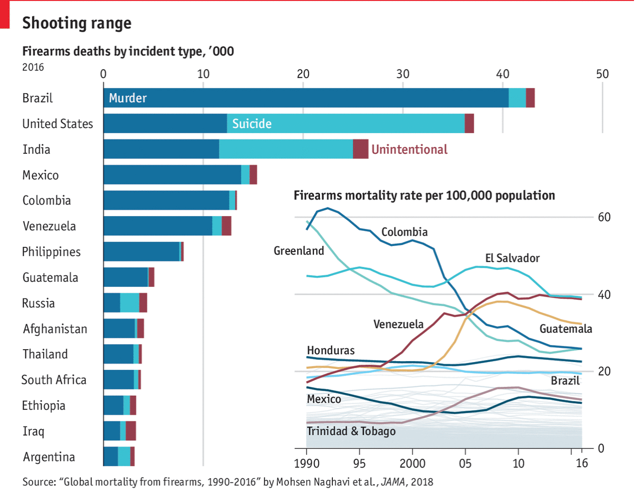
Indeed, a chart about deaths from firearms from the Economist. From a graphical standpoint, we all know how much I loathe stacked bar charts and this shows why. It is difficult for the user to isolate and compare the profiles of certain types of firearm violence against each other. Clearly there are countries where suicide by gun is more prevalent than murder, but most on this list are more murder happy.

And then the line chart that is cleverly spaced within the overall graphic, well, it falls apart. There are too many lines highlighted. Instead, I would have separated these out into a separate chart, made larger, so that the reader can more easily discern which series belongs to which country. Or I would have gone with a set of small multiples isolating those nine countries.

I am also unclear on why certain countries were highlighted in the line chart. Did they all need to be highlighted? Why, for example, is Trinidad & Tobago. It is not mentioned in the article, nor is it in the stacked bar chart.

But the biggest problem I have is with the data itself. But, every one of the countries on that list is among the developing countries or the least developed countries. Except one. And that, of course, is the United States.

Credit for the piece goes to the Economist Data Team.

The Rise of Online Dating

This past weekend I cited this article from the Economist that looked at the rise of online dating as a way of couples meeting. There was some debate about which channels of interaction/attraction still worked or were prevalent. And it turns out that, in general, the online world is the world today.

Meeting your partner in primary/secondary school has clearly gone out of fashion since the 40s.

My problem with the graphic is that it is a bit too spaghettified for my liking. Too many lines, too many colours, and they are all overlapping. I probably would have tried a few different tricks. One, small multiples. The drawback to that method is that while it allows you to clearly analyse one particular series, you lose the overlap that might be of some interest to readers.

Second, maybe don’t highlight every single channel? Again, you could lose some audience interest, but it would allow the reader to more clearly see the online trend, especially in the heterosexual couple section of the data. You could accomplish this by either greying out uninteresting lines or removing them entirely, like that primary/secondary school series.

Third, I would try a bit more consistent labelling. Maybe increase the overall height of the graphic to give some more vertical space to try and label each series to the right or left of the graphic. You might need a line here or there to connect the series to its label, but that is already happening in this chart.

However, I do like how the designers kept the y-axis scale the same for both charts. It allows you to clearly see how much of an impact the online dating world has been for homosexual couples. My back-of-the-envelope calculations would say that is more than three times as successful than it is for heterosexual couples. But that insight would be lost if both charts were plotted on separate axis scales.

But lastly, note how the dataset only goes as far as 2010. I can only imagine how these charts would look if the data continued through 2018.

Credit for the piece goes to the Economist Data Team.

Most Liveable Cities Ranking

There is nothing super sophisticated in these charts, but I love them all the same. The Economist Intelligence Unit (EIU) published its rankings of the world’s most liveable cities and this year Vienna knocked off Melbourne for top spot. But what about the rest of the list?

Thankfully the Economist, a related company, put together a graphic highlighting important or noteworthy cities among the entire dataset. It is a wonderful tangle of light grey lines that have select cities highlighted in thicker strokes and brighter colours. Labelling each city would be too tricky at this scale.

I'm okay with the occasional rainbow spaghetti

I’m okay with the occasional rainbow spaghettiThat said about labelling each city, a few years back I worked on a similar top cities in a category datagraphic for Euromonitor International. We took a similar approach and coloured lines by region, but we presented the entire dataset and then complemented it by some additional charts to the side.

These were always fun pieces on which to work

What is really nice about the Economist piece, however, is that they opted not to show the whole dataset. This could be a business decision, if people want to find where a particular city they could be persuaded to either outright subscribe or otherwise provide contact information in exchange for access to the data. Either way, the result is a piece that has space to provide textual context about why cities rose or fell over the years.

I think I like these types of pieces because there is so much to glean from getting lost in the chart. And this one from the Economist does not disappoint.

Credit for the liveability piece goes to the Economist Data Team.

Credit for the destinations piece goes to me.

My New Toast

I am a millennial. That broadly means I am destroying and/or ruining everything. It also means I am obsessed with things like avocado toast. It also means I am not buying a house. Thankfully the Economist is on top of my next fad: indoor houseplants.

Plant things
Plant things

Your author will admit to having a few: a hanging plant, an Easter lily, an aloe plant and its children, and a dwarf conifer. Just don’t ask me how they’re doing. (Hint: not well.) Turns out I am not a plant person.

In terms of the graphic, though, what we have is a straight up set of small multiples of line charts. The seasonality mentioned in the article text appears quite clearly in a number of plants.

But is Swiss Cheese really a plant?

Credit for the piece goes to the Economist Data Team.

Development Languages

Last week the Economist published an article sort of about my industry. Now I am a designer and more familiar with the front-end design and some HTML and CSS, but a lot of the things I have designed over the last few years have needed some serious developers with some serious skills. And those guys were the ones who would truly understand this graphic, which looks at the popularity of Python relative to other languages like C++, Java, Javascript, .NET, &c.

Python has certainly climbed in importance

I really like what the designers did here. First and foremost the key chart is a ranking chart showing the popularity of languages since 1988—Java and C have consistently been at the top. But other languages no longer relevant are not even shown. (Where are you, Actionscript?) Those that are both relevant and also mentioned are colour coded within the set.

But the truly nice thing is being able to use the empty space of the lower-left area of the chart to add some context. It shows the growth in Google searches since 2010 in searches for Python.

Bonus note, look at that rise in R since 2008.

Credit for the piece goes to the Economist Data Team.

The Decline of the Media

Everybody loves maps. Unfortunately this is not a map to love. The Economist looked at the global status of the free press and its decline around the world.

If only it were a larger map

The graphic is a neat little package of a map to anchor the narrative and a few callout countries with their general declines—or in Tunisia’s case the reversal thereof—highlighted. But I do have a few issues with the piece.

Do the lines need to be curved? Some certainly make sense, e.g. how do you get from the Turkey box to the outline of Turkey? But then for Afghanistan, a straight line through Balochistan, Pakistan would mean the line would not have to cover Pakistan, India, curve around Sri Lanka, and then finally reach the box.

In the little boxes, I also wonder if the lines need to be as thick as they are. Could a lighter stroke weight improve the legibility of the charts?

And to be super picky, I wonder if the stroke outlines of the countries are complete. My trained eye fails to register an outline of both the European part of Turkey and of the Russian oblast of Kaliningrad.

Credit for the piece goes to the Economist’s Data Team.

The Rising Tide of Jihadist Violence in Africa

The other day somebody mentioned to me that Africa is big, to which I agreed. It is big. It contains, depending upon how you count, about 55 countries and over one billion people. It stretches from Mediterranean climates and deserts in the north to rainforests around the equator and then back down through steppe climates to the southern coast of South Africa.

But in that vast territory also comes jihadist violence, and in this article by the Economist, it points out that despite that vastness, the violence can be found in two main areas: first, along the Mediterranean coast and, second, along the Sahel and savannah.

At least it's not spiking?
At least it’s not spiking?

The map uses dots to nice effect here, pinpointing the actual locations of violence and then providing additional detail by colouring the dots according to the perpetrators of the violence. But what I really enjoyed was the simple effect of tying together the dot colours to the stacked area chart in the lower left. It shows the number of people killer per year. And while significantly up from 2010, at least the number of people killed by Boko Haram is down from its heights in 2014–15.

But the reason I brought up the vastness at the beginning is that while these are all groups following a jihadist ideology, many are also driven by very local concerns. Consequently they likely have local solutions. And we need to be careful about how much lumping together we do about jihadist violence in Africa.

Credit for the piece goes to the Economist data team.

Penalty Shoot Outs

Well, football is not coming home. But the World Cup continues. And should we get another final match tied at the end of extra time, that means penalty shoot outs. Thankfully, the Economist did a nice job detailing the success rates on goal by placement of the ball.

Coin flips
Coin flips

The only thing I am unsure about is whether the dots represent the actual placement or just positioning within the aggregate zone. The colours work well together and the graphic of the goal is not overpowering.

Credit for the piece goes to the Economist Data Team.

Chinese Urban Clusters

Yesterday the Economist posted a graphic about Chinese urban clusters, of which the Chinese government is planning to create 19 as part of a development strategy. In terms of design, though, I saw it and said, “I remember doing something like that several years ago”.

The Economist piece looks at just the geography of the Chinese clusters. It highlights three in particular it discusses within the article while providing population numbers for those clusters. Spoiler: they are large.

The Economist graphic does little else beyond labelling the cities and the highlighting of the three features clusters. But that is perfectly okay, because that was probably all the graphic was required to do. I am actually impressed that they were able to label every city on the map. As you will see, we quickly abandoned that design idea.

The Chinese government's new urban cluster plan
The Chinese government’s new urban cluster plan

So back in 2015, using 2014 data, my team worked on a series of graphics for a Euromonitor International white paper on Chinese cities. The clusters that the analysts identified, however, were just that, ones identified by researchers. Since the Chinese government had not yet created this new plan.

We added some context to our cluster map

We also looked at more cities and added some vital context to the cluster map by working to identify the prospects of the various Chinese provinces. Don’t ask me what went into that metric, though, since I forget. The challenge, however, was identifying the four different tiers of Chinese city and then differentiating between the three different cluster types while overlaying that on a choropleth. Then we added a series of small multiples to show how now all provinces are alike despite having similar numbers of cities.

Credit for the Economist piece goes to the Economist Data Team.

Credit for the Euromonitor piece is mine. I would gladly give a shoutout to those that worked with me on that project…but it’s been so long I forget. But I’m almost certain both Lindsey Tom and Ciana Frenze helped out, if not on that graphic, on other parts of the project.

When the Whole Is Less Than the Sum of its Parts

Last week we talked a lot about trade—and we will get back to it. But the World Cup is now in full swing and I want to take a look at a couple of things this week. But to begin, the Economist published an article about the difficulty of predicting the outcome of World Cups. It looks at the quirks of random events alongside more quantitative things like ranking systems and their differences.

But one graphic in particular caught my attention. It explore the difference between the ranking in individual players versus the teams as a whole. In short, some teams are valued more highly than their constituent players and others vice versa. The graphic is fairly straightforward in that it plots the team value on the y-axis and the players’ on the x.

When sums are greater or less than the whole…

Personally? I would never bet against Germany. Or Brazil.

But if your author is lucky, he’s going to enjoy the England–Tunisia match this afternoon for lunch—rooting for England, of course. Though thanks to some online tools that’s not the only team I’m rooting for this year. But more on that later this week.

Credit for the piece goes to the Economist graphics department.