Everybody loves maps. Unfortunately this is not a map to love. The Economist looked at the global status of the free press and its decline around the world.
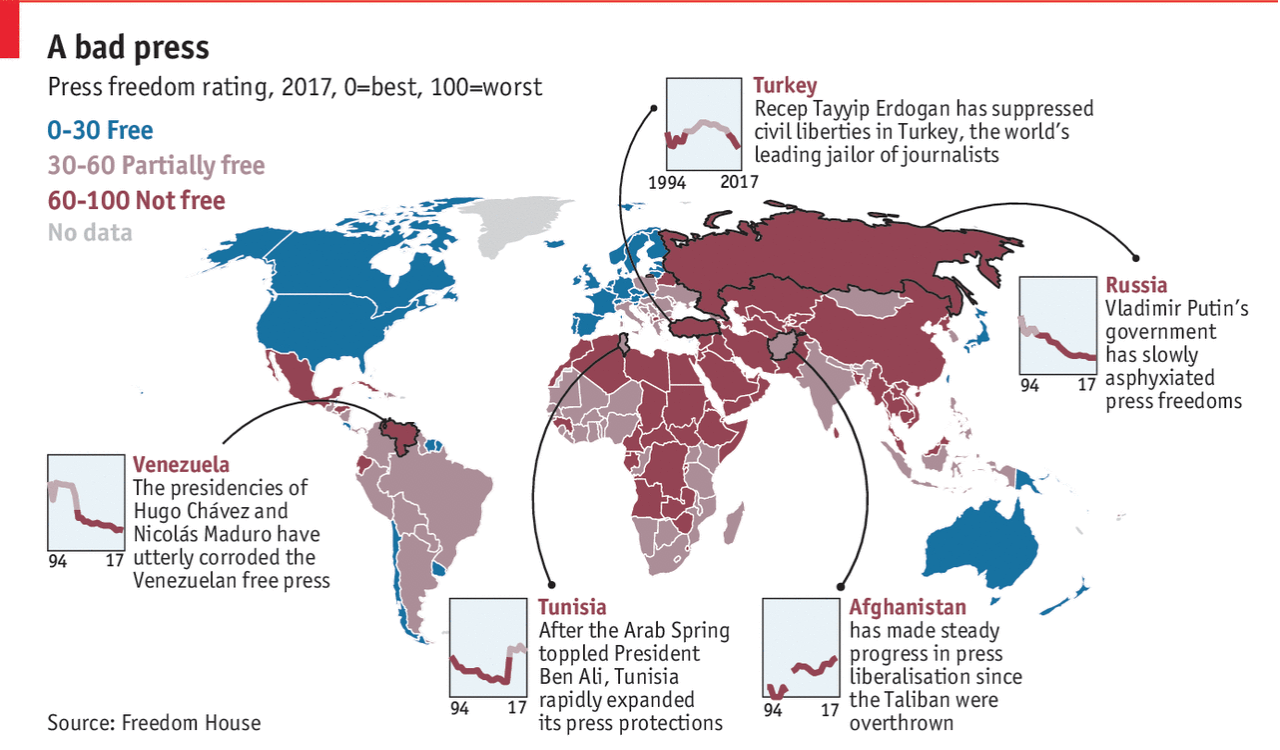
The graphic is a neat little package of a map to anchor the narrative and a few callout countries with their general declines—or in Tunisia’s case the reversal thereof—highlighted. But I do have a few issues with the piece.
Do the lines need to be curved? Some certainly make sense, e.g. how do you get from the Turkey box to the outline of Turkey? But then for Afghanistan, a straight line through Balochistan, Pakistan would mean the line would not have to cover Pakistan, India, curve around Sri Lanka, and then finally reach the box.
In the little boxes, I also wonder if the lines need to be as thick as they are. Could a lighter stroke weight improve the legibility of the charts?
And to be super picky, I wonder if the stroke outlines of the countries are complete. My trained eye fails to register an outline of both the European part of Turkey and of the Russian oblast of Kaliningrad.
Credit for the piece goes to the Economist’s Data Team.
Leave a Reply
You must be logged in to post a comment.