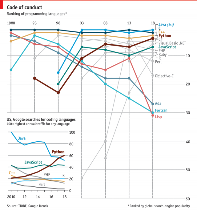
Last week the Economist published an article sort of about my industry. Now I am a designer and more familiar with the front-end design and some HTML and CSS, but a lot of the things I have designed over the last few years have needed some serious developers with some serious skills. And those guys were the ones who would truly understand this graphic, which looks at the popularity of Python relative to other languages like C++, Java, Javascript, .NET, &c.

I really like what the designers did here. First and foremost the key chart is a ranking chart showing the popularity of languages since 1988—Java and C have consistently been at the top. But other languages no longer relevant are not even shown. (Where are you, Actionscript?) Those that are both relevant and also mentioned are colour coded within the set.
But the truly nice thing is being able to use the empty space of the lower-left area of the chart to add some context. It shows the growth in Google searches since 2010 in searches for Python.
Bonus note, look at that rise in R since 2008.
Credit for the piece goes to the Economist Data Team.
Leave a Reply
You must be logged in to post a comment.